The Brand Monograph
The Met brand identity by Wolff Olins
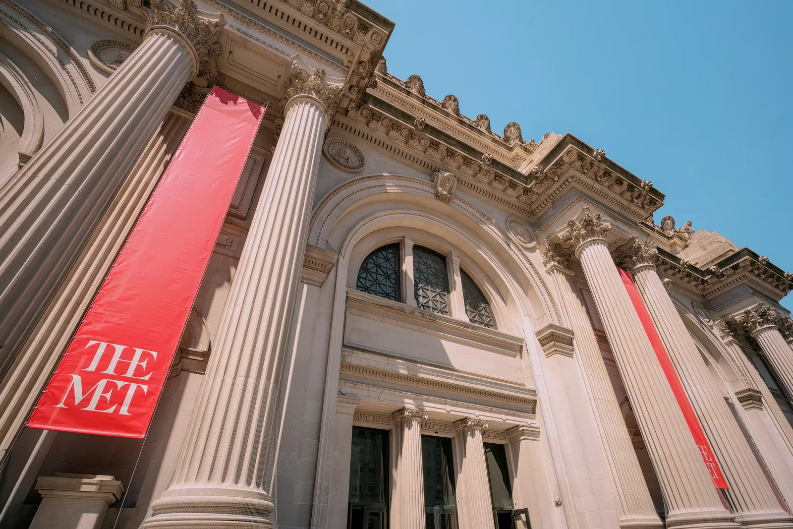
↗The boldest move in Wolff Olins' work for The Met is a subtraction. The studio retired the formal, lengthy Metropolitan Museum of Art in favor of the name visitors already use, then let that decision set the tone for everything else. The brief was to make a 140-year-old institution, home to 5,000 years of art, feel open to audiences who wanted museums to be warmer and easier to enter.
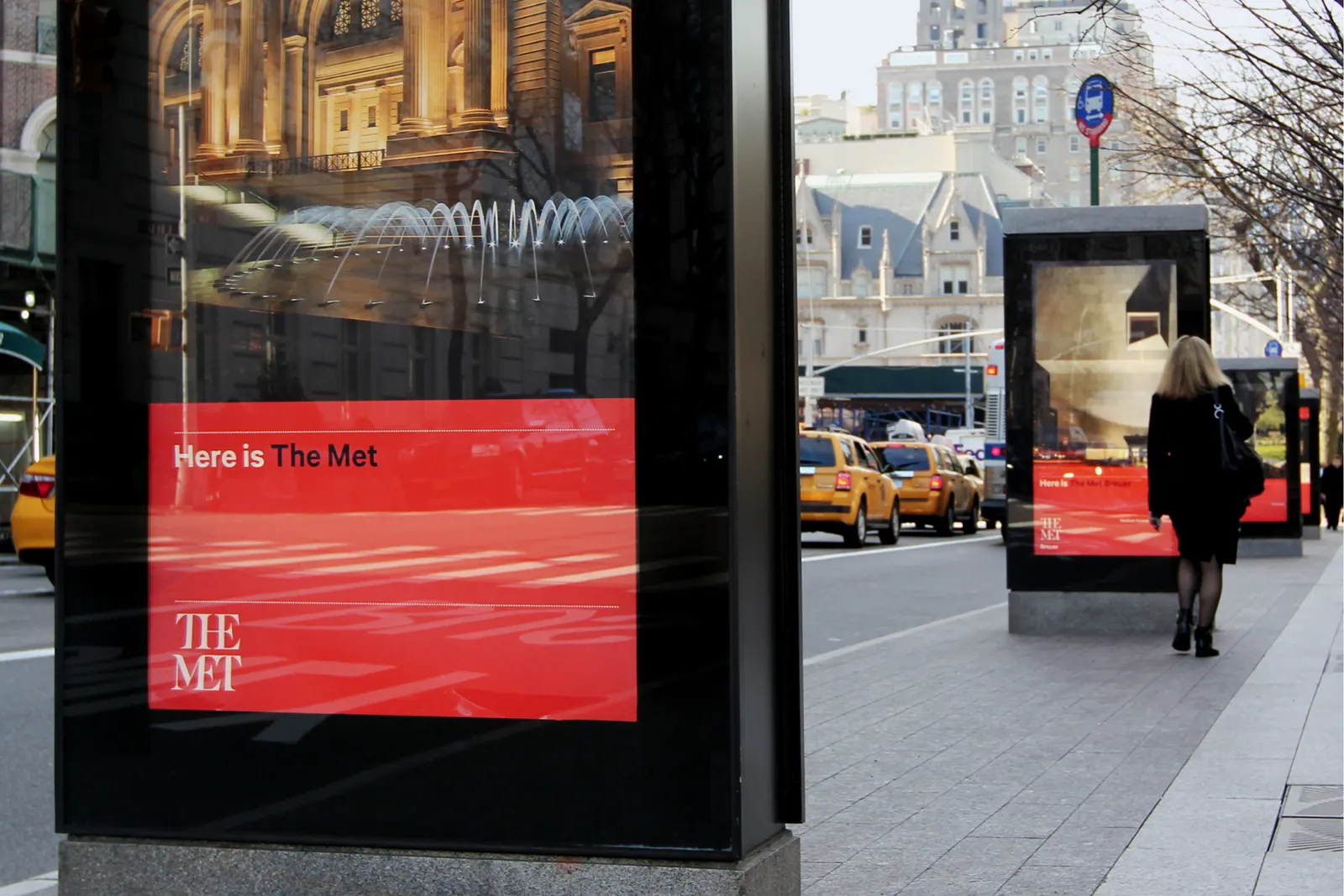
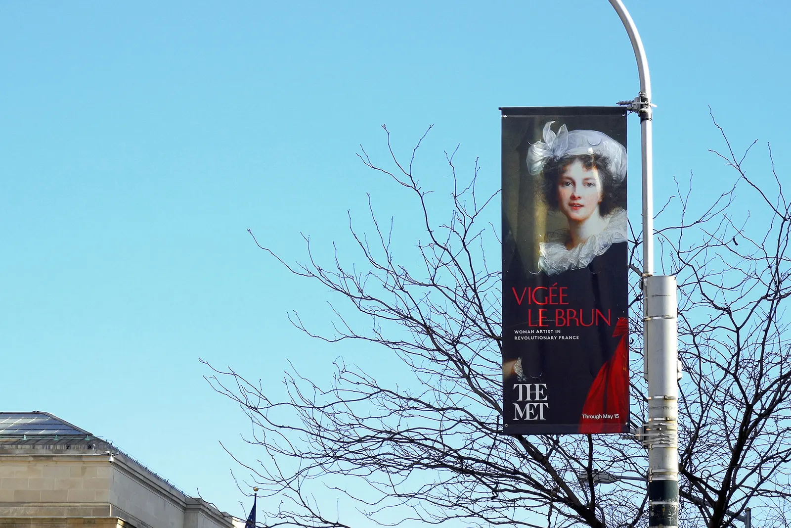
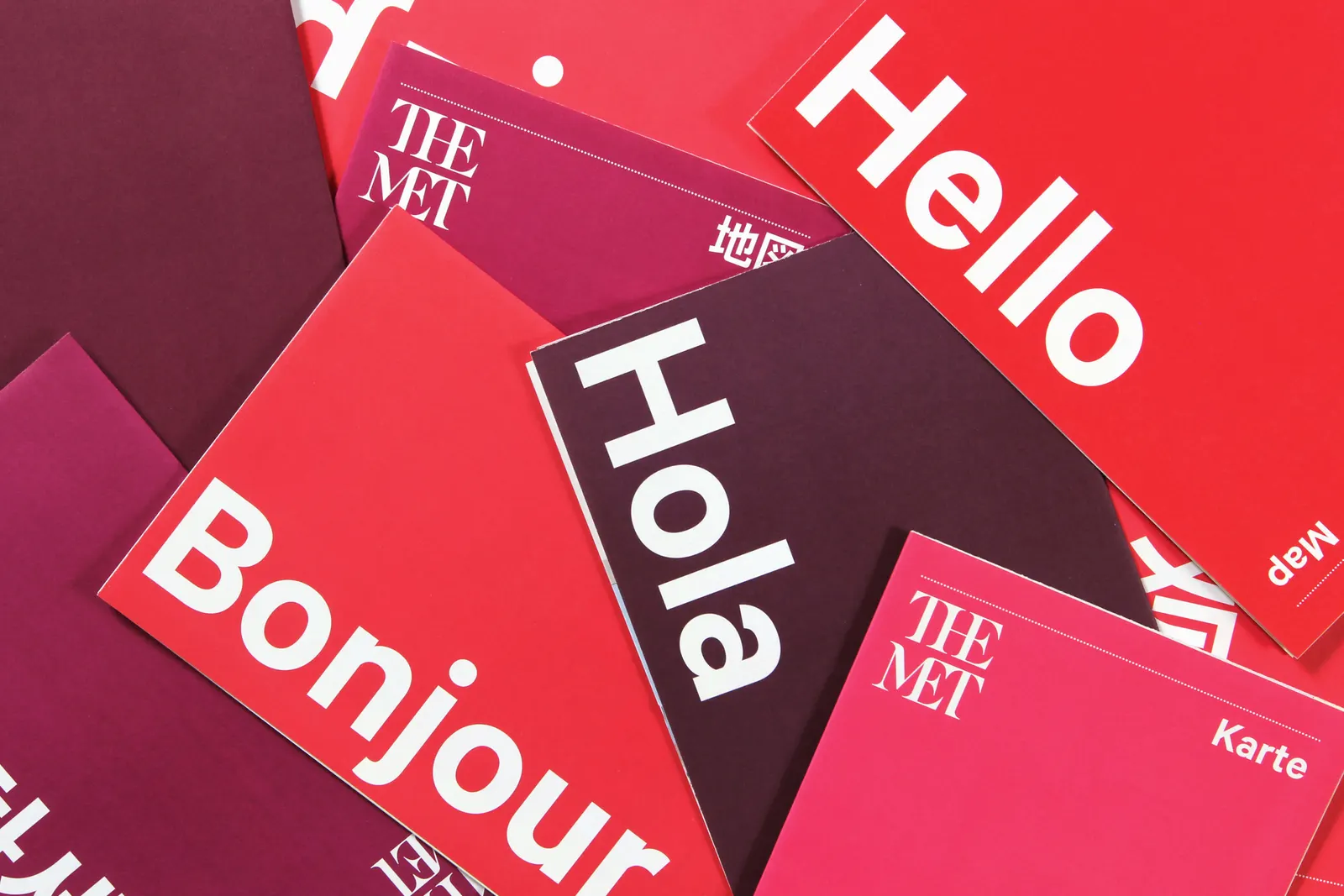
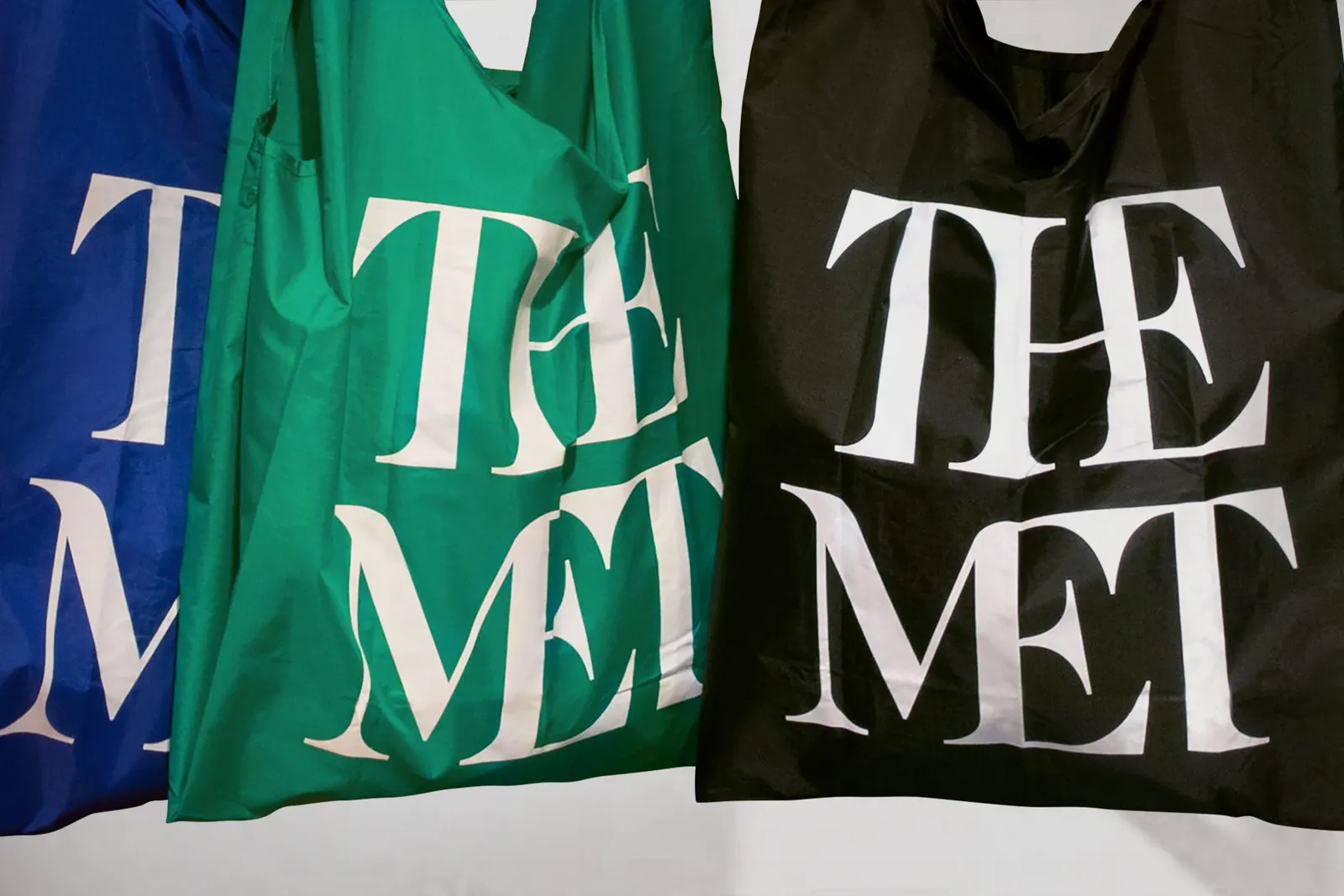
Wolff Olins worked with British type designer Gareth Hague on a logo that joins its letters and reworks typographic traditions, so it feels rooted and current at once. Around it, the studio built a flexible system of type, color, ornament, image treatment, material, and composition that holds together across print, screen, and gallery. Attendance reached 7 million, the highest in more than 40 years of tracking, and the Met 360 videos have drawn 11.5 million views and a Webby Award.
Why it works
Museum identities often default to restrained wordmarks that signal authority and little else. Here, the short name does the welcoming before any design is seen, and the linked letters in Hague's mark add personality without giving up gravitas. That balance suits an audience ranging from first-time tourists to lifelong members. It also gives the system room to flex: a mark with real character can sit confidently beside very different art, and a name this easy to say works equally well on a ticket, a screen, or in conversation.
Applications
Logo
Typography
Images and video from wolffolins.com, by Wolff Olins.