The Brand Monograph
McKinsey brand identity by Wolff Olins
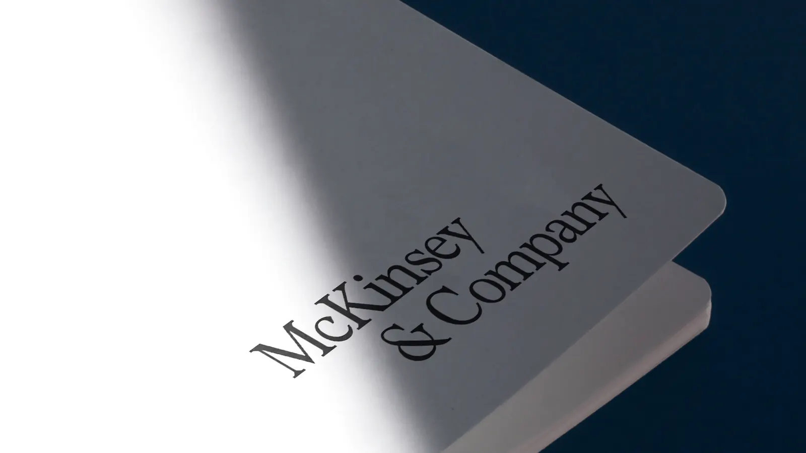
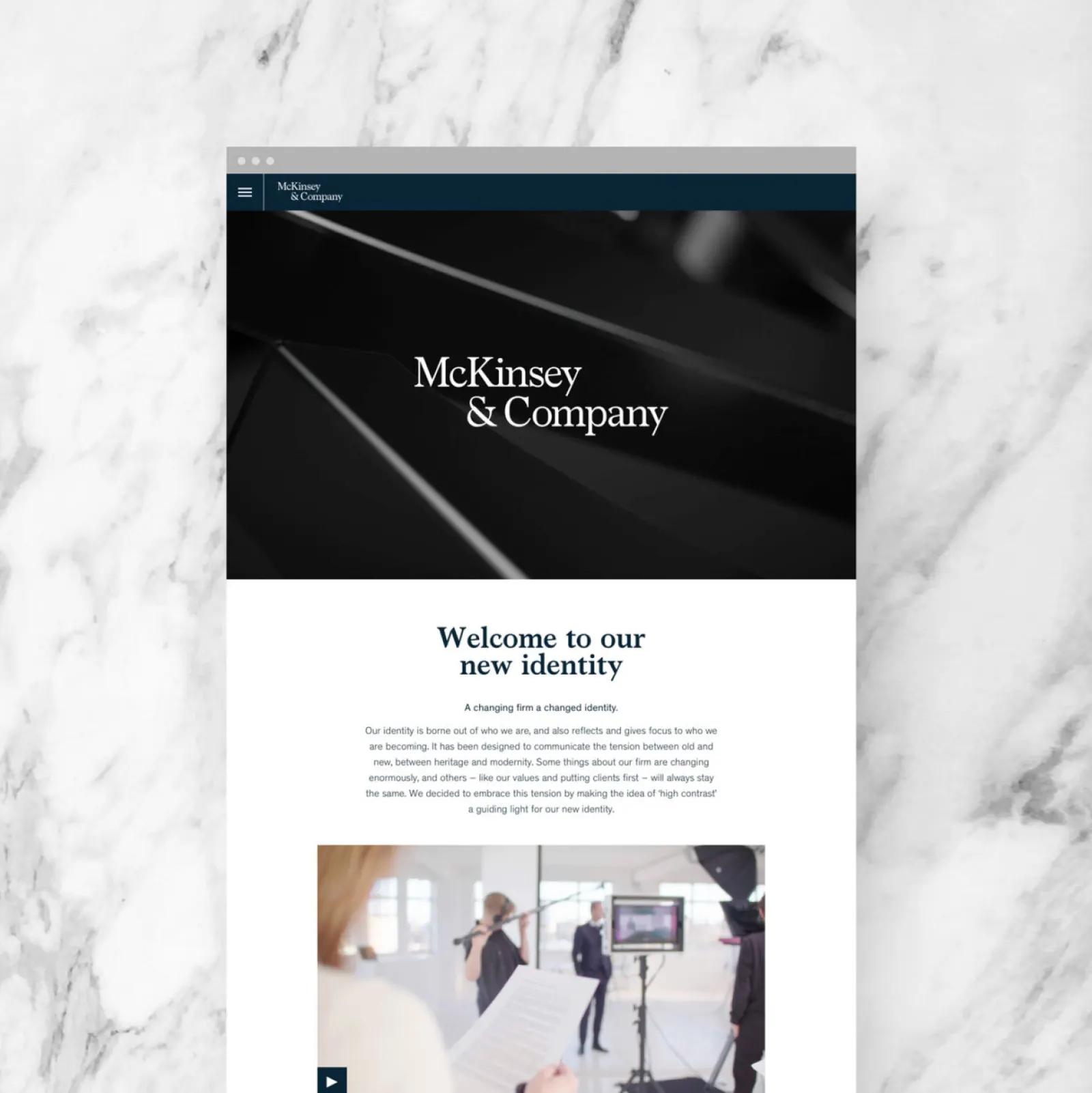
↗Few identities carry as much inherited authority as McKinsey's, and Wolff Olins handled that with restraint. Instead of replacing the firm's familiar wordmark, the studio gave it a more contemporary character and built a fuller toolkit around it. The brief reflected a shift in the firm's role: McKinsey increasingly stays with clients to carry out strategy, not only to recommend it, and its identity needed to show that.
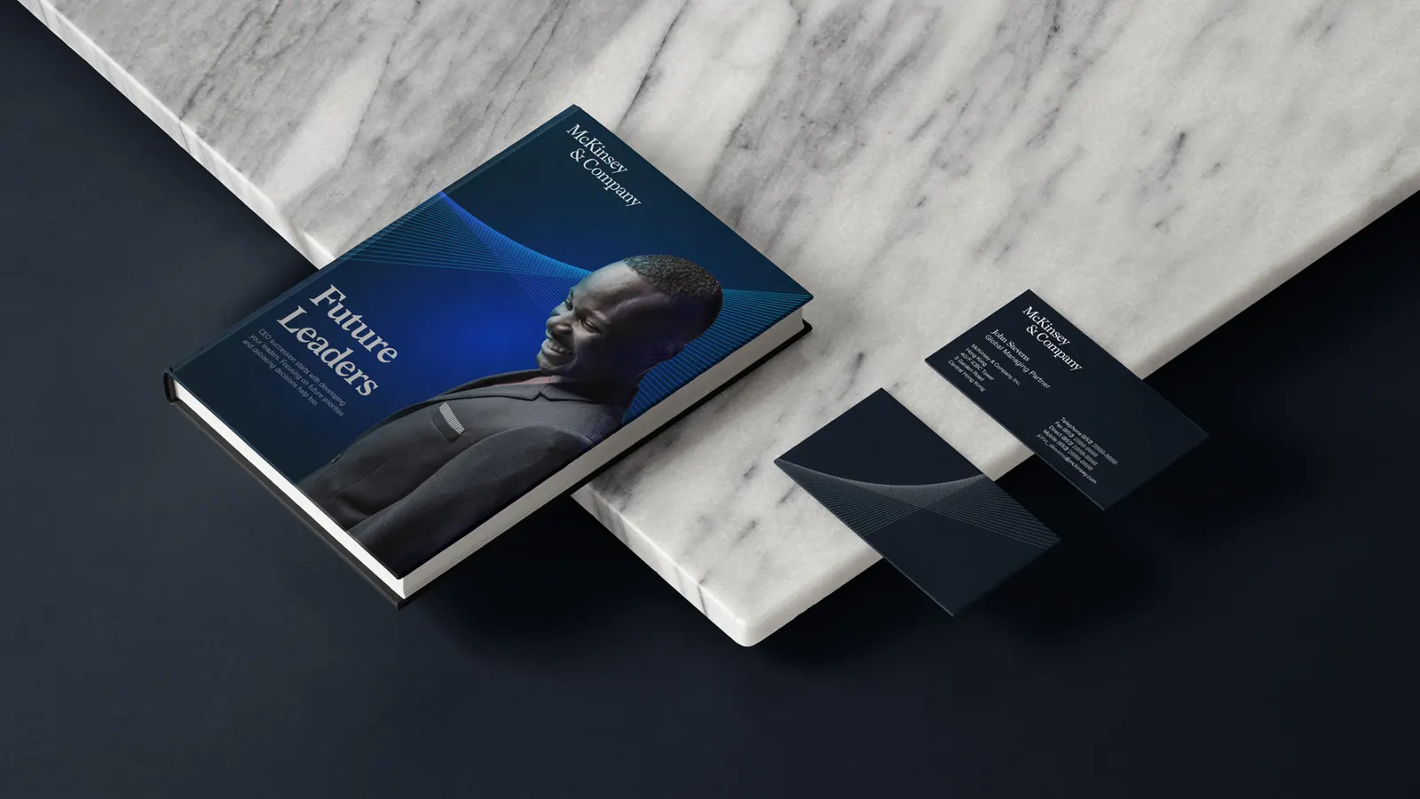
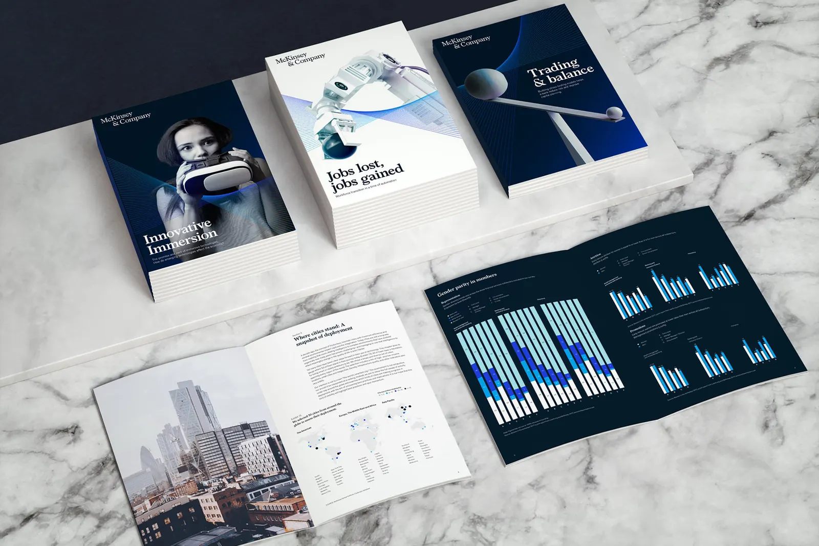
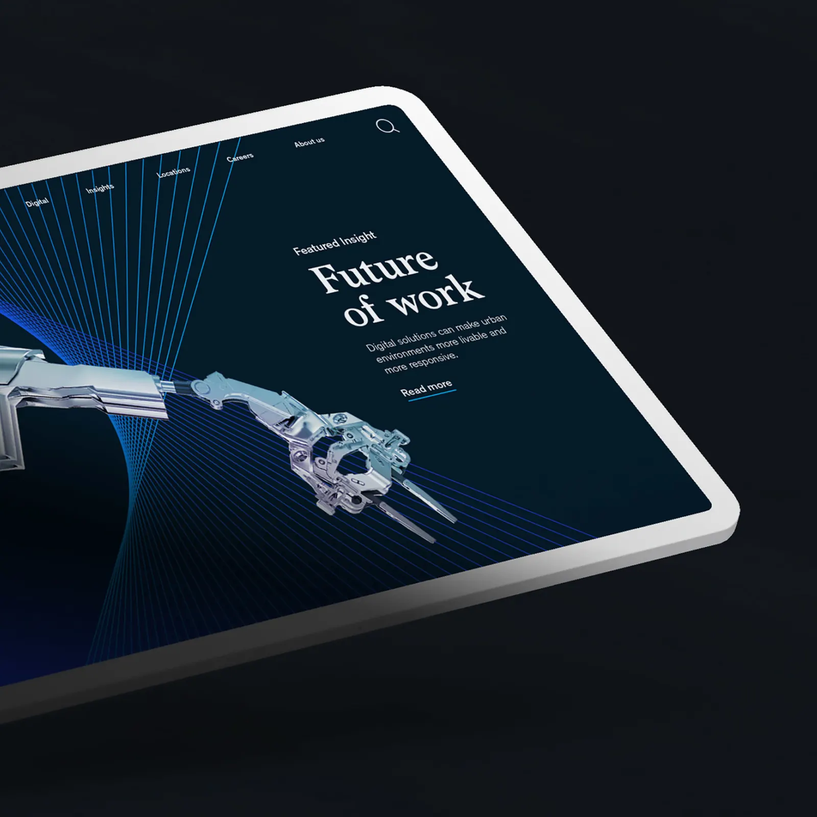
The craft is in the details. Typographer Radim Peško worked with the studio on Bower, a custom typeface named for pioneering McKinsey partner Marvin Bower. An animated Partnership Mark suggests teams moving in step, a data visualization system gives complex information a consistent voice, and a new photographic style completes the kit. Blue remains the anchor, now in a deeper shade set against white. The rollout began globally in February 2019.
Why it works
Keeping the wordmark was the smartest decision here. It preserves decades of recognition while the rest of the system does the modernizing. Bower gives the firm a voice of its own, which matters in a category where many competitors look interchangeable. Deep blue on white stays sober enough for a boardroom, and motion lets the mark express collaboration without disturbing the logo. The data visualization system also fits a firm whose product is evidence.
Applications
Logo



Images and video from wolffolins.com, by Wolff Olins.