The Brand Monograph
Mercedes-AMG Petronas F1 Team brand identity by Wolff Olins
↗Most teams with a record this long would let the trophies do the talking. Wolff Olins took a different route for Mercedes-AMG Petronas, a team with eight straight Constructors' titles behind it. The identity looks forward, treating setbacks as the thing that sharpens a team and giving everyone from the factory floor to the grandstand a part in the result.
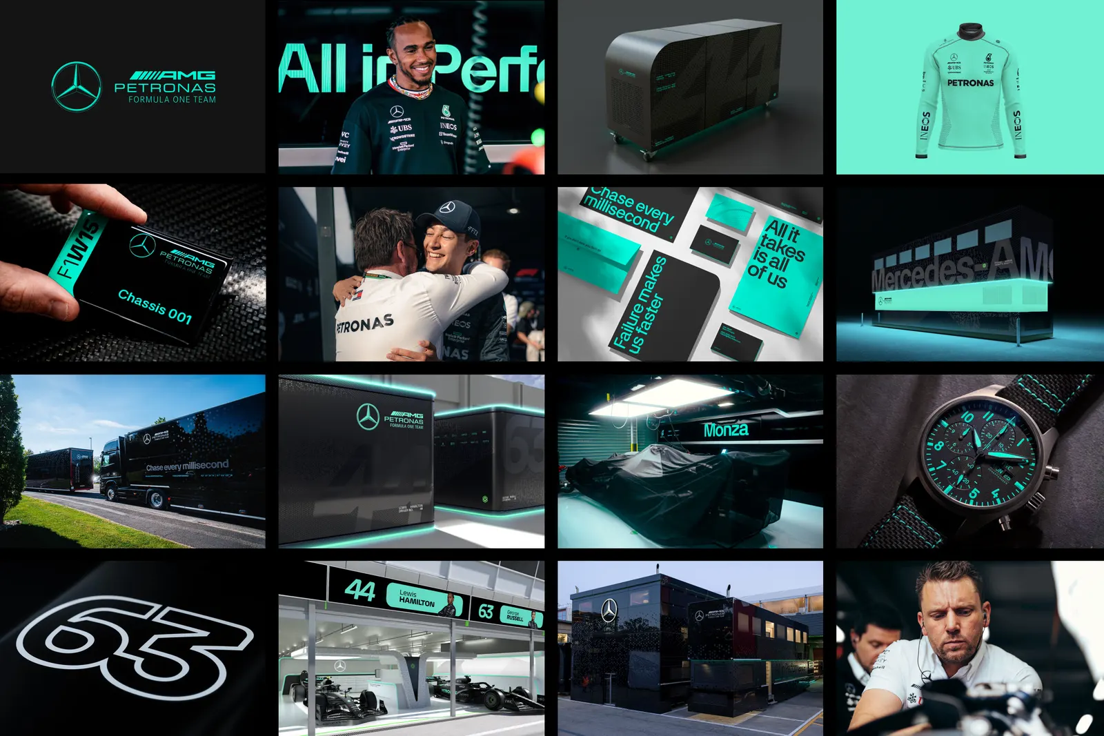
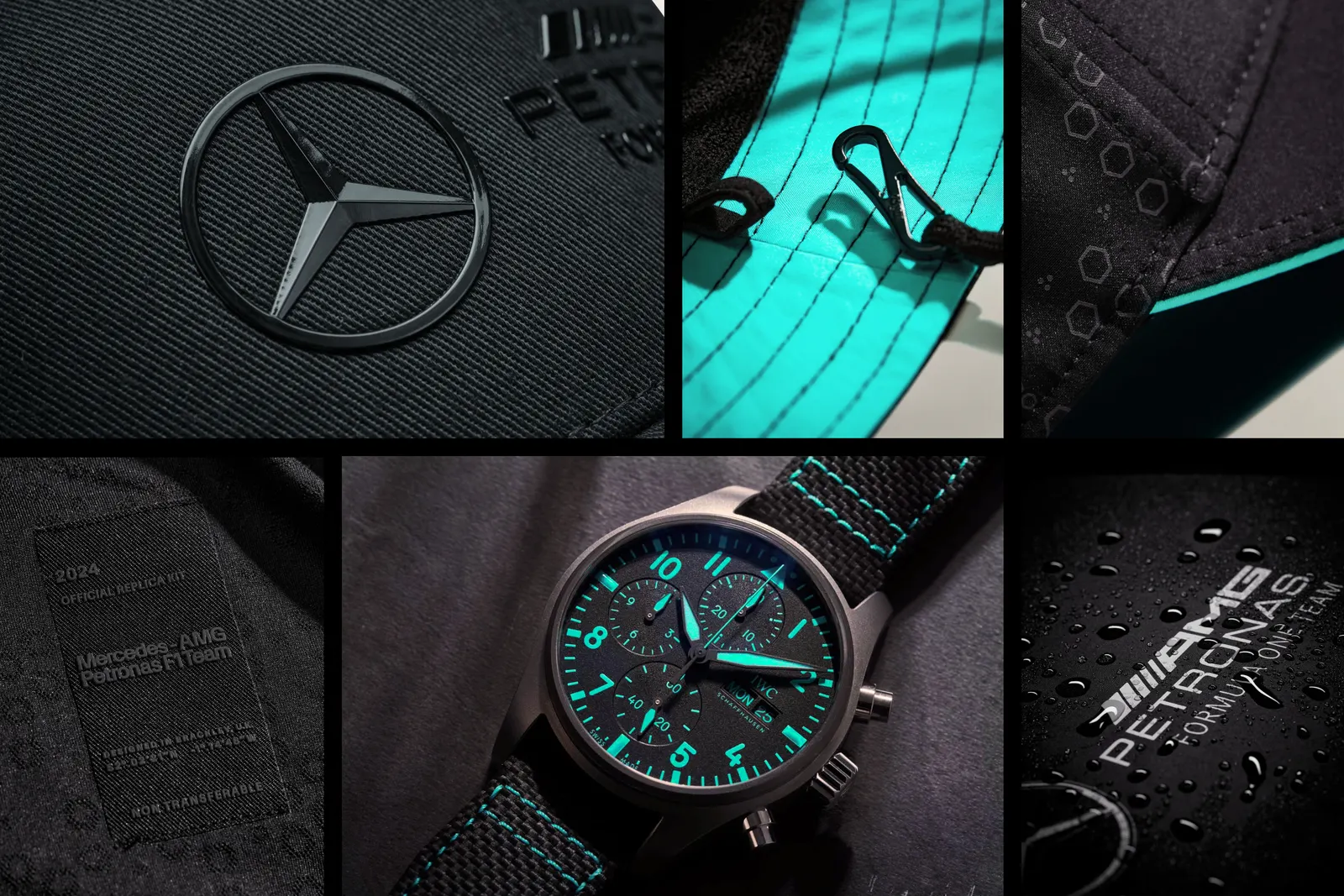
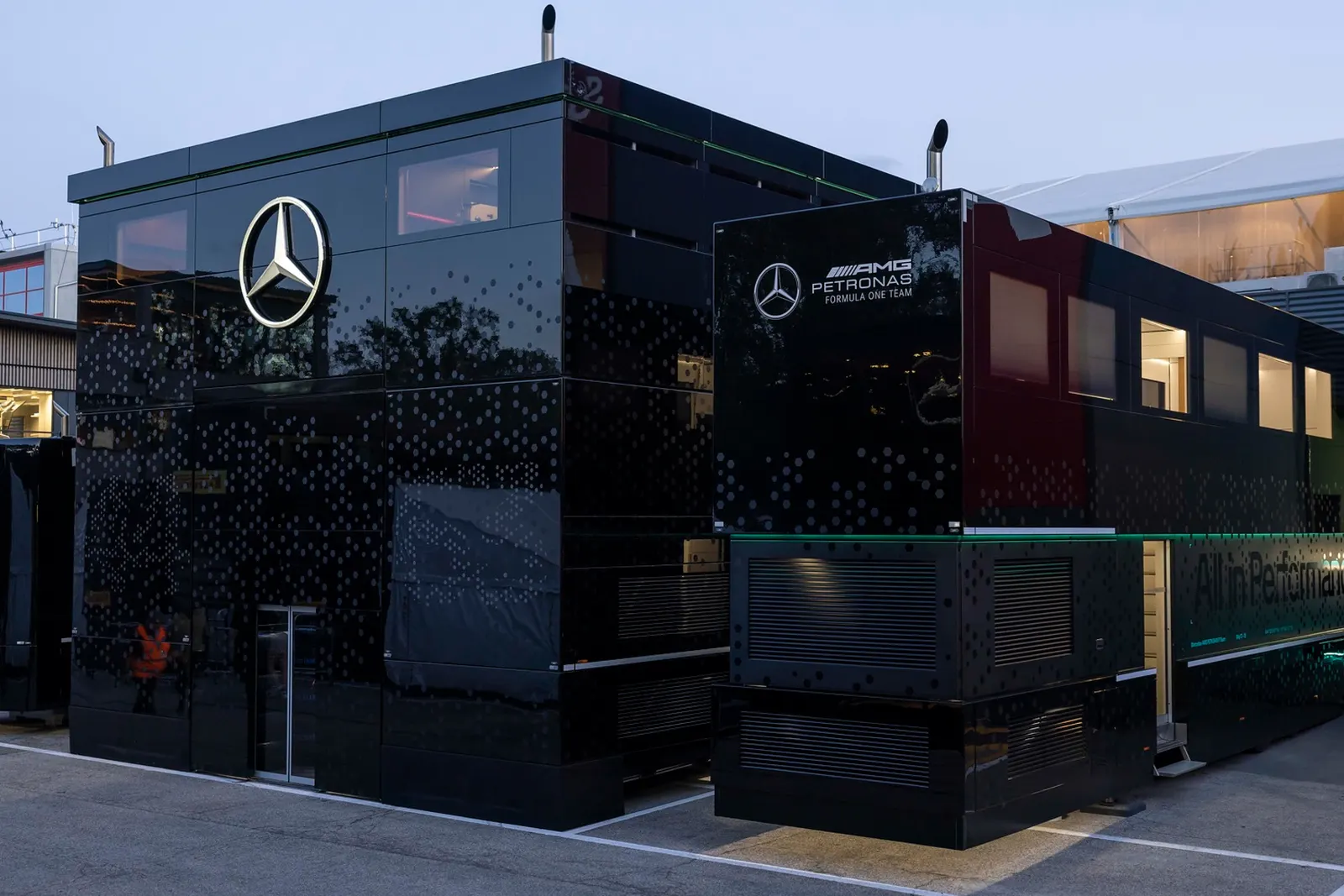
The studio spent time at the factory and the circuit, drawing on Toto Wolff's leadership and the team's culture of unity to define an ethos of total commitment to performance. Working with the team's in-house designers, it built a system of colors, bespoke typefaces, imagery, patterns, textures, materials, and motion behaviors that carries across the car livery, physical environments, digital touchpoints, and merchandise. A messaging system rooted in the team's cultural framework gives employees, sponsors, and fans a shared language. It rolled out across the 2023 and 2024 seasons.
Why it works
The strength here is that the identity is built to be shared. F1 is crowded with sponsor logos and loud liveries, and a bespoke type and motion system gives the team something ownable that partners can't easily overpower. Putting one ethos behind the car, the physical spaces, and the merchandise means a fan and a mechanic meet the same idea. And because the team's own designers helped shape it, the system looks made to keep growing after launch, which suits a team that has to stay hungry after winning so much.
Logo
Applications

Typography
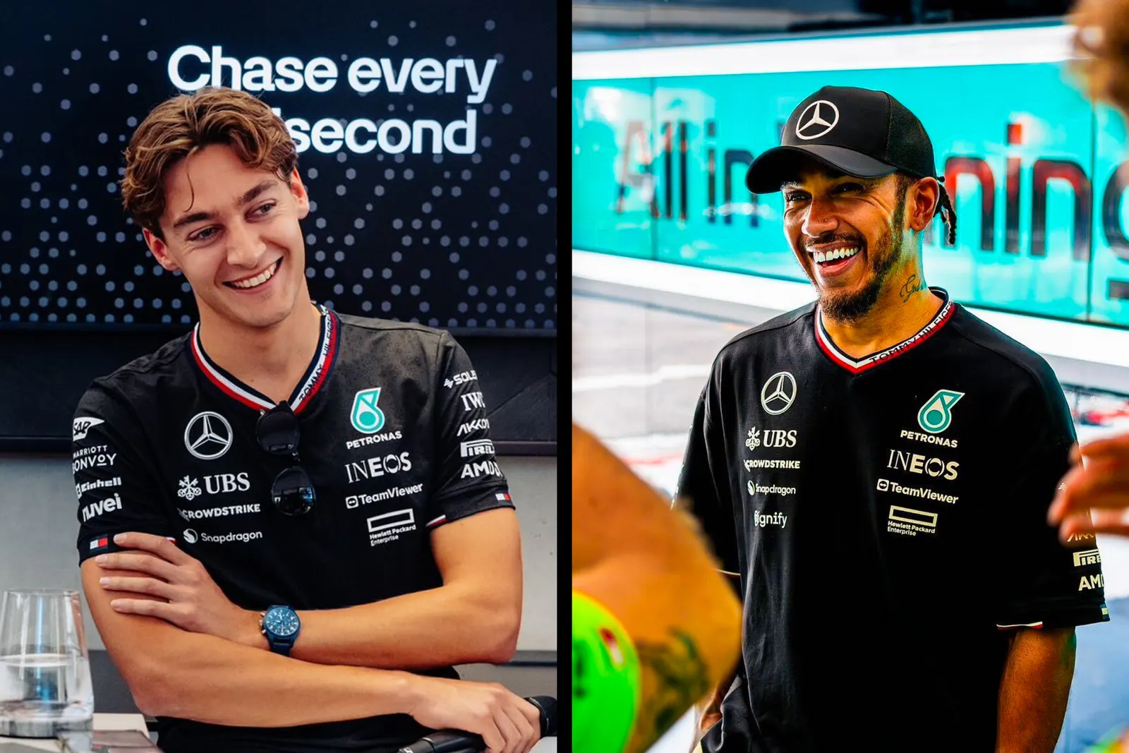
Images and video from wolffolins.com, by Wolff Olins.