The Brand Monograph
New York Botanical Garden brand identity by Wolff Olins
↗Few institutions have to speak to a neighborhood and a scientific community at once, and Wolff Olins built the New York Botanical Garden identity to do both. The Garden has welcomed visitors since 1891, but new leadership and a plan to widen its global reach called for a brand that could carry its research as convincingly as its seasonal spectacle. The studio spent three seasons on site, moving through labs, the Herbarium, and greenhouses, and even doing some volunteer gardening.
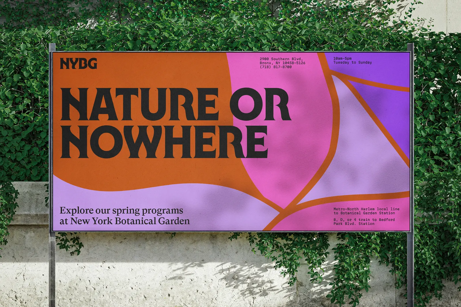
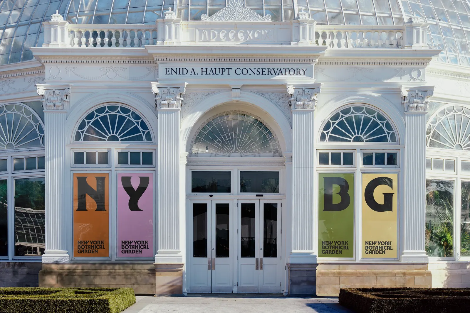
The resulting idea is a call to act on behalf of the natural world, whether that means studying, protecting, or simply enjoying it. Custom typography, developed with Ryan Bugden, takes cues from natural forms. The palette comes from the grounds themselves, from trees to fungi to the Bronx River. Photography adopts a plant's-eye view, and the grid borrows the glass panes of the Enid A. Haupt Conservatory. The work has since won recognition from the Type Directors Club, The One Show, and D&AD.
Why it works
Botanical institutions often default to soft illustration and generic greens, which makes them look interchangeable. Here, the confident custom lettering gives the Garden the authority of a research institution without losing the organic quirks that make it feel alive. The colors come from specific places on the grounds, so the palette reads as particular rather than merely natural. The conservatory-inspired grid is the smartest move: it gives a flexible system a recognizable architectural anchor, and it lets scientific rigor and visitor delight share one structure.
Logo
Typography
Applications

Images and video from wolffolins.com, by Wolff Olins.