The Brand Monograph
Kenvue brand identity by Wolff Olins
↗Kenvue is an unusual branding problem: a company almost nobody had heard of, selling products nearly everyone has used. When Johnson & Johnson spun off its consumer health business, Wolff Olins had to build a parent identity that could stand on its own while stepping back for household names like BAND-AID and Listerine.
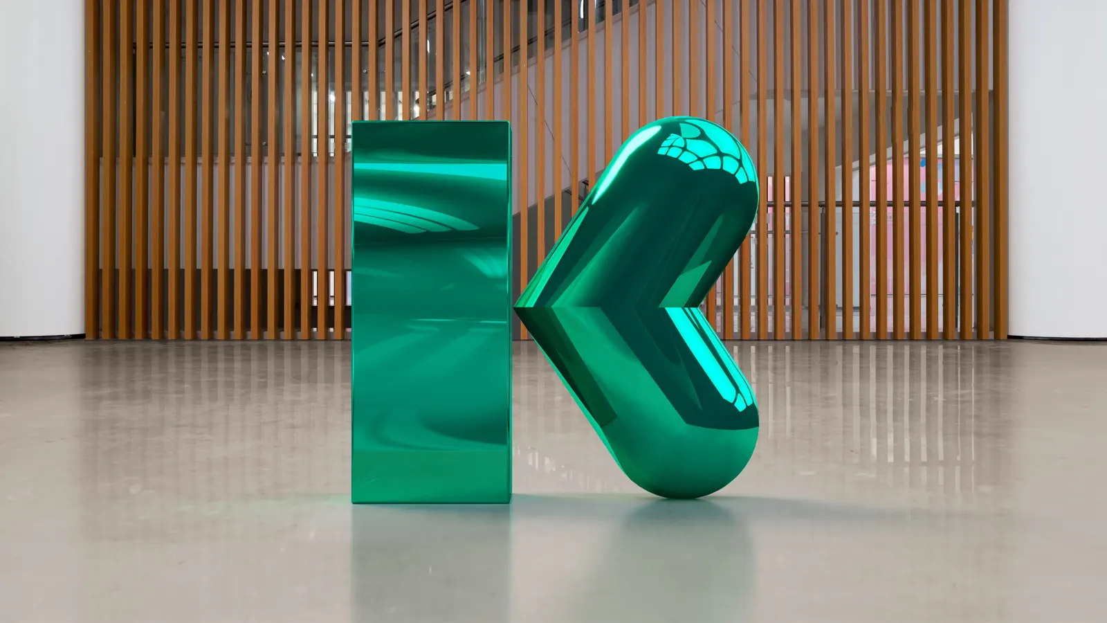
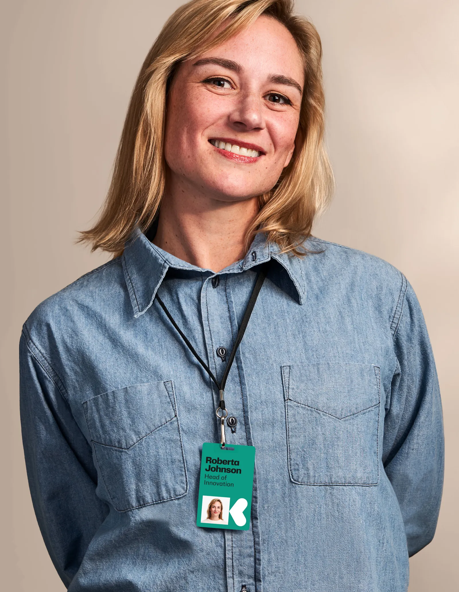
The studio found its idea inside the name, reading "vue" as a point of view on personal health. That became a custom K symbol, a flexible system that frames the product brands instead of competing with them, and a voice that is more personal than the category norm without losing its authority. Ryan Bugden contributed typography and Antfood handled sound, extending the identity beyond the visual. It all launched alongside Kenvue's $3.8bn IPO in 2023.
Why it works
Health parent brands often default to clinical, interchangeable corporate marks. Wolff Olins avoided that by giving an invented name a distinct symbol and a clear idea to hang on. The smartest move is restraint: consumers trust BAND-AID and Listerine, not Kenvue, so a system that lets those products lead makes the new parent feel like a champion rather than an intruder. The conversational voice does similar work, closing the distance between a large public company and the person at the pharmacy shelf.
Applications
Typography


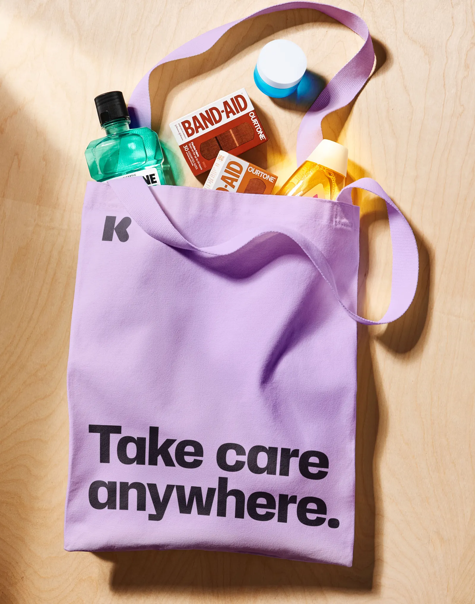
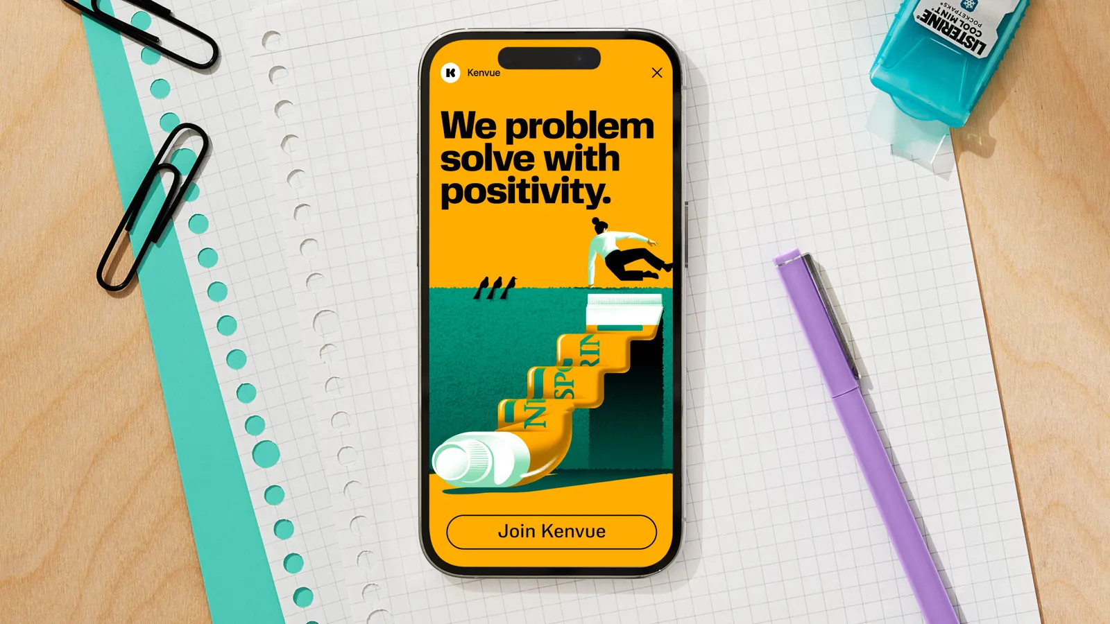
Images and video from wolffolins.com, by Wolff Olins.