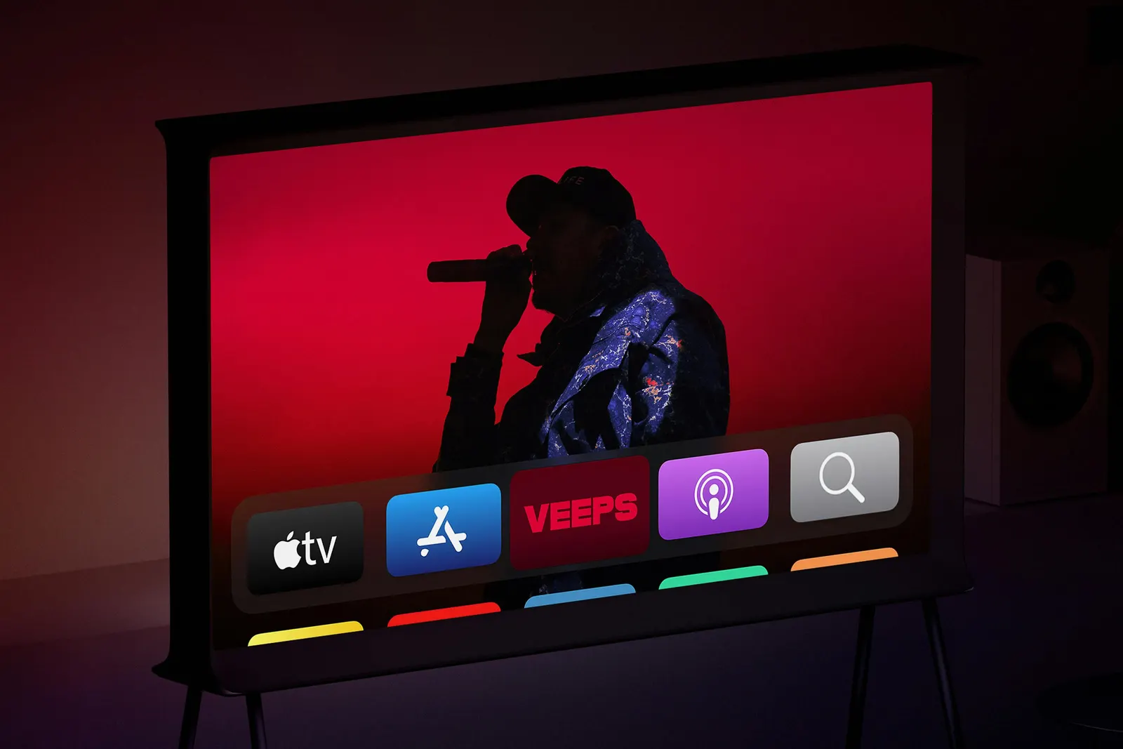
The Brand Monograph
Impossible brand identity by JKR
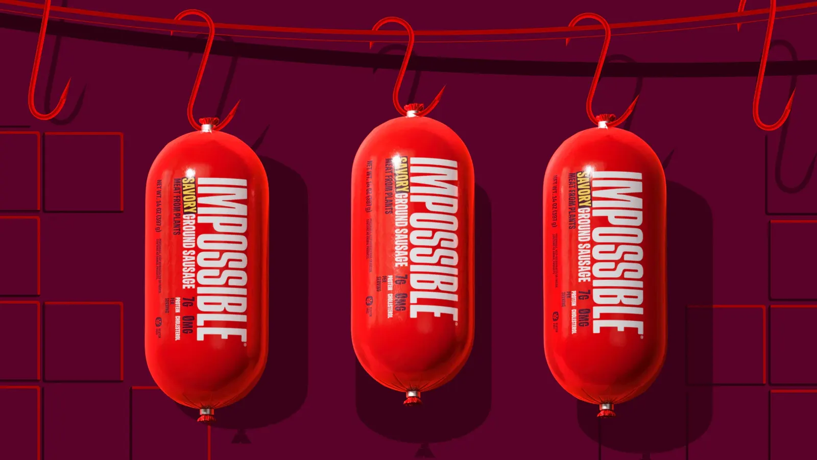
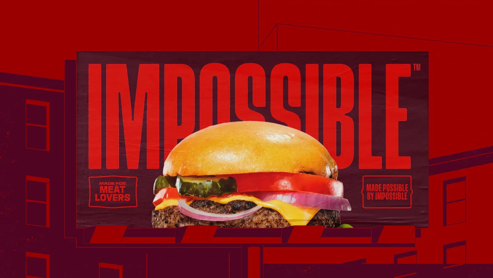
↗Most rebrands in this category try to look virtuous. JKR's work for Impossible Foods starts from the opposite instinct, and that's what makes it worth a close look. The brand wants people who love meat to eat less of it, which is a hard sell if it looks like it belongs in the health-food aisle. So the studio dropped the visual habits of plant-based food and set out to compete on the terms meat brands play by.
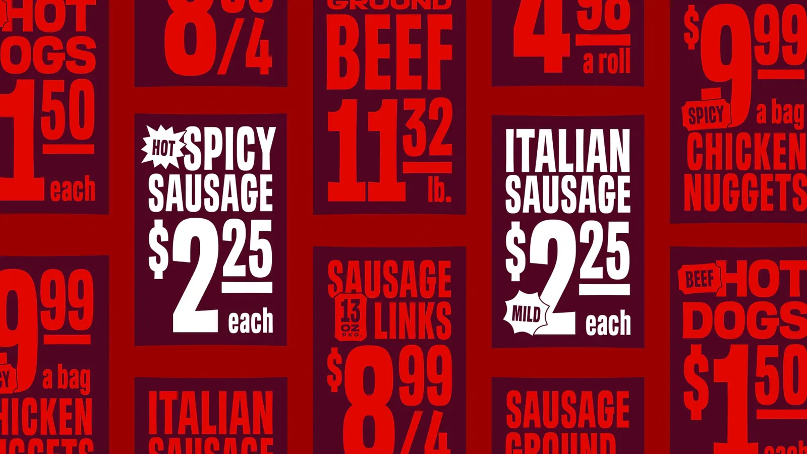
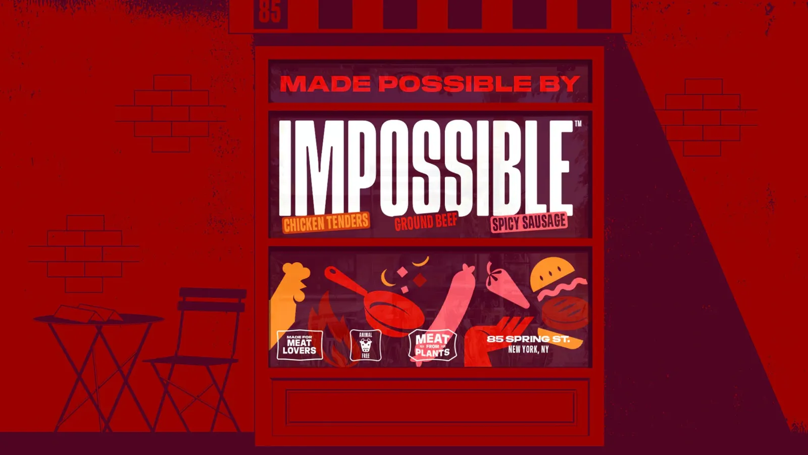
The identity draws on three specialist collaborators. Colophon Foundry handled typography, BurkleHagen Photography shot the images, and Cachete Jack contributed illustration. Between them, type, photography, and illustration do the work of making the brand feel appetizing rather than worthy, which is the shift the whole project turns on.
Why it works
Impossible's audience doesn't need convincing that vegetables are good for them. They need a reason to pick something else up, and appetite is a stronger argument than conscience. JKR gave the brand a point of view that leads with craving, and bringing in a type foundry, a photographer, and an illustrator suggests each layer was treated as its own expressive voice rather than a template. That gives Impossible a presence that can stand beside meat brands without apologizing, and nothing in it asks the customer to feel virtuous.
Applications
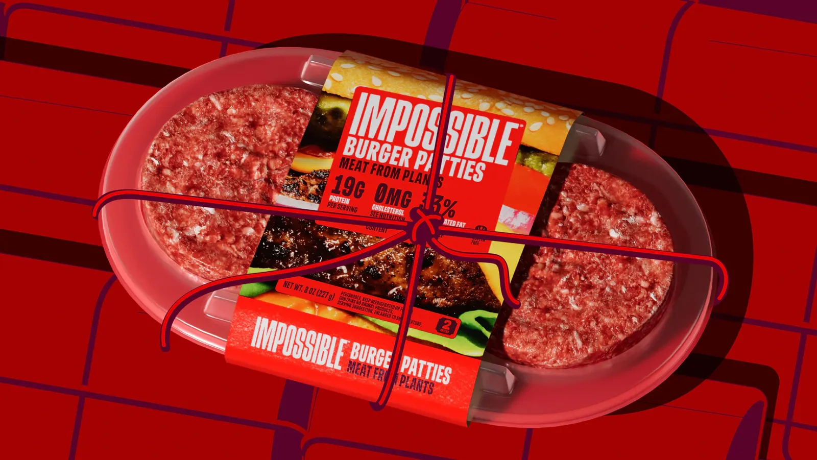
Logo
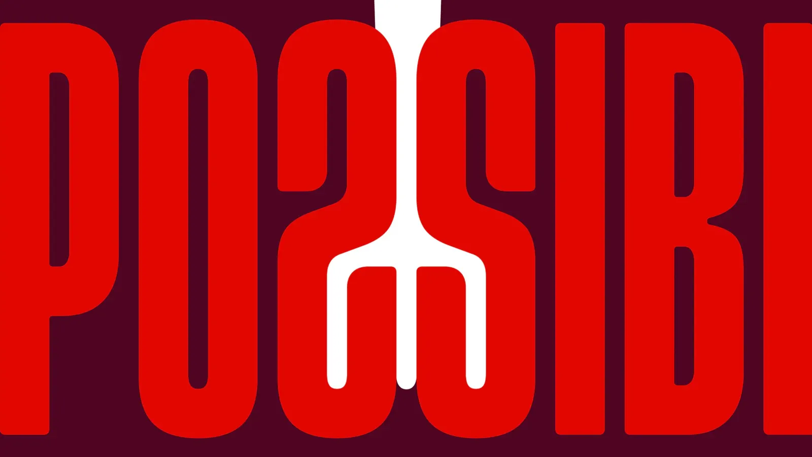
Color
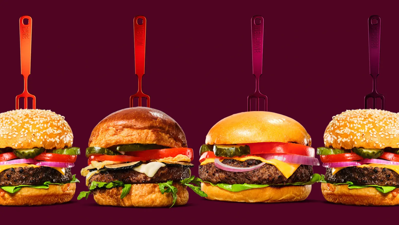
Images and video from jkrglobal.com, by JKR.