The Brand Monograph
Manischewitz brand identity by JKR
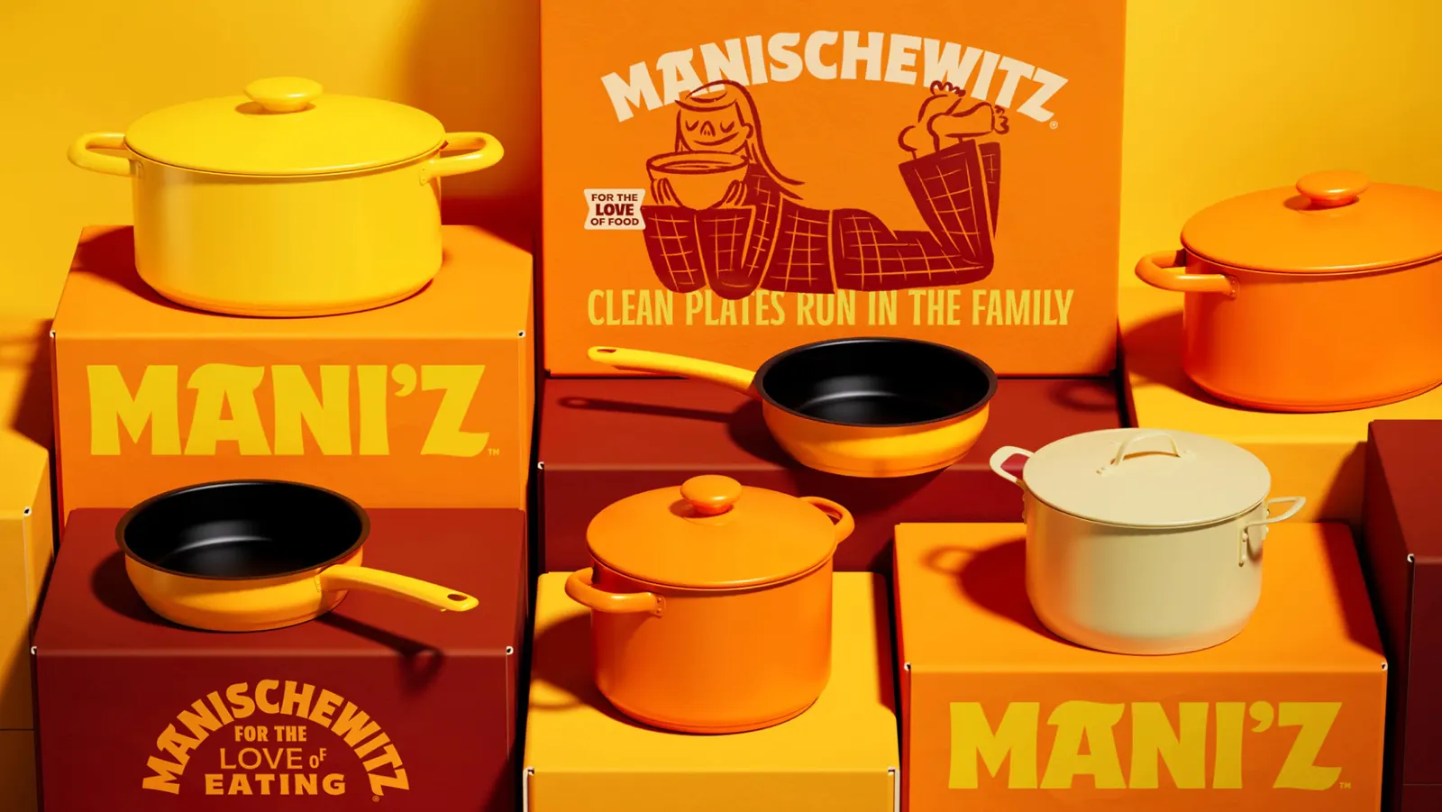
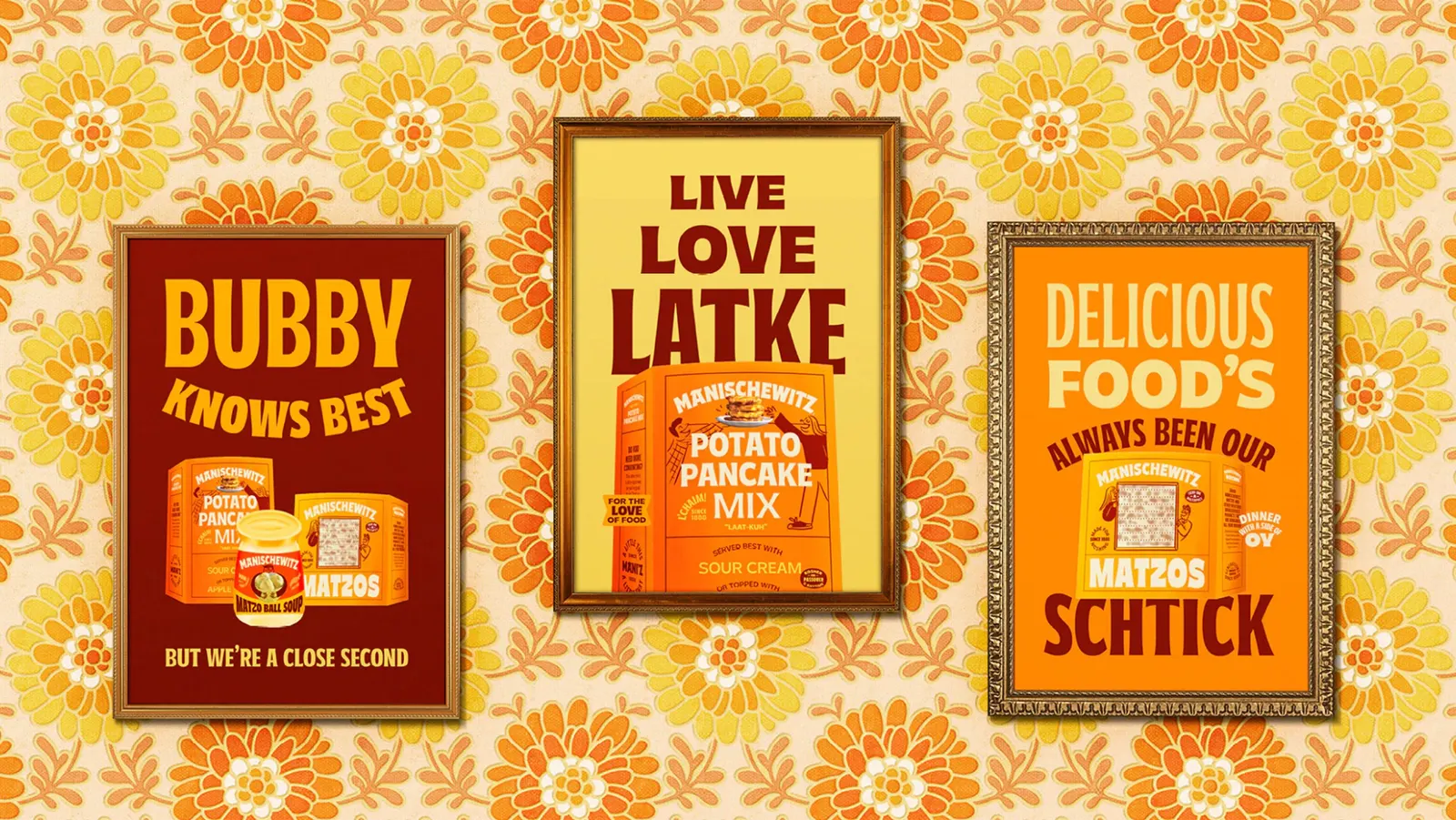
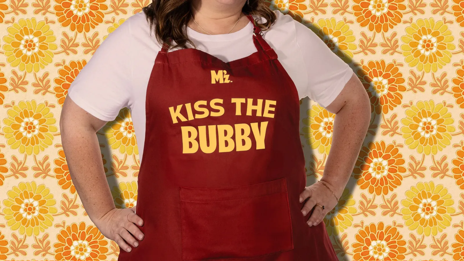
↗JKR gave Manischewitz a voice that sounds like it comes from a family kitchen rather than a supermarket shelf. The brand has long been tied to the kosher aisle. The task was to reach a wider American audience without loosening its hold on the Jewish-American traditions it grew out of.
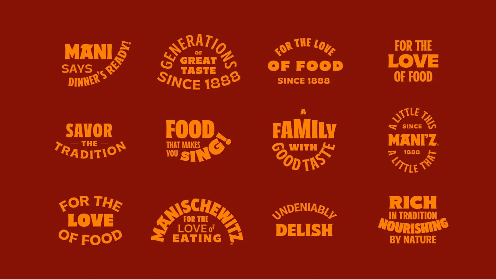
The studio made Jewish food itself the subject. The campaign line is built around "bupkis," a Yiddish word delivered with a wink, and the work invites people to snack, try a classic recipe, and pick up the family habits behind it. Photographer Yechiel Orgel, illustrator Maria Milenko, and typographer Simon Walker each shaped how that warmth shows up, so the tone carries across image, drawing, and letterform.
Why it works
Choosing a word that already lives in everyday American speech was smart. It lets longtime customers feel recognized and newcomers feel in on the joke, with no explanation needed. The humor also does strategic work: it makes tradition feel lived in rather than preserved, which is a hard thing for a heritage food brand to pull off. Bringing in specialists for photography, illustration, and type suggests the studio wanted the personality to be crafted into every touchpoint, not just stated in a slogan.
Applications
Logo
Typography
Images and video from jkrglobal.com, by JKR.