The Brand Monograph
Marina Bay Sands brand identity by Frosty
↗Marina Bay Sands has one of the most recognizable silhouettes in the world, which makes naming it in type a tricky job: the building already does the talking. Pentagram, led by partner Michael Gericke, let the architecture shape the letters. The custom wordmark borrows its curves from the towers, a companion symbol distills the profile, and typographers David Jonathan Ross and Victor Bartis stretched it into a full family led by Marina Bay Serif.
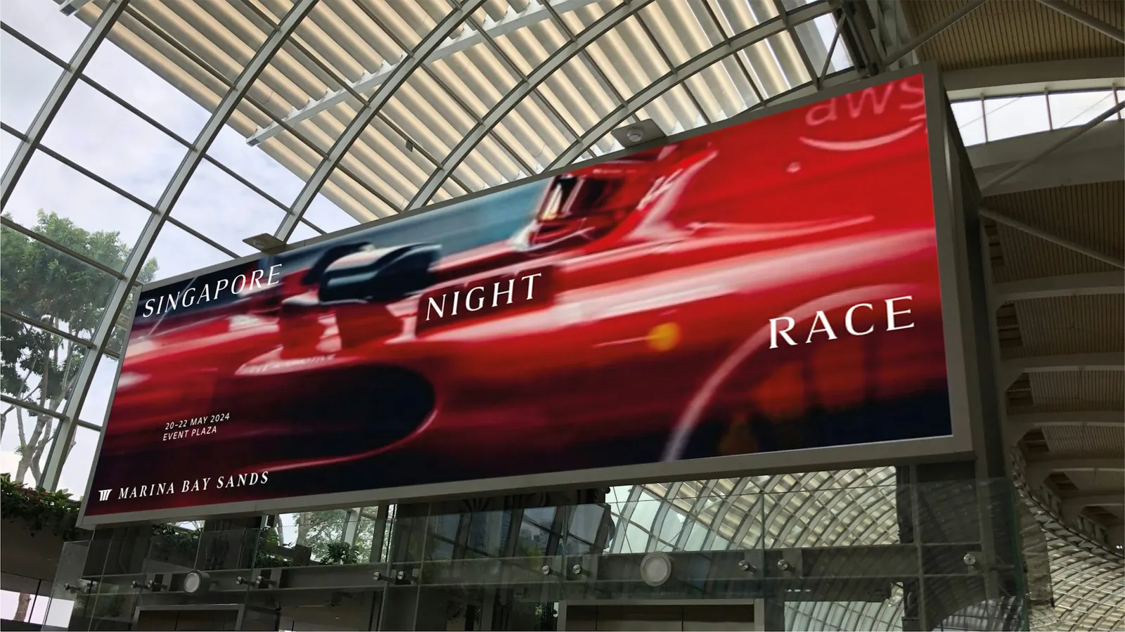
The identity landed during a US $1.75 billion revitalization of the resort. Frosty then built the brand system with Marina Bay Sands' internal creative team, covering supporting typefaces, a refreshed palette that balances interior and exterior spaces, photography direction, and consumer touchpoints. The campaign, made with director Celine Song and photographer Nick Yang, is quieter and more human than most hospitality advertising.
Why it works
A serif is a confident choice in a category that tends to default to gilded flourishes or anonymous sans-serifs. Because the letterforms come from the building itself, the wordmark feels owned rather than decorated, and no other resort could borrow it. The symbol gives the brand a compact shape for tight spaces, so the wordmark can stay elegant. A palette drawn from both natural and built surroundings keeps the luxury from feeling cold. And a custom type family keeps one voice running across a resort with an unusually wide mix of experiences.
Applications
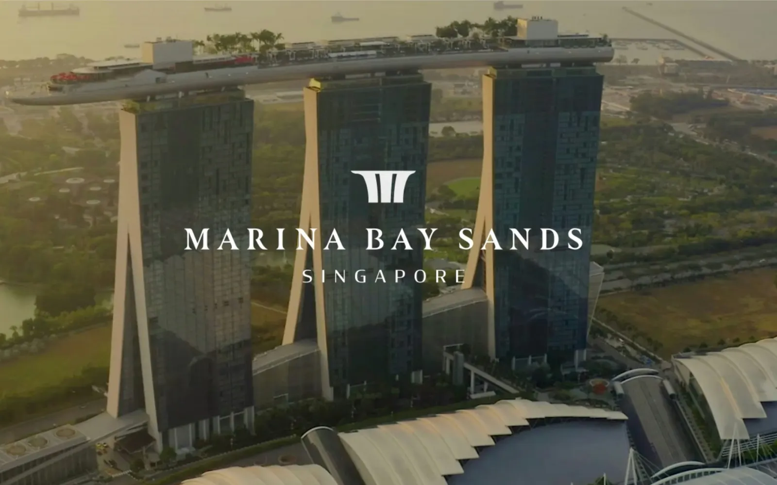
Logo
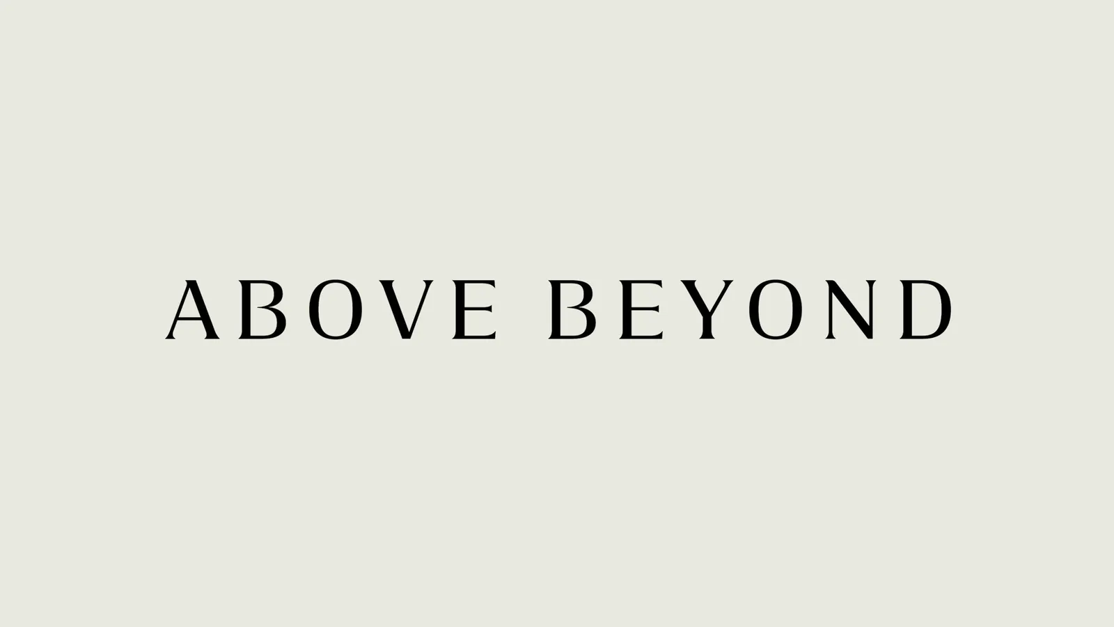
Typography
Images and video from pentagram.com, by Frosty.