 The Brand Monograph
Museum of Fine Arts, Boston brand identity by Base Design
↗Base Design gave the Museum of Fine Arts, Boston an identity that treats approachability as a design problem. The museum's programming had grown more diverse, but its columned building and old-guard reputation still dominated how people saw it. The studio's job was to close that gap, and it did so with a system that feels more like a city newsroom than a temple.
The logo moves "Boston" forward and fuses the A and B into a single join. The custom type is bold and a little odd, with glyphs that arch over or prop up neighboring letters. Black, white, and the museum's heritage red anchor the palette, with brighter shades in support. A red triangle, descended from the old square, drives an animated ticker. Working with strategists Katerina Mery, Marc Hill, and Mirek Nisenbaum, the studio built the campaign around collection portraits spanning eras and regions. Motion designers Mikey Kelly and Yaniv Fridman animated the system, which debuted on posters across the city before the Obama portraits arrived in September 2022.
Why it works
Art museums usually default to hushed serifs and restrained palettes. This identity does the opposite, and it still feels credible because it keeps the red the museum already owned. The joined A and B make the mark read like a place name rather than an institutional stamp. The ticker borrows the language of headlines, so the museum seems to be about what's on now, not only what's preserved. Using faces from the collection puts people, not architecture, at the front door.
Applications


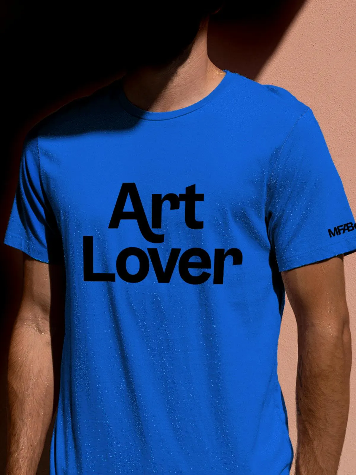
Images and video from basedesign.com, by Base Design.


