 The Brand Monograph
Netflix Is a Joke: The Festival brand identity by Porto Rocha
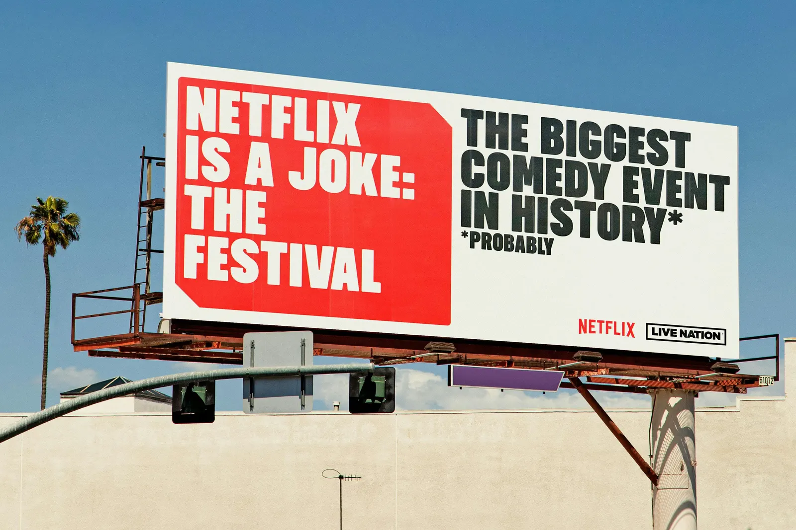
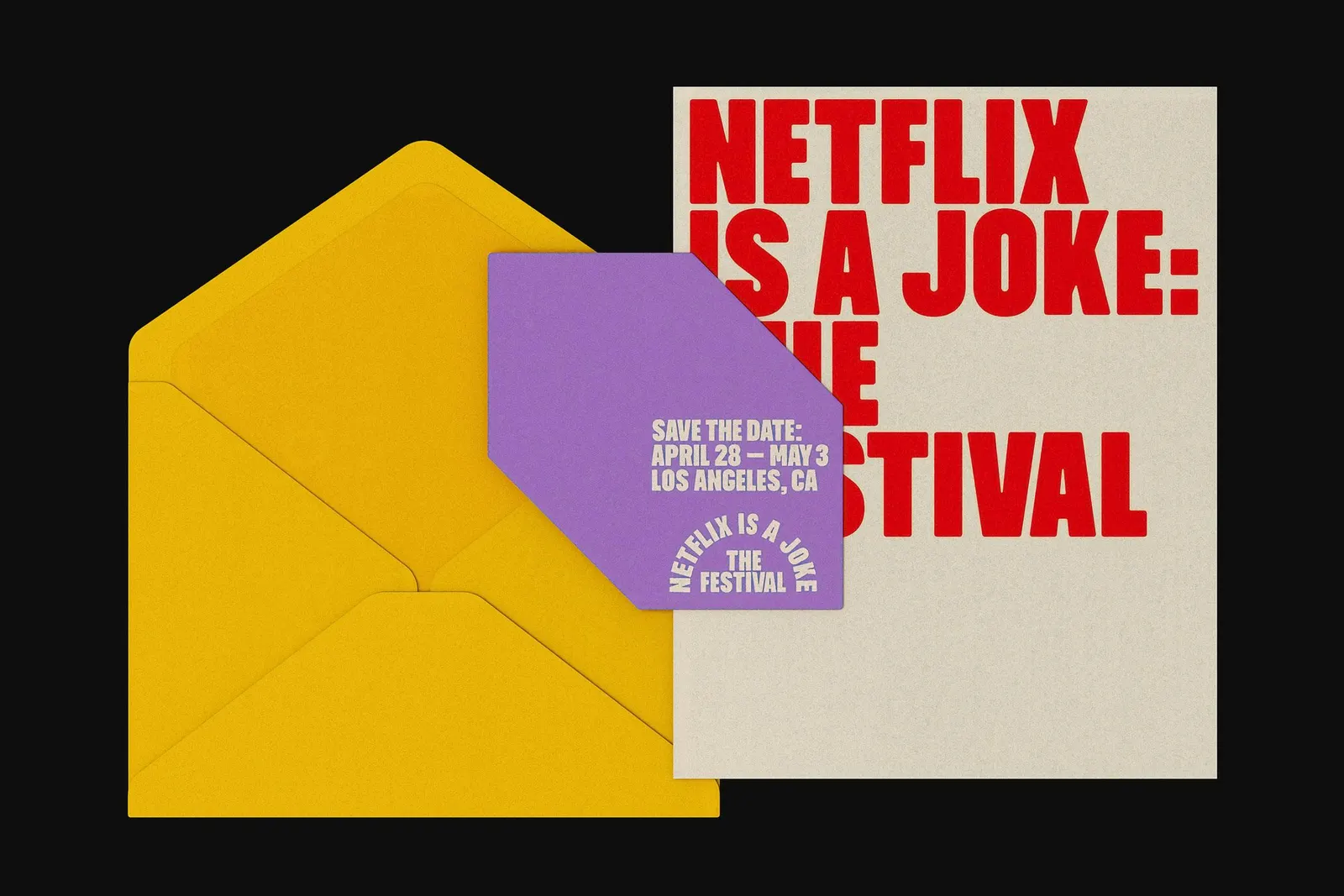
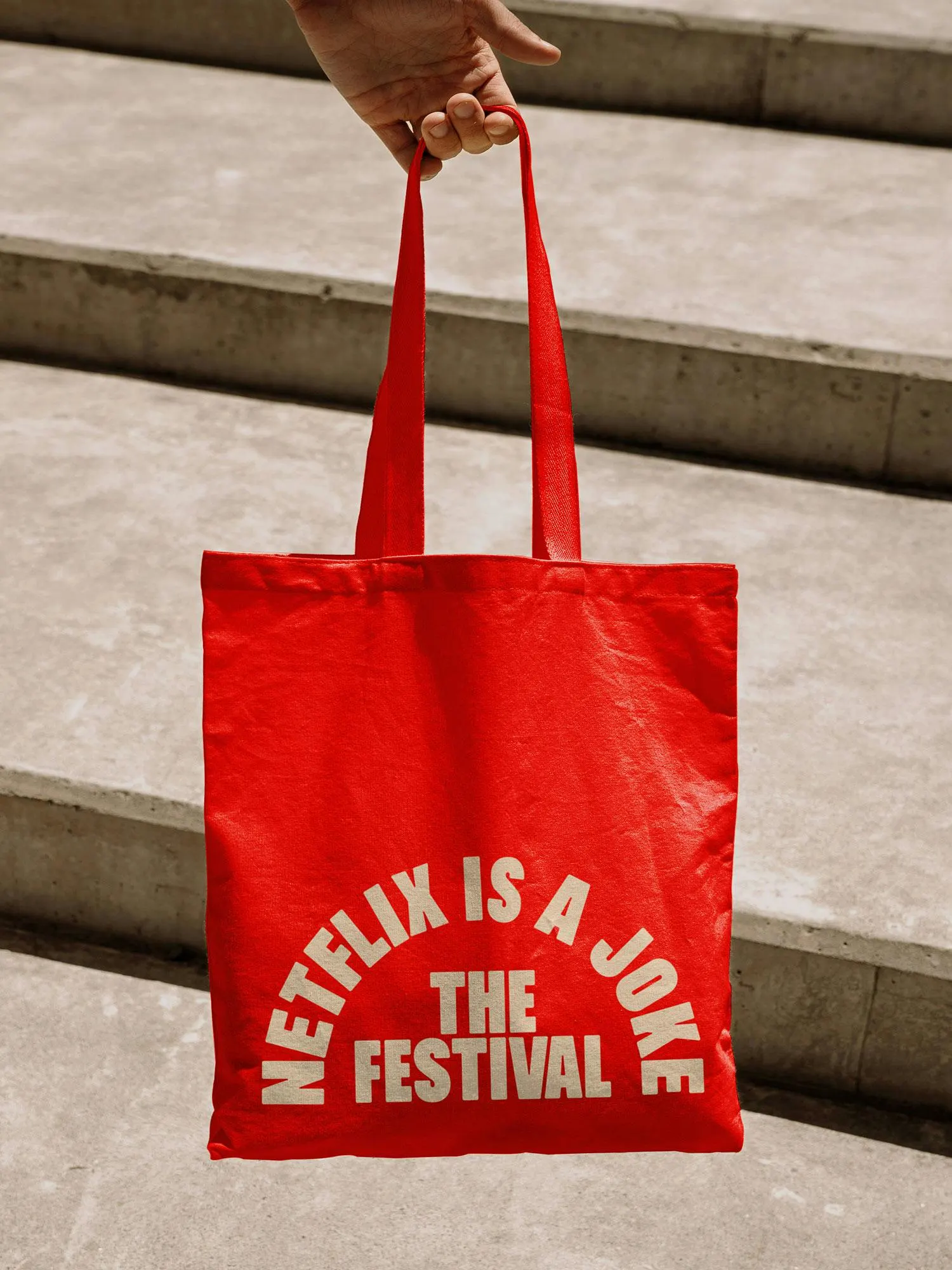
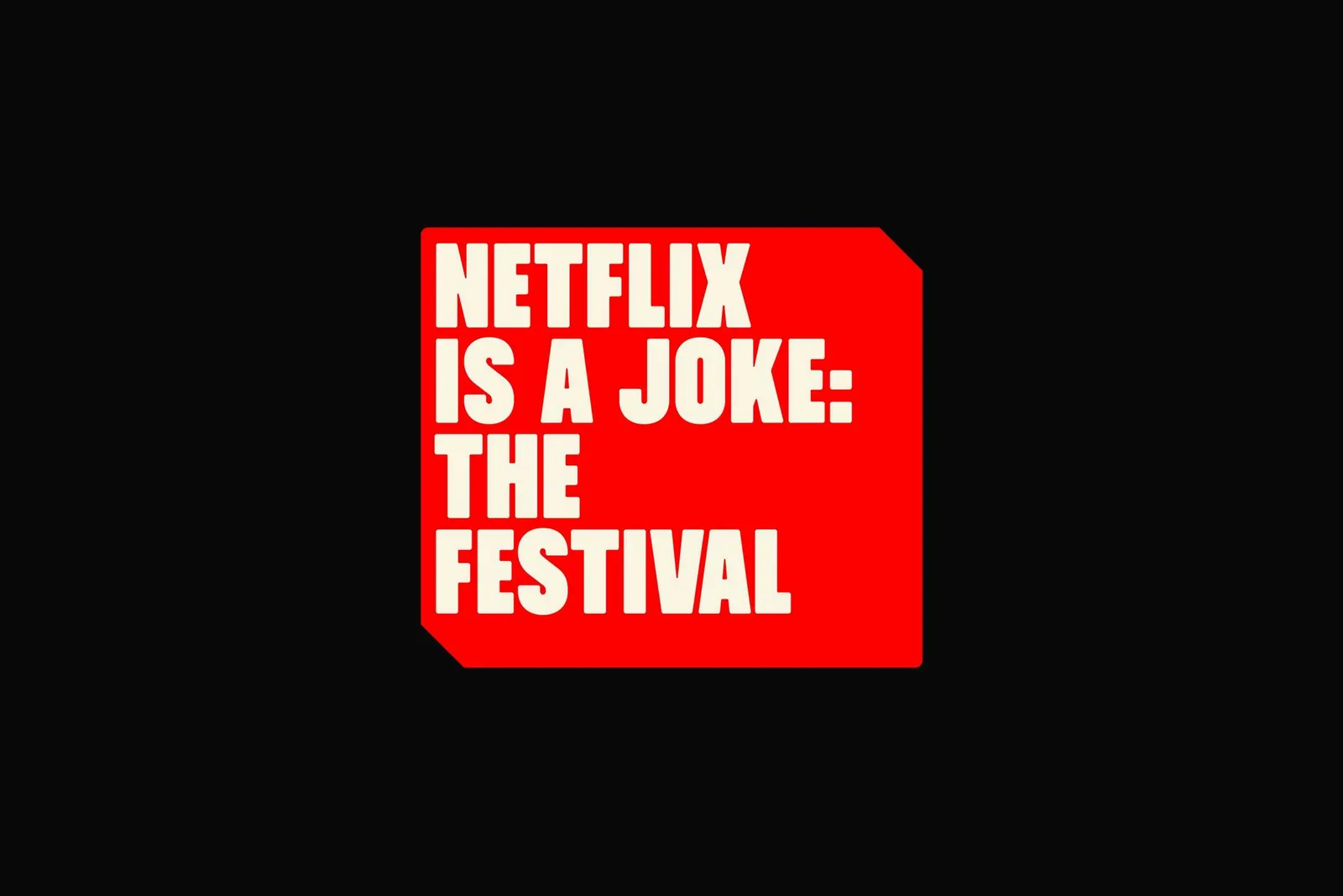
↗Porto Rocha gave the Netflix Is a Joke festival an identity that works like a good punchline: the words do the heavy lifting. The festival packed 130 comedians and more than 280 events into 11 days across Los Angeles. The studio built its system around headline copy and chunky, wood-type-style lettering, set inside dimensional containers that give every message weight and depth.
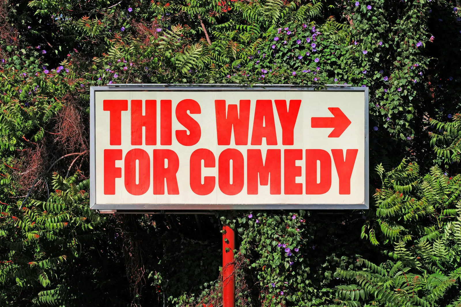
Casey Ellison's copy is dry and self-aware, teasing the talent and Netflix alike. Colophon Foundry supplied the typography, and the same look runs from out-of-home takeovers to main stage graphics. Panic Studio and Netflix then pushed the dimensional idea into a trailer where the logo becomes a physical object. The design team, including Felipe Rocha and Leo Porto, kept it all consistent.
Why it works
A lineup that spans Ali Wong to Snoop Dogg can't share one visual personality, so making the language the constant is the right call. The heavy letterforms stay legible at billboard distance and recall old-fashioned showbills, which ties a streaming brand to live performance. The raised containers add a stage-prop quality, so the festival feels like a place you could walk into. And a sponsor that mocks itself is rarer, and more likable, than most entertainment marketing.
Applications
Logo
Images and video from portorocha.com, by Porto Rocha.


