The Brand Monograph
Paramount brand identity by JKR
↗JKR's work for Paramount stands out because it treats a corporate consolidation as a question of inheritance. When the Viacom business came together under the Paramount name in 2022, the studio had to bring a company founded in 1912 into the present without losing the recognition that made the name valuable in the first place.
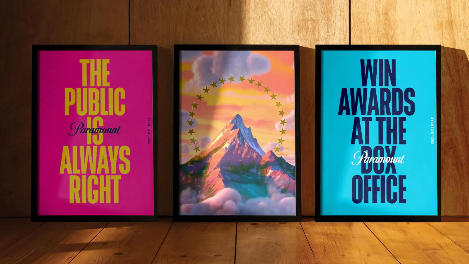
The brief asked for one identity that could hold a large, varied entertainment portfolio and still feel open to a broad audience. JKR's response draws on the brand's own heritage, particularly its star and mountain imagery, instead of starting from a blank page. The result is a Paramount that reads as a single, confident company rather than a merger of parts.
Why it works
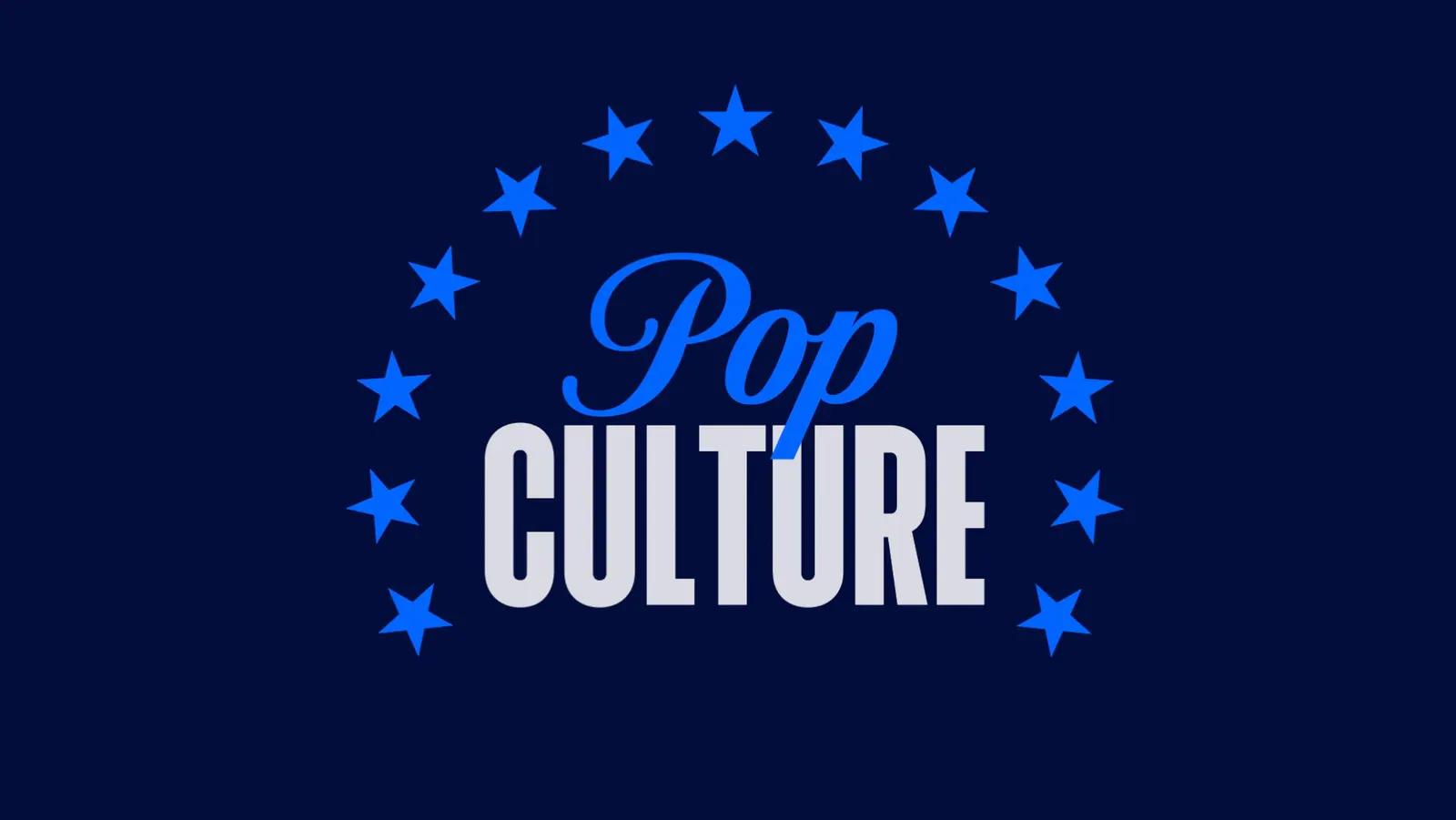
Paramount already owns one of the most recognizable emblems in entertainment, and JKR wisely builds on it rather than replacing it. A mountain ringed by stars is simple, ownable, and instantly legible at any size, which matters for a company whose logo appears before films, on screens, and across many different channels. Keeping that emblem central gives a newly unified business immediate authority. It also gives audiences of every age a familiar point of entry.
Applications
Logo
Typography
Images and video from jkrglobal.com, by JKR.