The Brand Monograph
Payz brand identity by Pentagram
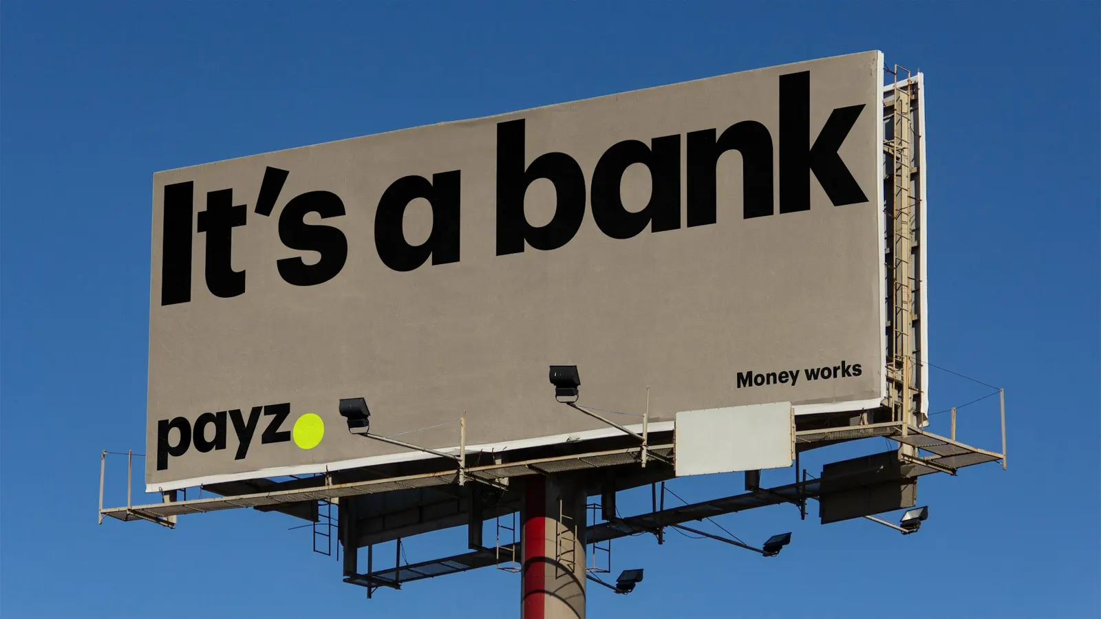
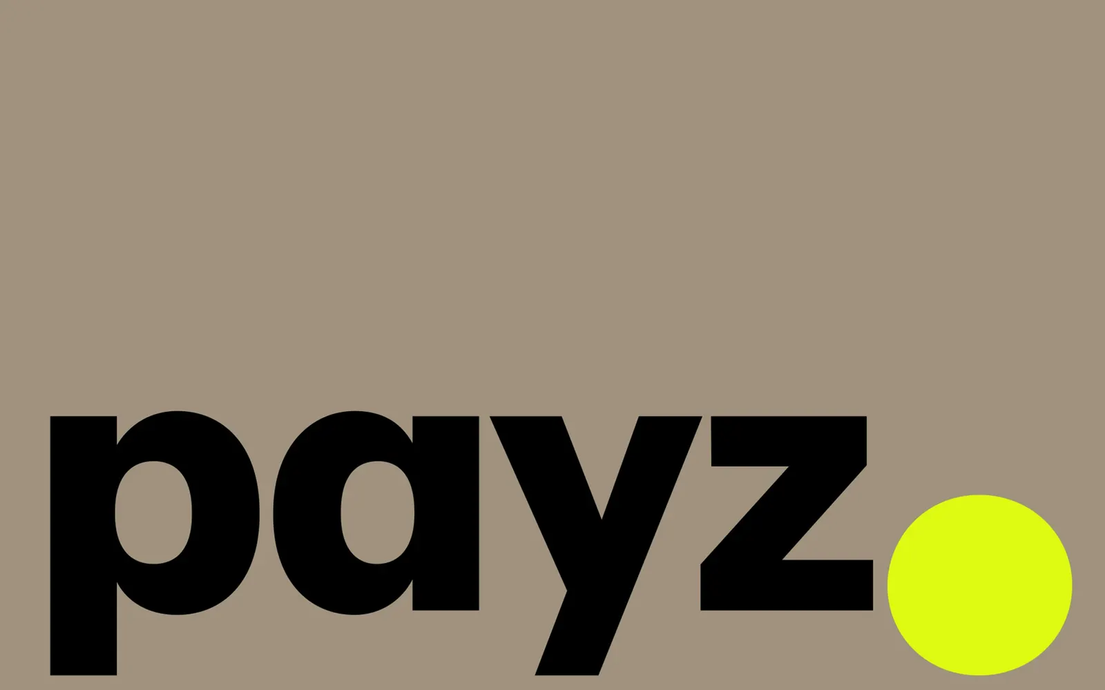
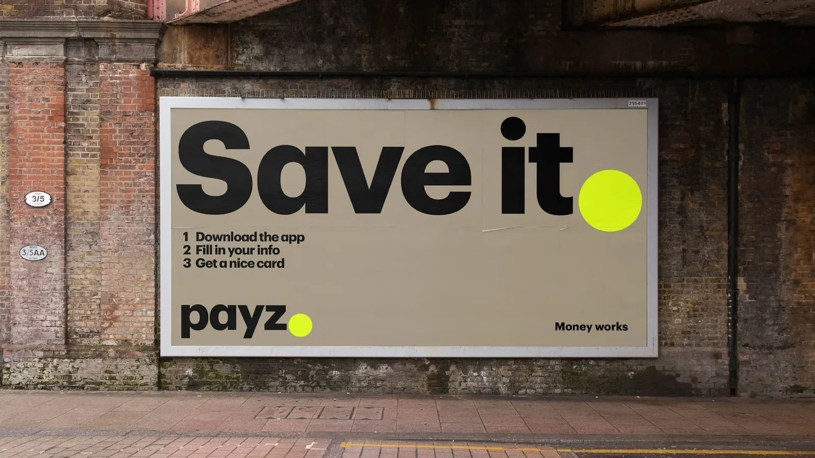
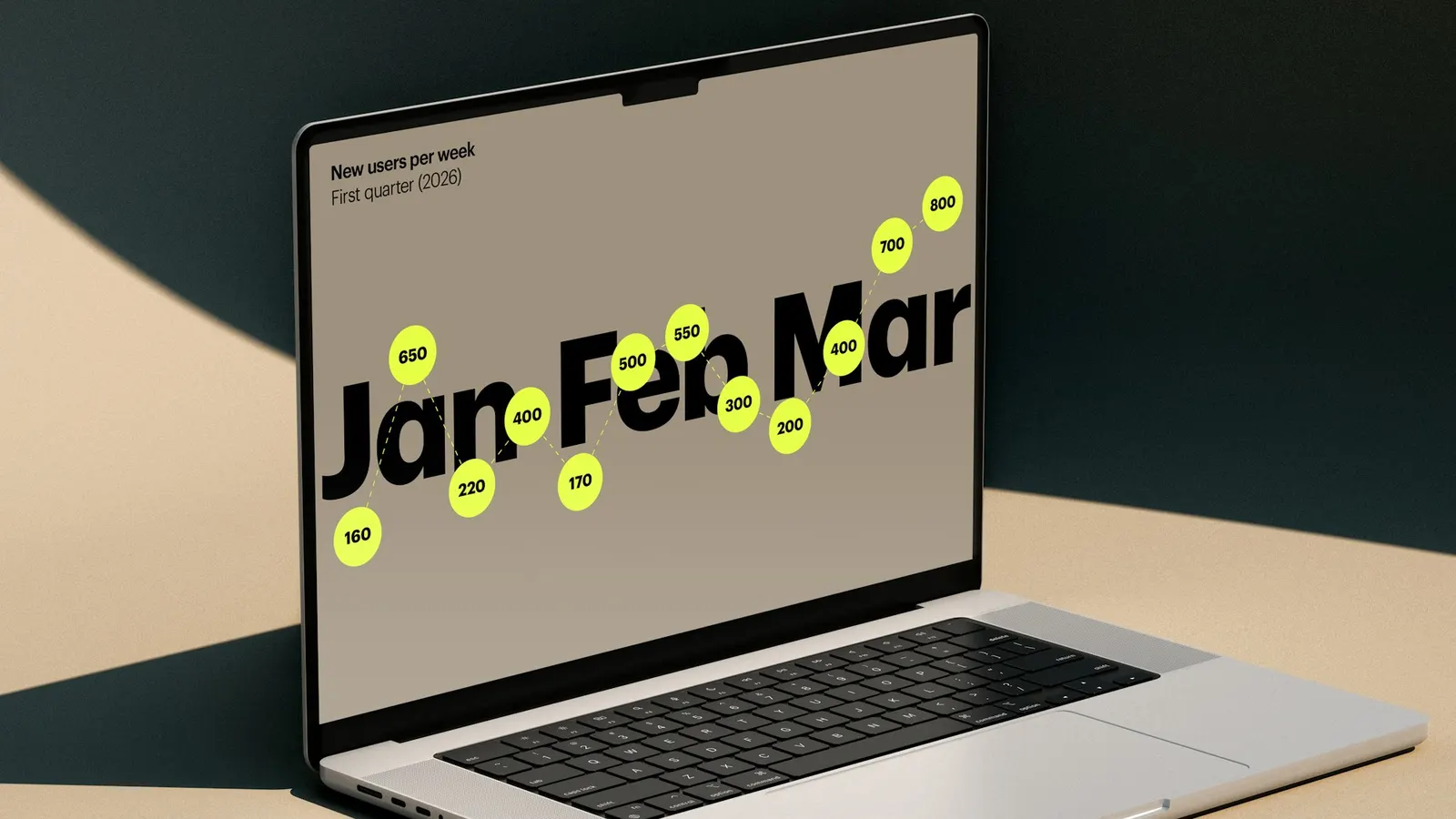
↗Payz doesn't look like a bank, and that's the point. Pentagram built its identity around one gesture: an oversized acid yellow full stop that closes the black wordmark and then keeps turning up across the system.
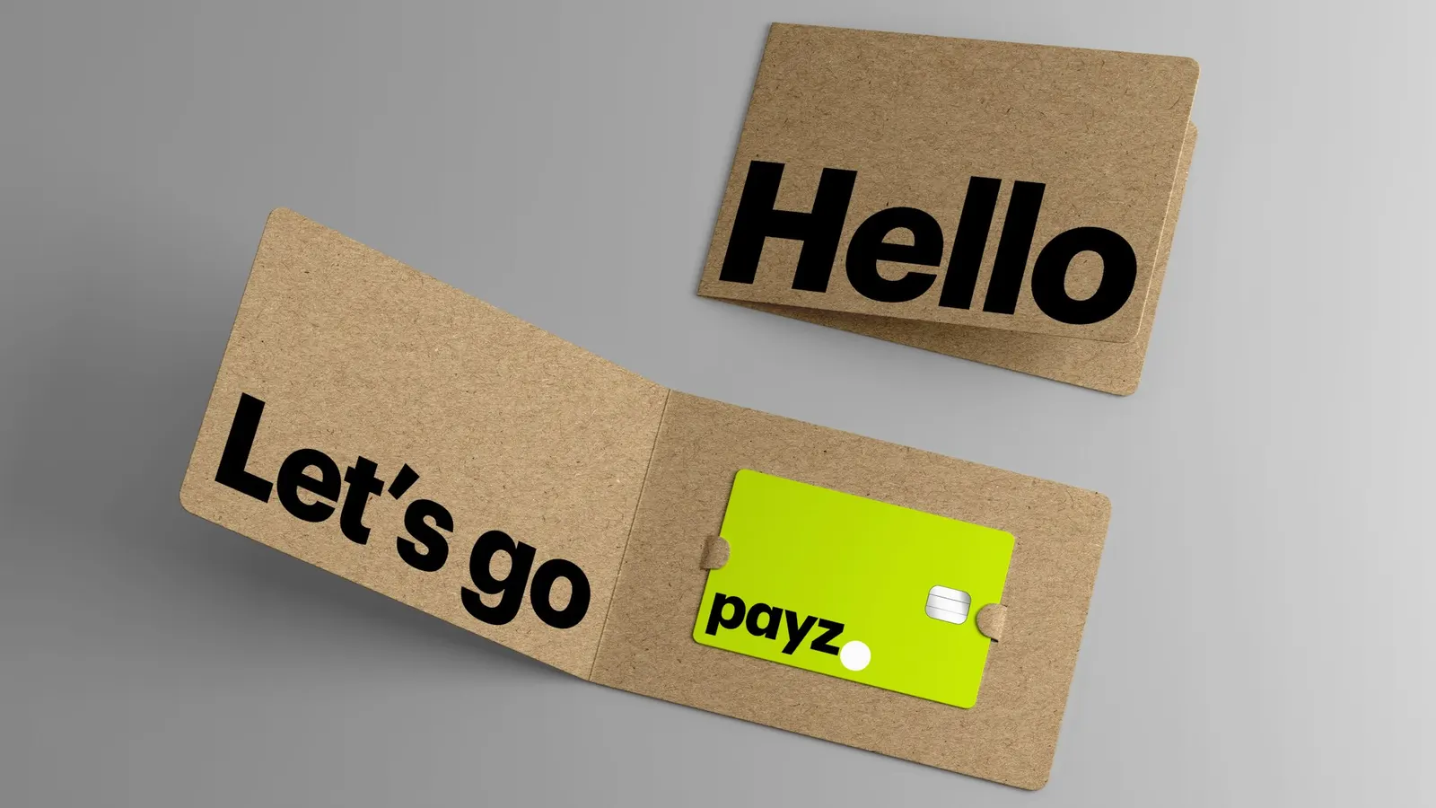
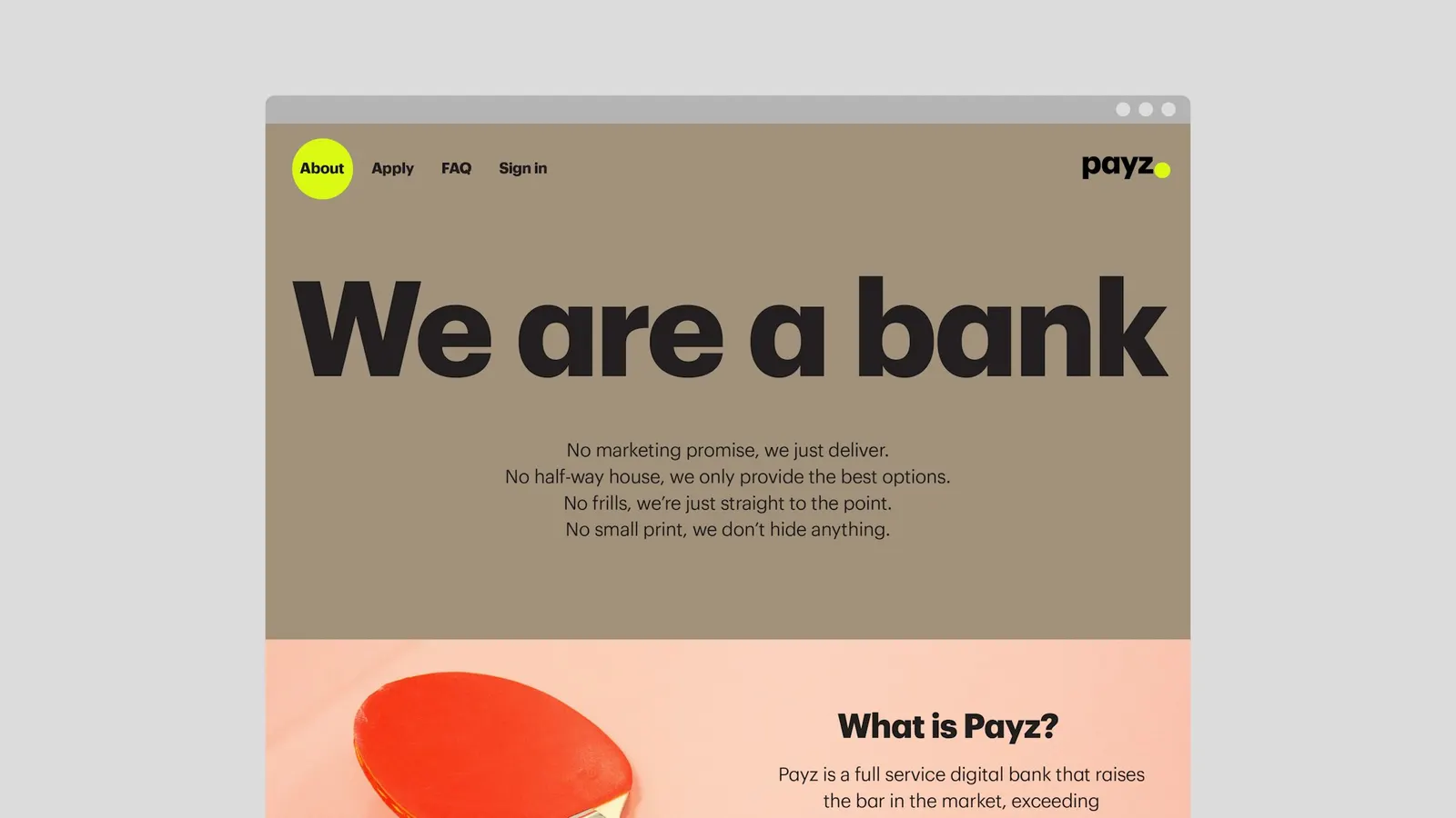
The brief was to help Payz, an FCA-regulated service for cards and transfers in more than 50 currencies, grow into a full bank without losing its approachable character. Working with Marina Willer, Cleber de Campos, Deborah Taffler, Hamlet Auyeung, Kate Blewett, Marta Gaspar, and Thomas Chan, the studio drew a custom typeface from Commercial Type's Graphik, set in Bold and Regular, and added the full stop as its own glyph. Black, white, and yellow are warmed by a kraft tone that recalls cardboard packaging. Short, plain-spoken straplines in heavy type carry the voice, and the website and app follow the same rules.
Why it works
Most financial brands try to look trustworthy by looking cautious. Pentagram earns trust through clarity instead. The full stop is simple enough to hold up at app-icon size, and it says "done," which is what people want from a payment. Black and yellow give strong contrast and instant recognition in a sea of blue and purple fintech. The kraft tone adds a physical, everyday quality to a category that can feel abstract, and the plain language backs it up.
Applications
Logo
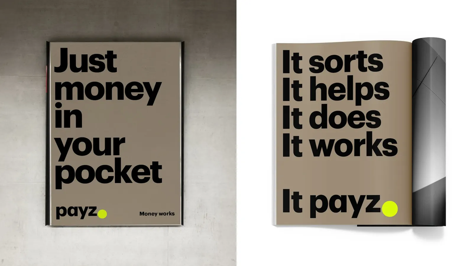
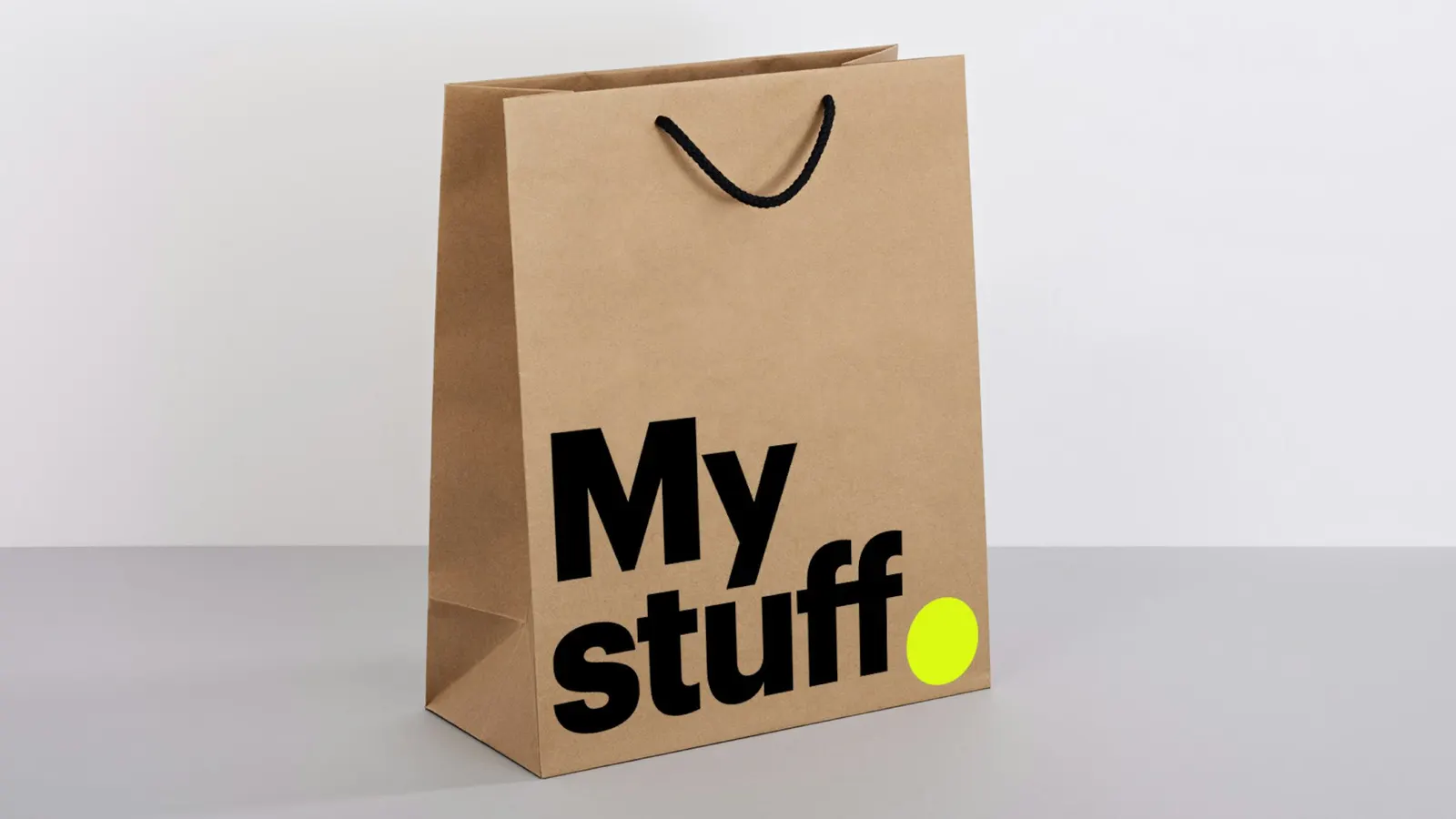
Images and video from pentagram.com, by Pentagram.