The Brand Monograph
Philharmonia brand identity by Pentagram
↗Most orchestra identities lock in a single mark and defend it for decades. For the Philharmonia's 80th anniversary season, Pentagram went the other way and built a logo meant to change from one season to the next. The London orchestra, a longtime Pentagram client, wanted a milestone identity that matched its appetite for new music and new audiences.
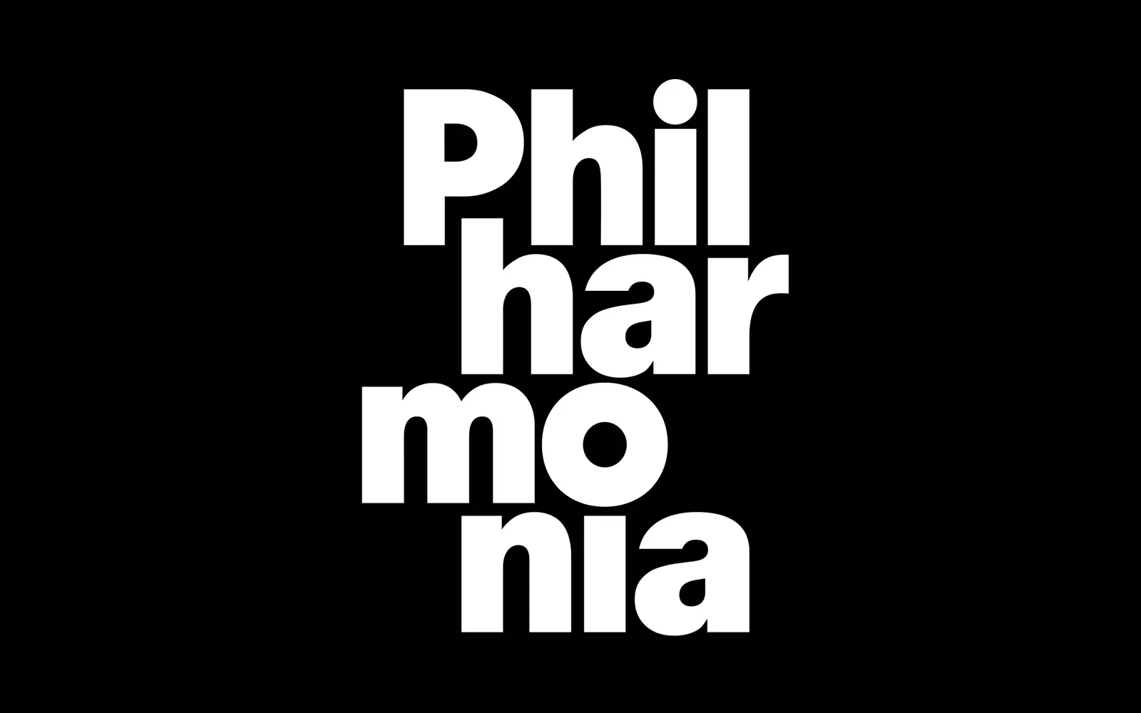
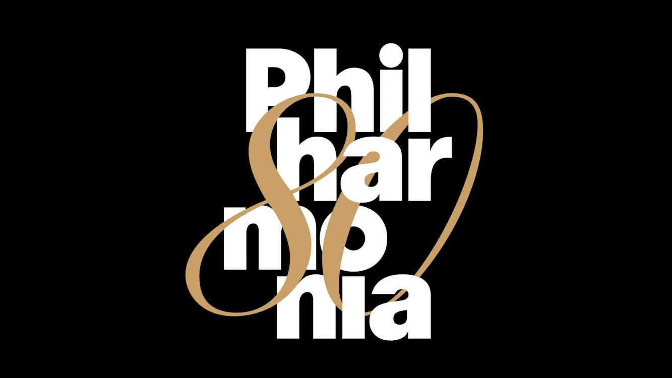
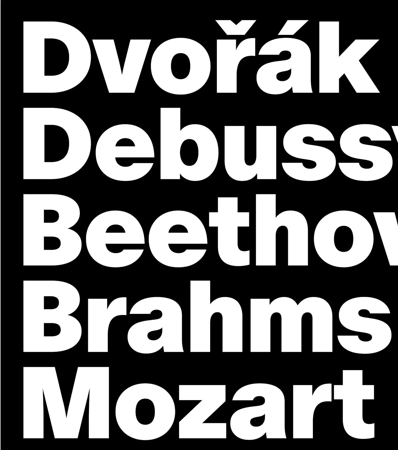
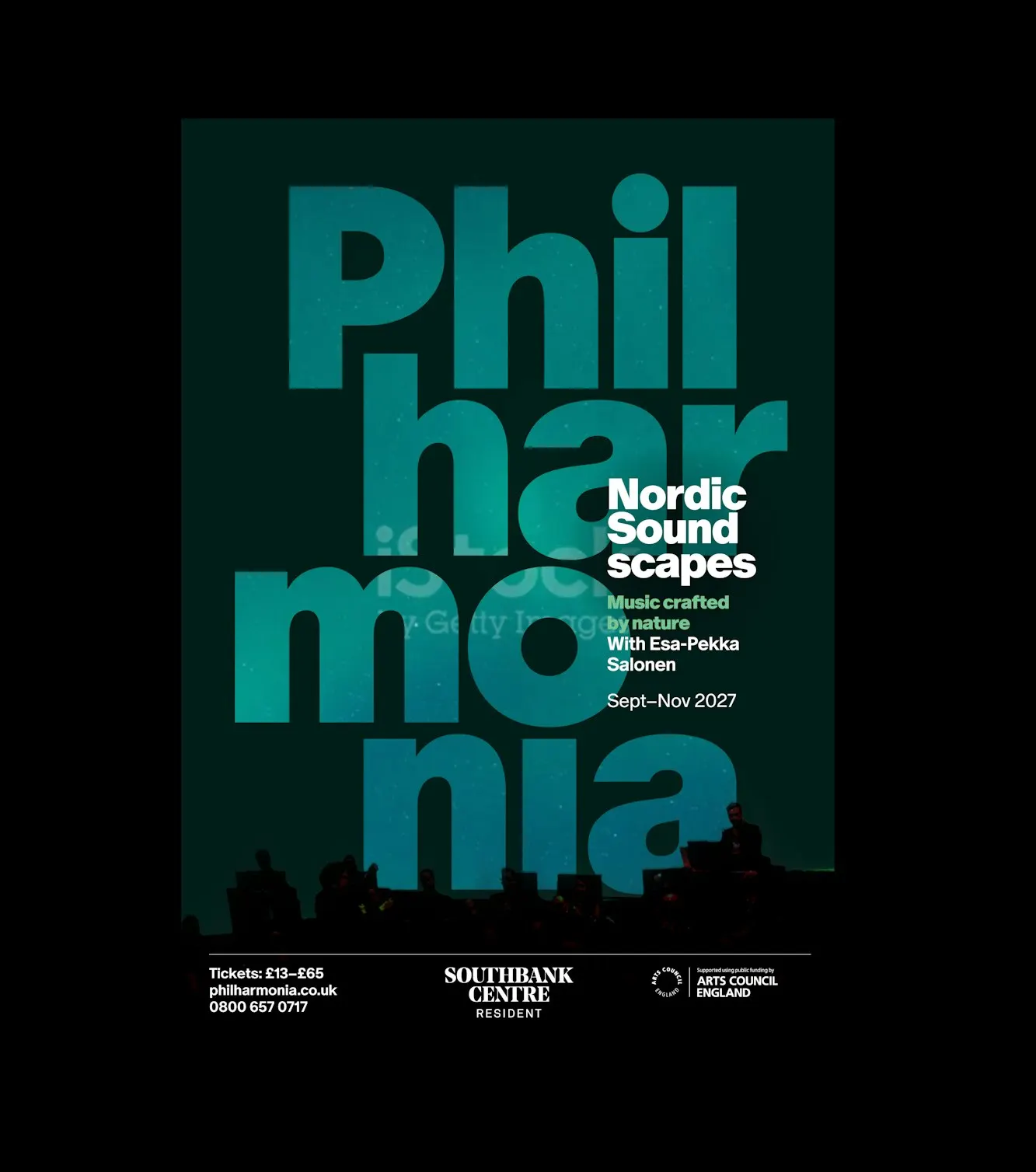
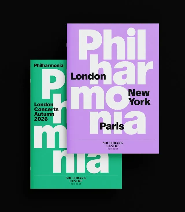
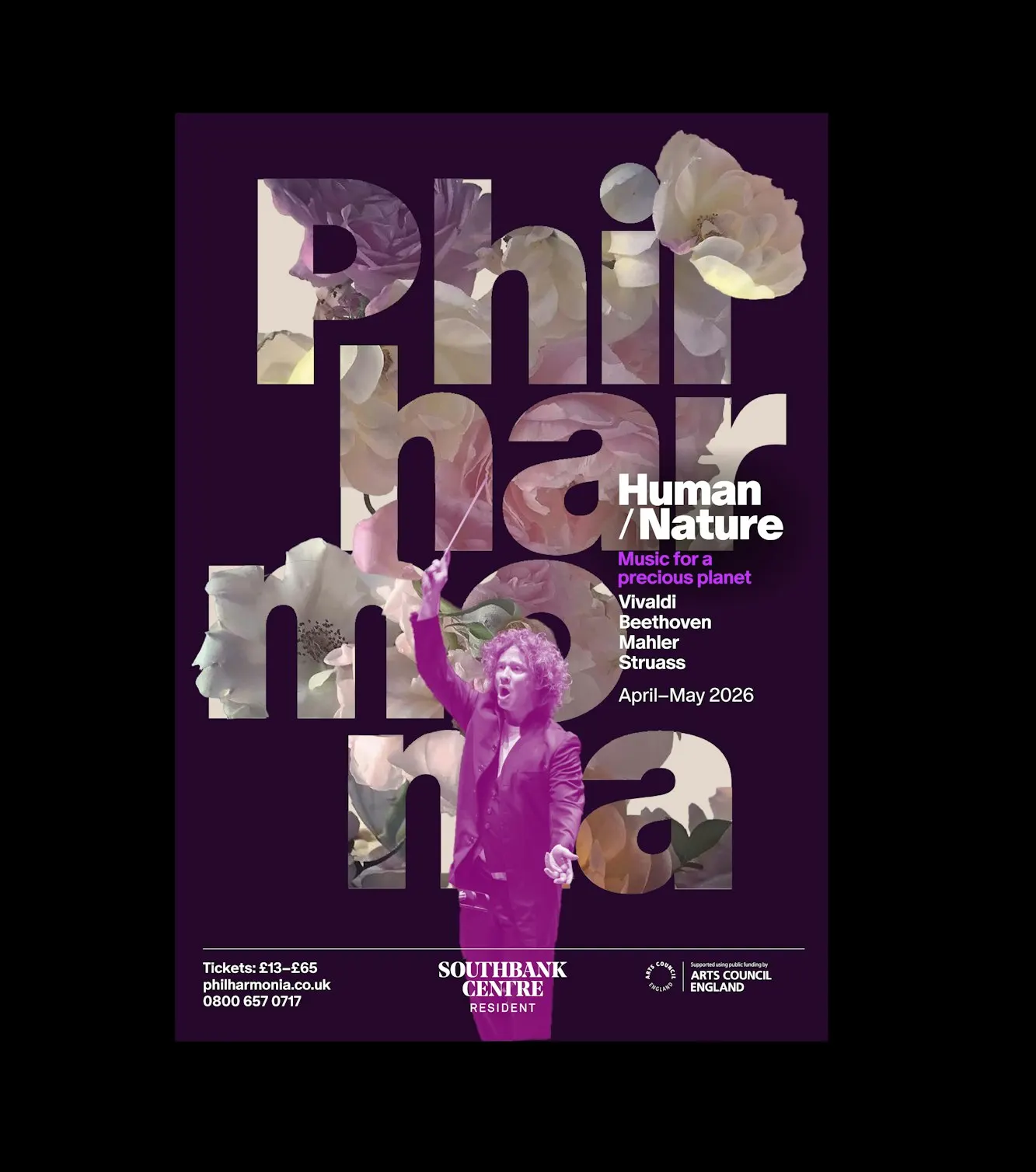
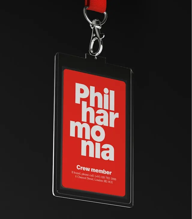
A team of Edward Roberts, Harry Pearce, Hyo Lee, Romilly Winter, and Tiffany Fenner worked with players from the orchestra, starting with the logo. Set in Dinamo's ABC Oracle Black with a few letters redrawn, a stacked version of the name sits beside the traditional wordmark and anchors photography, instrument illustrations, and layered type. The orchestra's long-time red turns warmer and runs from programmes to tote bags to the equipment truck. For the anniversary, a fluid gold "80" is laid over the white stacked logo on black.
Why it works
Stacking the name breaks a long, formal word into short beats, so it is easier to remember and easier to play with. The heavy black weight also feels more confident than the restrained, serif-led look common in classical music. Keeping the conventional wordmark means the orchestra's established audience still has something familiar, and the stacked version can take the risks. Red gives continuity, and it suits an orchestra with such a strong recording history. Gold on black adds a sense of occasion without breaking the system.

Images and video from pentagram.com, by Pentagram.