The Brand Monograph
Rack brand identity by JKR
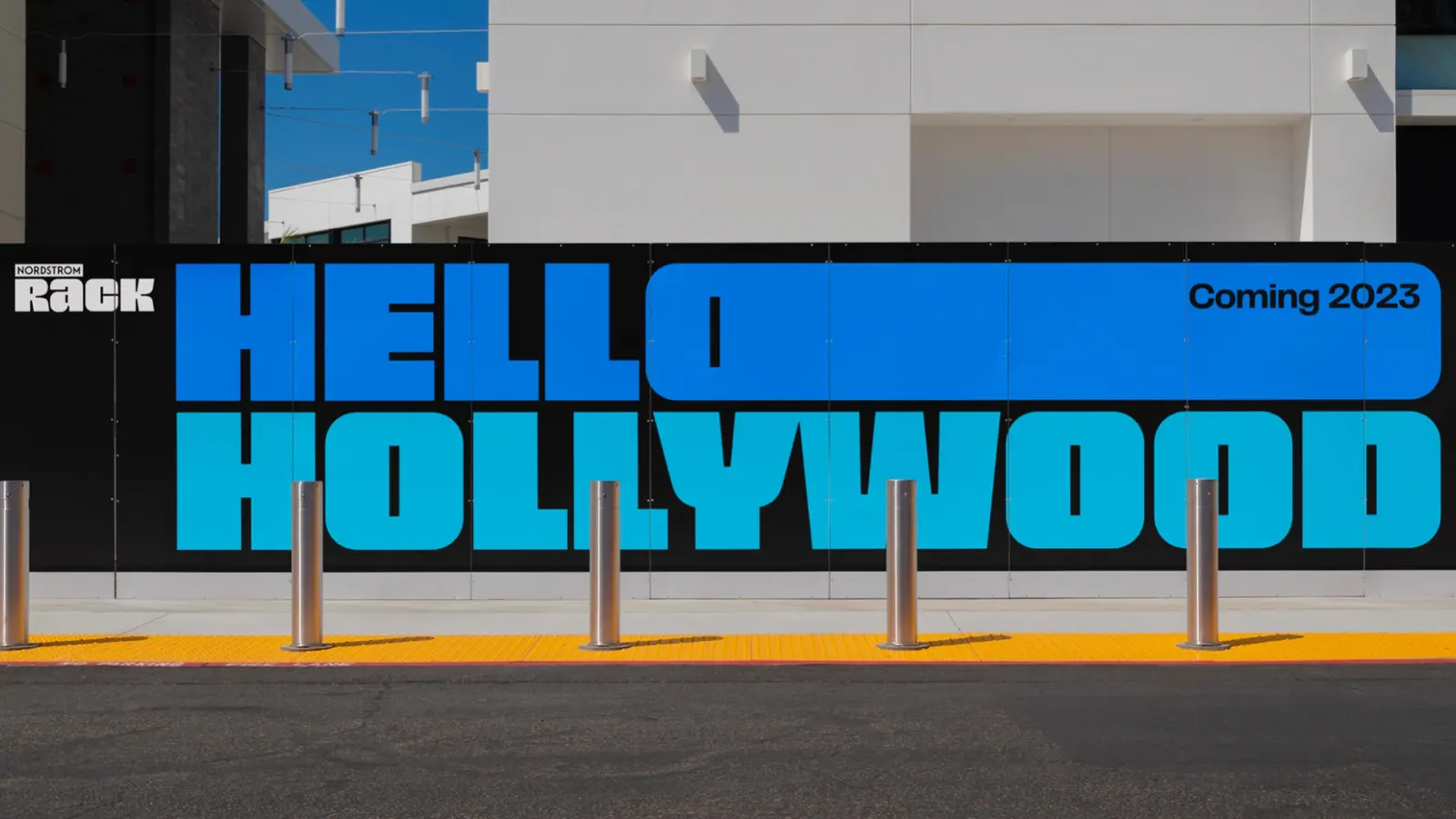
↗JKR's rebrand of Nordstrom Rack stands out because it treats off-price retail as a place for style, not just savings. Discount brands often lean on loud, price-first signals. Here, the studio starts from the shopper: someone with taste and confidence who also happens to be very good at finding a deal.
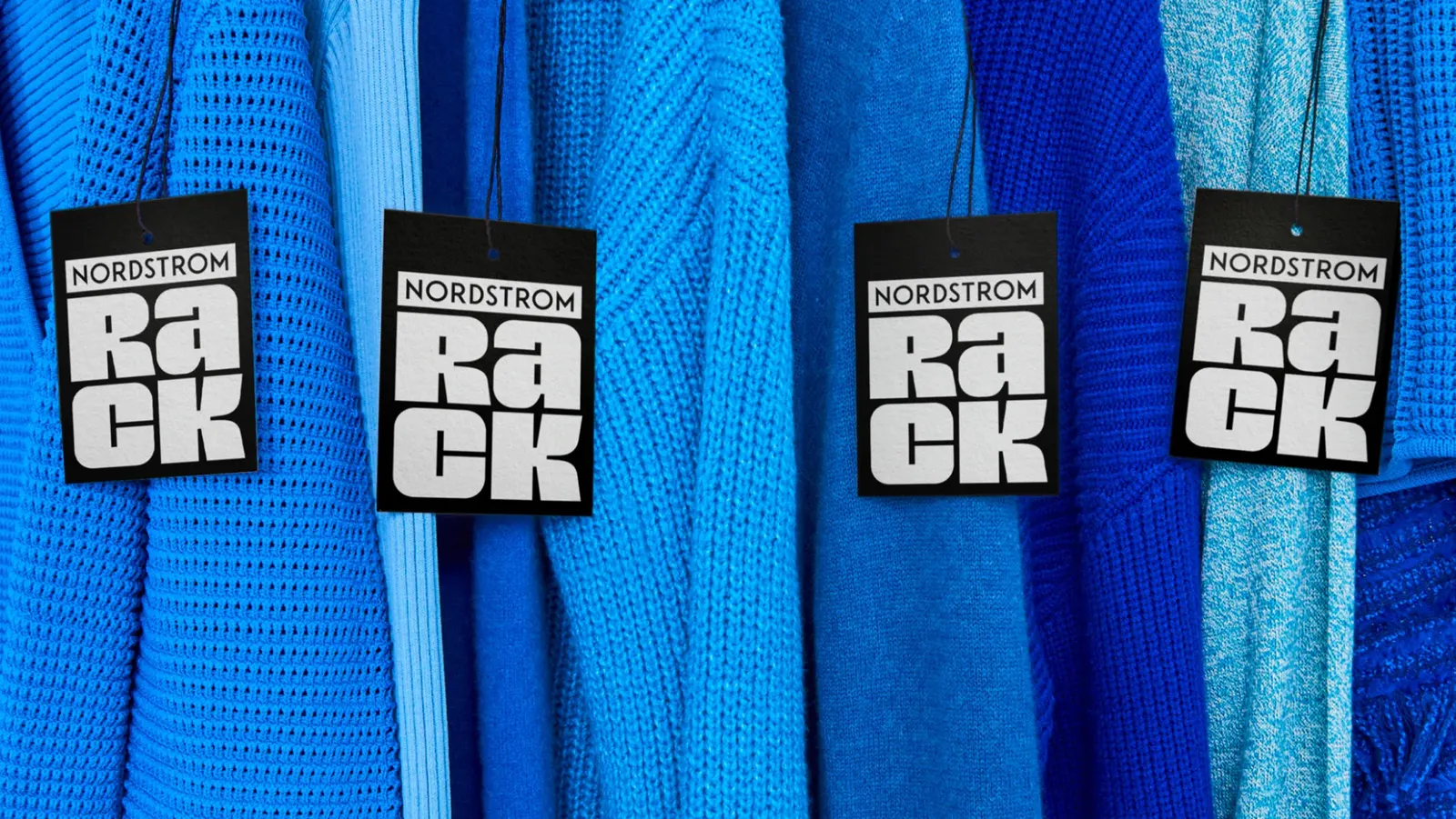
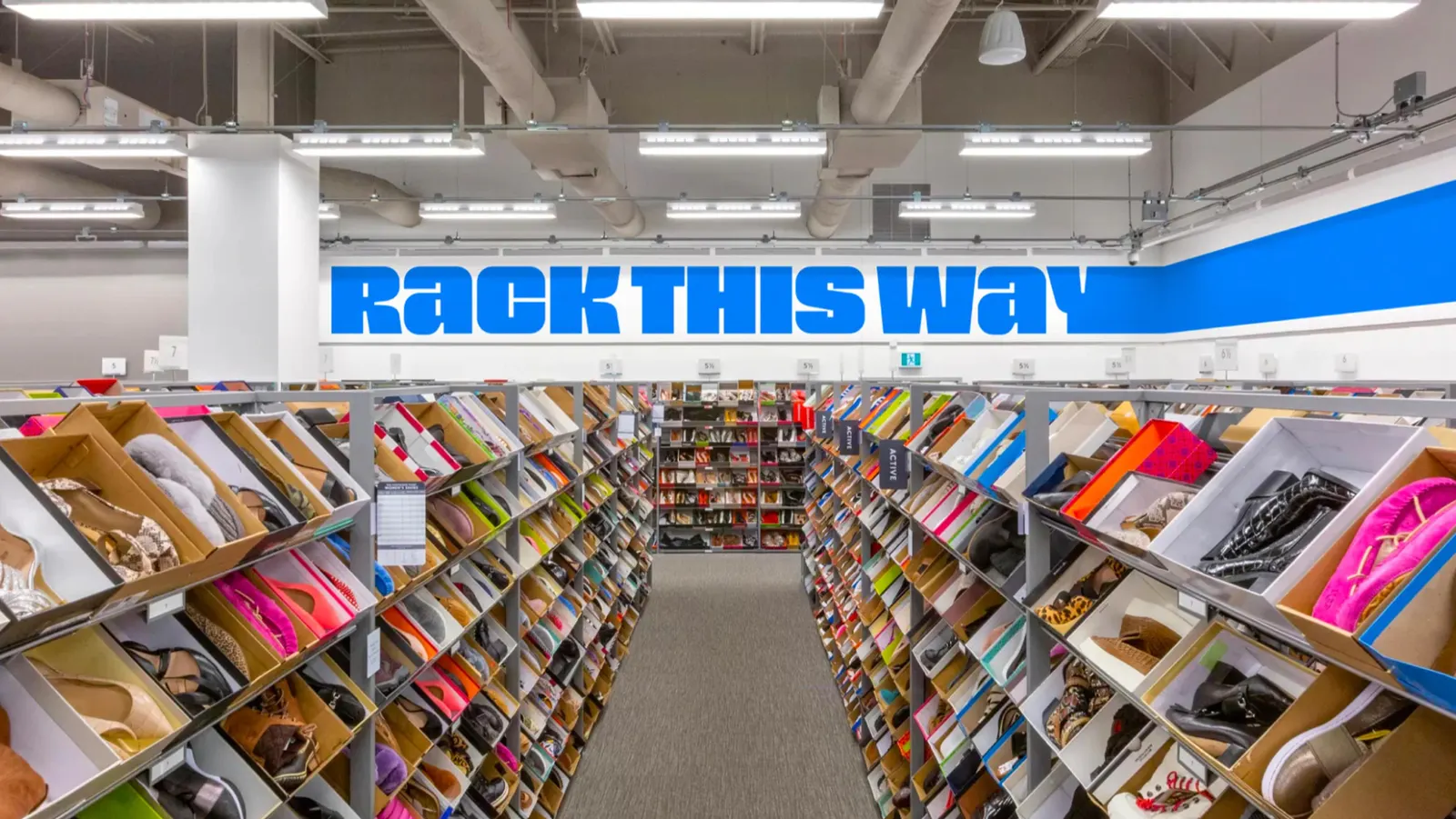
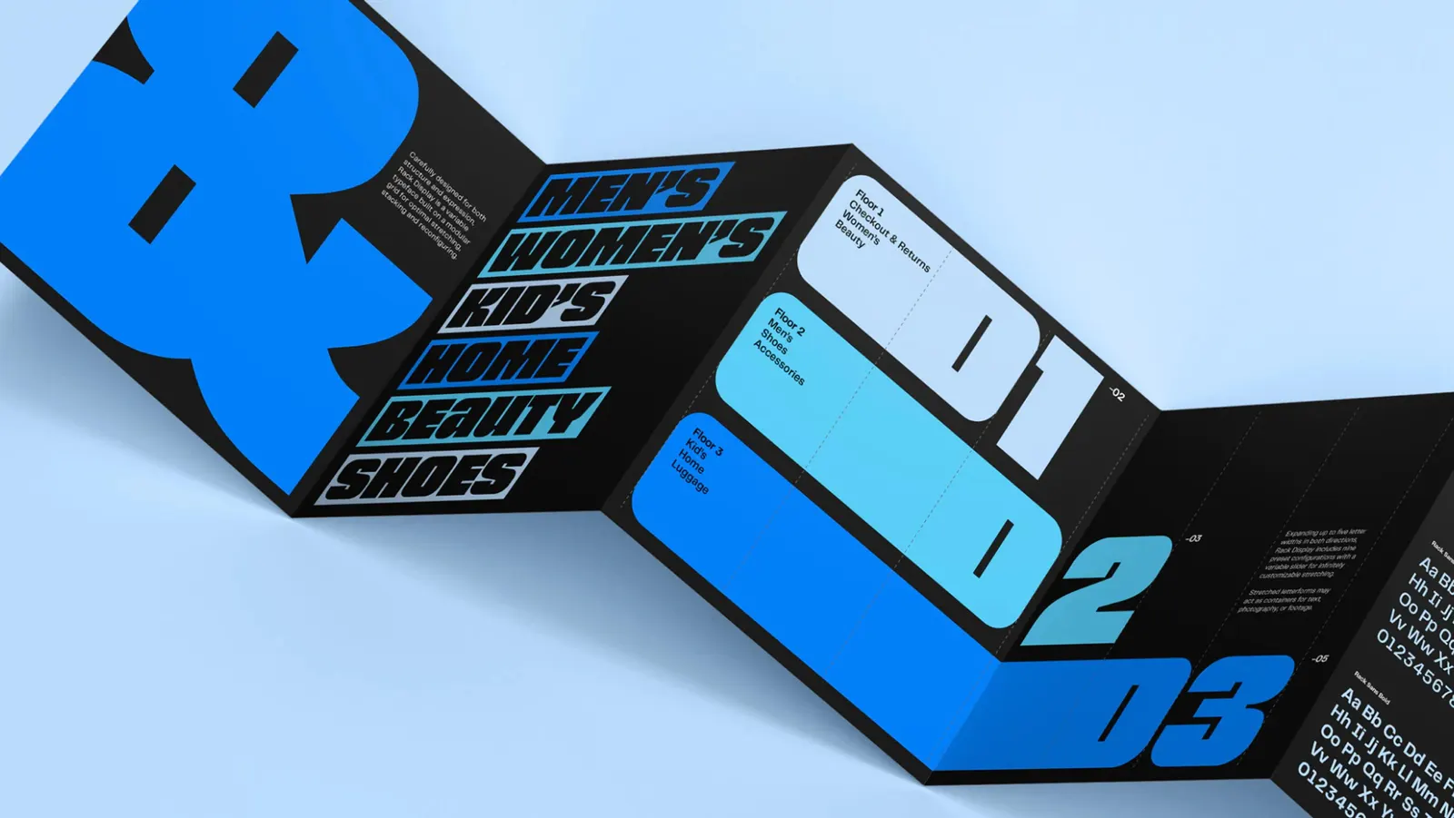
The brief was to give Nordstrom Rack an identity that keeps up with customers who are resourceful and far from uniform. JKR built the idea around individuality, so the brand can flex across many tastes instead of speaking in one voice. Typography, developed with OH no Type Company, carries much of that personality and gives the system a distinct, fashion-aware tone.
Why it works
Rack competes in a category where most brands look alike and lean on the same urgency cues. Making individuality the organizing idea lets the identity feel like fashion instead of clearance, and it respects the shopper's sense of their own style. Bringing in a dedicated type foundry also signals that lettering is the main tool for expressing confidence and wit without shouting about price. That is a smart, flexible way to set Rack apart from its neighbors.
Applications
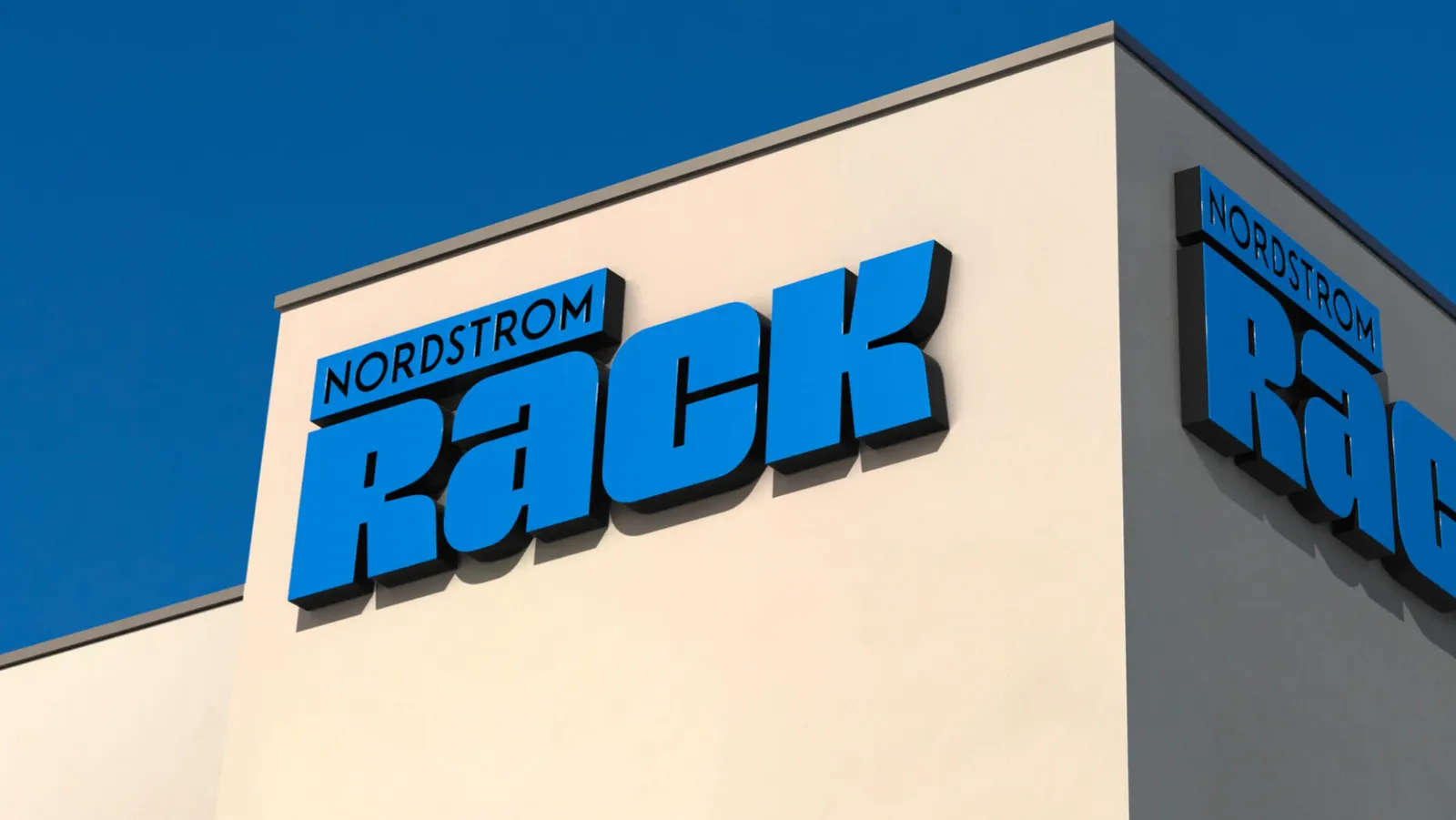
Typography
Color
Images and video from jkrglobal.com, by JKR.