The Brand Monograph
San Francisco Running Company brand identity by Study Hall
↗Study Hall's identity for San Francisco Running Company treats a neighborhood running shop like a racing team. The references come from rally driving rather than the usual running-brand vocabulary of sunrise gradients and motivational slogans. That gives the shop a sharper, more physical personality than its category tends to allow.
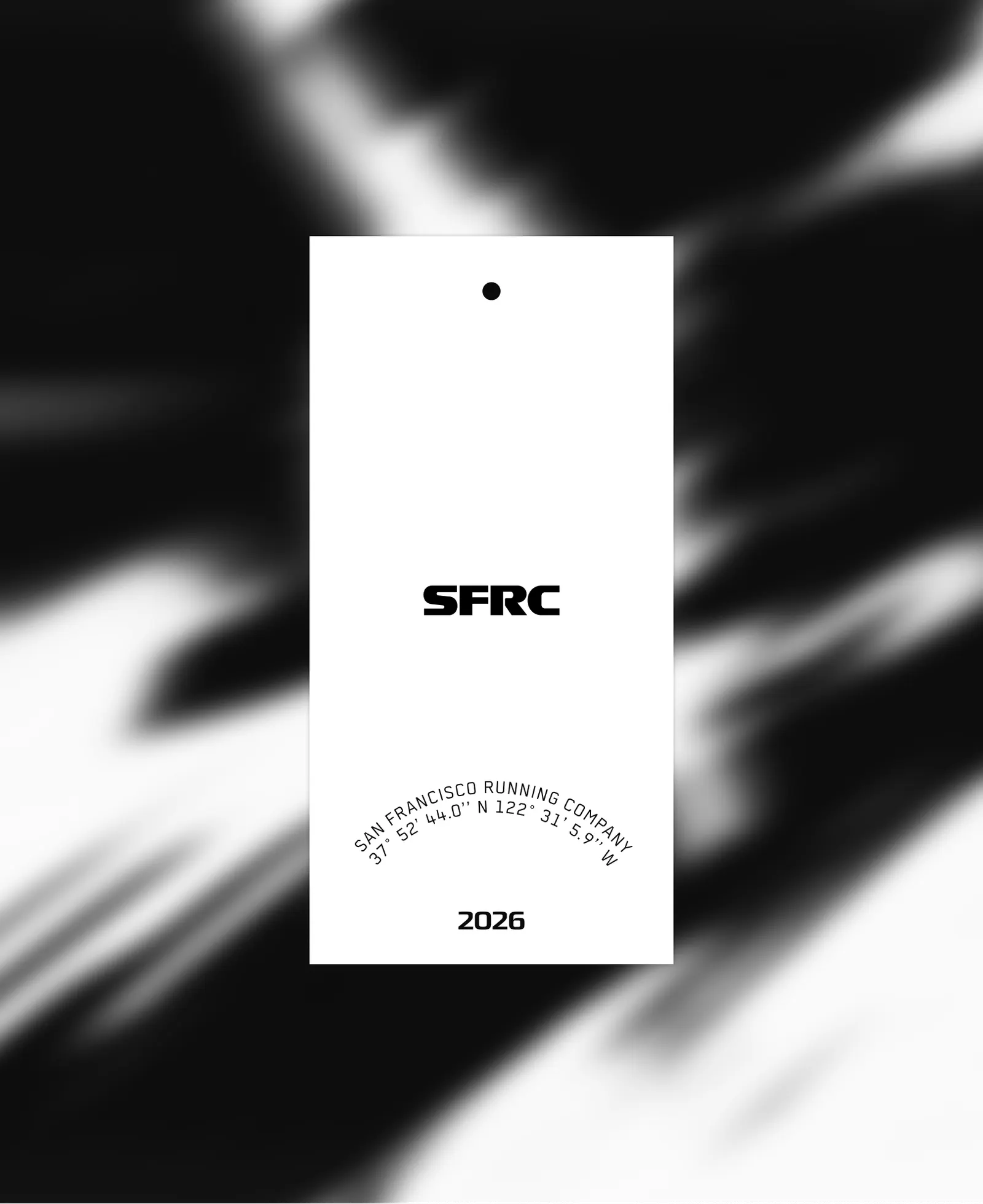
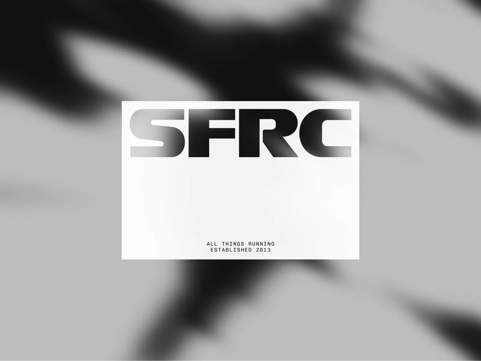
The shop sits near Mt. Tamalpais and has anchored Bay Area running since 2013. As a new wave of runners arrived, it needed a brand that looked as considered as the gear it stocks. Study Hall's answer pairs bold typography with racing-style details, then adds fog and motion blur to suggest speed and tie the system to its home terrain. Alberto Rondoni's motion work carries that momentum, while Jeremy Volk's strategy and Scott Erdiakoff's copy shape the point of view. The design team of Dani Grimm, Marina Glikman, Matt Yerman, and Mortaza Amiri kept the whole thing feeling current without leaning on a trend.
Why it works
Rally racing is a smart borrowed world because it values endurance, mess, and teamwork over polish, which is how most committed runners see their sport. Heavy type gives the shop confidence on shelves and in feeds where so many competitors look alike. Fog and blur do double duty: they signal speed and make the brand unmistakably Bay Area, so the system couldn't be lifted onto a shop in another city. The attitude appeals to serious runners without shutting out newcomers.
Applications
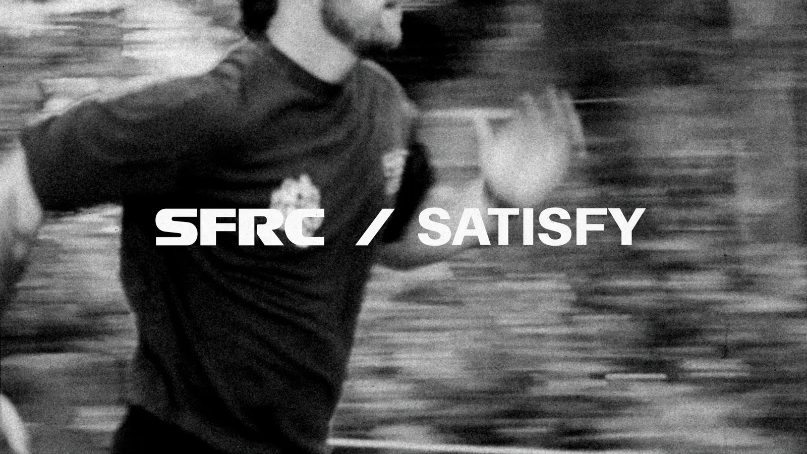
Logo


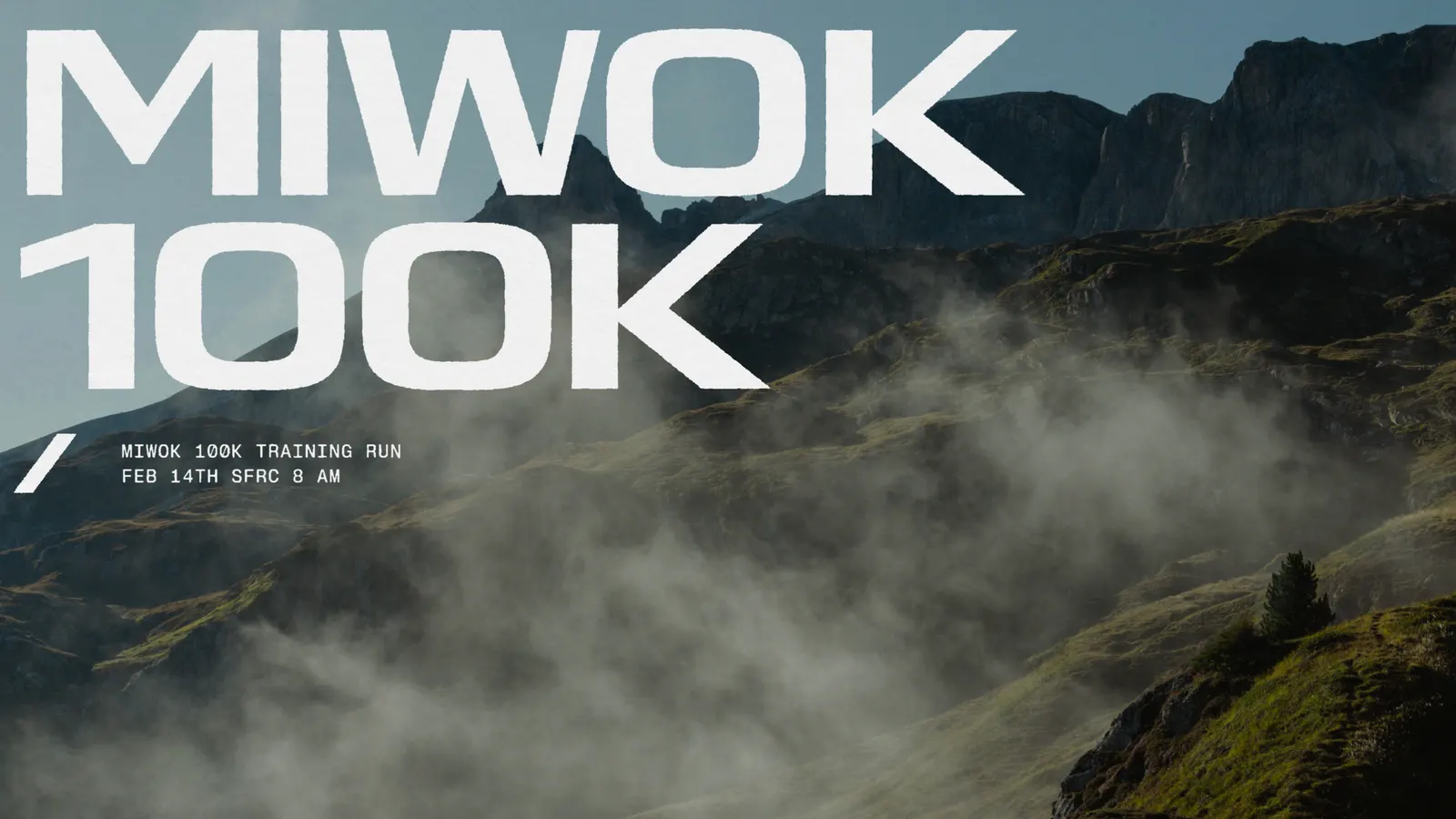
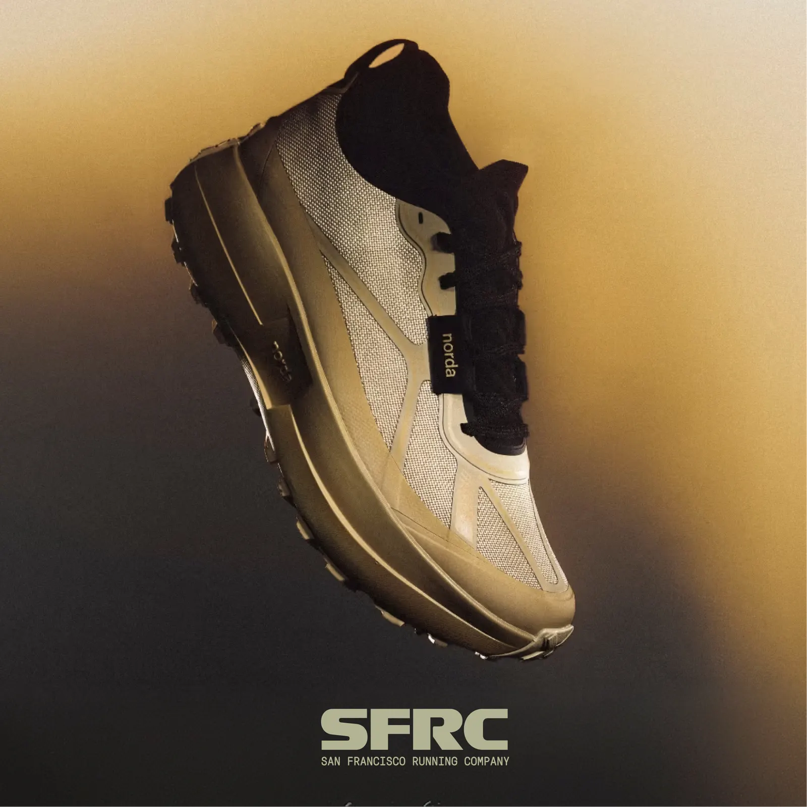
Images and video from studyhall.design, by Study Hall.