The Brand Monograph
Stella-Artois brand identity by JKR
↗Most beer brands lean on heritage and leave it there. JKR's work for Stella Artois takes a different route, treating the world's number one draught beer less like a pub staple and more like a label you'd want to be seen with.
The brief was a gap between product and presentation. The beer had the history, the quality, and the following, but the brand wasn't carrying the same weight. The studio's answer was to borrow from fashion, pairing a modern sensibility with the brand's old-world roots. Photography by Cait Oppermann and typographic work from Alec Tear and Pangram Pangram Foundry give that idea its visible form, setting the tone for how the brand looks and speaks.
Why it works
Fashion is a smart language for a beer that already sits at the premium end of its category. It lets Stella Artois compete for attention with things people choose as a statement, not just with other lagers. Photography and typography are also the right levers, since they are where fashion houses build tone and recognition, and both stretch easily across many touchpoints. Keeping the heritage in the mix matters too. It supports the price and the reputation without making the brand feel like a museum piece.
Applications
Logo
Typography
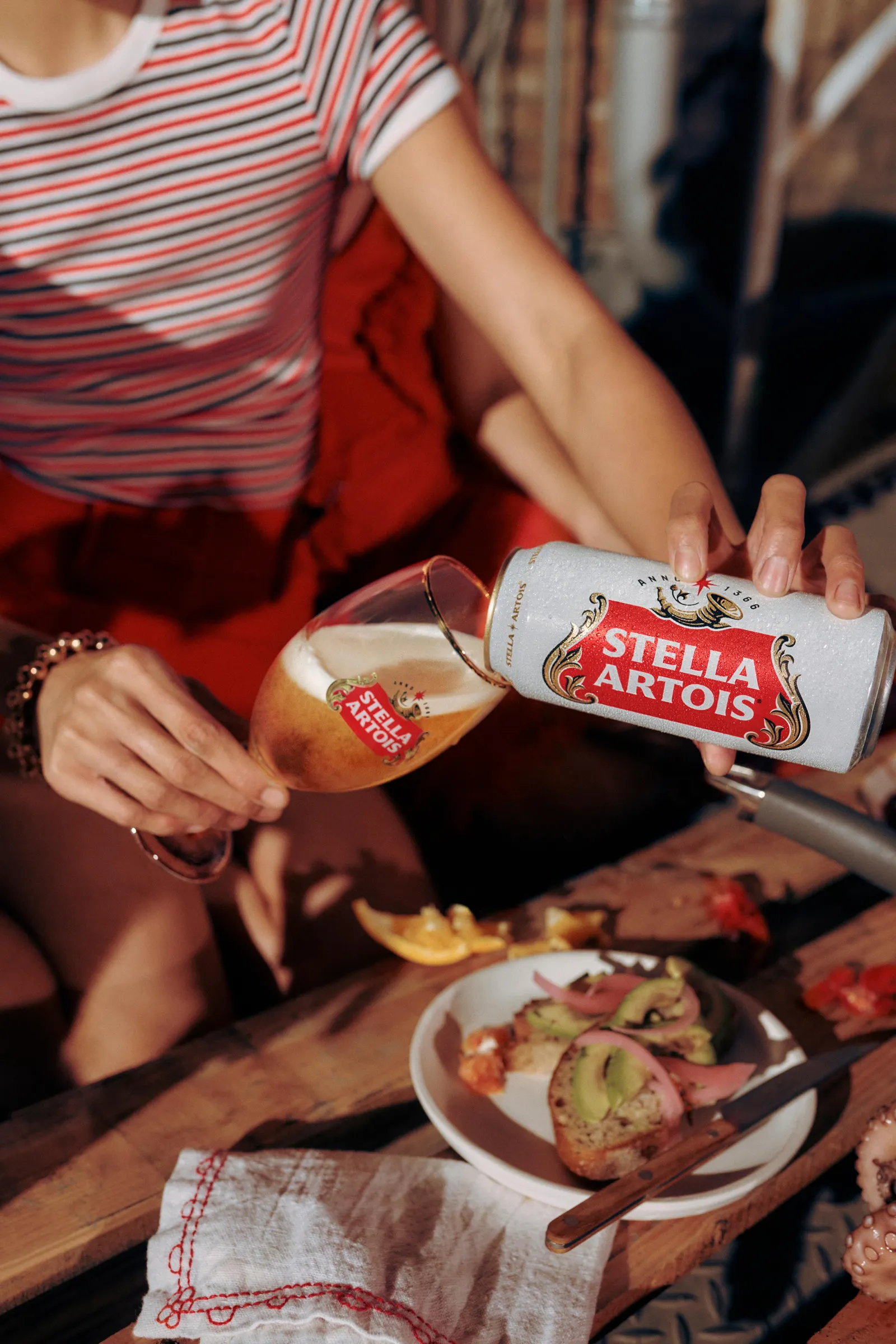
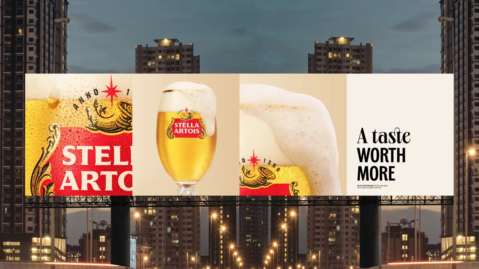
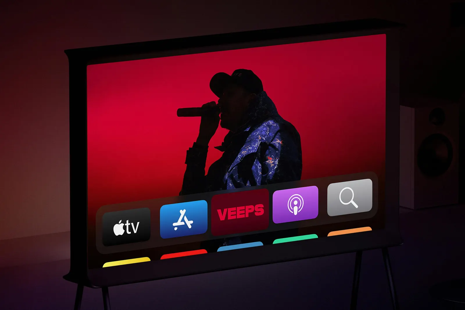
Images and video from jkrglobal.com, by JKR.