The Brand Monograph
The Wang Contemporary brand identity by Pentagram
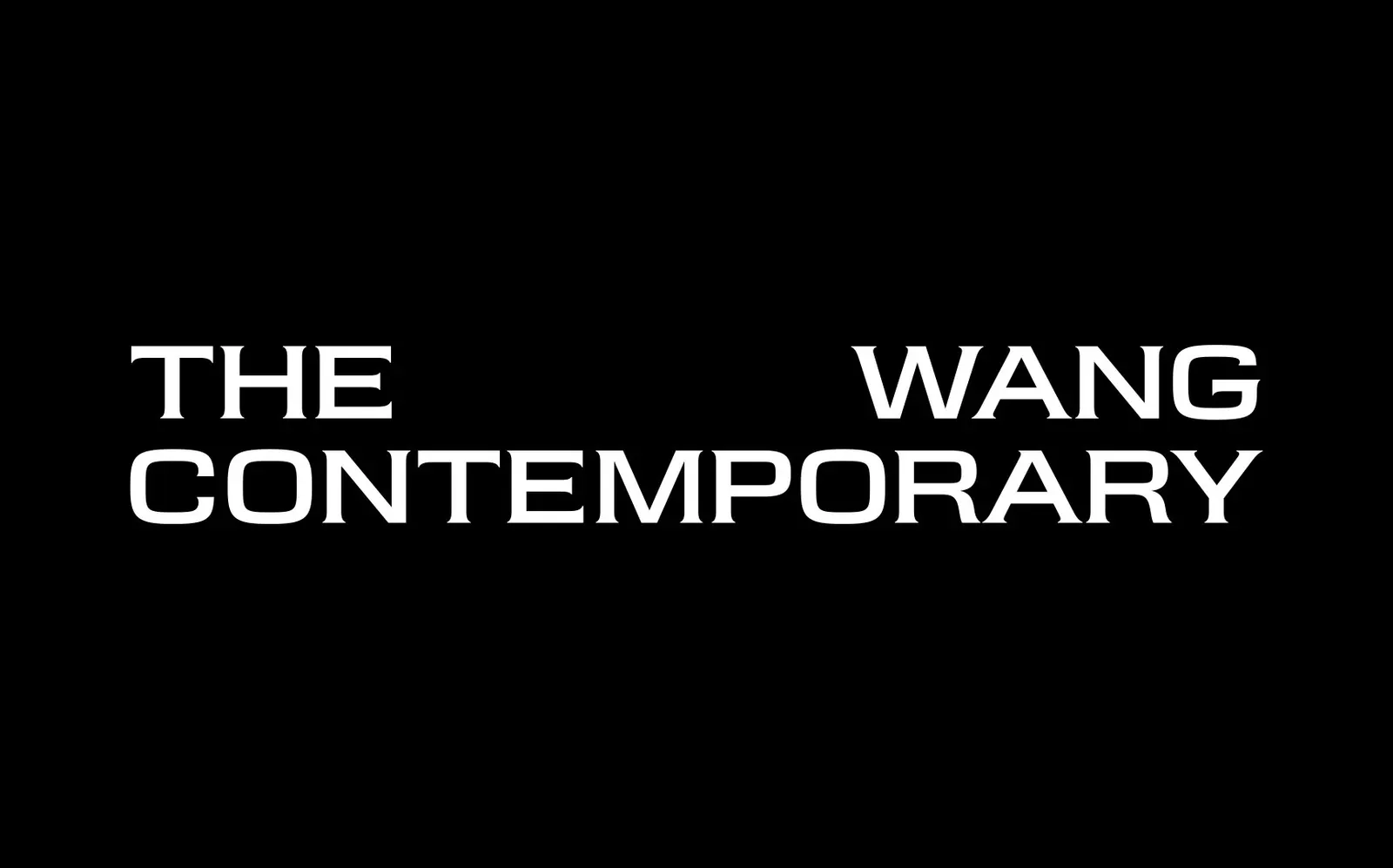
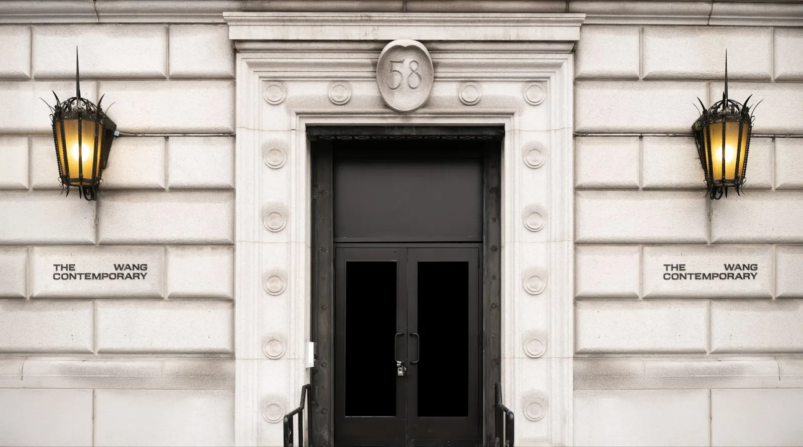
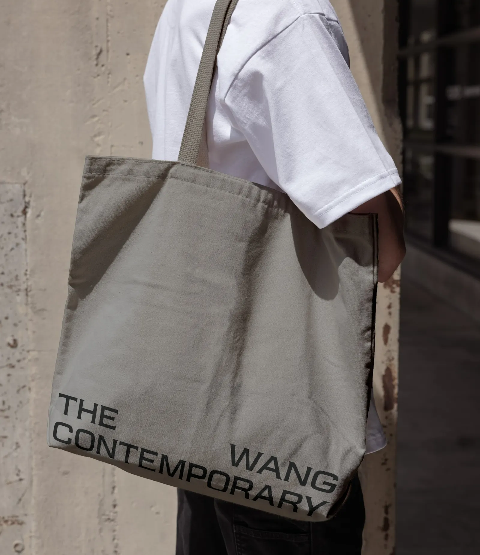
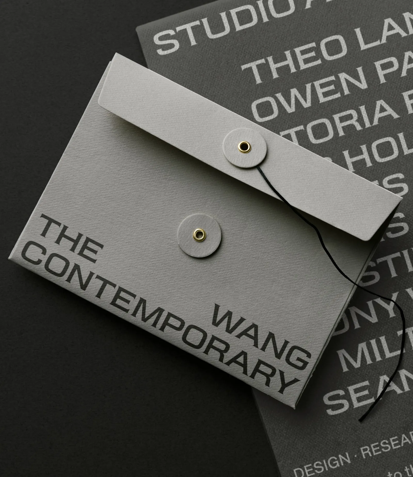
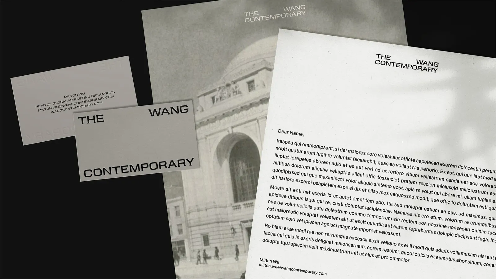
↗Pentagram's identity for The Wang Contemporary starts from an unlikely source: the ceiling of a former bank. The building sits at Canal and Bowery, at the foot of the Manhattan Bridge, and is now Chinese-American owned for the first time in more than a century. Natasha Jen and her team had to give the new arts center a voice that honors the landmark, serves the vision of Alexander Wang and his mother, Ying Wang, and stays distinct from his fashion label.
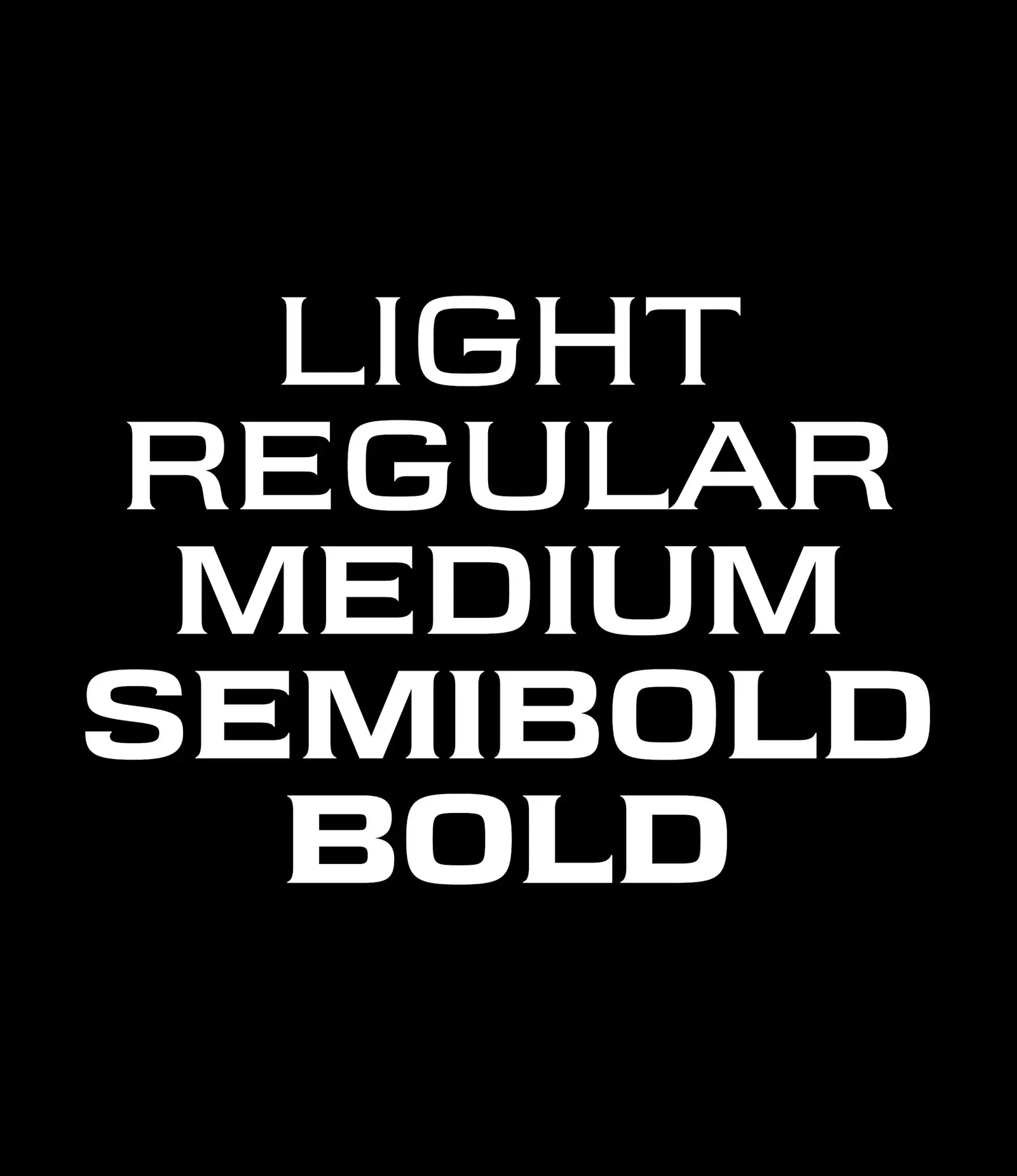
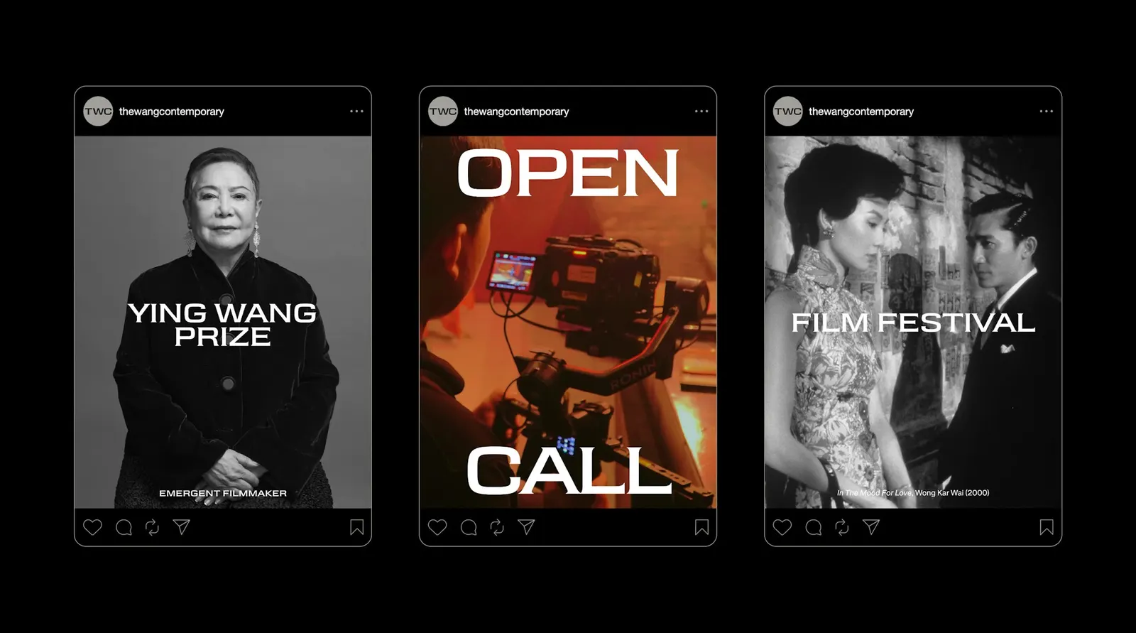
The studio's answer is Wang Grotesque, a custom typeface developed from Wang's proprietary font. It merges the hand-painted ceiling lettering with the curves of the dome's supporting beams, and the flares swell as the weights get heavier. The palette is sampled from the weathered stone outside. Layouts follow a simple rule: type sits at the edge when artists are featured and moves to the center when the institution speaks for itself.
Why it works
The flare rule is the smartest move here. It turns one typeface into a range of voices, quiet at light weights and monumental at heavy ones, and it ties every headline to the building's structure rather than to a trend. A stone-derived palette keeps the system restrained, so artists supply the energy. The edge-or-center logic is also a clear editorial position: the center is reserved for the institution, and everyone else gets room to be seen. Few cultural identities look this specific to their address.
Applications
Logo
Typography
Images and video from pentagram.com, by Pentagram.