The Brand Monograph
ThredUp brand identity by Red Antler
↗Most secondhand advertising leans on virtue: spend less, waste less. Red Antler's work for ThredUp sells something more tempting, the thrill of finding the exact piece you pictured. ThredUp was already the largest online secondhand retailer for women, so the job was less about explaining the category than getting the name to stick, and making the technology behind the site feel like a style advantage rather than a back-end detail.
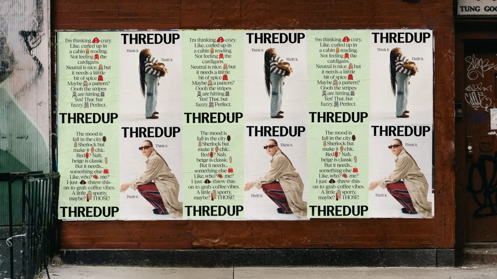
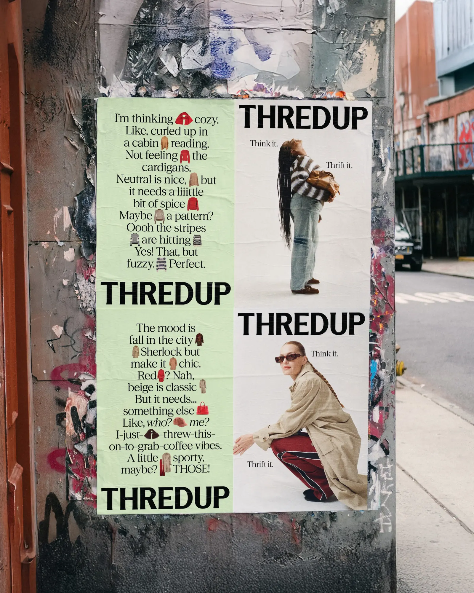
The studio built the campaign around a short, imperative line that treats a wardrobe as something you imagine first and assemble second. In New York, tear-off flyers were written for individual neighborhoods, riffing on local style types. Wildpostings and a series of films, made with Mat+Kat and produced by Alien Productions, put a thrifter's private thoughts on screen, while an influencer push, with Fat Earth also contributing, carried the idea across social.
Why it works
The strength here is specificity. Tear-off flyers are an old, cheap, street-level format, and using them to tease neighborhood style types makes ThredUp feel like part of the city rather than a website you visit. It flatters the shopper's taste instead of her budget, which separates the brand from the more virtue-led tone common in resale. The imperative line also does double duty: it is easy to repeat and describes how the product works, so every execution, from poster to film, reinforces the same promise.
Applications
Typography
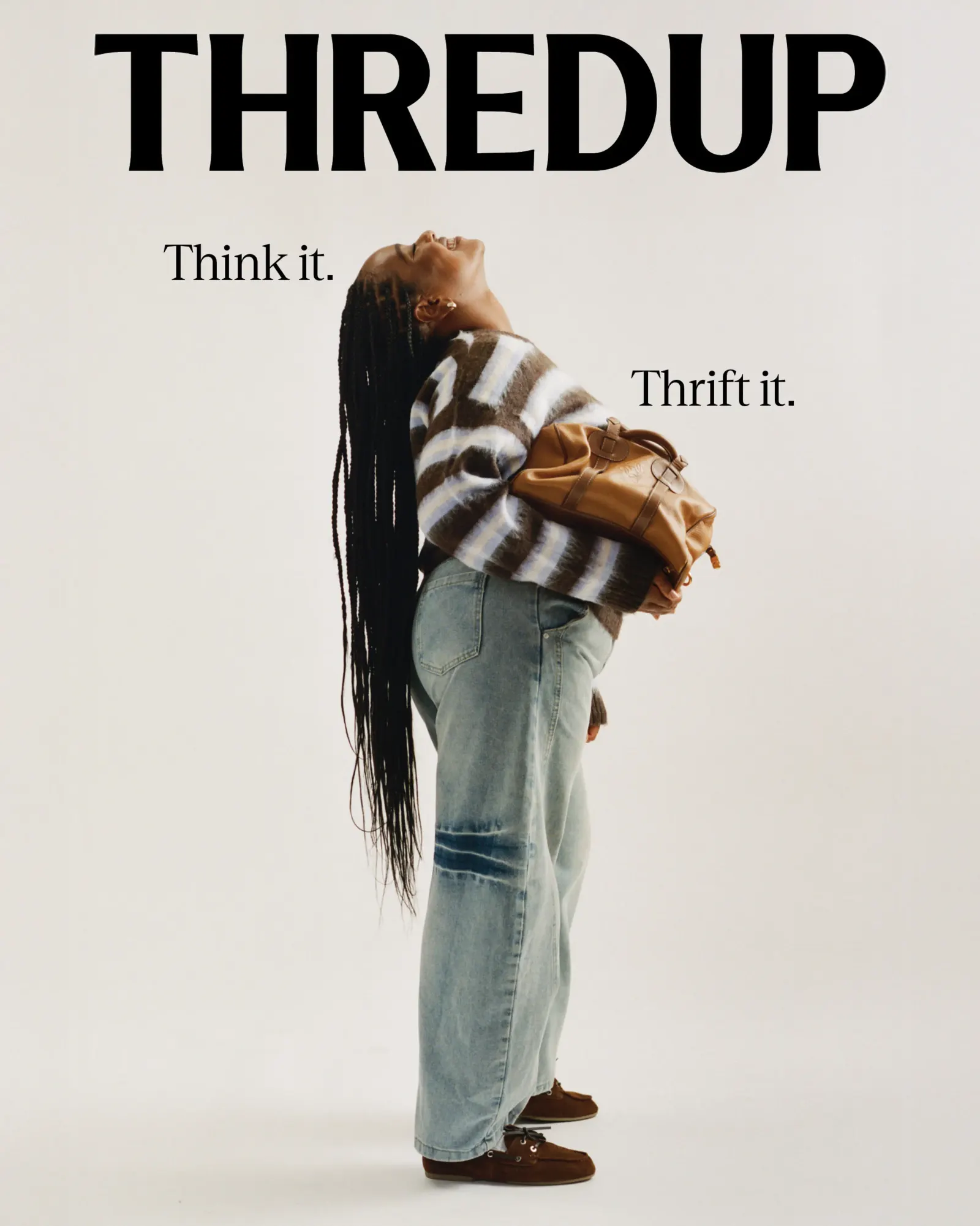
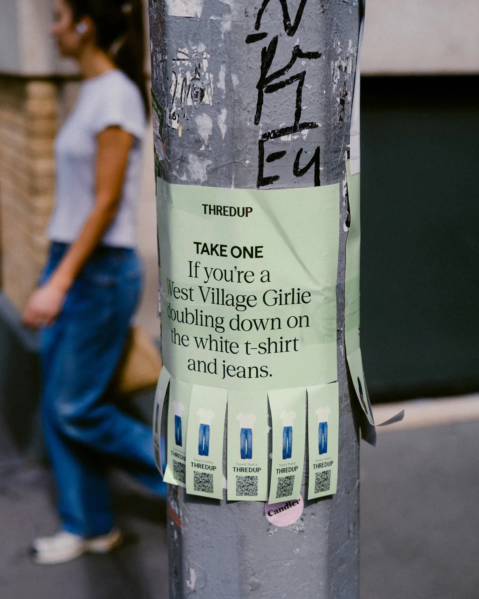
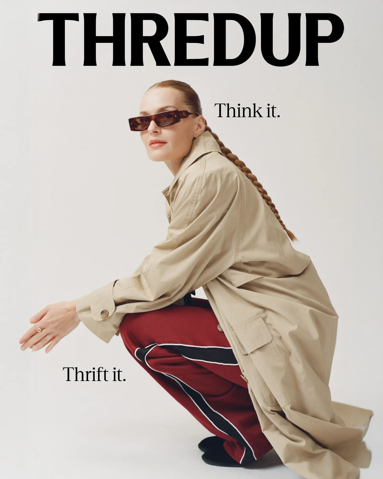
Images and video from redantler.com, by Red Antler.