The Brand Monograph
Toledo brand identity by Nouvelle Idée
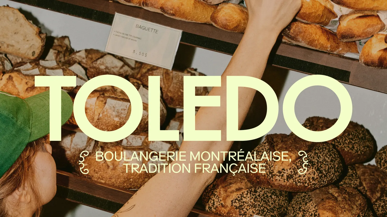
↗Nouvelle Idée found its starting point for Toledo inside a croissant: the uneven, air-filled cells that form when dough is laminated. Toledo, a Montréal bakery and specialty café that opened in 2019, was preparing for its third location and needed an identity that could grow with it without losing what regulars already loved.
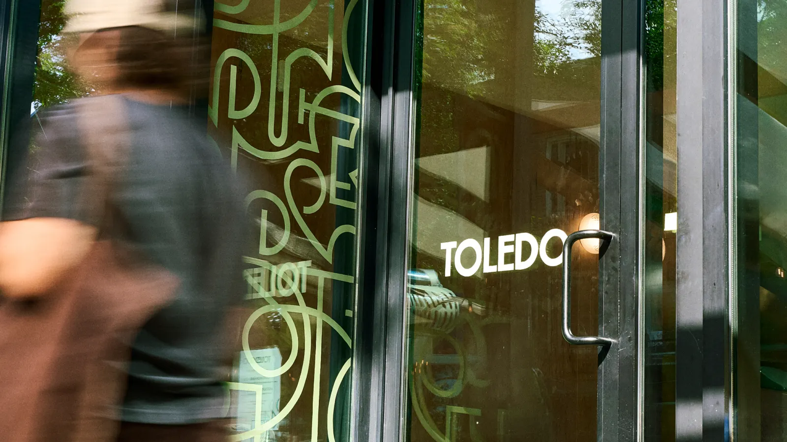
Working with designers Justin Daoust and Samuel Lauzon, and with Arianne Thivierge handling production, the studio turned those irregular cells into a system of organic shapes that carries across packaging, signage, and interior spaces. The palette comes straight from the pantry, with flour, butter, coffee, and a just-baked crust, while Toledo's green stays as the anchor. Ornamental details borrowed from French baking craft sit alongside a contemporary typeface.
Why it works
The pattern comes from the product itself, so it feels earned rather than borrowed from the usual bakery shorthand. Because the shapes are irregular by nature, they stretch across a bag, a wall, or a window without a rigid grid to break, which matters for a brand that is adding locations. Keeping the green gives existing customers something familiar to hold onto. And pairing ornament with a modern typeface keeps the heritage cues from tipping into nostalgia, which helps Toledo look current in a category that often leans on rustic clichés.
Applications
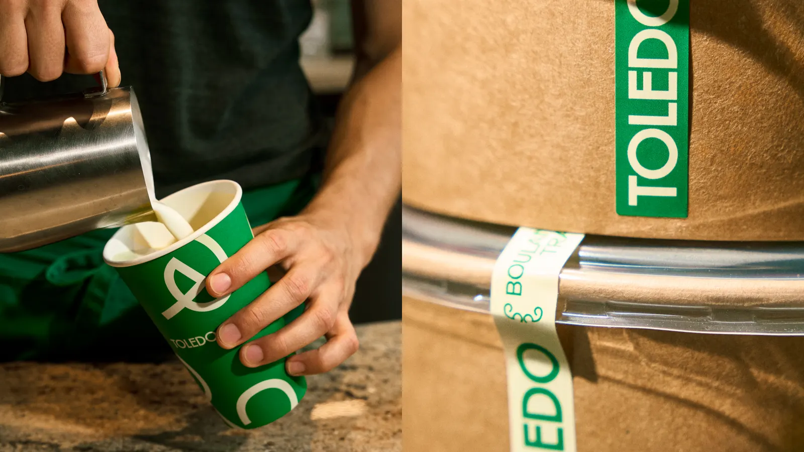
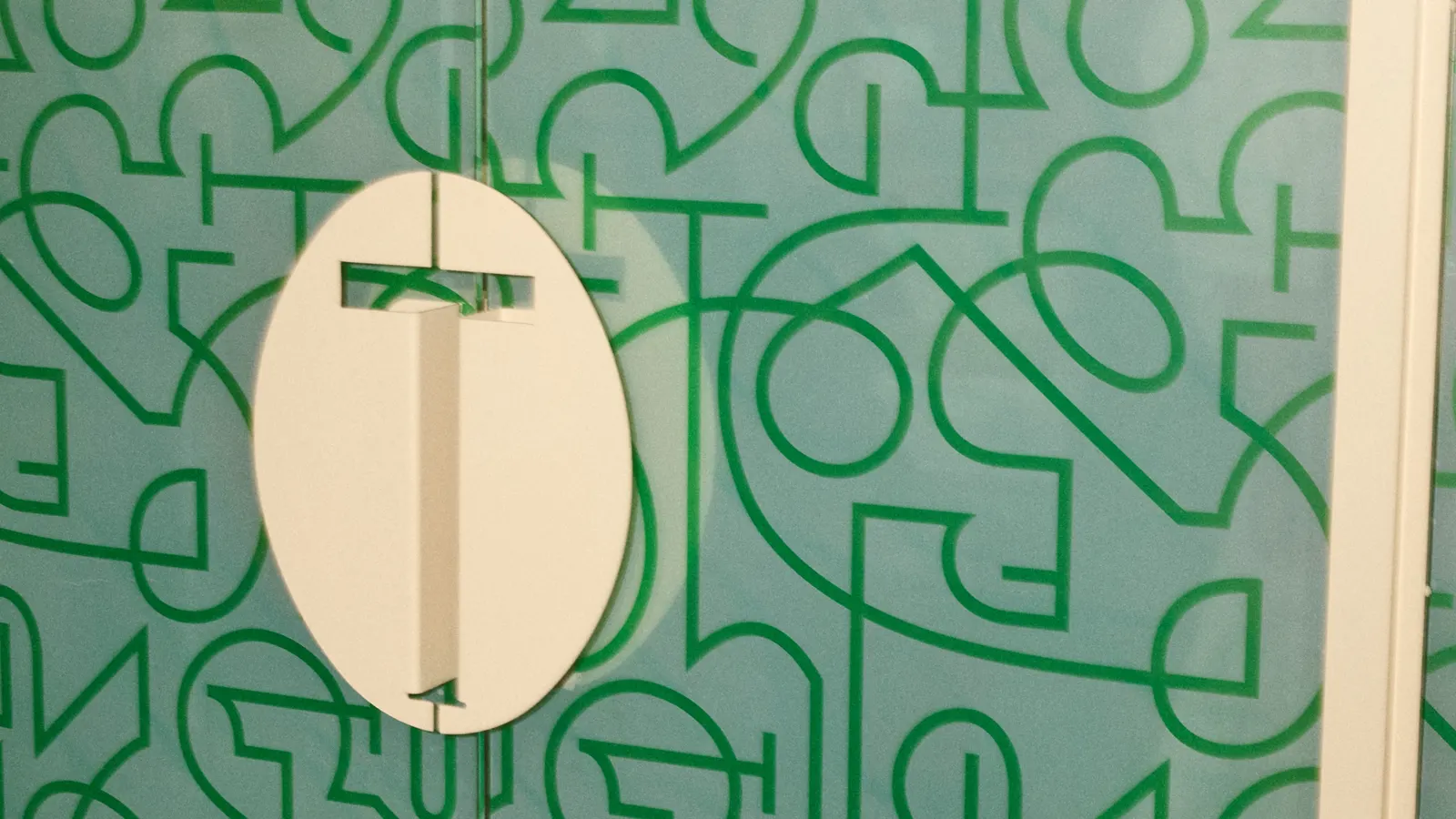
Images and video from nouvelleidee.work, by Nouvelle Idée.