The Brand Monograph
Uber brand identity by JKR
↗Few identity projects start with so little and ask so much of it. For Uber, JKR reduced a sprawling brand to three of the most basic geometric forms: a circle, a line, and a square. The brief was strategic as much as visual. Uber was moving past its ride and delivery roots toward a business that covers every way of getting around, and its separate apps needed something to hold them together.
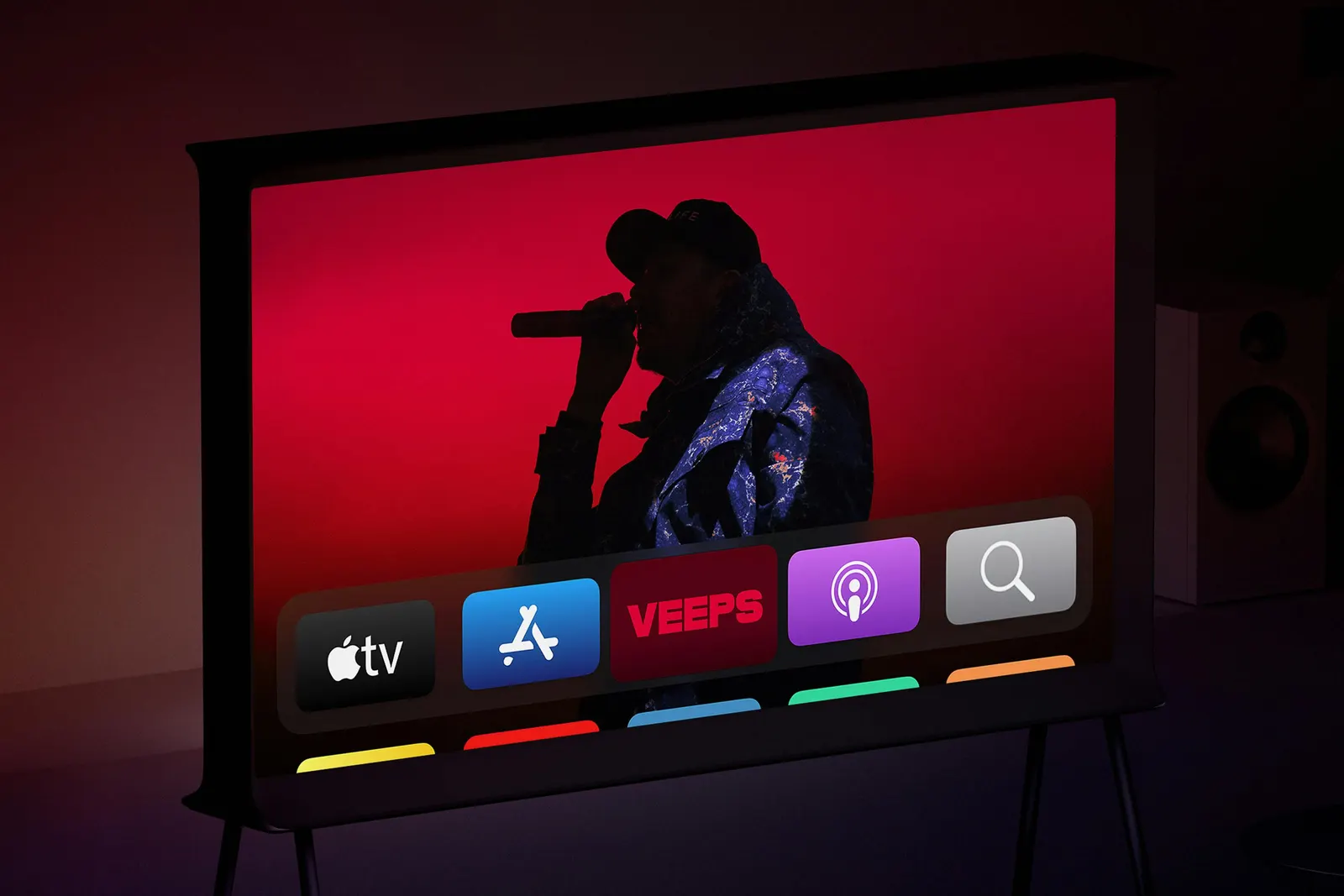
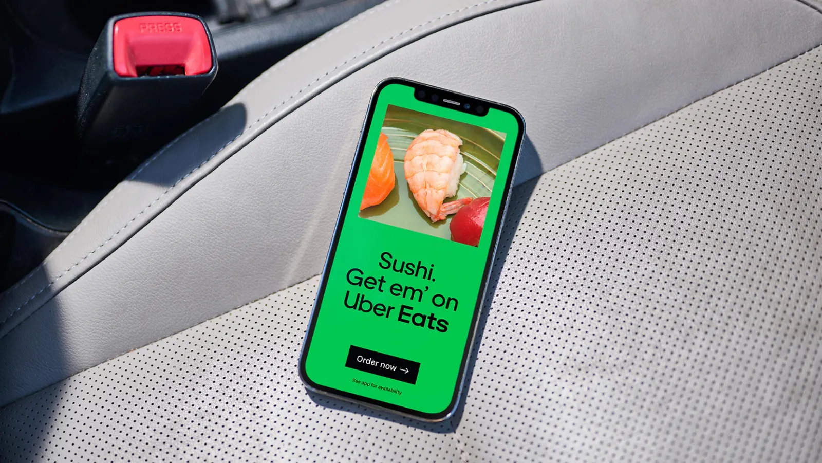
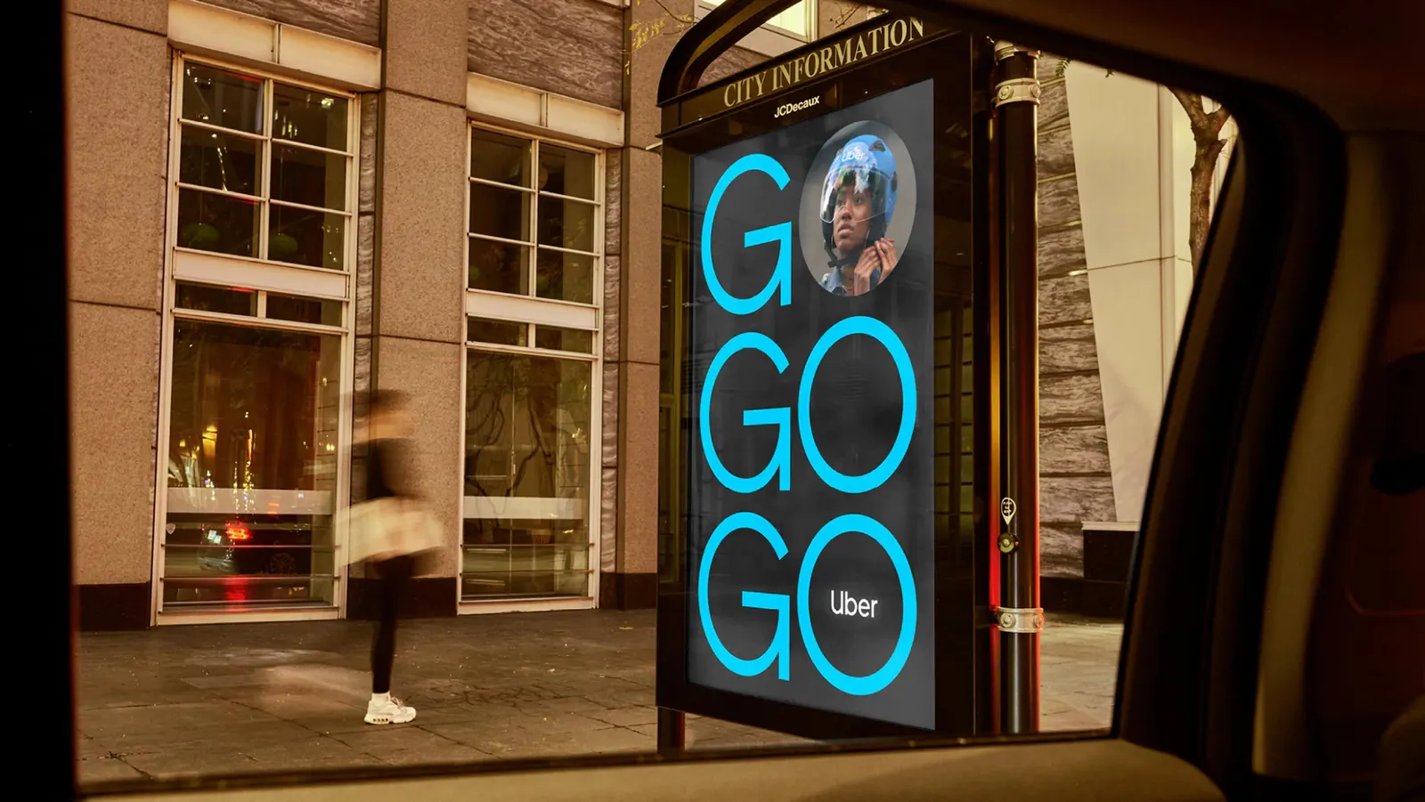
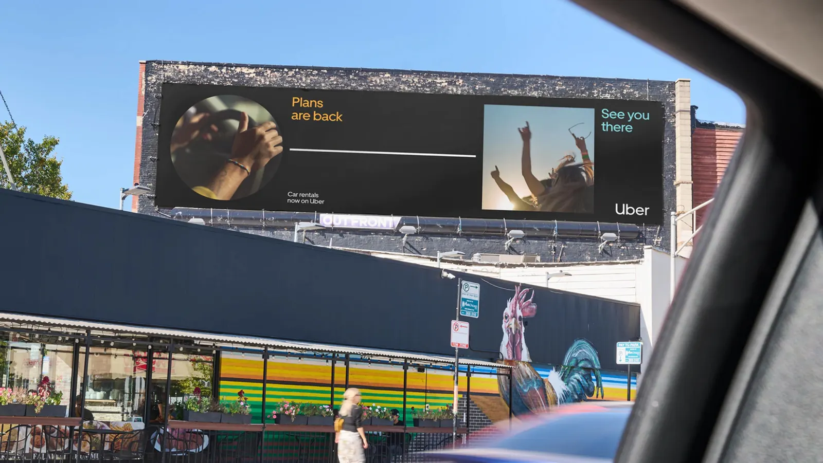
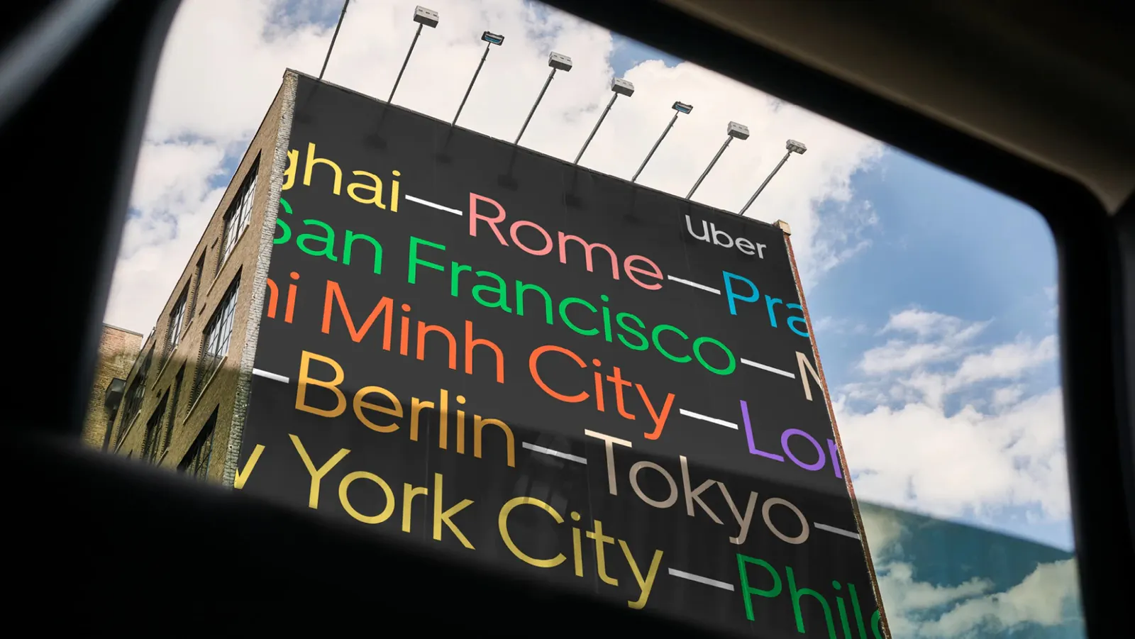
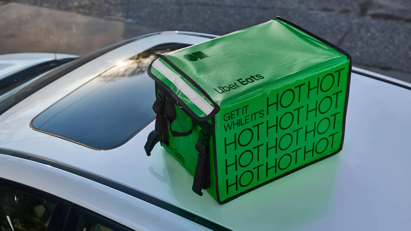
JKR treats the three icons as a kit of parts rather than a fixed logo lockup. The studio combines them in bold, high-energy arrangements that stay simple enough to apply across products, so the apps read as one family instead of unrelated services. It is a system built on connection, with the shapes signaling movement and range.
Why it works
Basic geometry is a smart foundation for a brand that has to stretch. A circle, a line, and a square carry no baggage from any single service, so they can suggest a rider, a route, a package, or a destination without the identity needing to change. That openness lets Uber add new kinds of mobility without redrawing the brand. The shapes are also easy to recognize at small sizes, which matters for a company that lives on phone screens. Simplicity here is a practical choice, not a stylistic one.
Applications
Logo
Typography
Images and video from jkrglobal.com, by JKR.