The Brand Monograph
Utah City brand identity by Pentagram
↗Pentagram Austin was asked to name a 700-acre development near Vineyard, Utah, and to give it an identity that could carry the weight of a city. The developer, Woodbury Corporation, is building on the site of a former steel mill. The studio tested more than a hundred names, drawing on regional history, railroads, and the lake, before landing on the simplest pattern in the book: Utah City, in the tradition of Salt Lake City, Kansas City, and New York City.
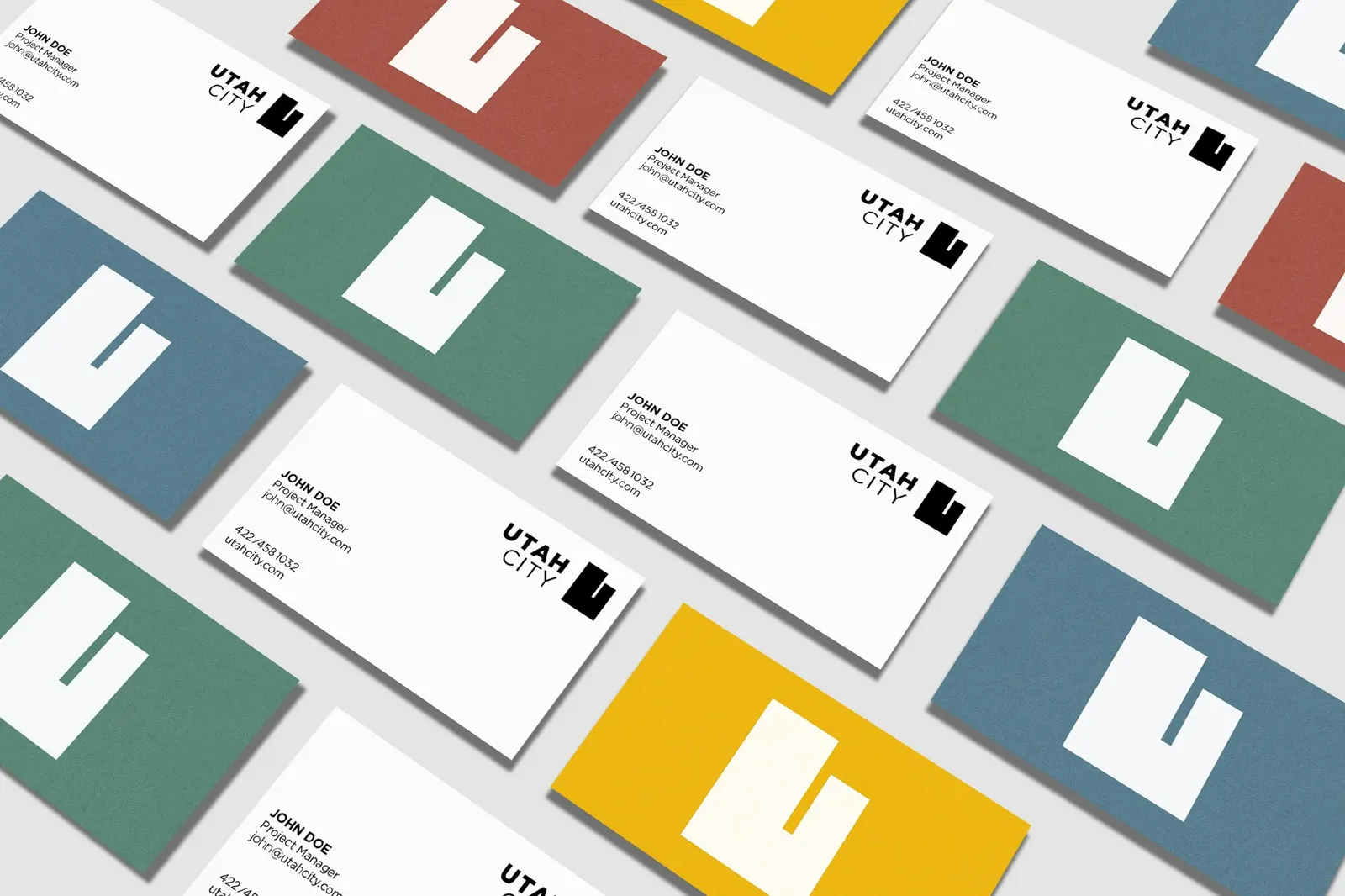
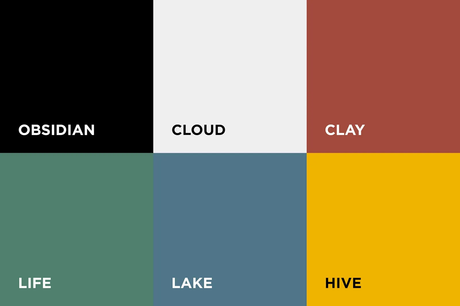
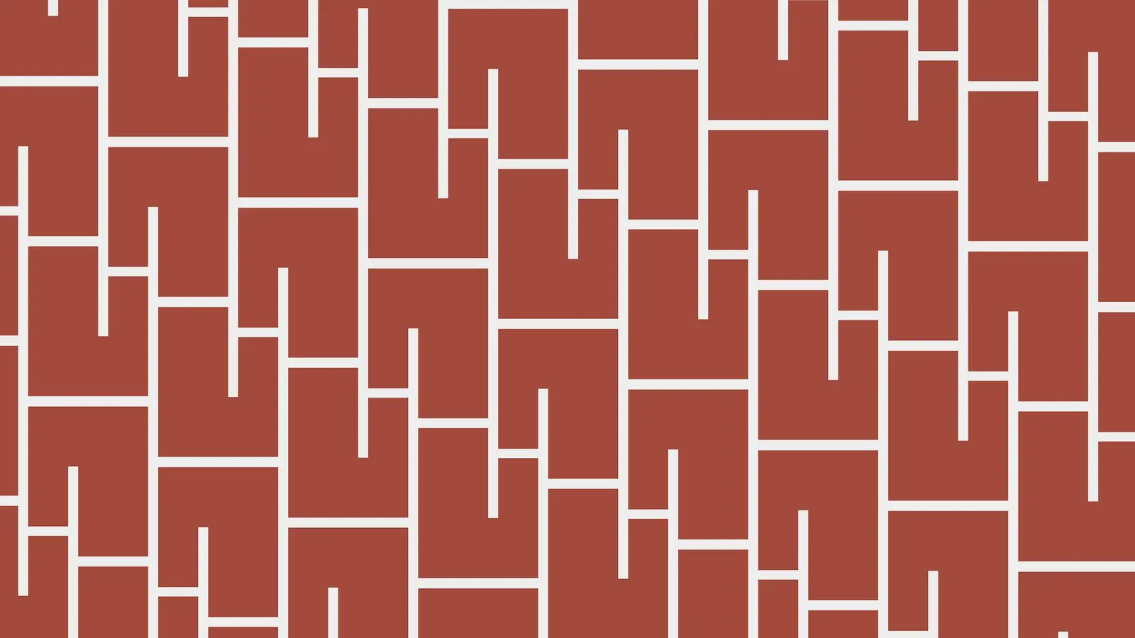
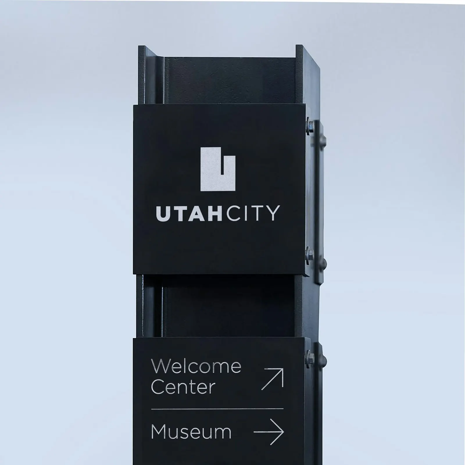
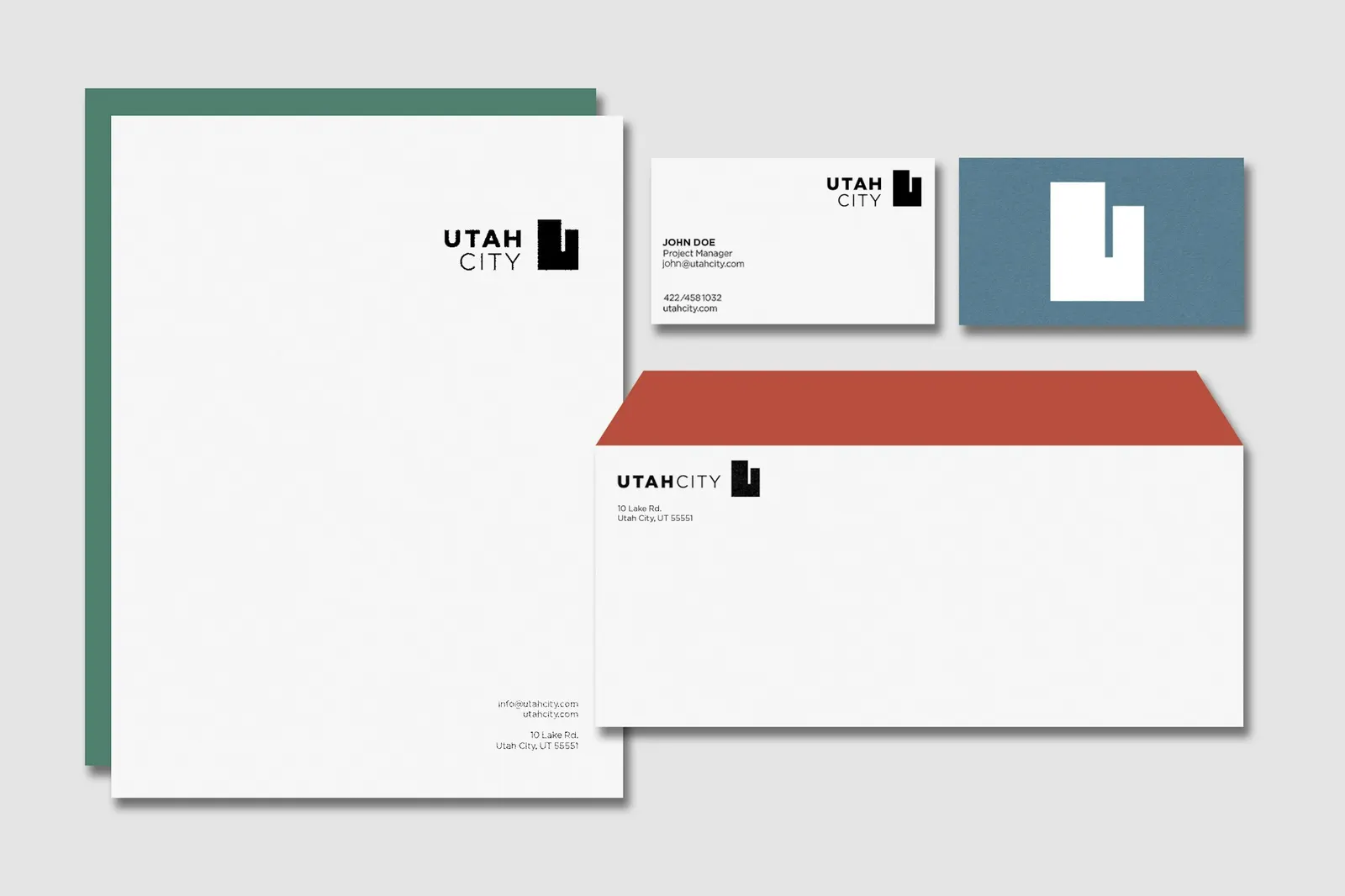
The mark joins a capital U, shaped like the outline of the state, with a spare skyline. The wordmark is all-caps Gotham, run together, with "Utah" in Black. DJ Stout and Davian-Lynn Hopkins designed it, and the studio followed with guidelines for lockups, supporting type, and a palette drawn from Utah Lake's eastern shore, with colors named Obsidian, Cloud, Lake, Life, Clay, and Hive.
Why it works
The name does the heavy lifting, and the identity wisely doesn't compete with it. A state-shaped U is an obvious idea, but it's the right one: it claims the territory, it's simple enough to hold up at small sizes, and the skyline turns a letter into a place. The weight contrast in Gotham keeps "Utah" in front while "City" stays steady, so the wordmark reads as civic rather than as real estate marketing. The landscape-based palette gives a site built on industrial land a sense of roots it can't yet show on the ground.
Applications
Color
Logo





Images and video from pentagram.com, by Pentagram.