The Brand Monograph
VerdX brand identity by Chittco
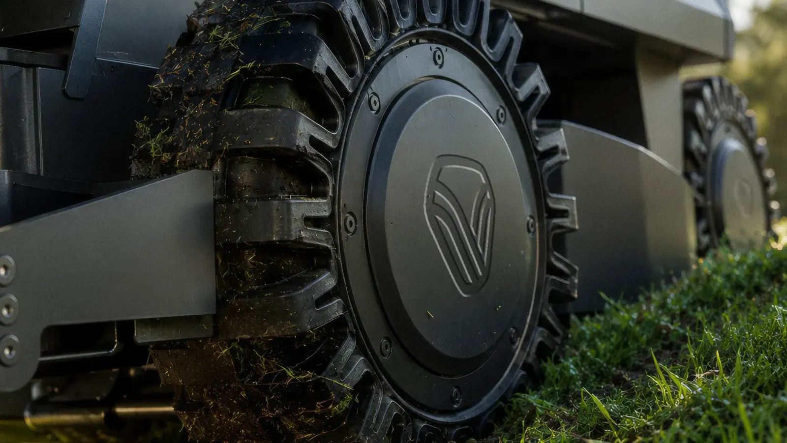
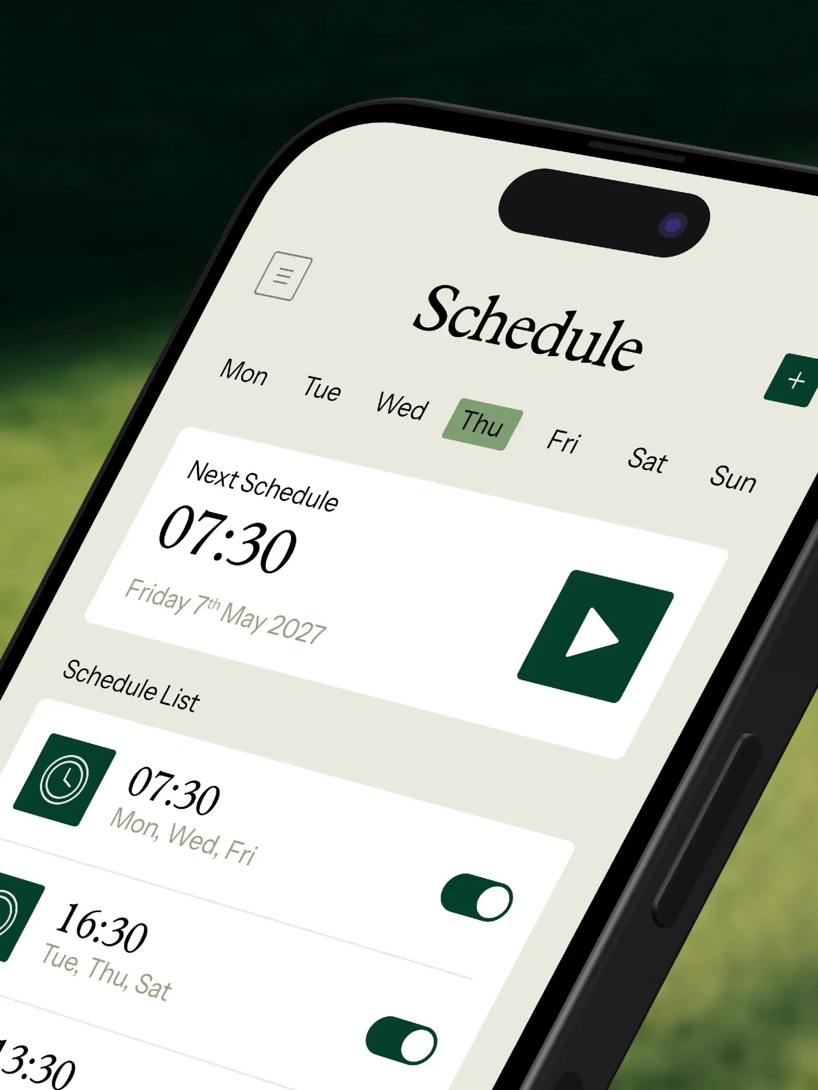
↗Most robot mower brands look like either a heavy-equipment catalog or a startup pitch deck. Chittco's identity for VerdX, an all-wheel-drive mower built for slopes and uneven ground, takes a third route: a machine that is clearly capable, presented in a way that feels friendly enough to leave in your yard.
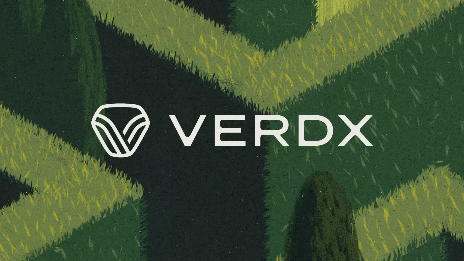
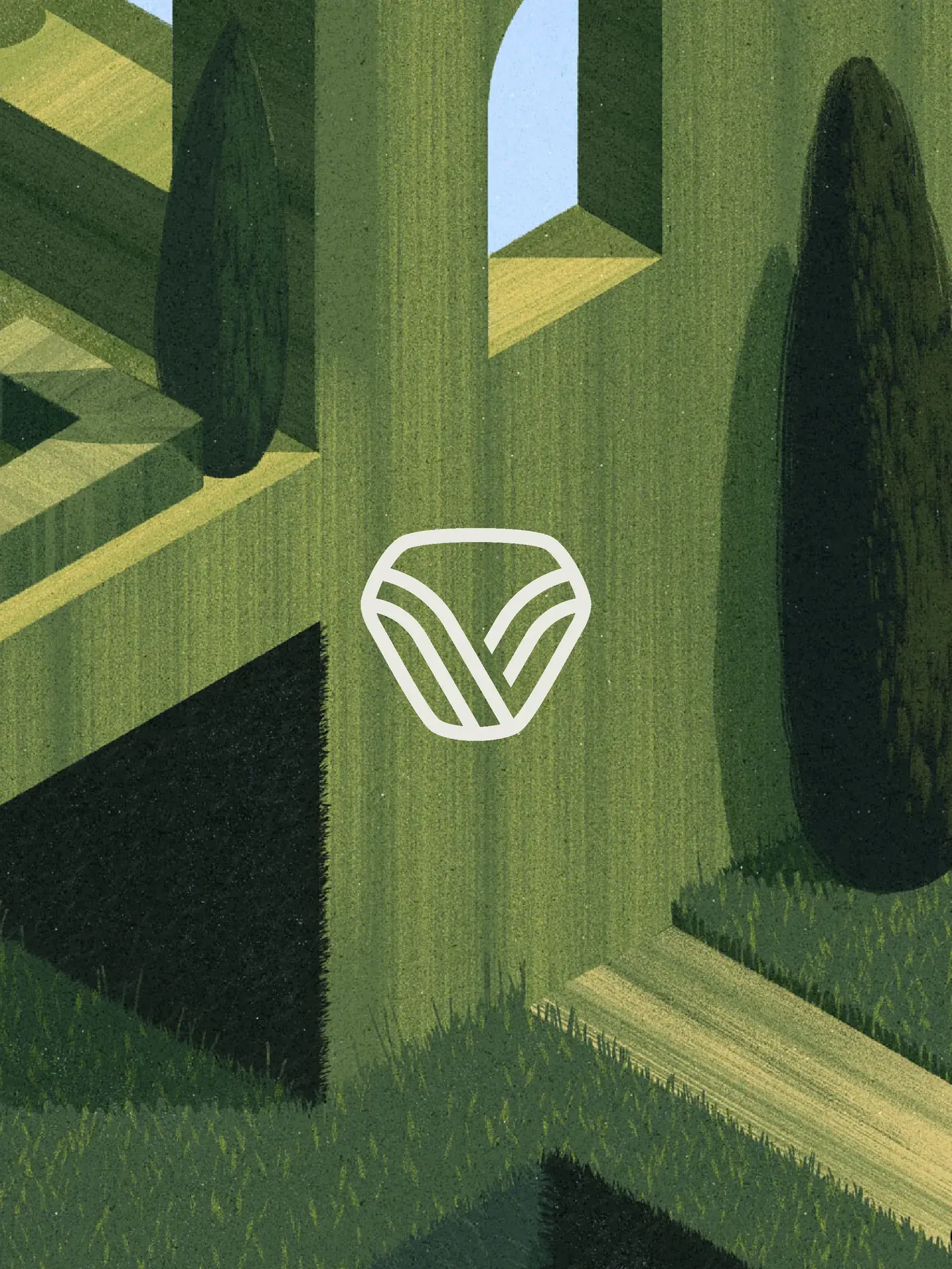
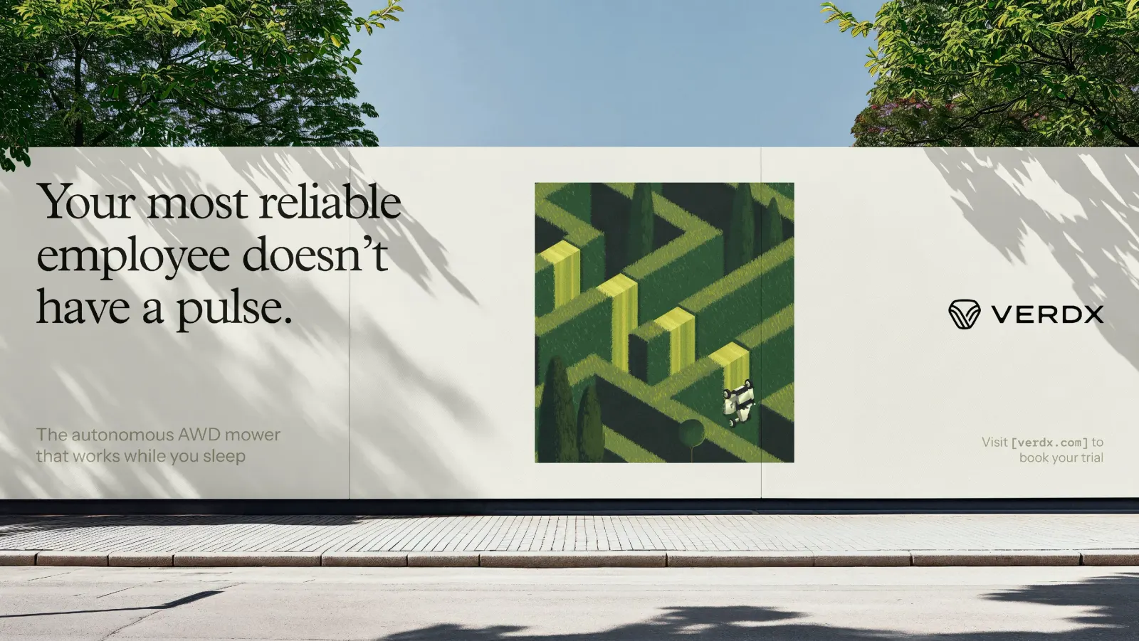
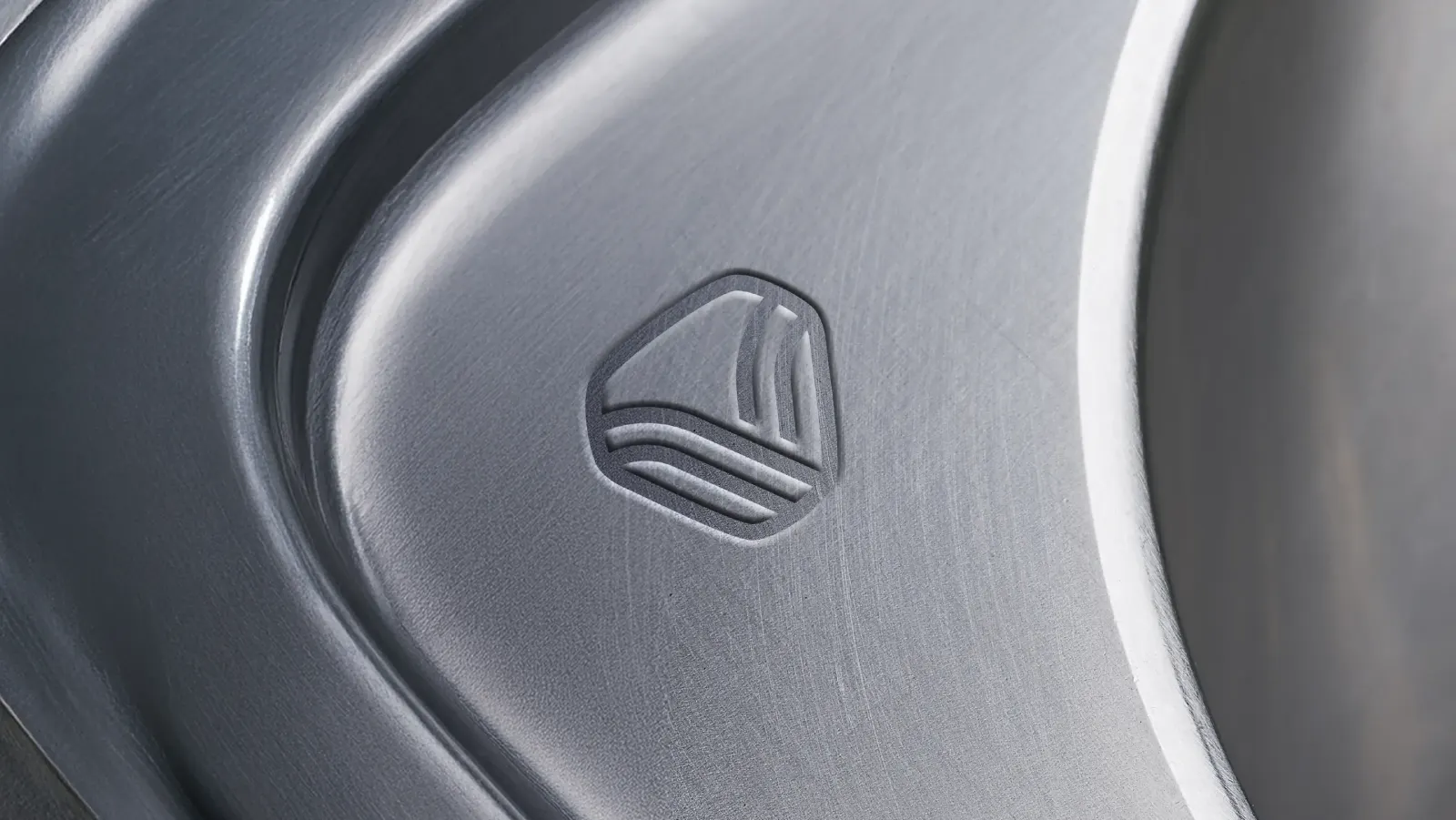
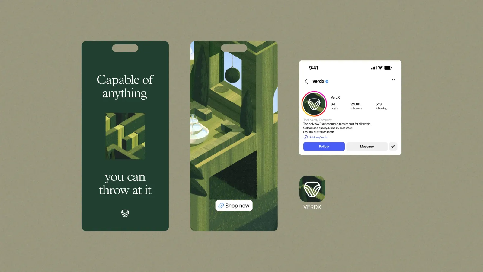
The mark is a stylized V inside a triangular hexagon, with mowing stripes and hillside angles built into its form and no product tied to it. The wordmark echoes those angles with hard edges and softened corners. Plantin MT Pro headings, Instrument Sans, and a mono for specs nod to vintage print ads. Myriam Wares added three grainy, isometric illustrations in an Escher spirit, while darkened earth tones replace the usual neon green.
Why it works
The smartest move is restraint where competitors shout. The dark, earthy palette reads as premium and makes the product look at home on a lawn rather than in a lab. The serif headlines bring warmth and authority, while the mono keeps spec comparison honest for buyers who do their homework. The mark is the real workhorse: it hints at terrain, the product's one true advantage, yet stays open enough to stretch across future products. The illustrations then give the brand a world to live in, not just a logo to wear.
Applications
Logo



Images and video from chitt.co, by Chittco.