The Brand Monograph
Sinfonia Varsovia
by TOFU Studio
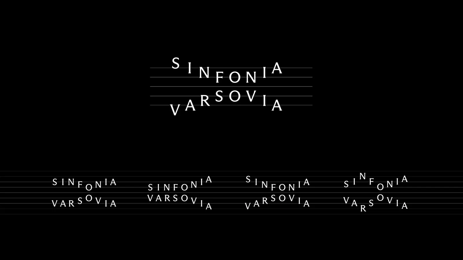
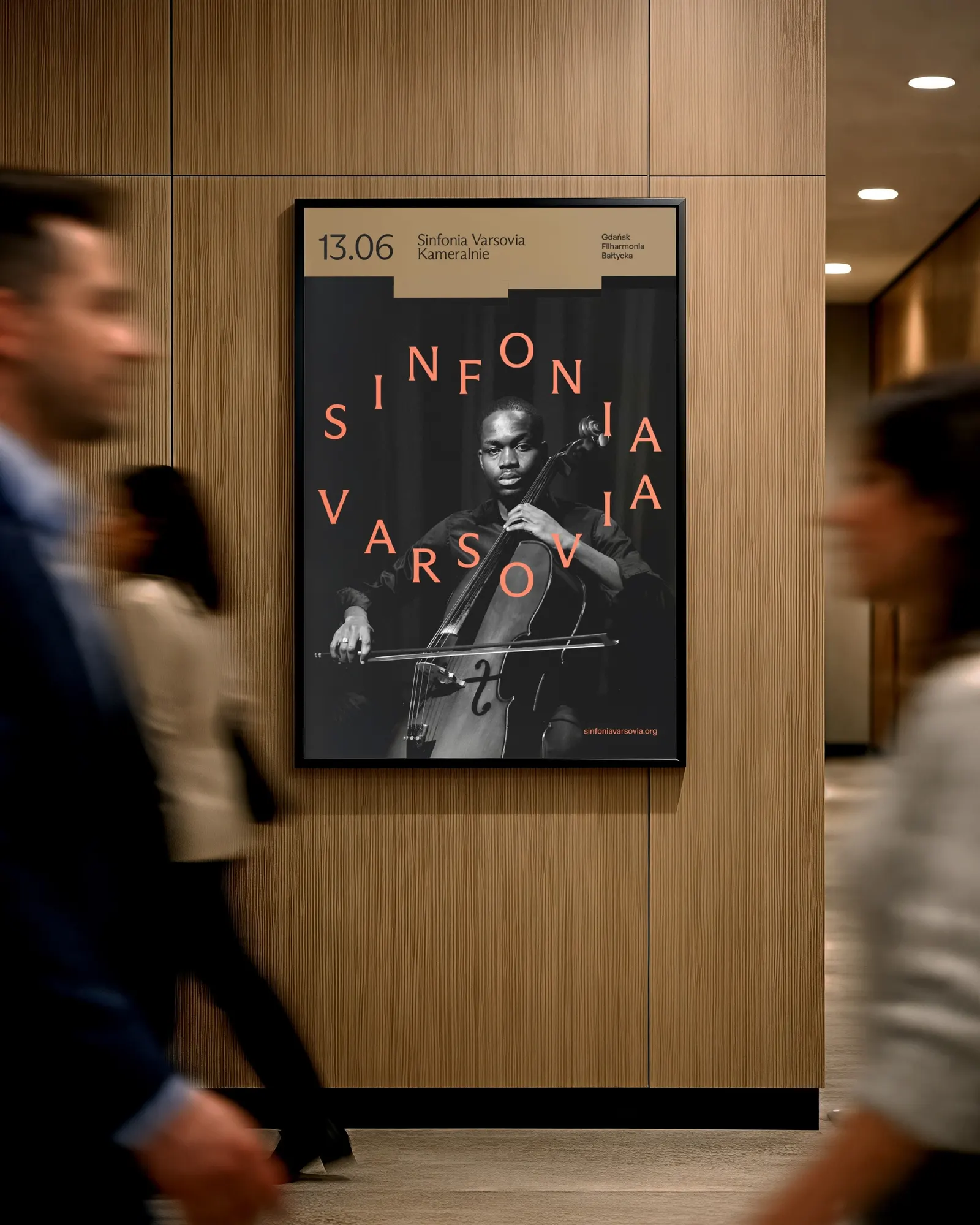
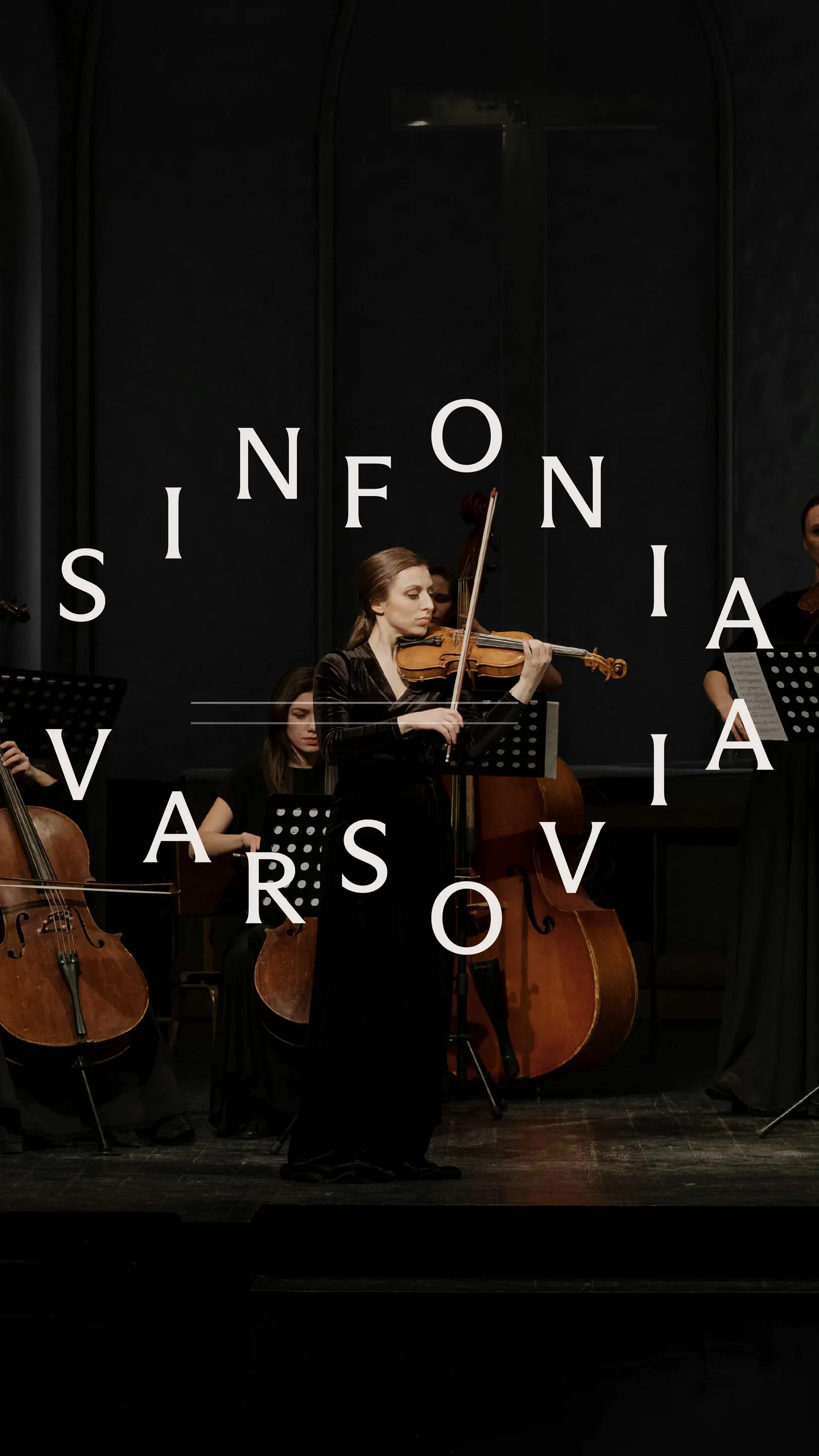
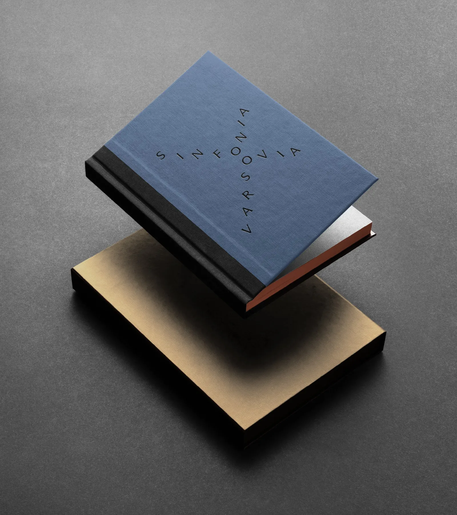
TOFU Studio's identity concept for Sinfonia Varsovia turns the logo into something close to an instrument. Letters sit on a staff like notes, and the mark can be rearranged, variation by variation, to "write" a composition of its own. It was never implemented, since the competition remained unresolved, but the thinking holds up on its own.
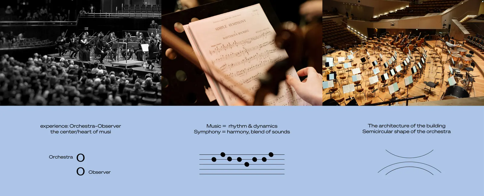
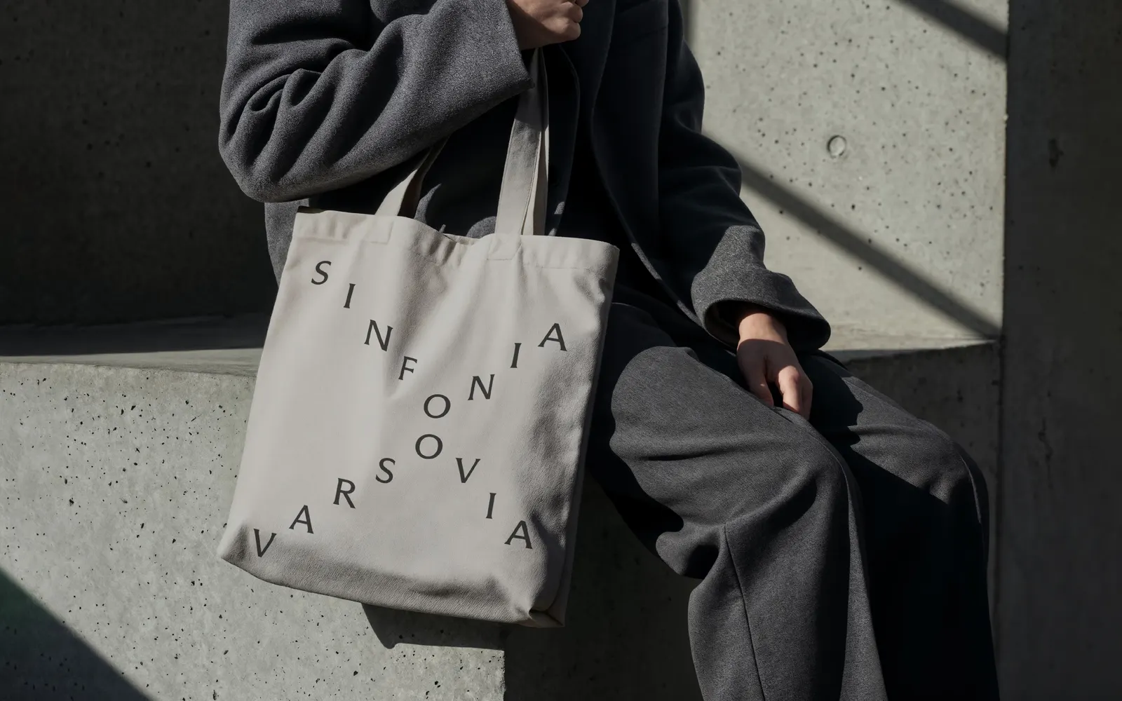
The brief was an identity for the Warsaw orchestra, known for international collaborations, a wide repertoire, and educational work, as its new music centre takes shape. TOFU Studio built the idea around harmony: distinct elements merging into one dynamic whole, and a shared moment between audience and orchestra. The stacked letters stand in for many tones sounding at once, while a semicircular line echoes both the orchestra's shape and the building's interior architecture.
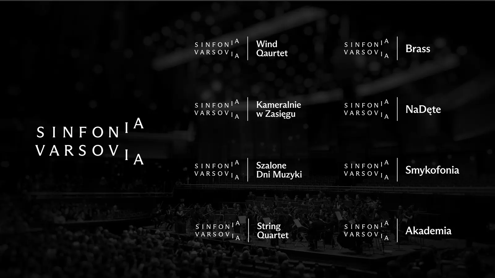
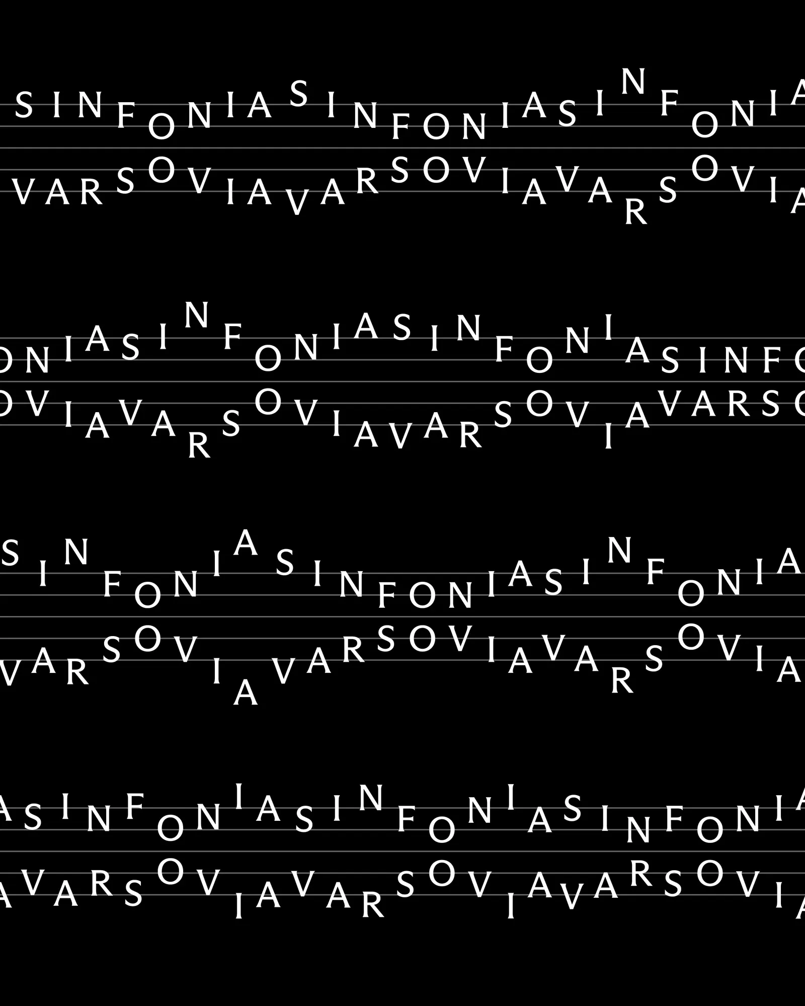
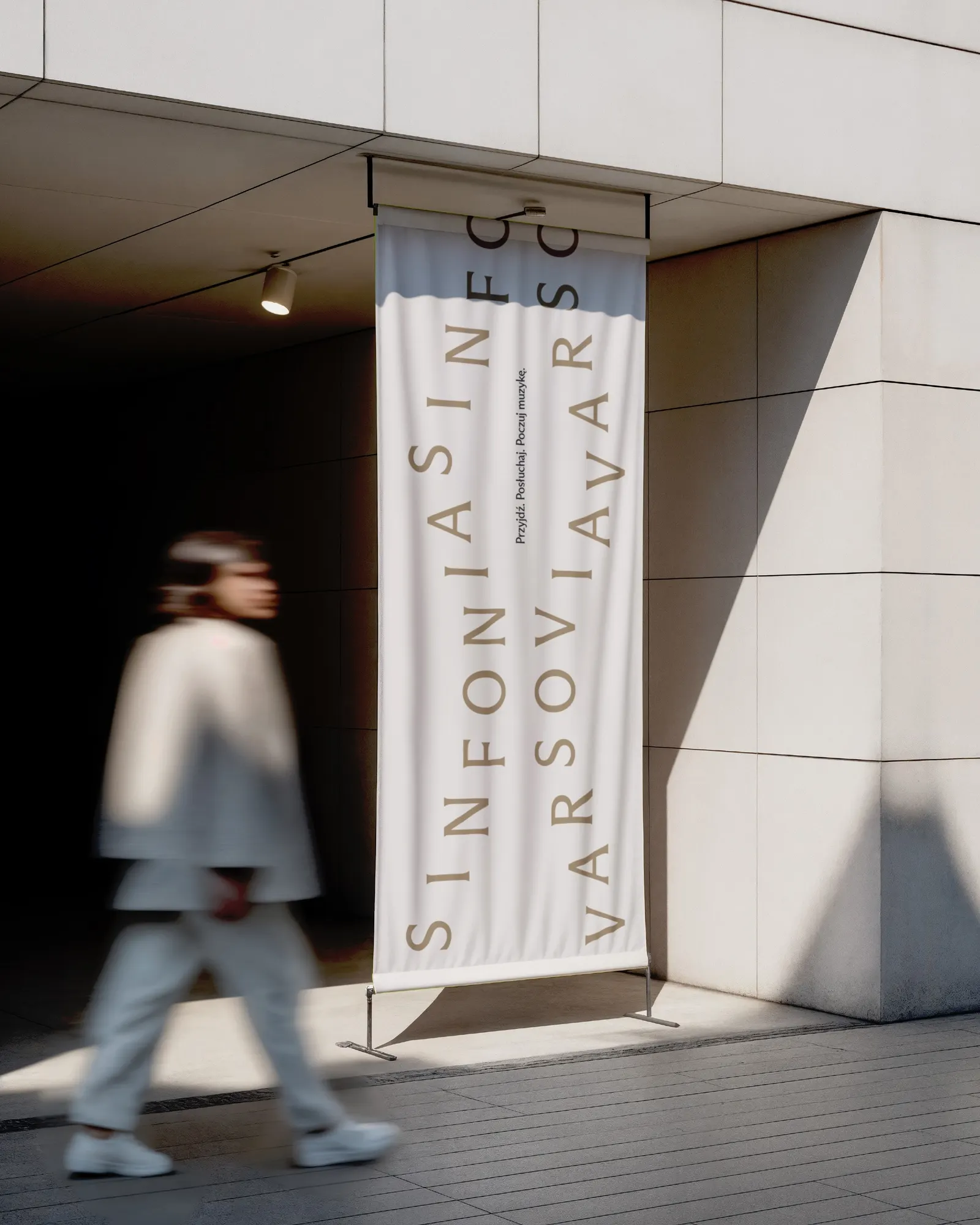
The craft shows in how far the system stretches. A simplified version of the mark opens up sub-brands for smaller ensembles, education, and festivals. In the key visual, the logo repeats and combines into a long, continuous score, joined by an elastic form derived from the mark that adds energy and keeps layouts orderly. Designers Anna Holik and Weronika Cyganik shaped the identity with motion designers Daniel Naborowski and Marcin Chyliński, and the result moves through rhythm, repetition, and modulation without losing clarity.

Images and video from tofu.pl, by TOFU Studio.