The Brand Monograph
Purple Garden brand identity by Mother Design
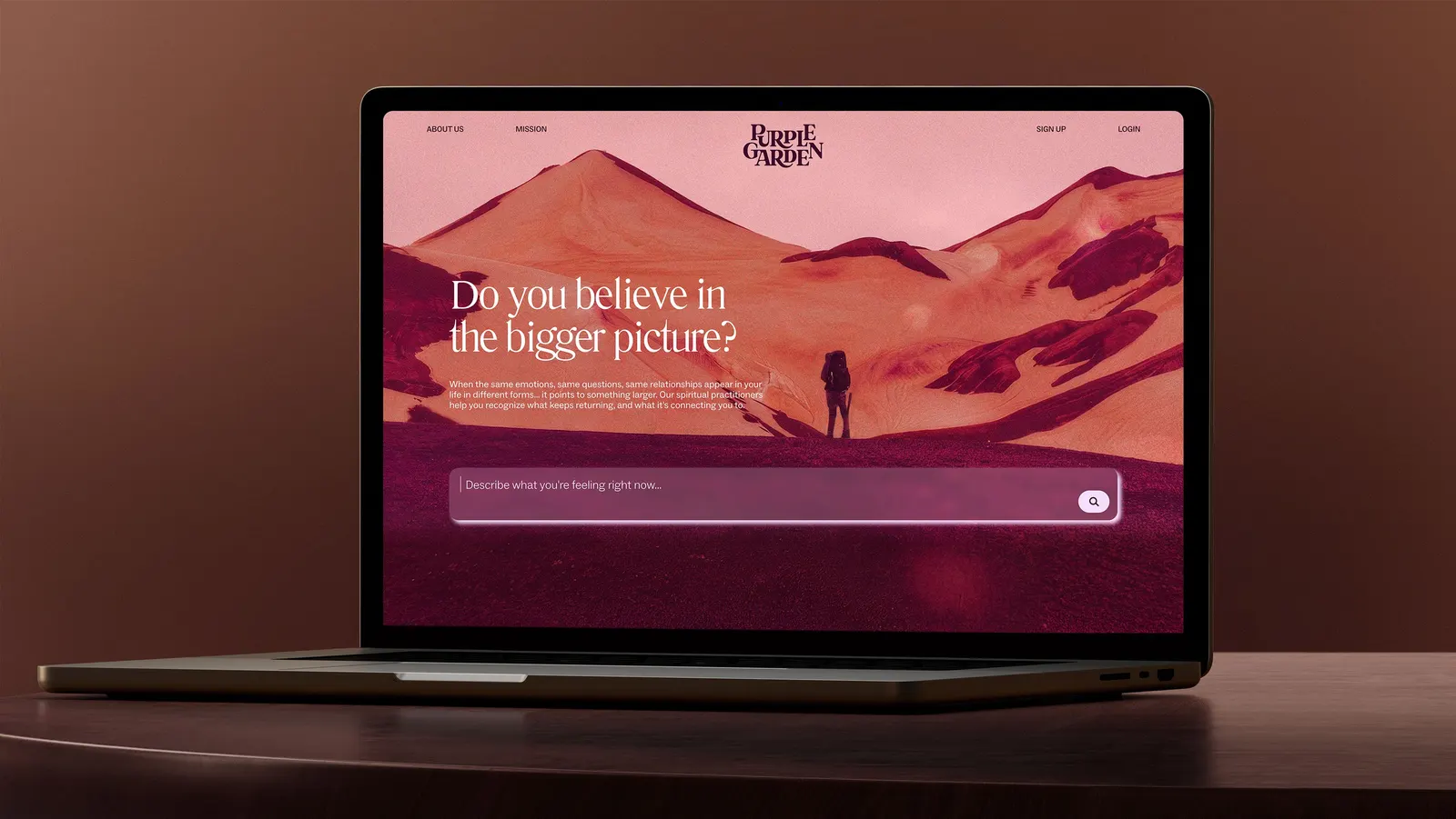
↗Purple Garden's identity stands out by treating spirituality as something to tend rather than something to rush. Mother Design set it against a category of stock mystic imagery and "act now" urgency, and made a brand that feels warm, human, and unhurried.
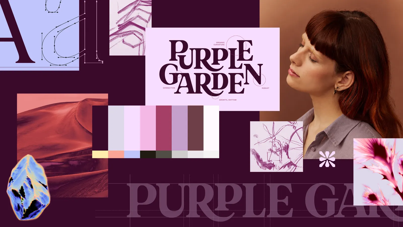
The brief was to bring the feeling of sitting across from a practitioner to a phone or laptop. Mother Design began with a séance, in which a Purple Garden practitioner led the team through automatic drawing exercises inspired by Hilma af Klint. Those drawings fed the brand idea, "A Living Practice," which puts human connection first and values the slow work that leads to clarity. The voice follows suit, balancing forward momentum with quieter, reflective moments.
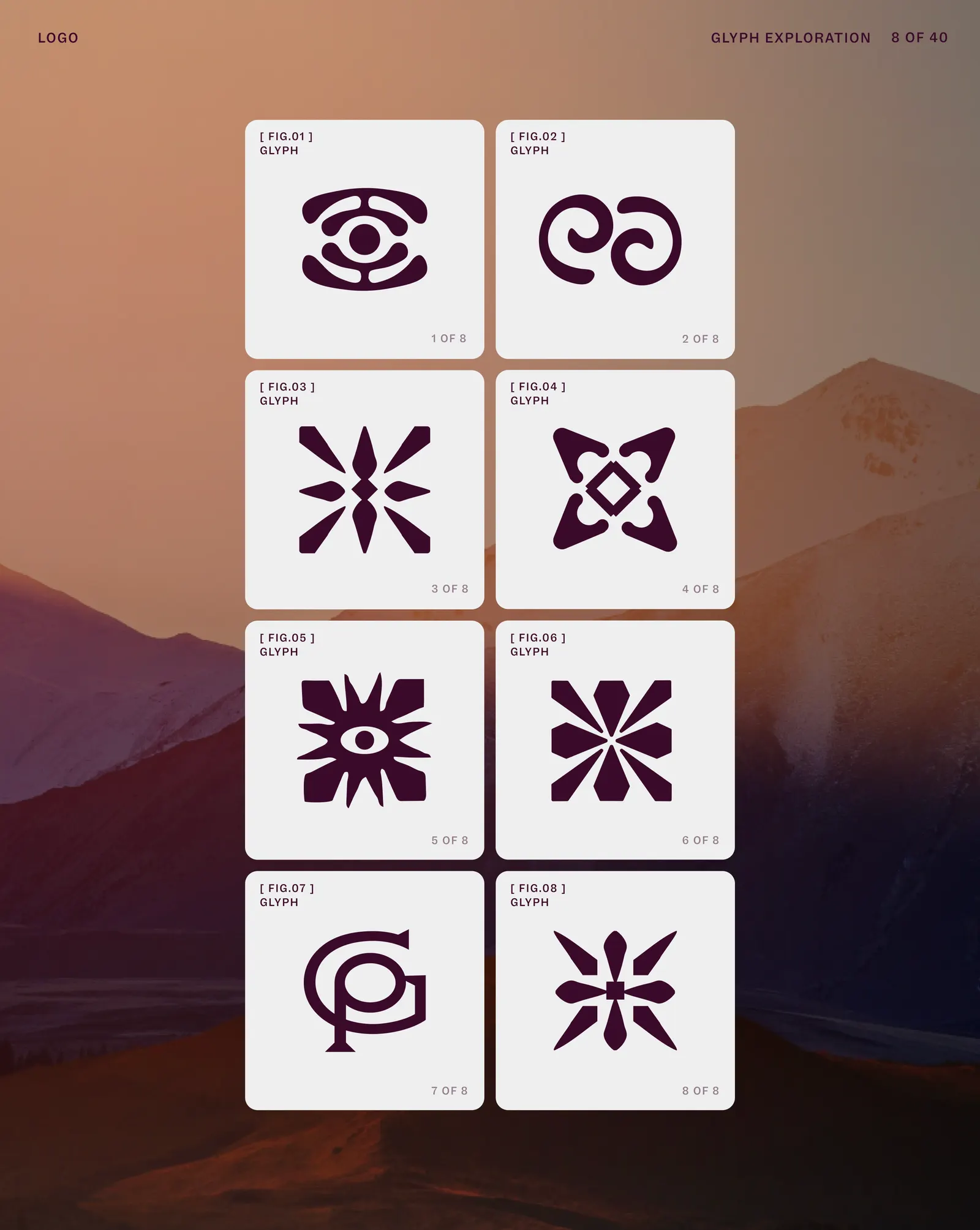
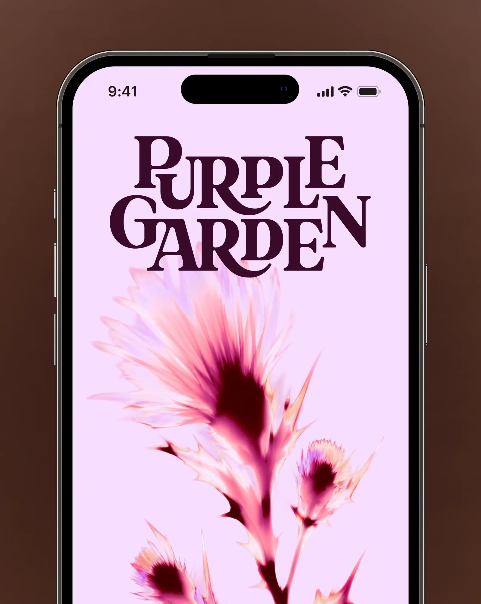
The craft is in the details. The wordmark suggests growth and cultivation yet stays functional on screen, while the glyph draws on flora, crystals, and charged energy. Instead of the bluish purple the category defaults to, the studio built a palette of seven warm purples, supported by secondary colors drawn from dawn, dusk, and moonrise. Living Type, shaped by cymatic patterns and atomic systems, keeps the identity in motion, and solarised neon surges express the energy exchanged in a session. Mother Design moved between traditional tools and AI to let assets evolve, then anchored everything in a design system that lets teams adapt the brand across platforms.
Logo
Typography

Applications

Images and video from motherdesign.com, by Mother Design.