The Brand Monograph
Banco Itaú brand identity by Pentagram
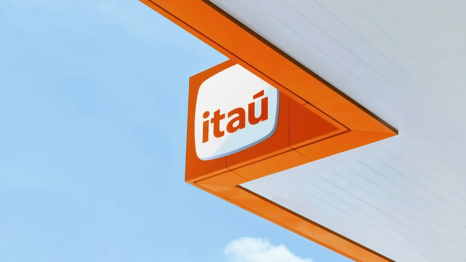
↗Few banks own a shape the way Itaú does. Its rounded square has marked the brand since the 1970s, but app icons have since turned that silhouette into common property. For the bank's centenary in 2024, Pentagram worked with Itaú's in-house design team to make a form only Itaú could claim.
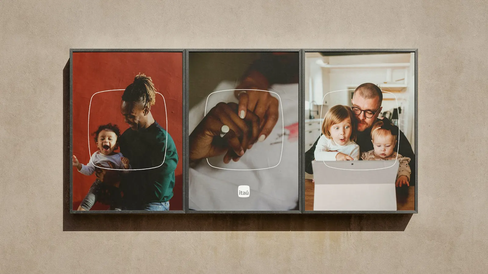
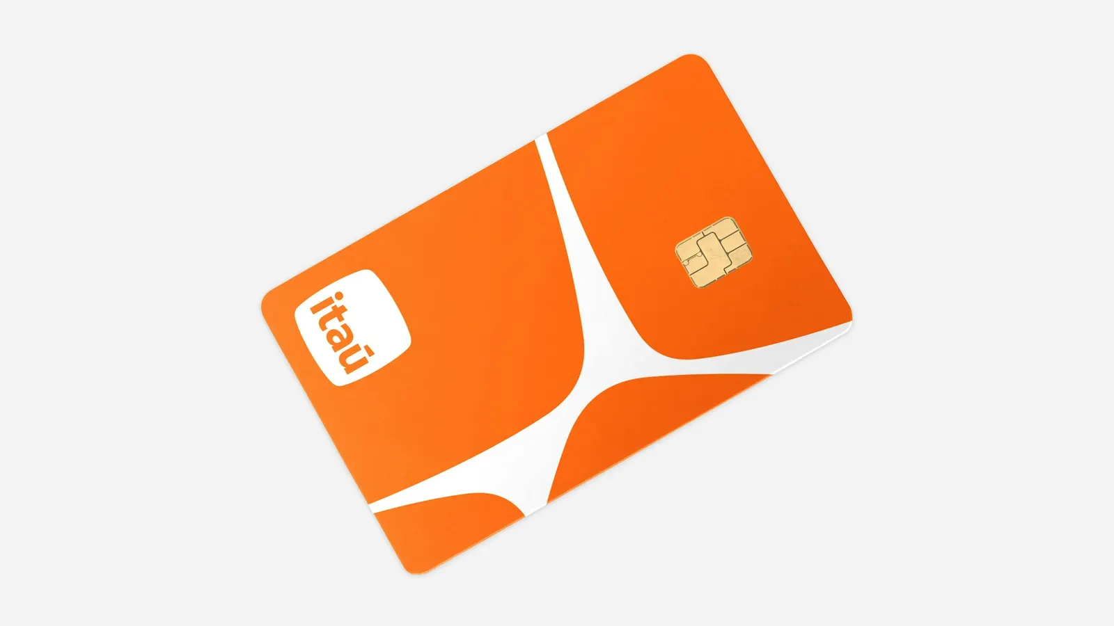
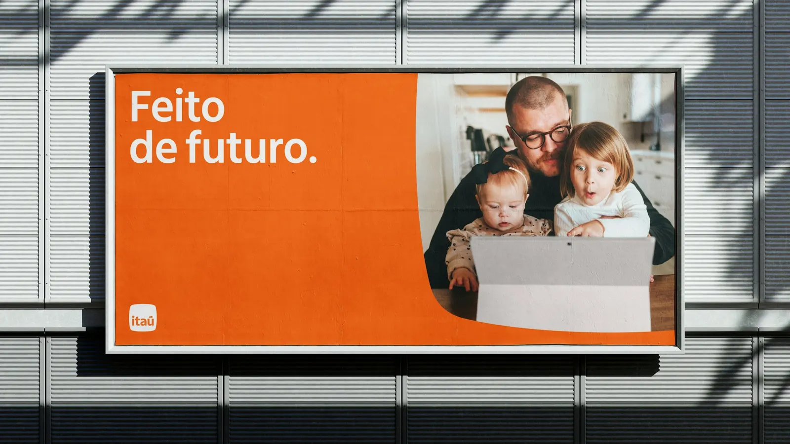
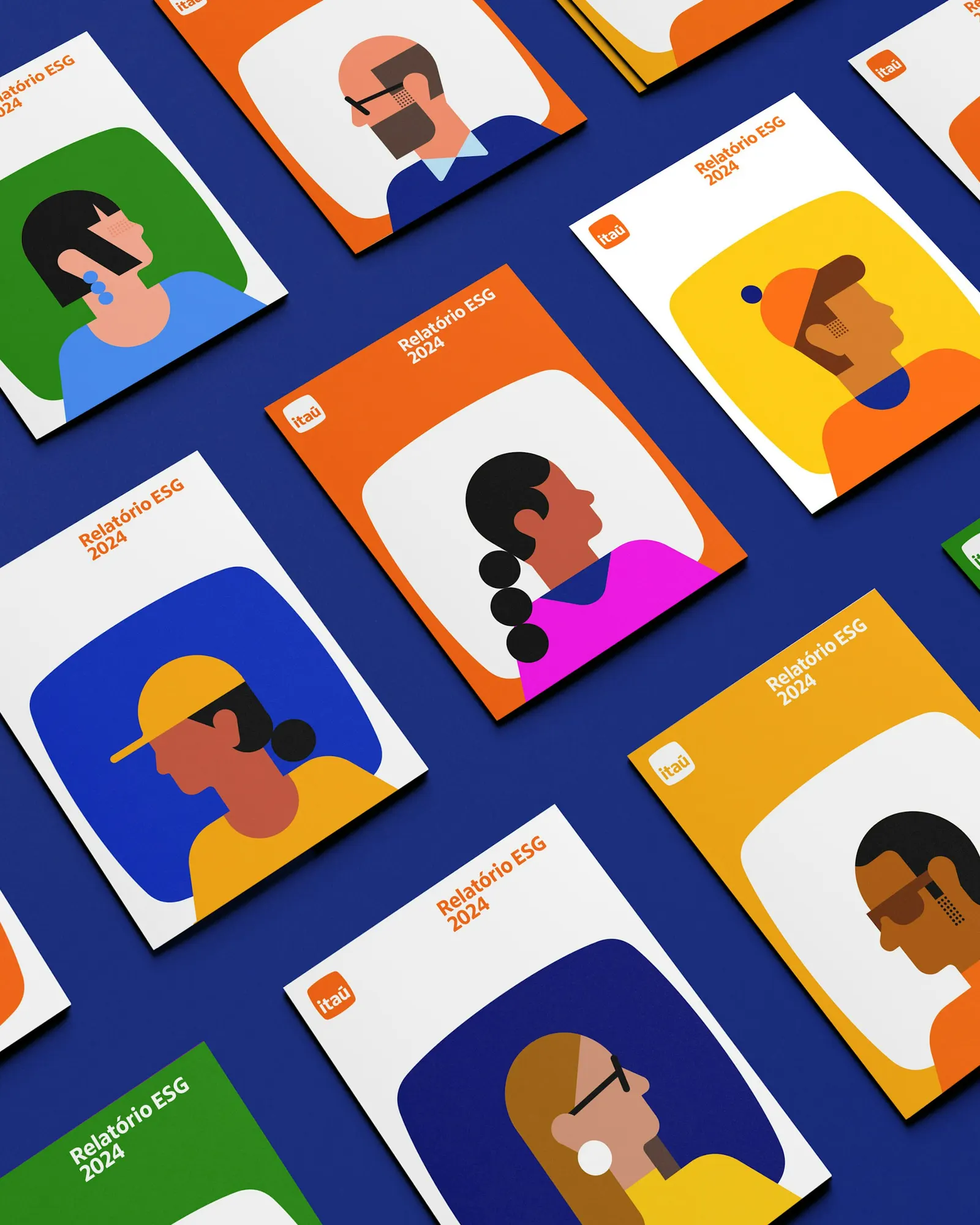
Larger corner radii and swelling sides produce the pedra, a softer outline named for the Portuguese word for stone and tied to Itaú's own name, which means black stone in Tupi-Guarani. Michael Bierut, Camila Pérez, Jonny Sikov, and Lauren Rush also reshaped the logotype on Dalton Maag's humanist sans, developed with Fabio Haag Type and Commercial Type, with fuller letters, a round dot on the i, and a balanced accent over the u. Orange now leads a wider Brazilian palette, and the stone doubles as image frame, pattern unit, and hidden detail in illustrations.
Why it works
The smartest move is treating a shared shape as raw material. With every phone wrapping icons in a rounded square, the old mark risked vanishing into the grid. A slightly irregular stone stays recognizable even without the wordmark, and it carries meaning from the bank's name. The type matches that softness, and the round dot and open forms feel friendly at a scale where a bank needs to seem personal. Promoting orange gives Itaú a color to own in a sector that leans on blue, while the broader palette keeps the system distinctly Brazilian.
Applications


Images and video from pentagram.com, by Pentagram.