The Brand Monograph
Chime brand identity by JKR
↗JKR's work for Chime stands out because it treats a bank like a consumer brand rather than an institution. Category advertising has long leaned on suburban milestones like houses and boats, so the studio started from a different audience: people who manage money on their phones, want to be paid sooner, and don't want the experience to feel dull.
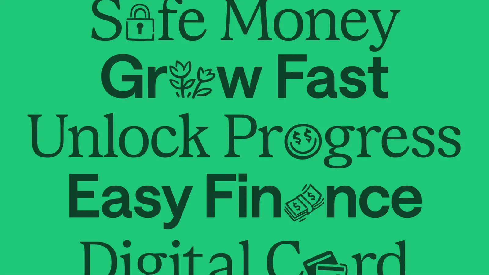
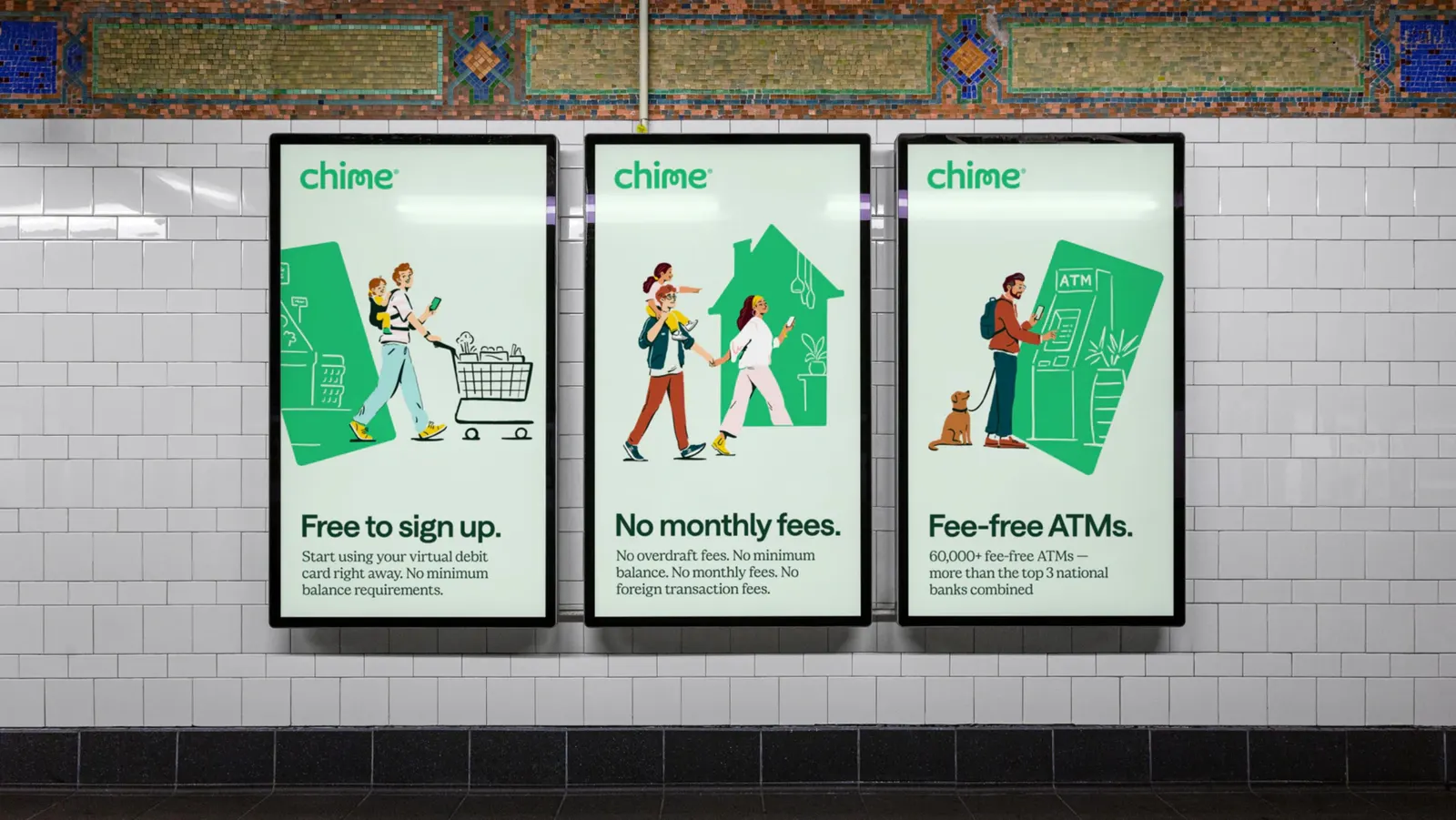
The idea behind the identity is progress as a passage, a way through to something better rather than a place you visit. JKR built the expression with outside specialists. Colophon Foundry and Displaay Type Foundry handled typography, and illustrator Marco Palmieri shaped the imagery. Bringing in two type foundries and an illustrator suggests a system that relies on letterforms and drawn work to carry personality, which is where many financial brands fall flat.
Why it works
Banking brands tend to look alike, with safe, reassuring type and stock imagery of families and homes. This identity avoids that by putting its craft where people actually meet the brand: in the typography and the illustration. Typefaces from specialist foundries give Chime a voice that reads as distinct and confident, and commissioned illustration keeps it from borrowing the category's visual clichés. For an audience that lives in an app and has been overlooked by traditional banks, those choices say the brand was made for them.
Applications
Logo
Typography

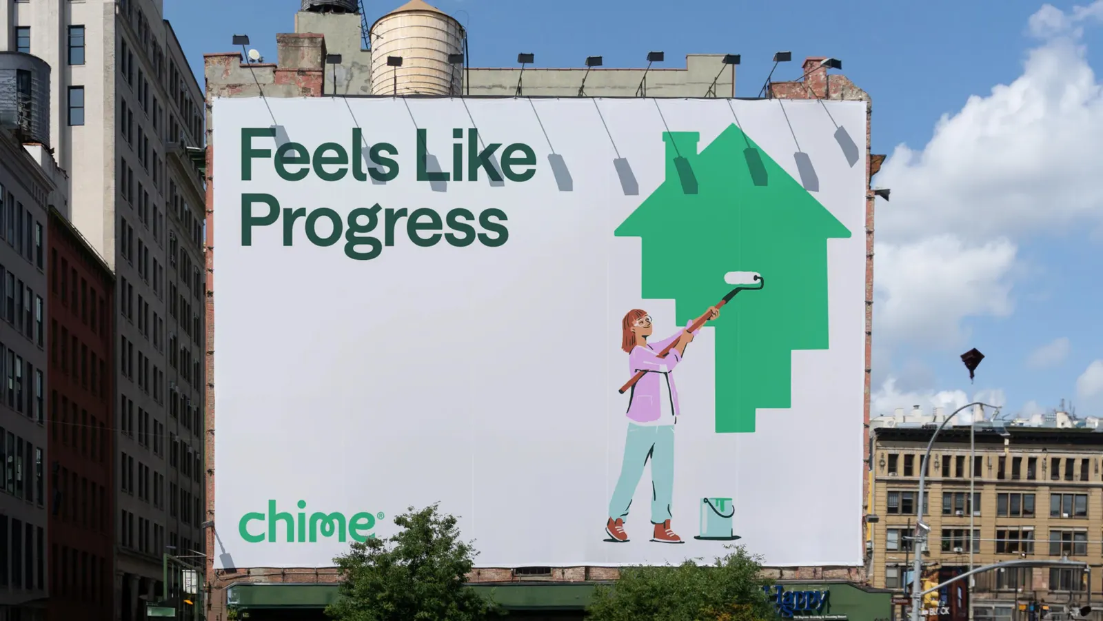
Images and video from jkrglobal.com, by JKR.