The Brand Monograph
Coach Potato brand identity by Echt brands
↗Most supplement brands sell the promise of more. Coach Potato, a new brand from Echt brands, sells restraint: products meant for long-term use that give the body what it needs and stop there. In a category built on intensity, it's a rare stance, and the studio gave it a face to match.
The brief was to earn trust in a market where shoppers are wary of newcomers. Echt brands answered with a positioning around moderation, a pun for a name, and a voice like a supportive friend rather than a drill sergeant. The identity centers on a mascot with a mullet, sunglasses, and a whistle, drawn in exaggerated proportions so he reads instantly. Around him, the studio set neon color, high contrast, and oversized type, plus sticker-like elements that keep digital and social work loose and flexible.
Why it works
The mascot does the persuading. He looks like the category's stereotype, the intense coach, then delivers the opposite message, and that gap is both memorable and disarming. The loud neon palette and oversized type make the brand hard to miss, while the humor keeps the volume from feeling like hype. Because the character carries the personality, the sticker elements can multiply across channels without diluting it. It's playful, but the restraint of the idea keeps it credible.
Applications
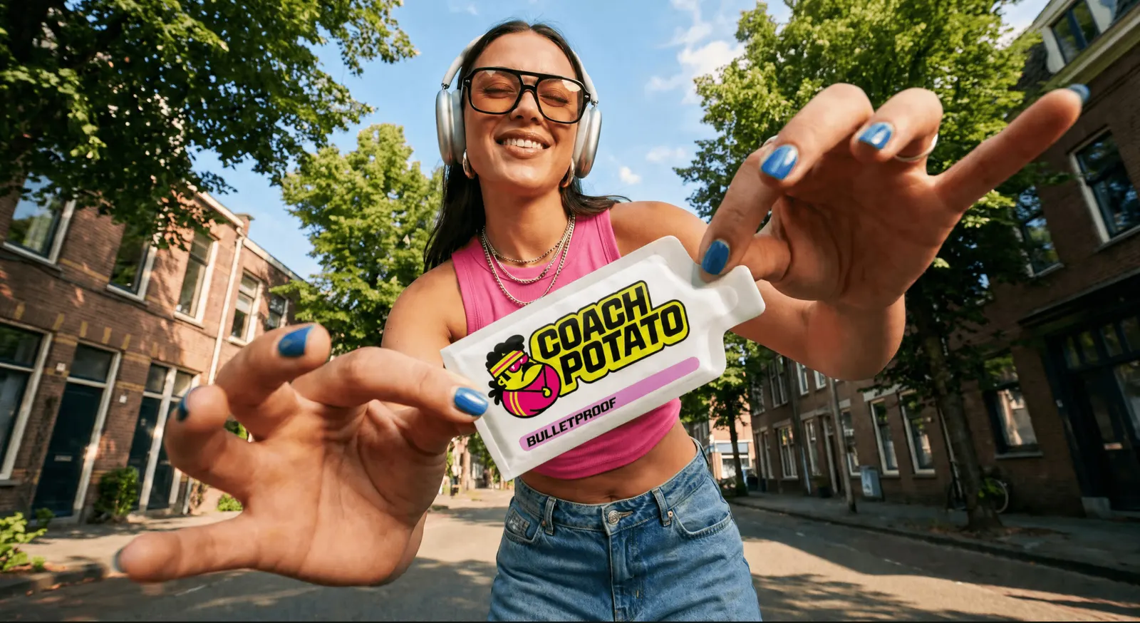





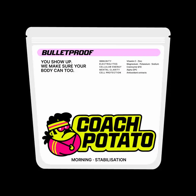

Images and video from echtbrands.com, by Echt brands.