The Brand Monograph
East London Liquor Co. brand identity by Ragged Edge
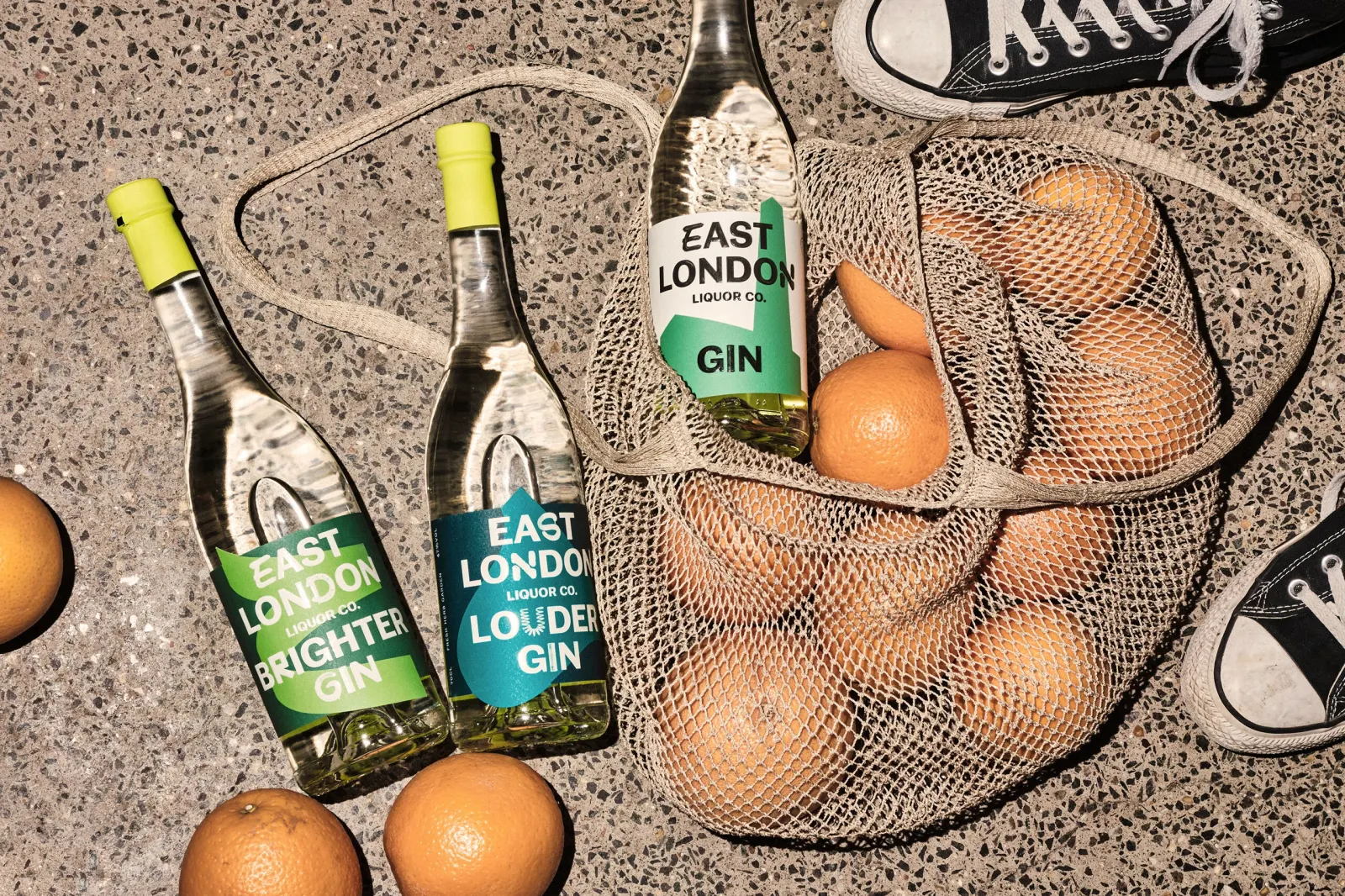
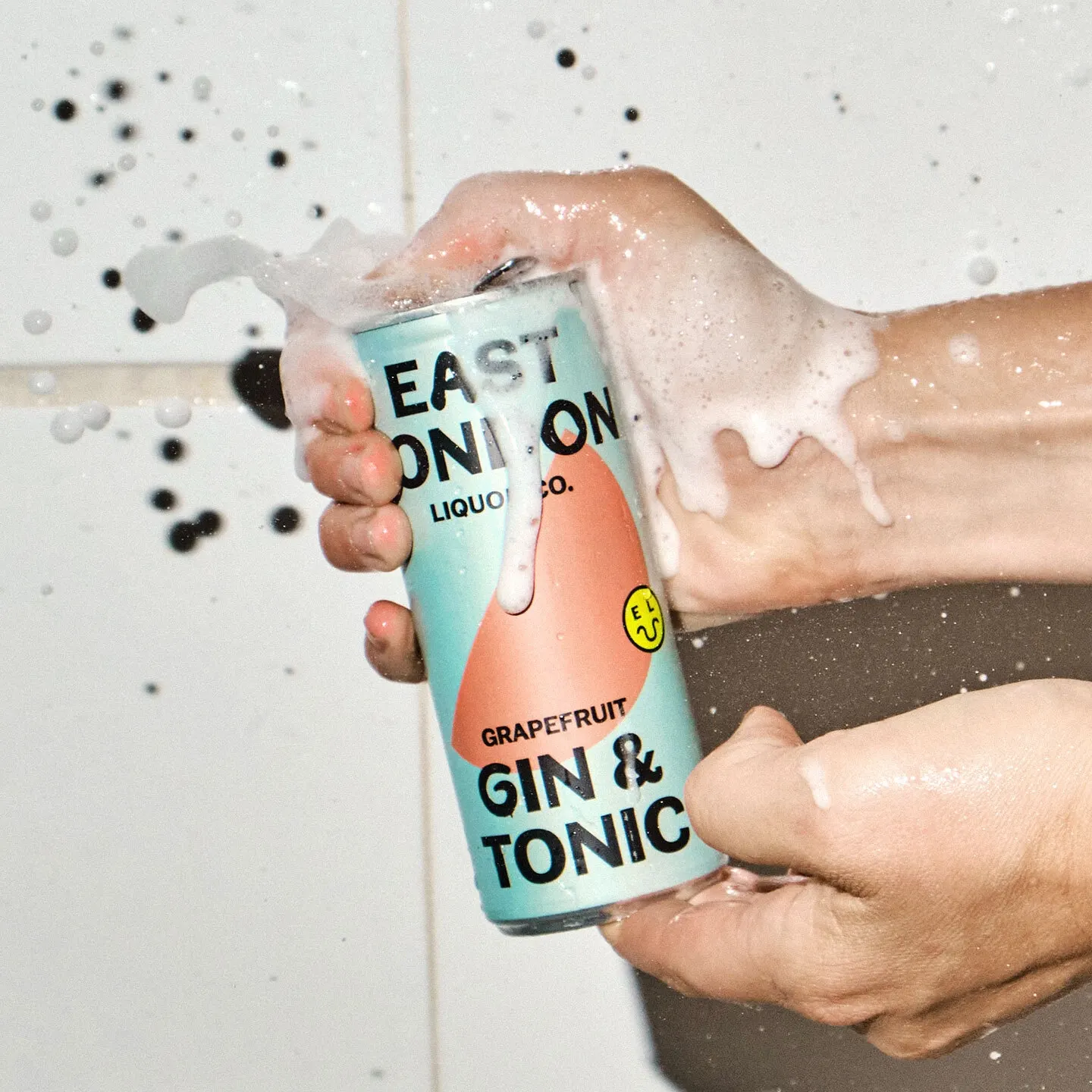
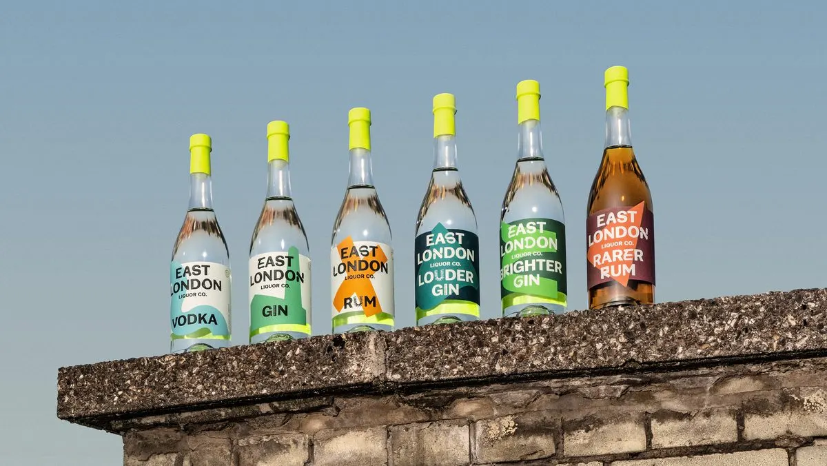
↗In a category where many bottles try to look handmade and expensive, Ragged Edge made East London Liquor Co. look loud, direct, and a little cheeky. The studio rebranded the London distillery, already a bar-trade favorite for its gin, vodka, rum, and whisky, as it moved into ready-to-drink cans and supermarket shelves.
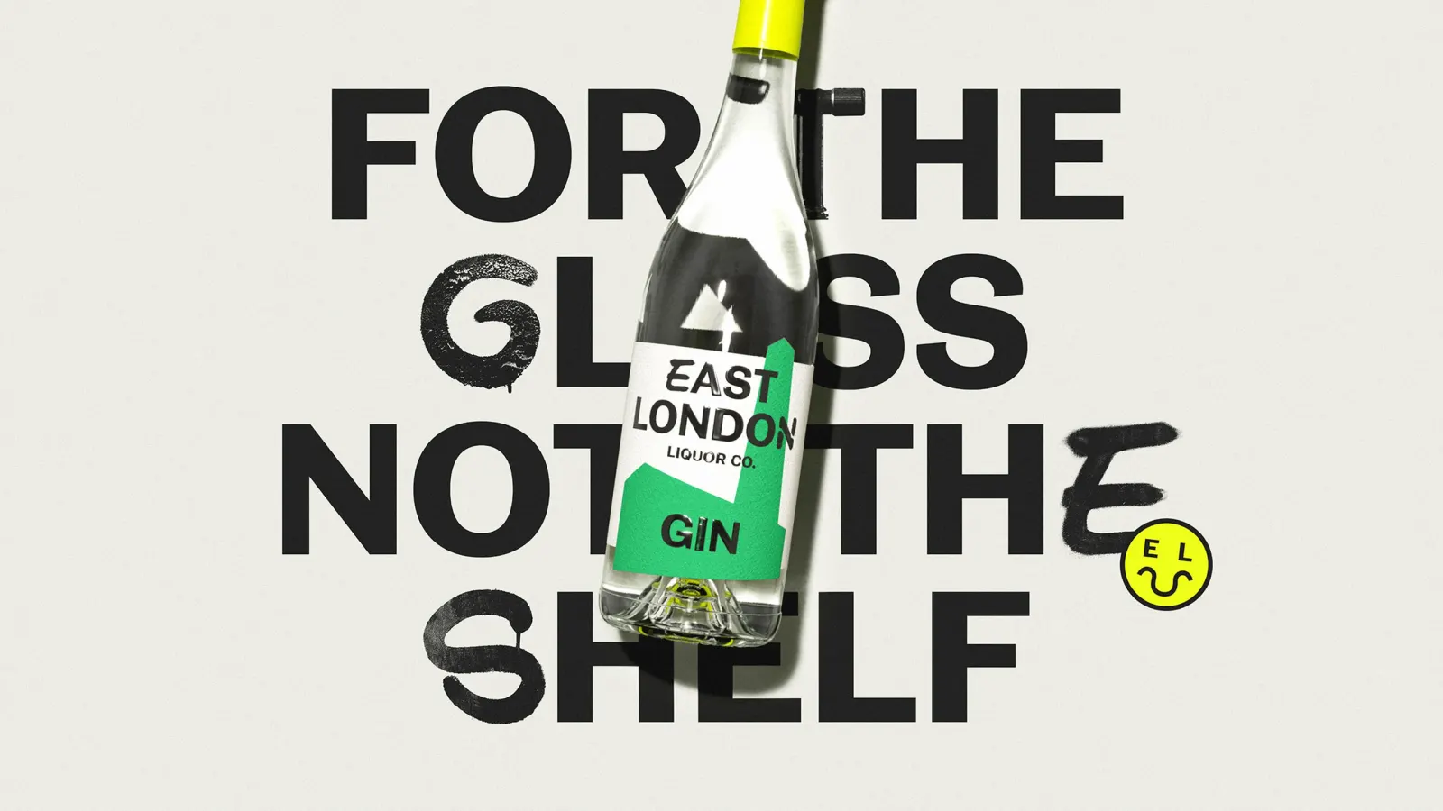
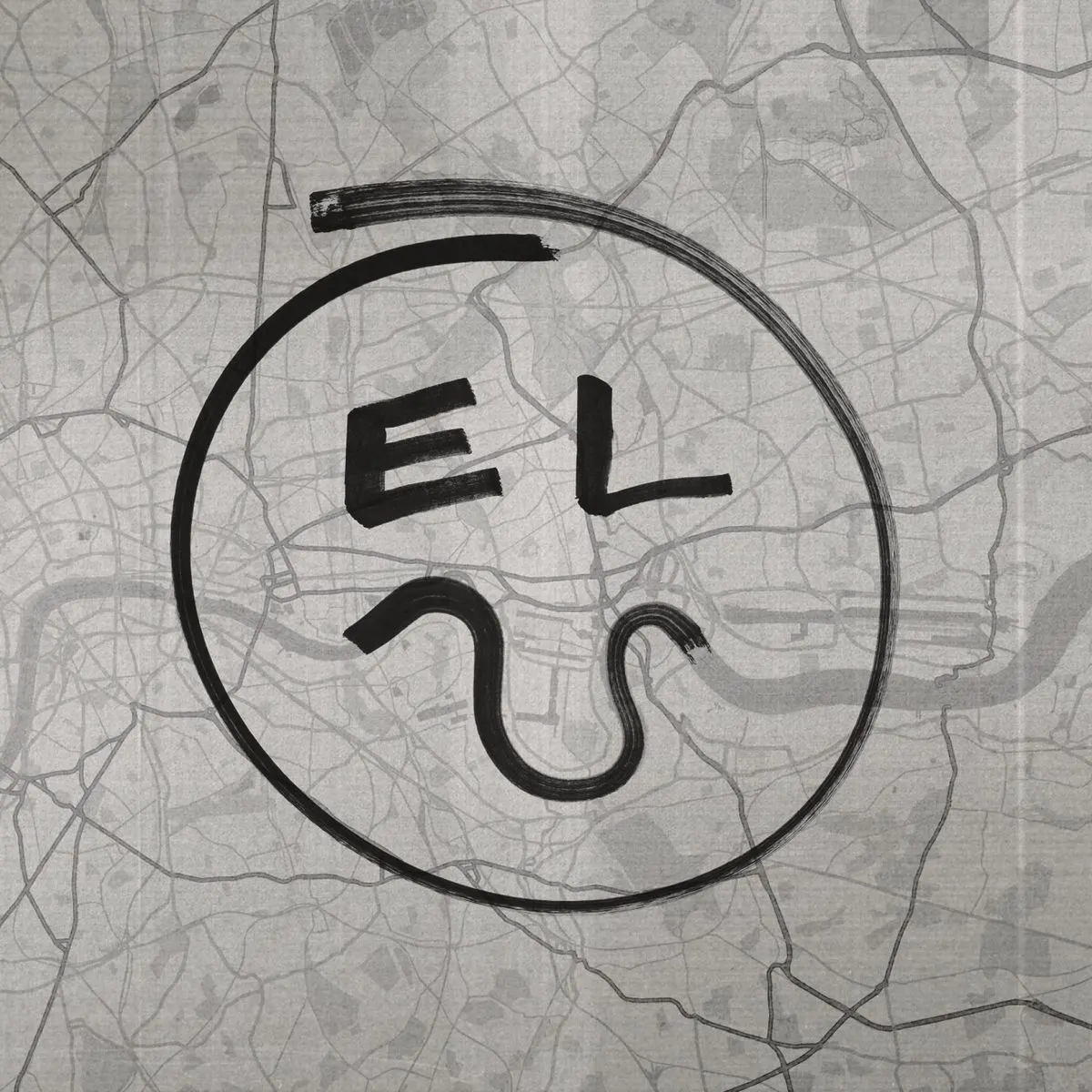
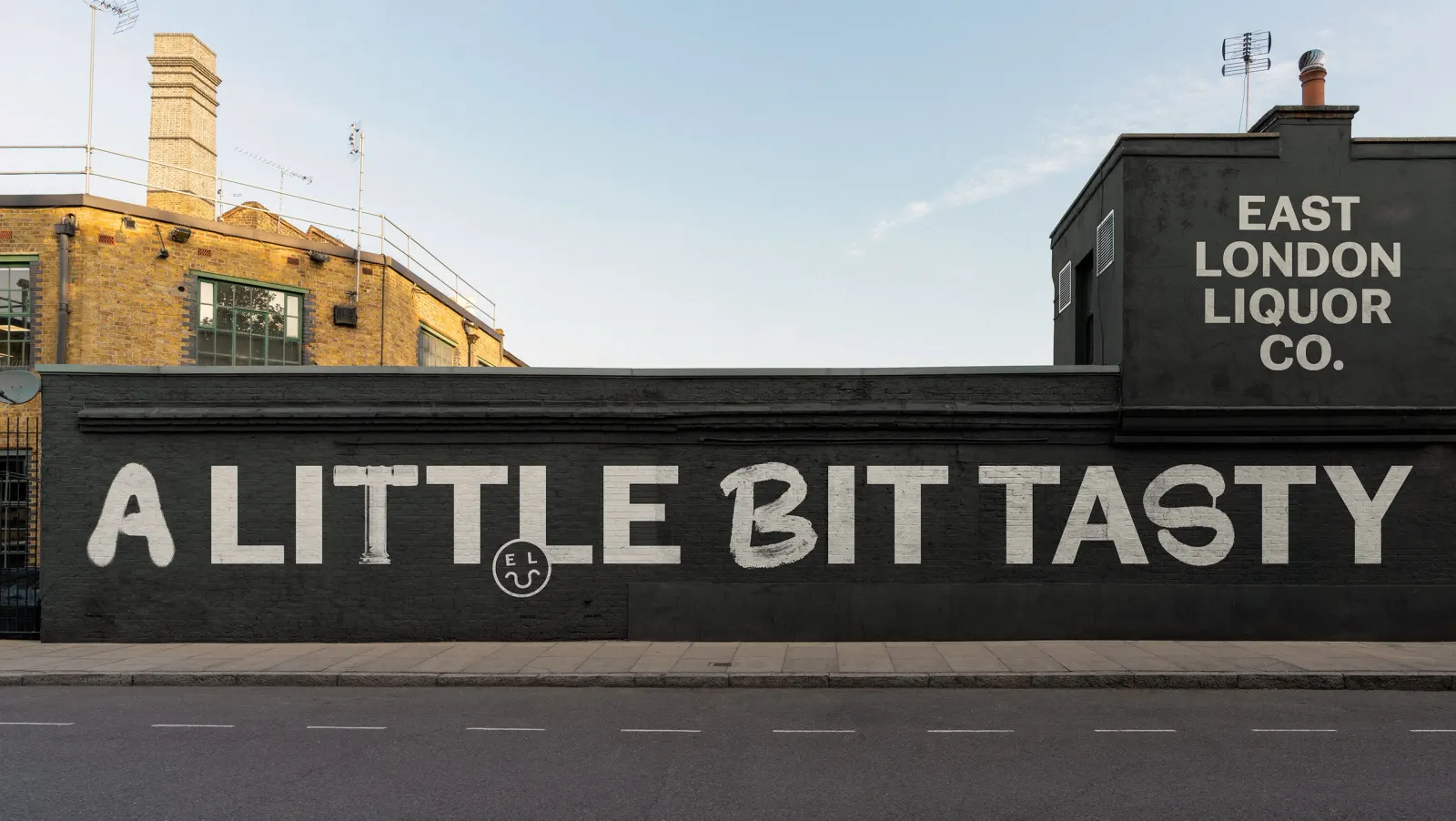
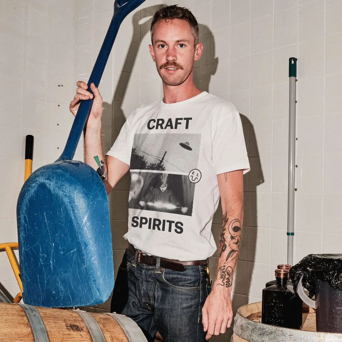
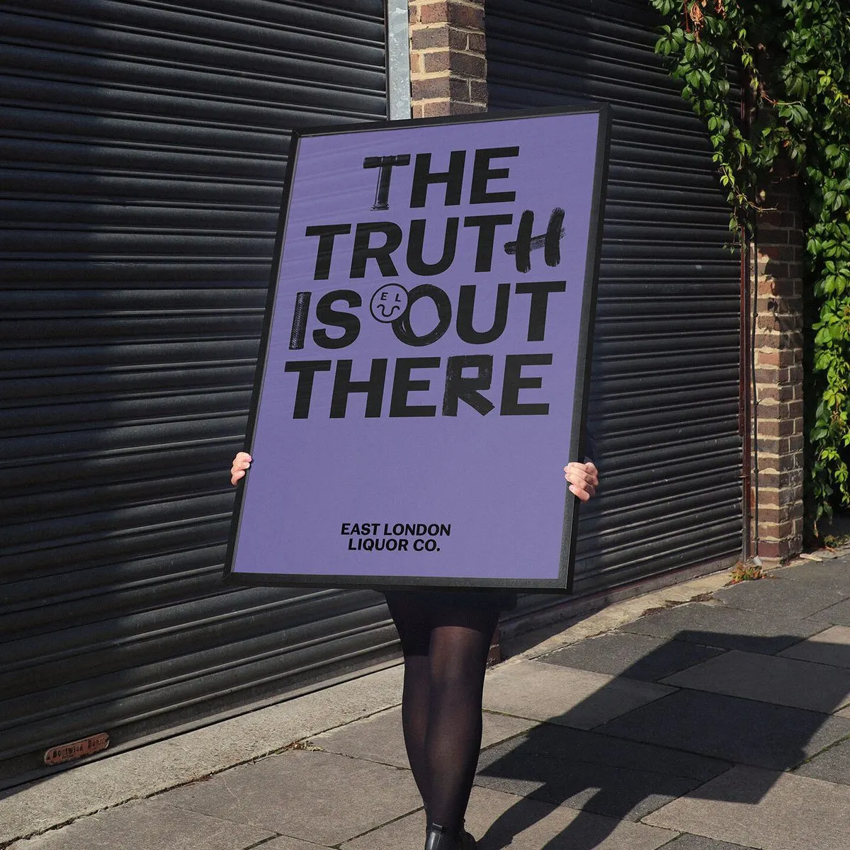
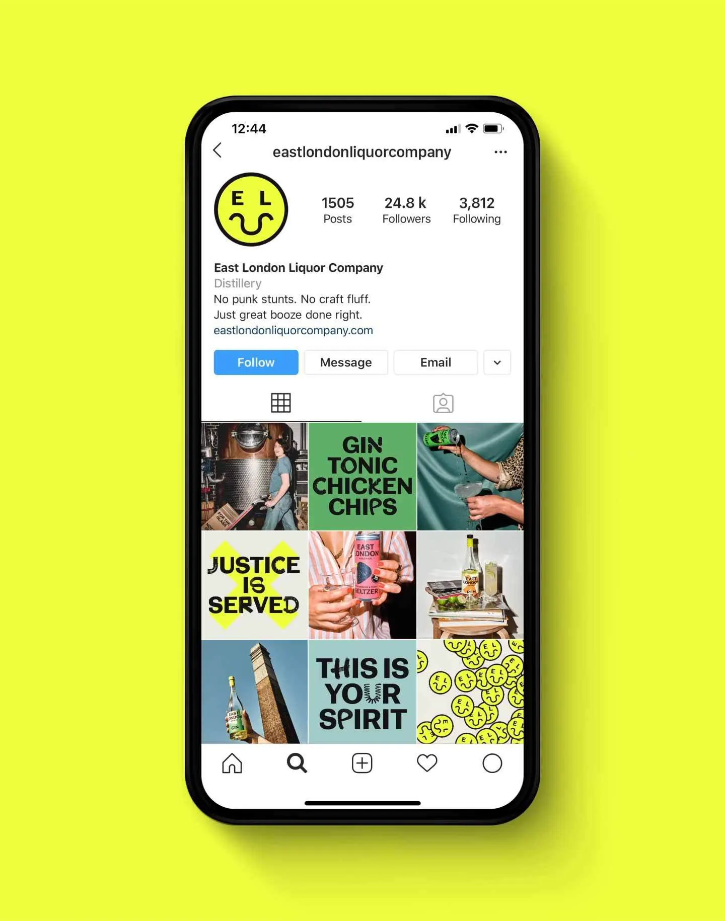
Attitude drives the whole system. Blunt headlines are set in a custom typeface, developed with NaN Foundry, that draws on the distillery and its neighborhood. A fluorescent yellow smiler serves as the mark, and Charlie McKay's candid photography replaces the glossy styling typical of spirits. The core bottles stay pared back with the odd premium touch, while the RTD range ignores shelf conventions entirely. The result: listings at Waitrose and Tesco, a D&AD Wood Pencil for Writing for Design, and shortlists for Typography and Packaging Design in 2021.
Why it works
The smiler is the smartest piece. It's friendly enough for a supermarket shopper and sarcastic enough for a bartender, and the fluorescent yellow gives it a presence that quieter, earth-toned competitors can't match from across an aisle. The custom type makes the headlines sound like they came from the street, not a naming workshop, which backs up the brand's straight-talking position. Keeping the core bottles restrained also matters, because it lets the writing do the work and keeps the premium cues from contradicting a fair-price promise.
Applications
Typography
Logo
Images and video from raggededge.com, by Ragged Edge.