The Brand Monograph
Grale brand identity by Pentagram
↗Pentagram's identity for Grale does something rare in sustainability branding: it leaves green out. The Stockholm company, founded in 2018 by brothers Allen and Max Mohammadi, makes a compostable, plant-based material that replaces plastic in straws, cups, and bags. Pentagram's brief took in a new name to replace PlasticFri, plus positioning, messaging, and a visual language.
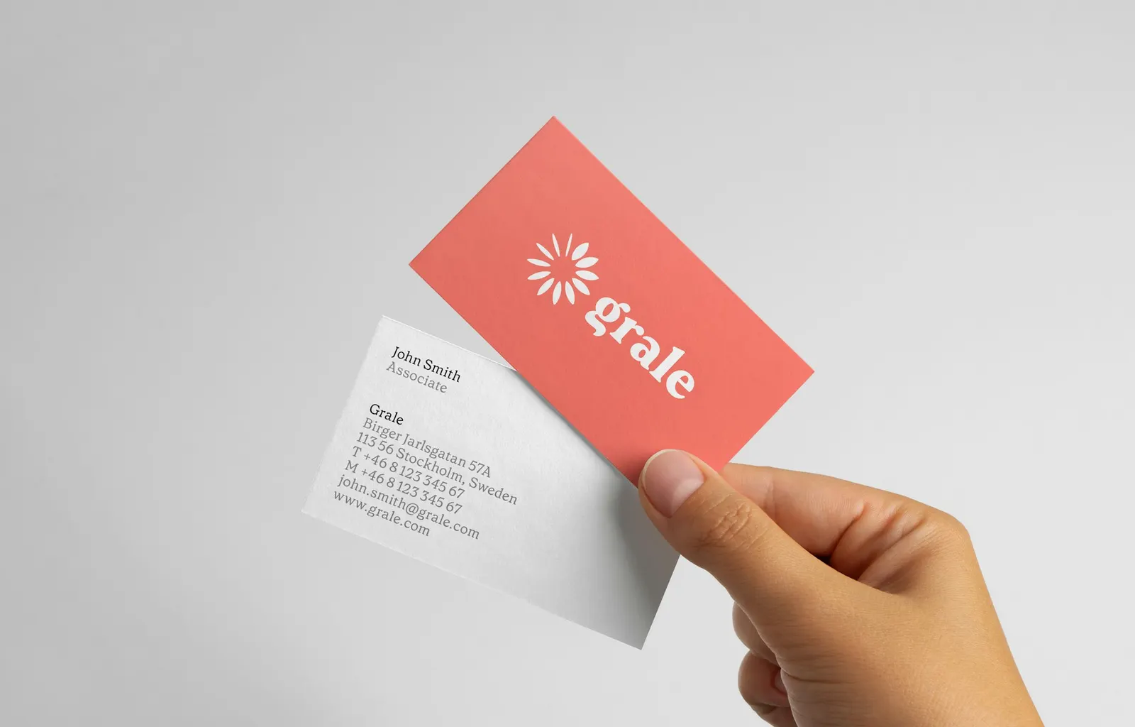
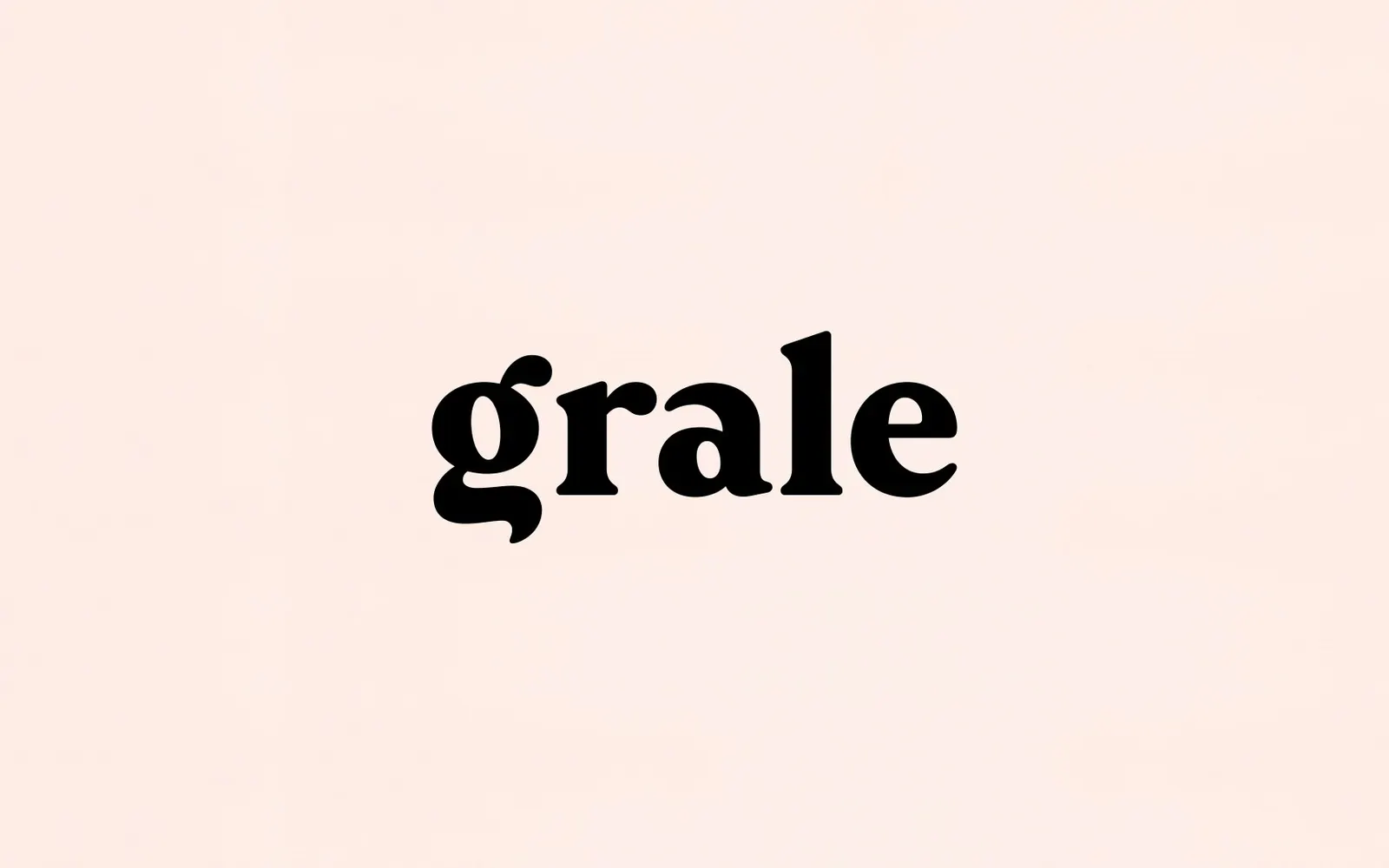
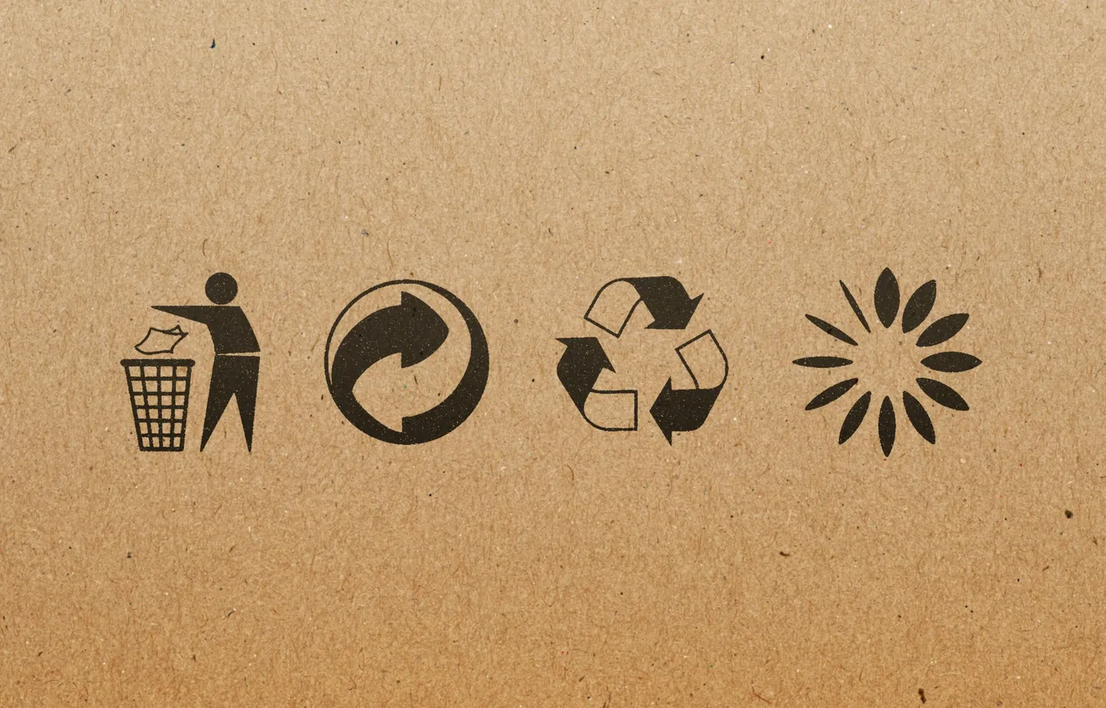
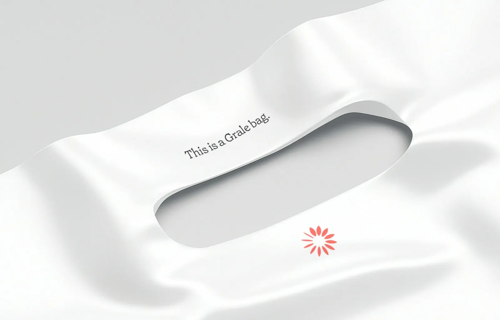
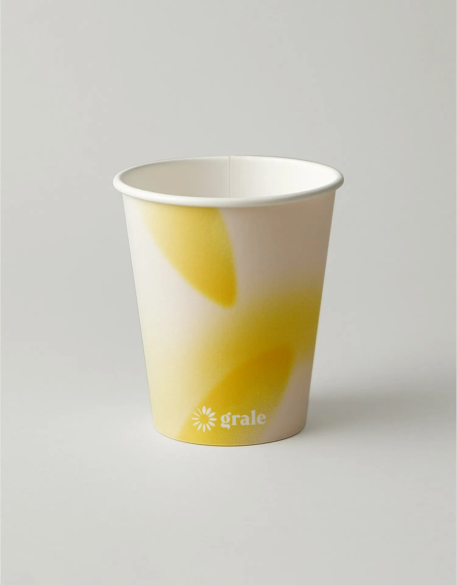
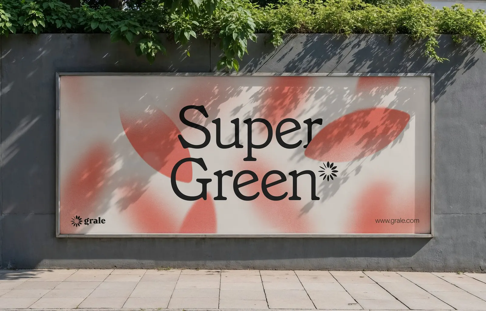
The symbol is a ring of leaf shapes caught mid-decomposition, and a gradient motif dissolves those forms into particles. The mark also works as an asterisk beside sustainability claims, and it can sit alongside standard recycling symbols. The wordmark has a custom "g," set against the serif Grenette from Colophon, with custom icons and a palette of coral, pink, yellow, and red. Designers Antonio Nogueira, Brett Hilton, Gracia Lee, Luke Hayman, Sewon Bae, and Shigeto Akiyama worked with strategists Ginger Strand and Robin Haueter.
Why it works
Coral is the smartest call here. In a category where leaves and green have become shorthand for good intentions, a warm palette reads as confident and a little playful, which suits a brand speaking to manufacturers and younger consumers alike. The symbol earns its place by doing real work: the decomposition story is built into the shape, so it explains the product without a diagram, and the asterisk role ties each claim back to the brand. Grenette's soft serif keeps the tone approachable rather than lab-like.
Applications
Logo
Typography
Images and video from pentagram.com, by Pentagram.