The Brand Monograph
Igluu brand identity by Pentagram
↗Most property platforms look like banks that learned to code: blue, gray, and faintly intimidating. For Igluu, a Prague-based platform that carries renters, buyers, and brokers through the whole housing journey in one place, Pentagram went the other way. Partner Michael Gericke led the project with Igluu co-founder and CEO Martin Mucha, and the brief was to make a fragmented, paperwork-heavy process feel manageable without losing credibility.
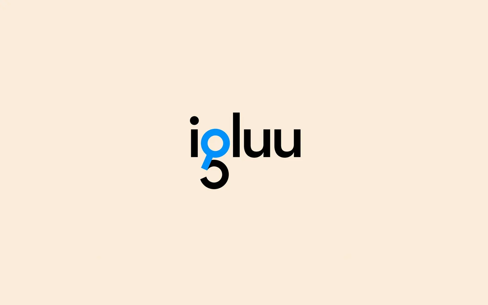
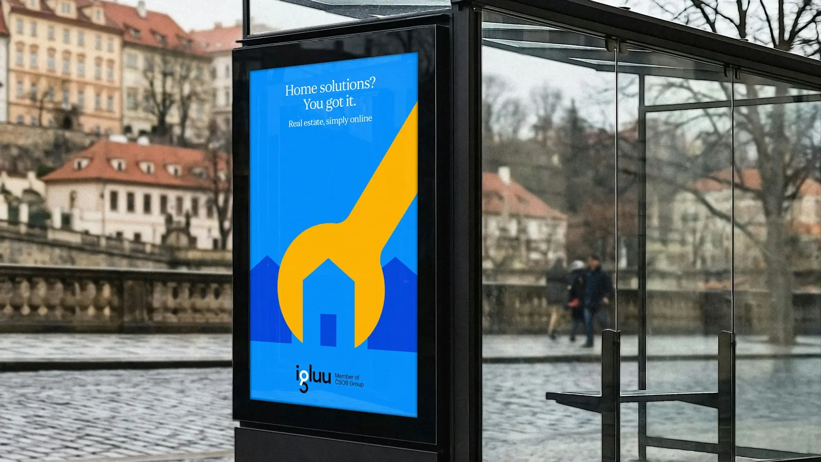
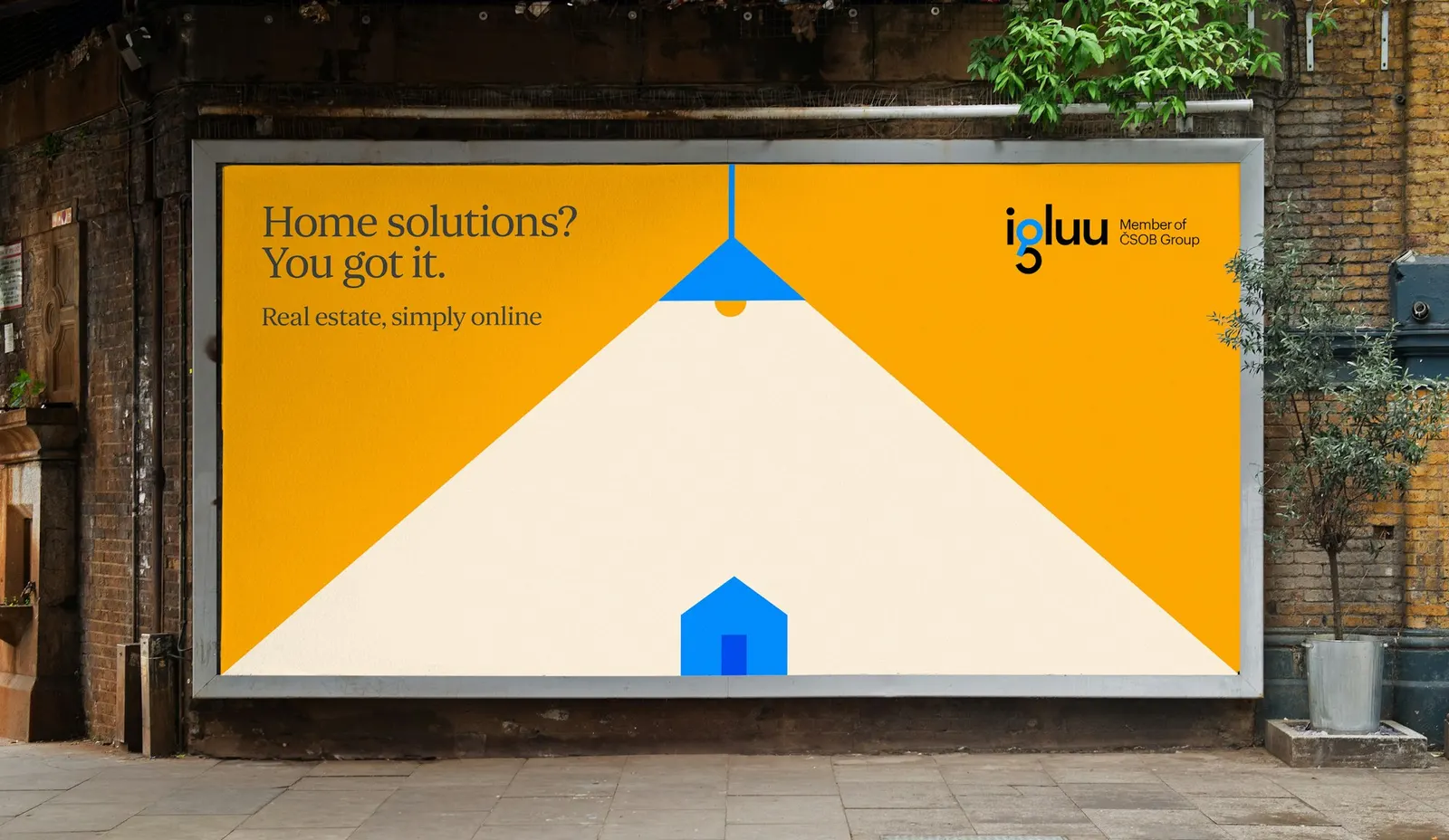
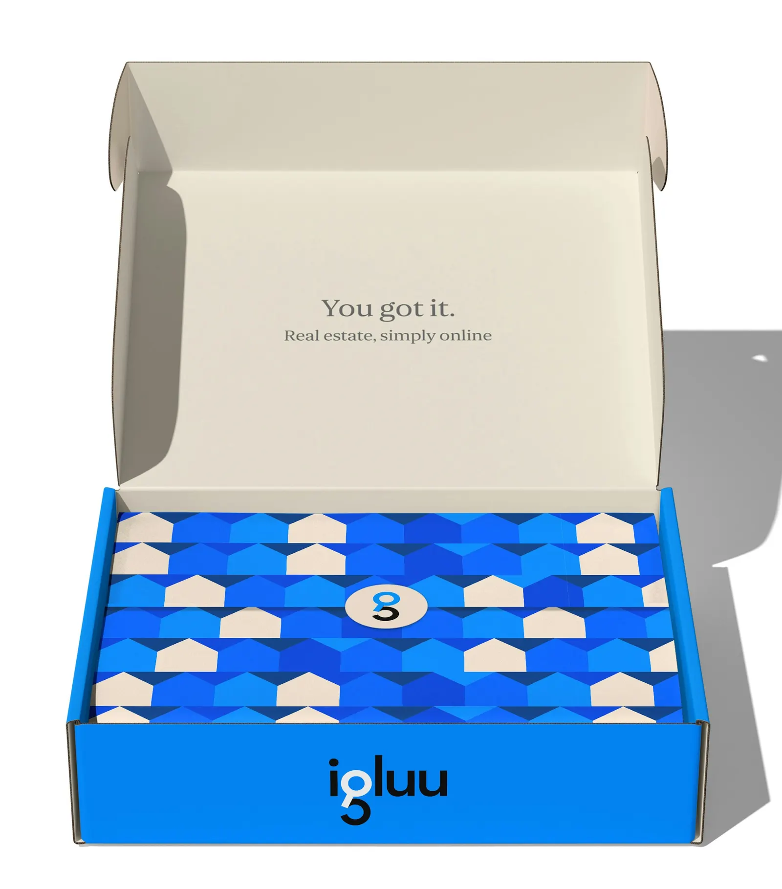
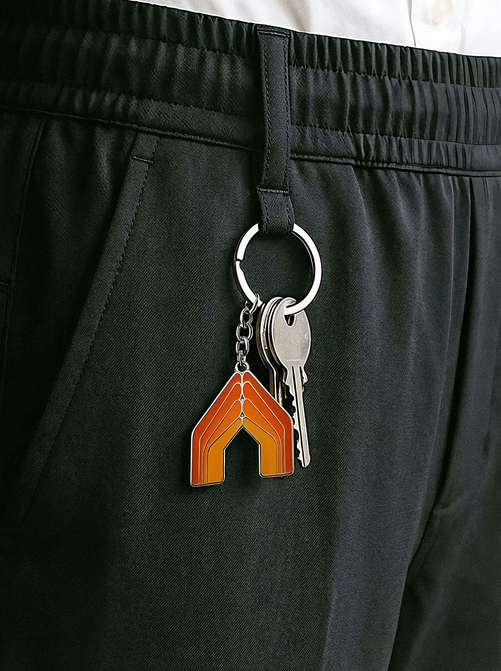
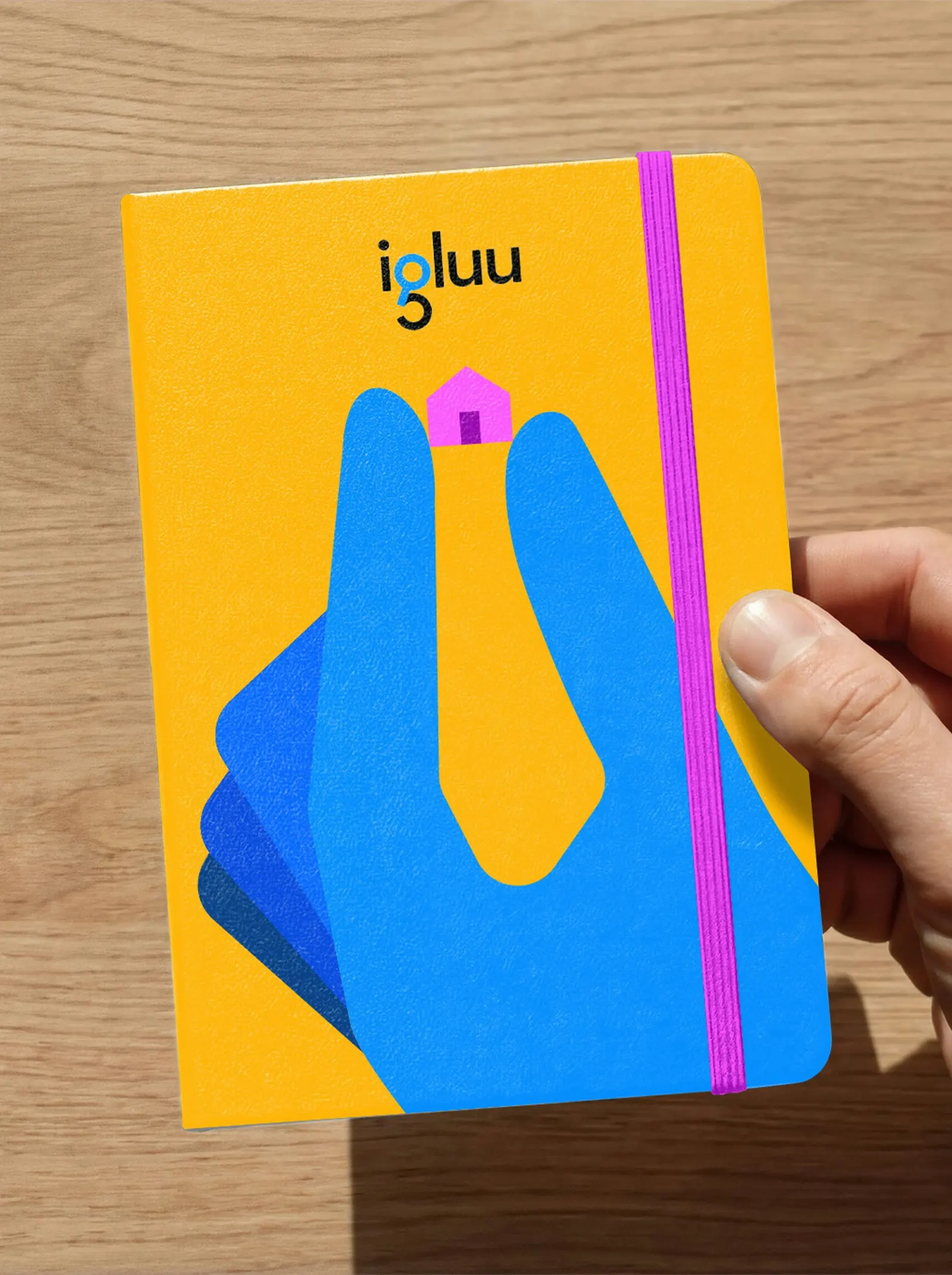
The resulting identity is compact and built to travel. A wordmark with a search icon built into it anchors screens and physical touchpoints alike. A warm palette, a friendly serif typeface, and illustrations that put people ahead of data carry the rest. Gericke's team, including Catherine Chung, Marielle Gross, Migle Jankauskaite, and Peter Huang, kept the toolkit small enough to scale across products and markets.
Why it works
The search icon inside the wordmark turns the most common action in the category into the brand's signature, so the name is memorable and useful at once. The serif is the boldest move. In a sector that defaults to neutral sans serifs, it reads as considered and human, which matters when users are handling money and big decisions. Warm color separates Igluu from fintech sameness, and the illustrations make a broad audience, from first-time renters to professionals, feel addressed.
Logo
Applications
Color
Images and video from pentagram.com, by Pentagram.