The Brand Monograph
Leeum Museum of Art brand identity by Wolff Olins
↗Few museum logos are built to move, and fewer come with results this easy to read. After Wolff Olins reworked its identity, Leeum Museum of Art in Seoul went from 13,000 monthly visitors to more than 20,000, a 54% increase. The museum has collected Korean, international, modern, and contemporary art since 2004, and it reopened after a major renovation wanting to be a place where people, ideas, and artworks mix.
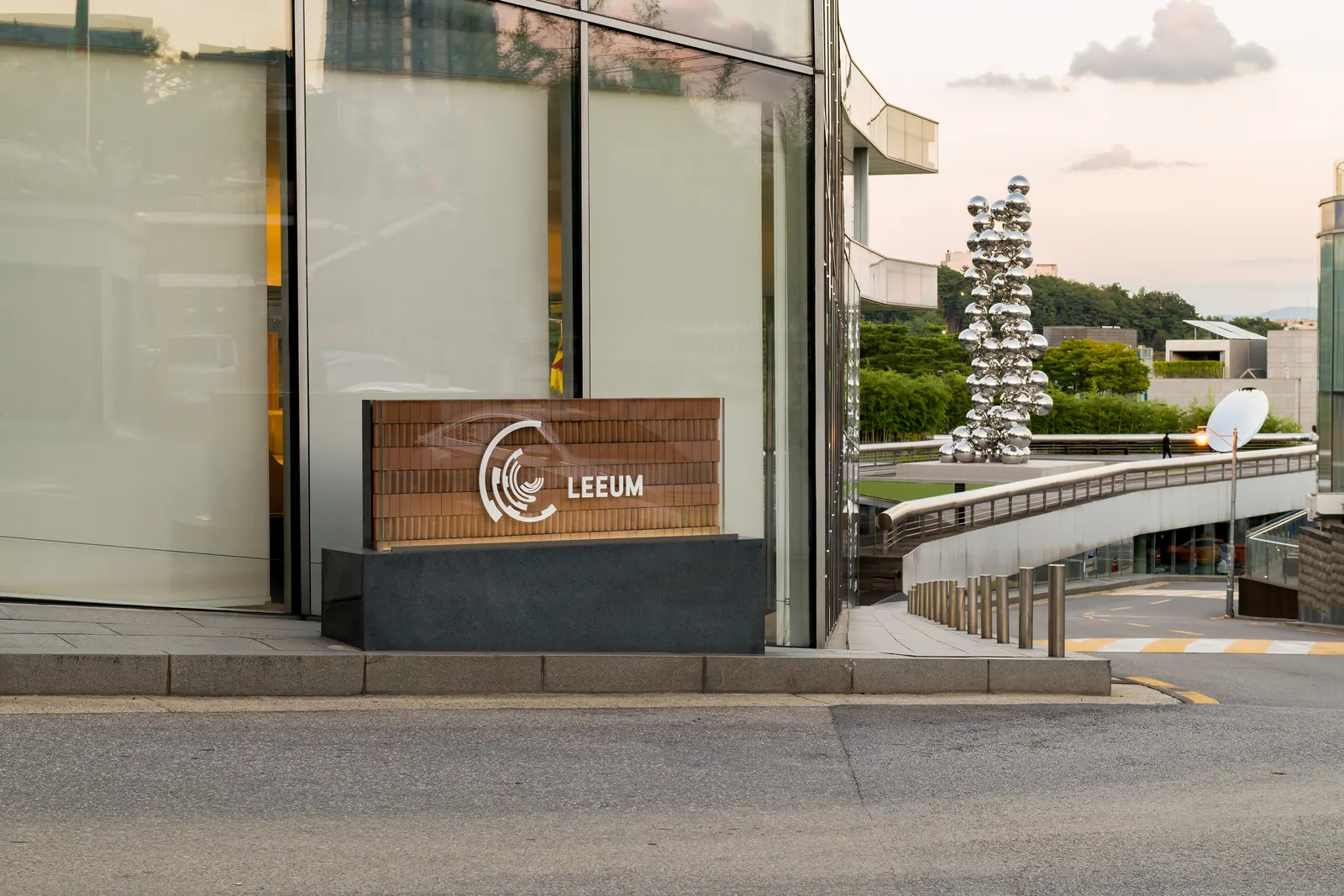
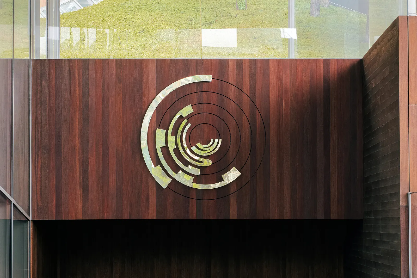
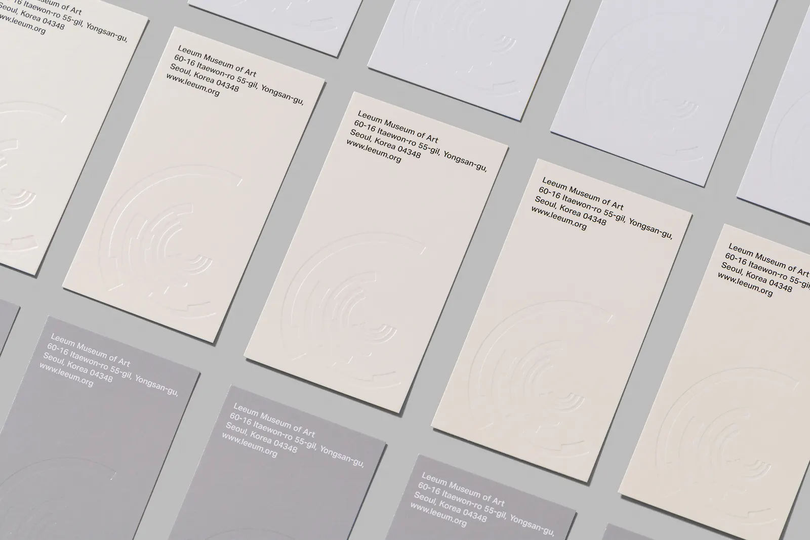
Working with Ordinary People on design, Wolff Olins built the system around a mark that reflects both the collection and the shape of the building. Motion is part of its basic behavior, while color and typefaces shift in scale to echo the range of the art. The studio carried it through signage, communications, social media, and augmented reality. Seungbeom Hur's photography documents the result.
Why it works
Museum identities often default to quiet, static wordmarks that defer to the art. Here the mark is a memorable object in its own right, which gives Leeum something ownable while leaving the system room to flex. Scale play in the type and color is a smart answer to a collection that spans eras and styles, since it avoids choosing one look to stand for all of it. Motion also suits an audience that often meets a museum on a screen before walking through the door.
Applications
Logo
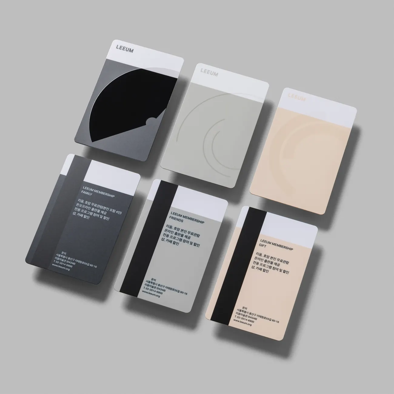
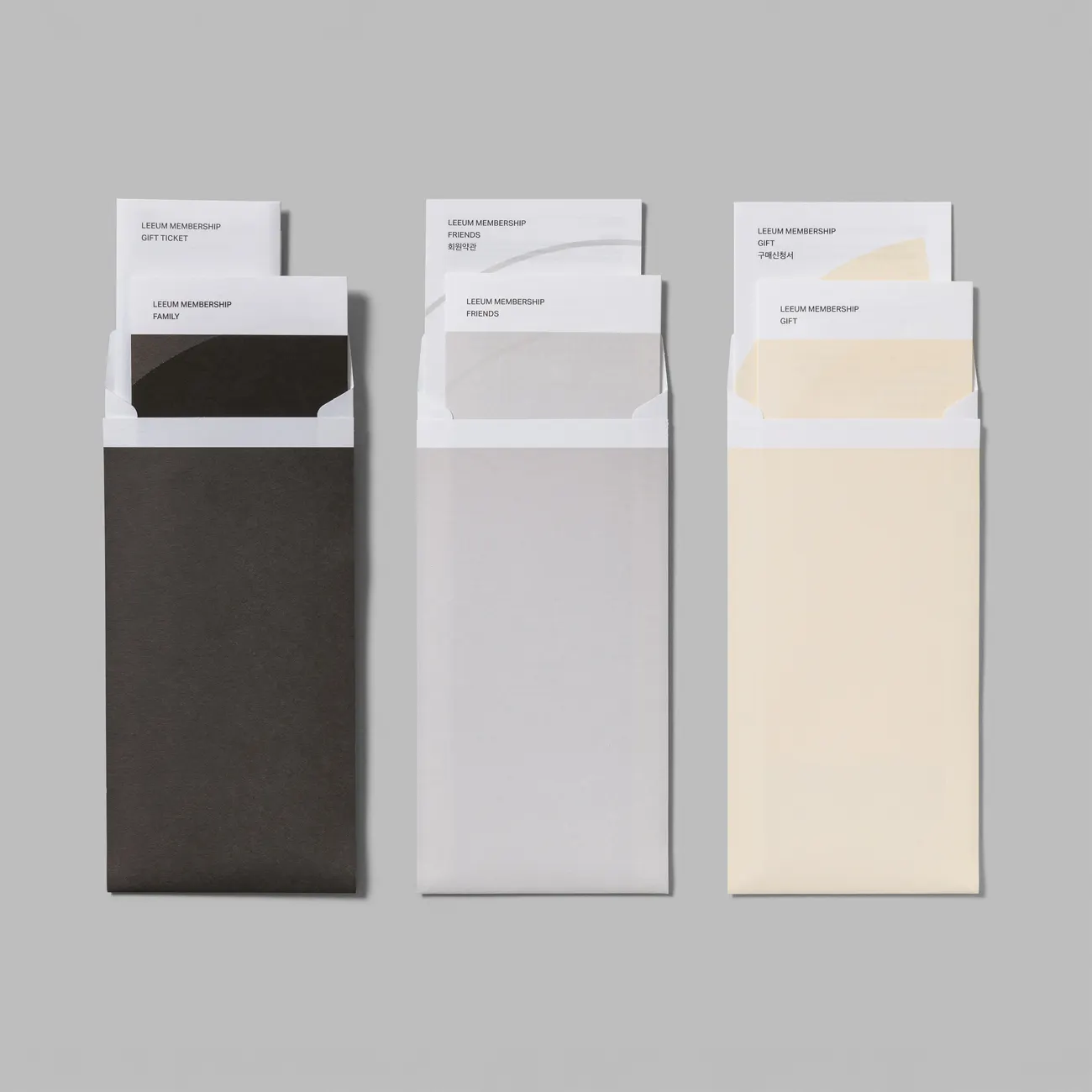
Images and video from wolffolins.com, by Wolff Olins.