The Brand Monograph
Next Insurance brand identity by Collins
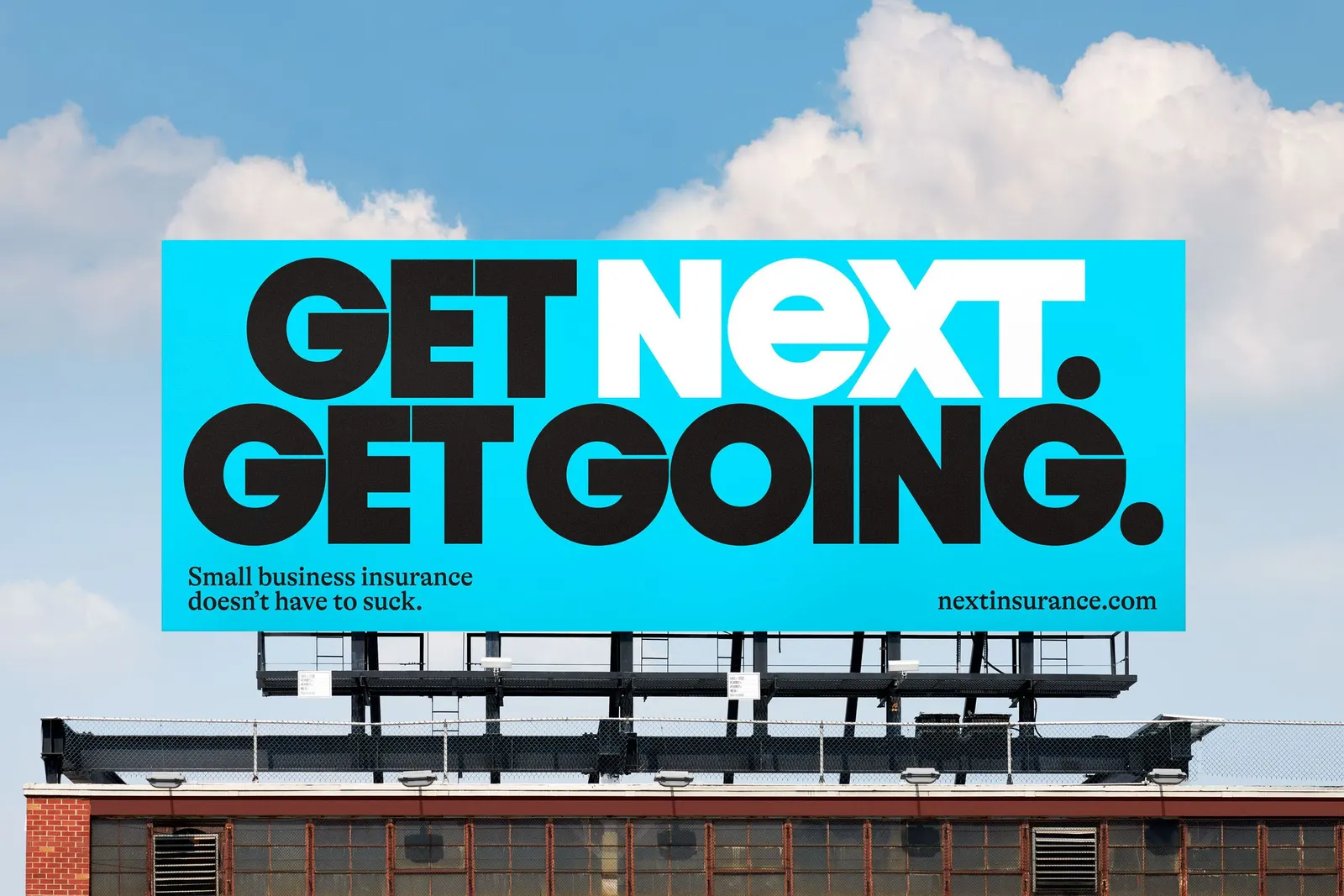
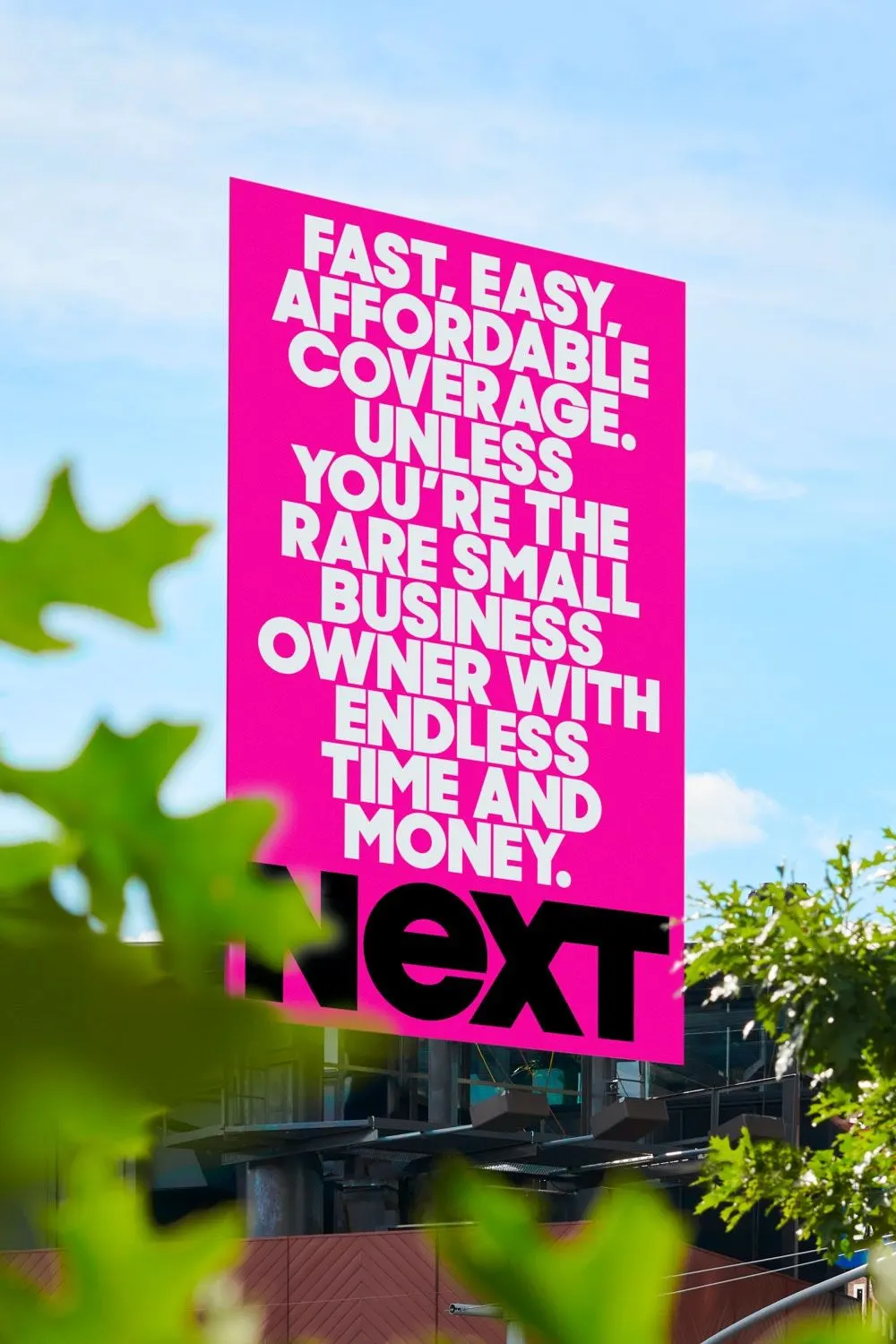
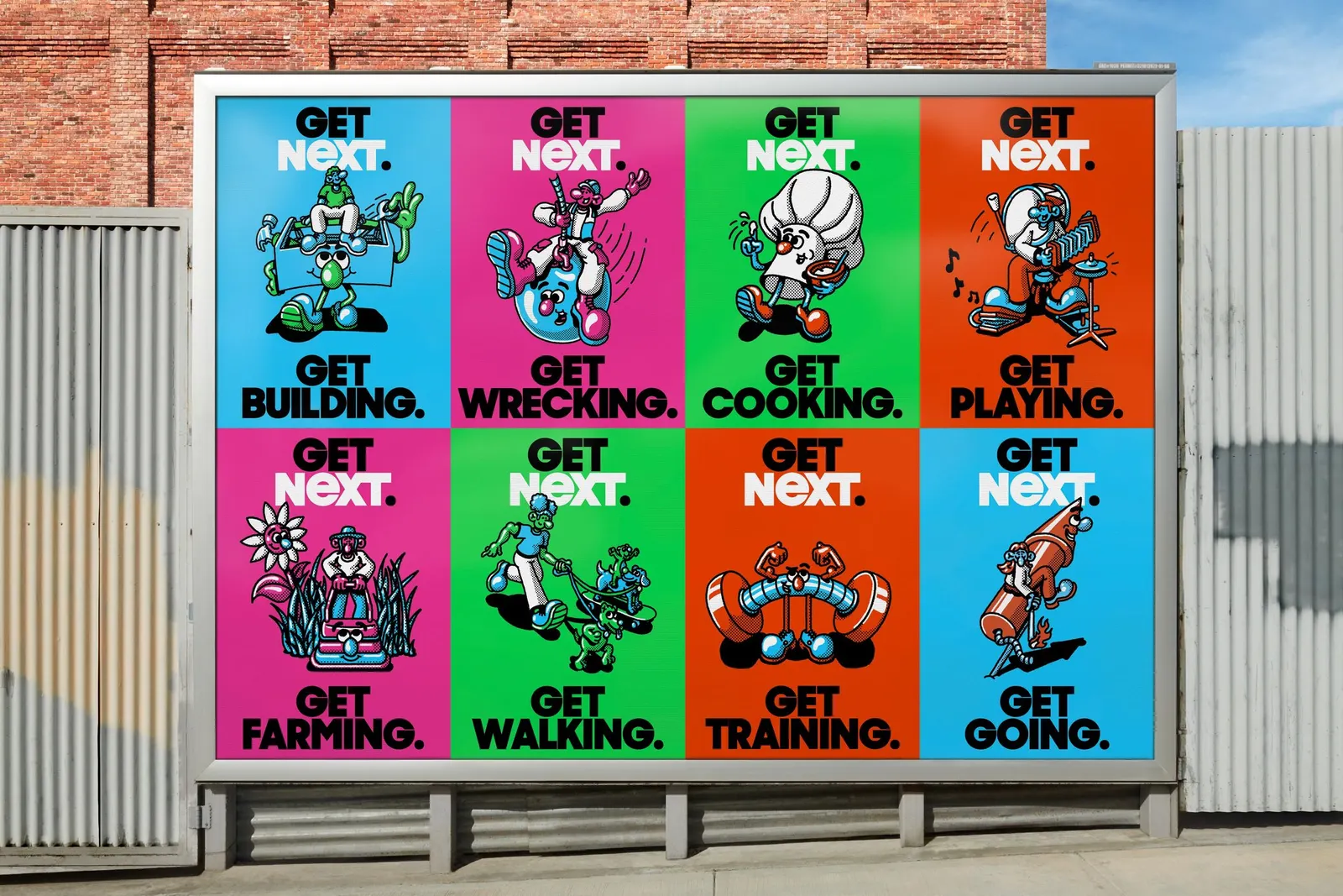
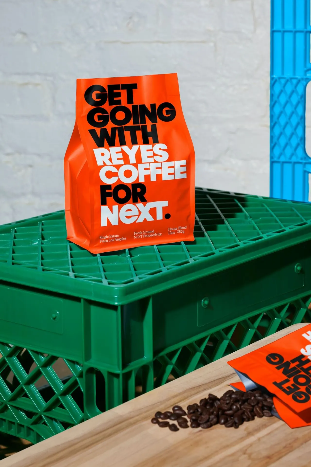
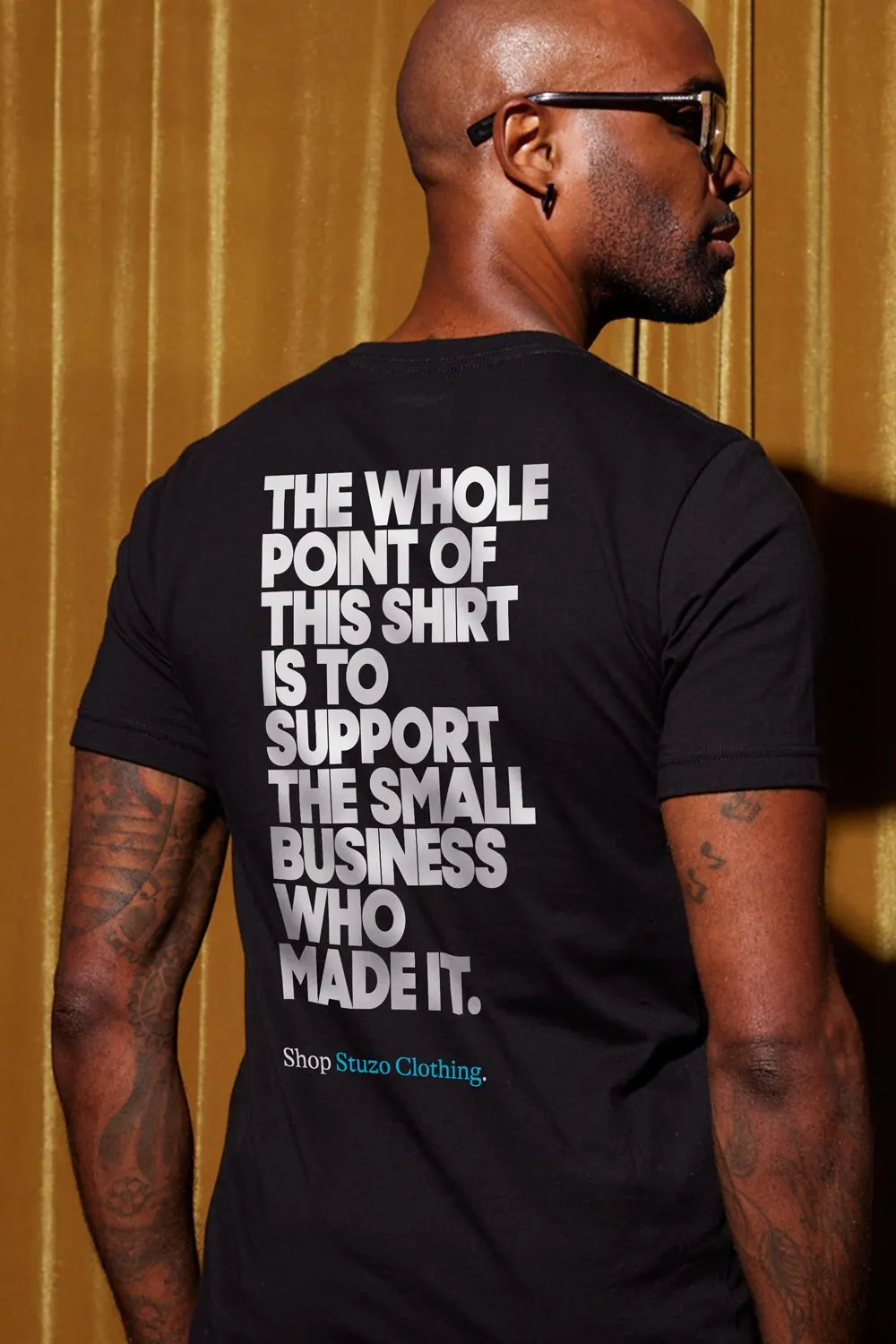
↗Insurance advertising tends to pick a lane: grave warnings or a talking animal with a punchline. Collins gave NEXT Insurance a different kind of voice, one that speaks to small business owners as ambitious people making calculated moves. After spending time with NEXT's customers, the studio built the Get Going platform on the confidence it heard from them, and framed insurance as a tool for growth rather than a defense against disaster.
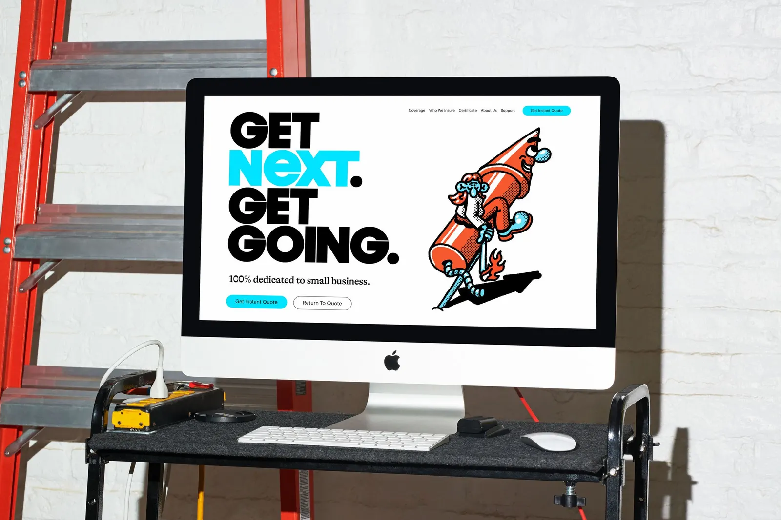
The look draws on periods when optimism held through hard times, the Great Depression and the 1970s, translated into hand-drawn illustration with a warm, scrappy feel. It runs across mass advertising, direct marketing, and social, with motion from BUCK, photography by Maggie Shannon, Making Pictures, and Mari Juliano, development by Upperquad, and sound from Barking Owl and Scout Music. Business results followed: tripled growth in 1.5 years and a $2.6 billion acquisition by Munich Re's ERGO Group.
Why it works
Hand-drawn marks are an unexpected choice for an AI-backed platform, and that is the point. They make a technology company feel like it was made by people, which is what an owner wants from whoever covers their business. The imperfect line also sets NEXT apart from both the stock reassurance imagery and the mascot gags that crowd the category, without leaning on jokes. A short, verb-led line puts the owner in the driver's seat, so the brand reads as a partner that backs their next move instead of a warning label. The visual and verbal sides carry one attitude.
Applications
Logo
Images and video from wearecollins.com, by Collins.