The Brand Monograph
Mews brand identity by Koto
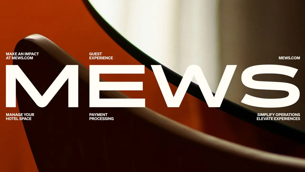
↗Mews makes software for running hotels and other hospitality spaces, in a category where most platforms look and sound alike. Koto's identity stands out because it doesn't catalog features. It tries to make the effect of the product felt, and it treats impact as the one idea everything else has to serve.
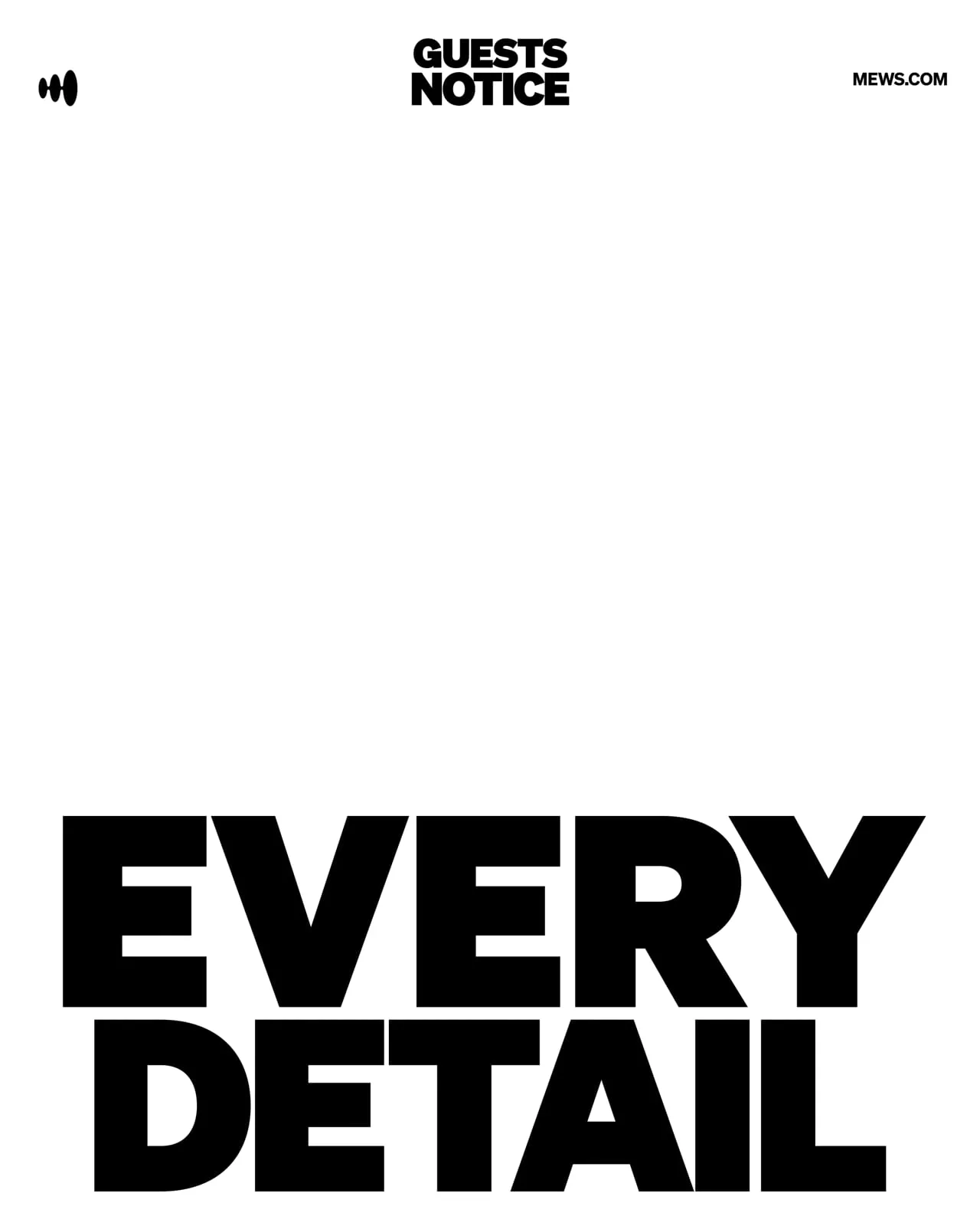
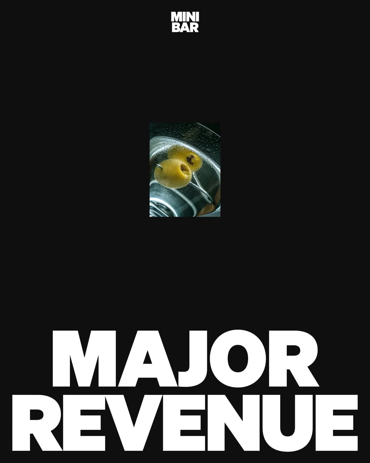
To get there, Koto combined fluid forms, a confident use of color, and responsive typography developed with Klim Type Foundry. Graphic devices drawn from the logo tie the pieces together, so the identity can move from product interfaces to campaigns, large-scale illustration, and motion. It scales up or pulls back depending on the context, and it stays recognizable throughout.
Why it works
Buyers in this category often compare products side by side, so distinctiveness matters more than polish. Fluid forms suggest movement, which suits software that sits in the middle of busy, never-ending operations. Building the graphic language from the logo means the mark does real work instead of sitting in a corner. Flexible type from a respected foundry lets the brand shift between a dense product screen and a bold campaign without feeling like two different companies. The result looks like a market leader before a word is read.



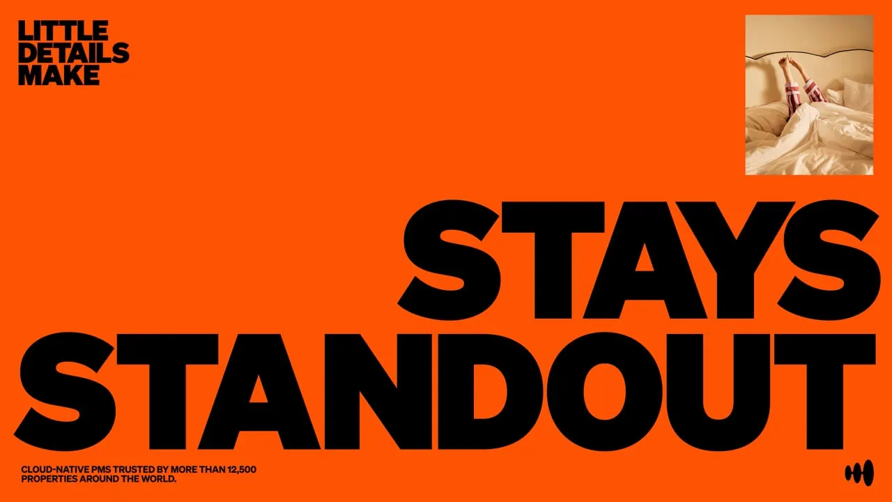
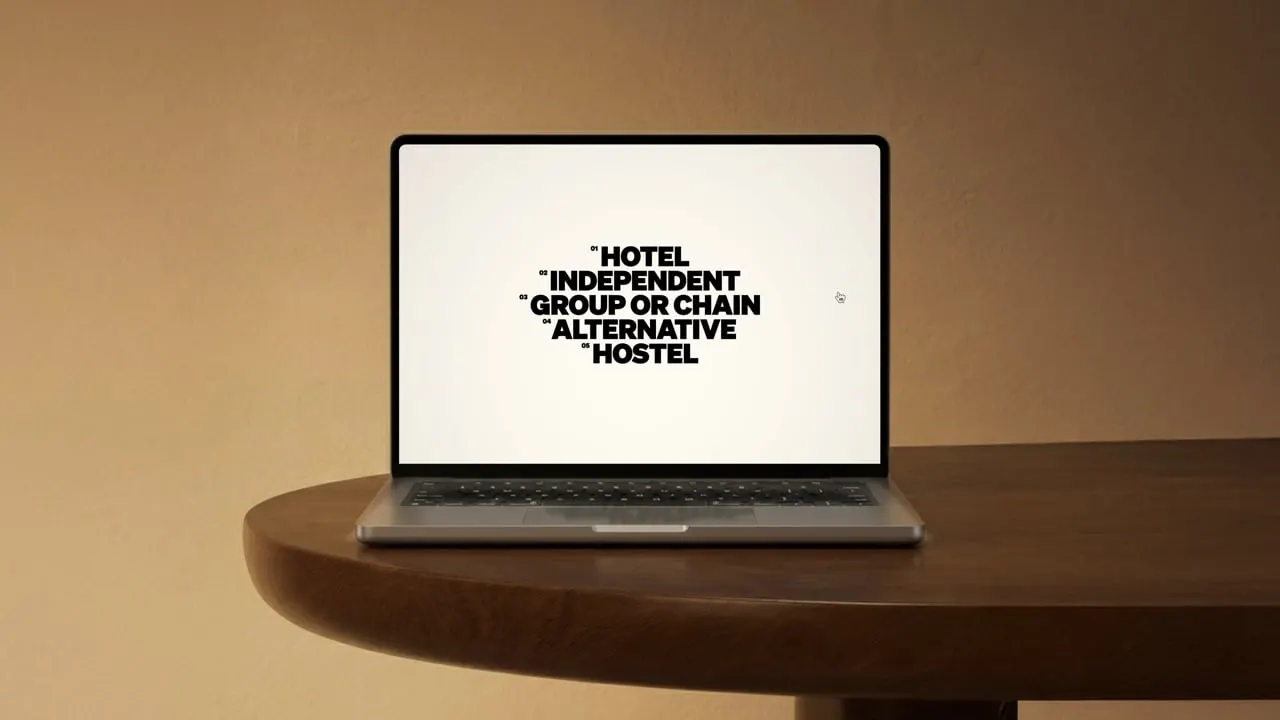
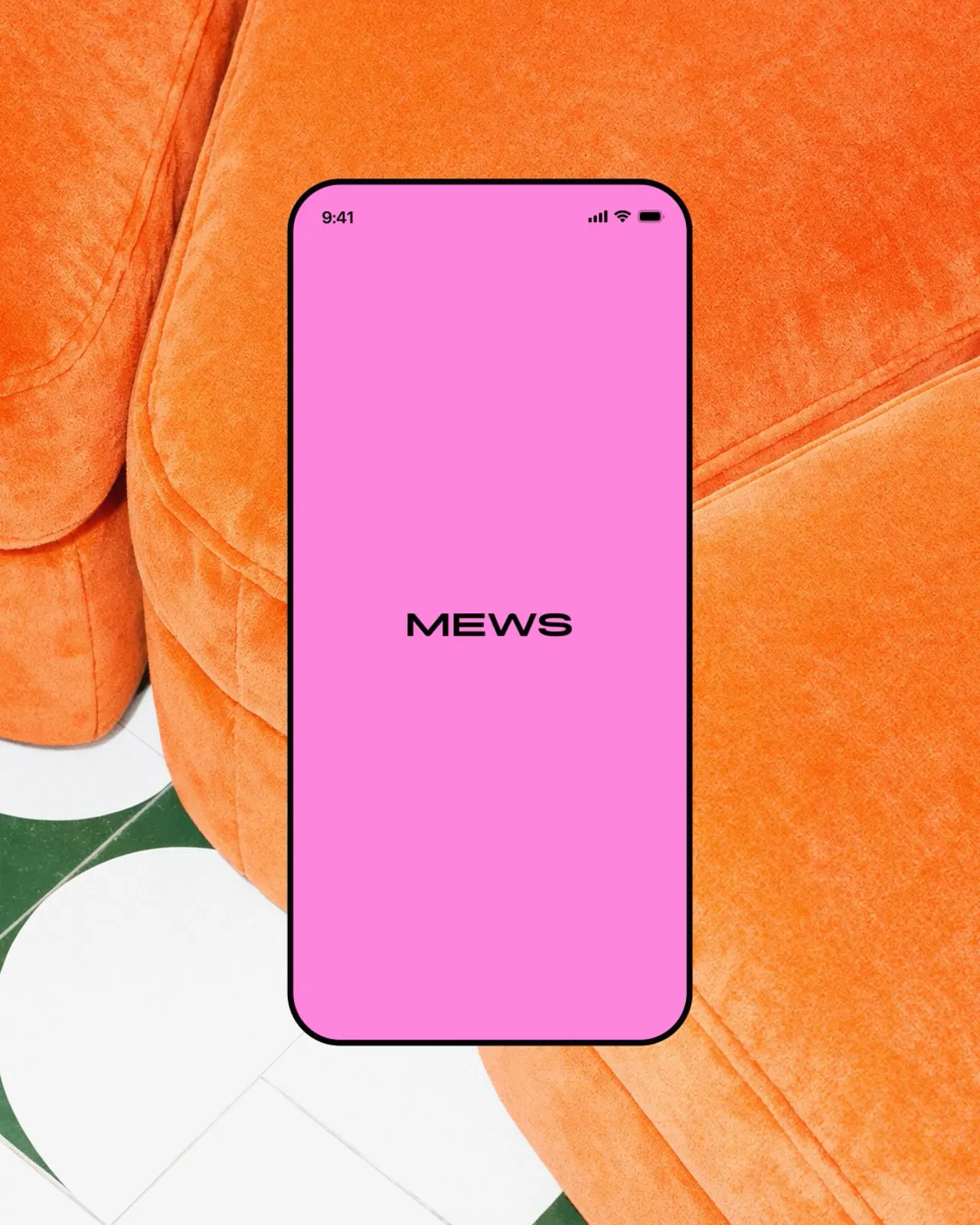

Images and video from koto.com, by Koto.