The Brand Monograph
MOCA LA brand identity by Base Design
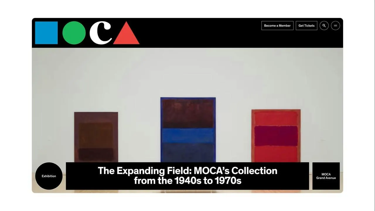
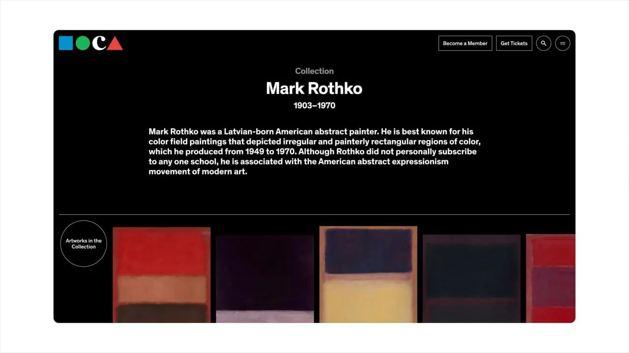
↗Most museum websites treat the logo as a stamp in the corner. Base Design's site for MOCA LA puts the 1984 Chermayeff & Geismar mark to work instead. The museum was founded by artists, spread across two Los Angeles buildings, and has never settled into institutional polish, so the studio set out to carry that character online without smoothing it over.
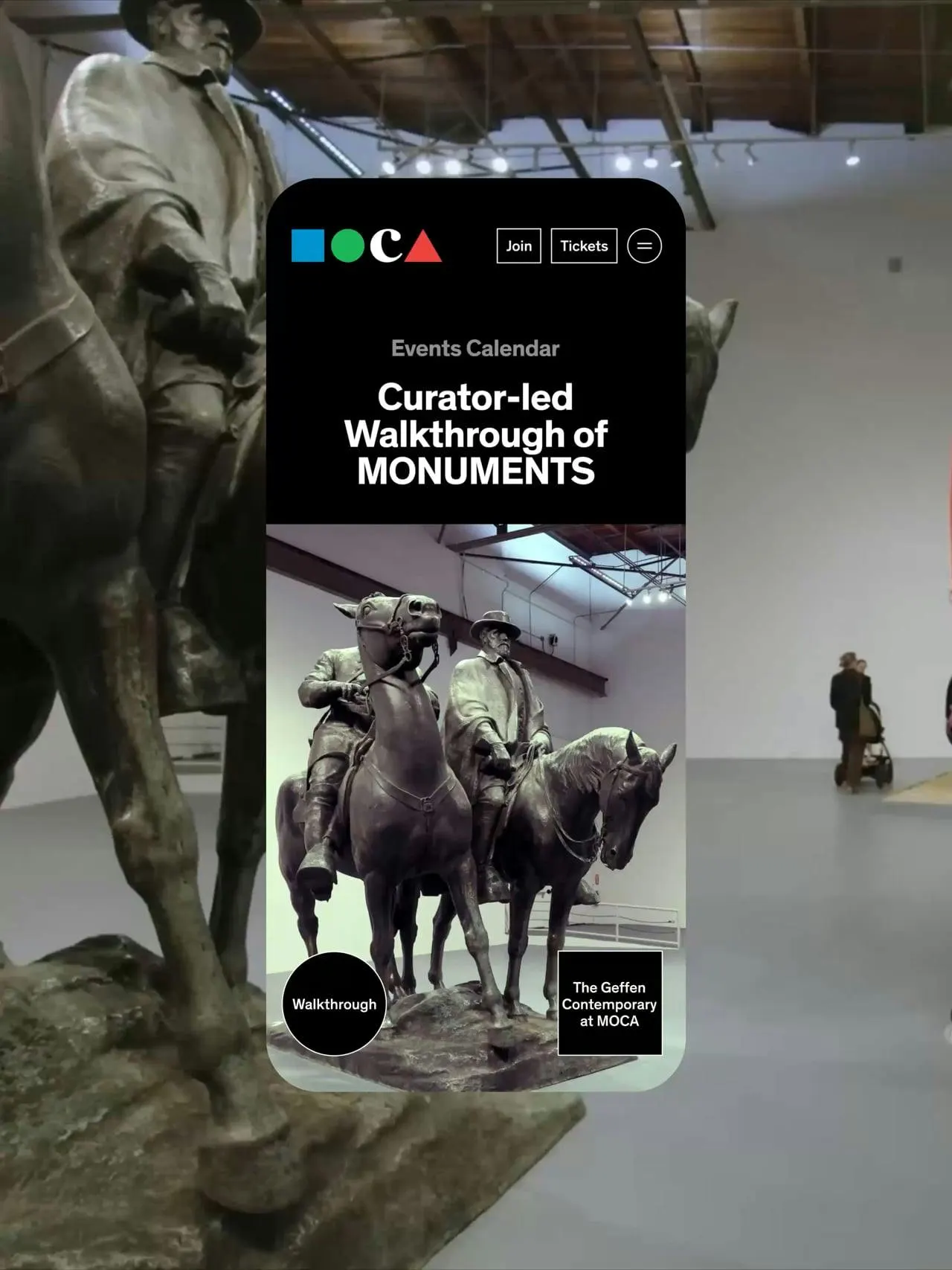
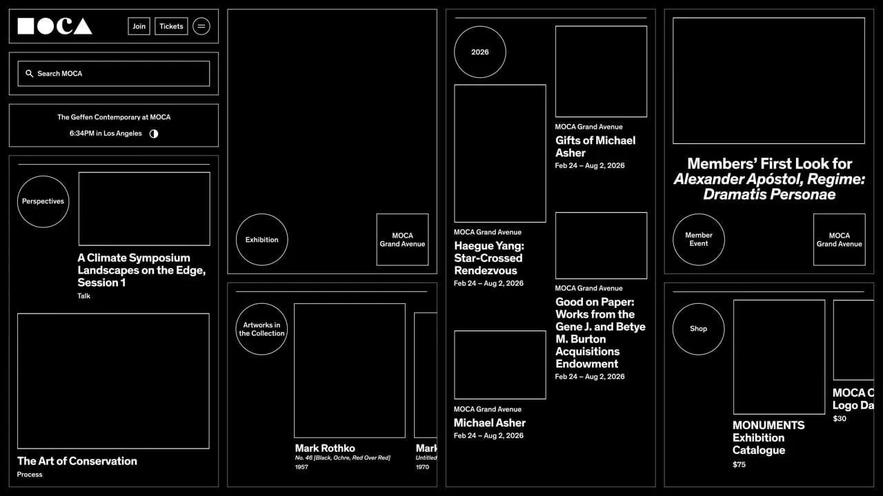
The idea starts on a phone. Base Design pulled the circle and square out of the logo and placed them at the bottom of the screen, within thumb reach, where they open the menu. The same two shapes then flag content, identify locations, and link pages together as visitors scroll. The studio added no new visual vocabulary, only more responsibilities for the existing one. Mirek Nisenbaum contributed to both strategy and design, Vivian Valentin worked across design and development, a larger dev team built it, and Lander & Adriaan handled sound.
Why it works
A logo built from basic geometry can be taken apart without losing itself, and that is what makes this approach credible. The circle and square are distinct enough to read as controls without labels, and the bottom-of-screen placement follows how people actually hold phones. Because the mark is also the interface, every tap reinforces recognition for an institution with two buildings and a long-running identity. The result is quiet, which suits a museum website whose real job is to put art first.
Applications
Typography
Logo
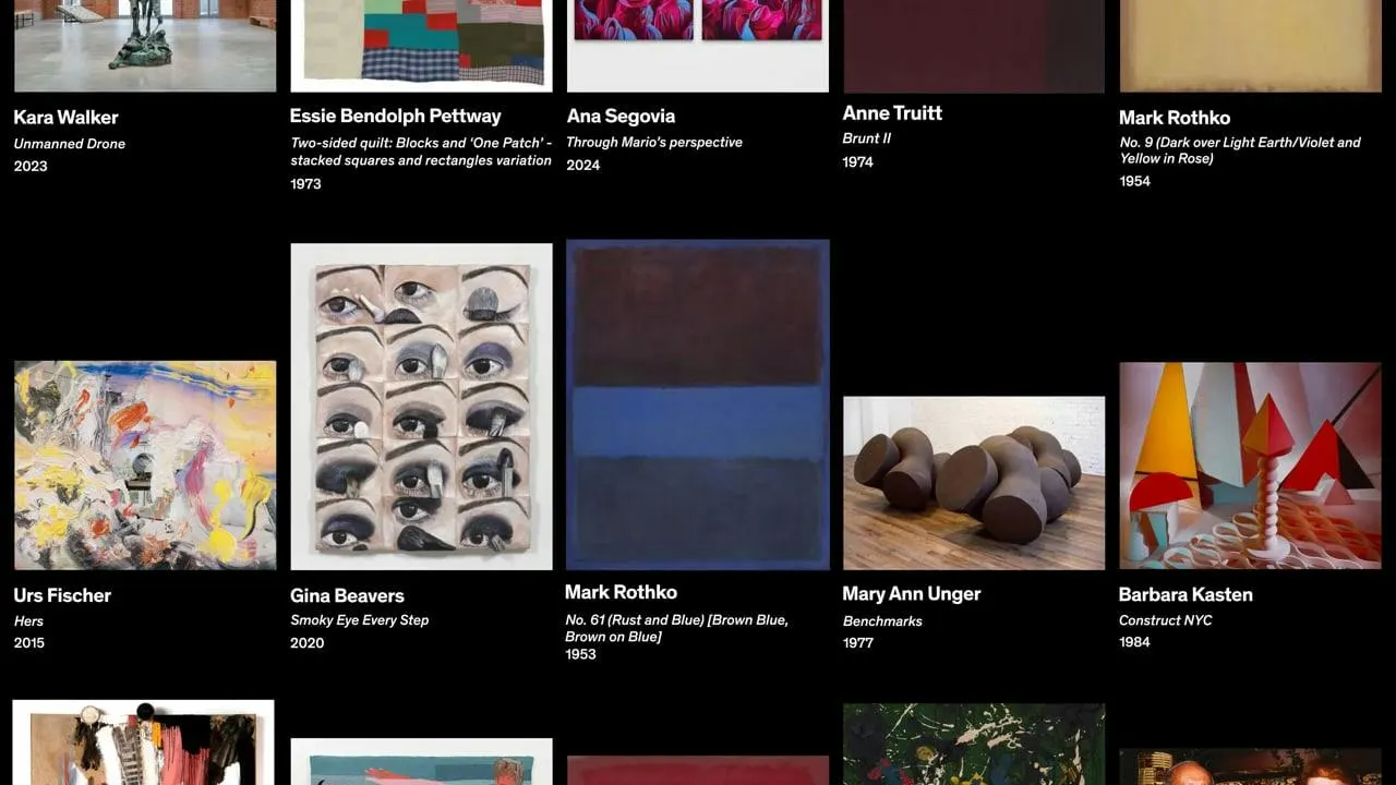
Images and video from basedesign.com, by Base Design.