The Brand Monograph
Monzo brand identity by Ragged Edge
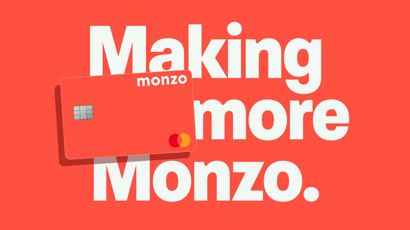
↗Ragged Edge's work for Monzo is restraint with the volume turned up. Rather than start over, the studio took what people already loved about the bank, starting with that coral card, and pushed it further. The brief was a tricky one: a brand with six million customers needed an identity that could stretch across more products and support a push toward profitability, without losing the personality that got it there.
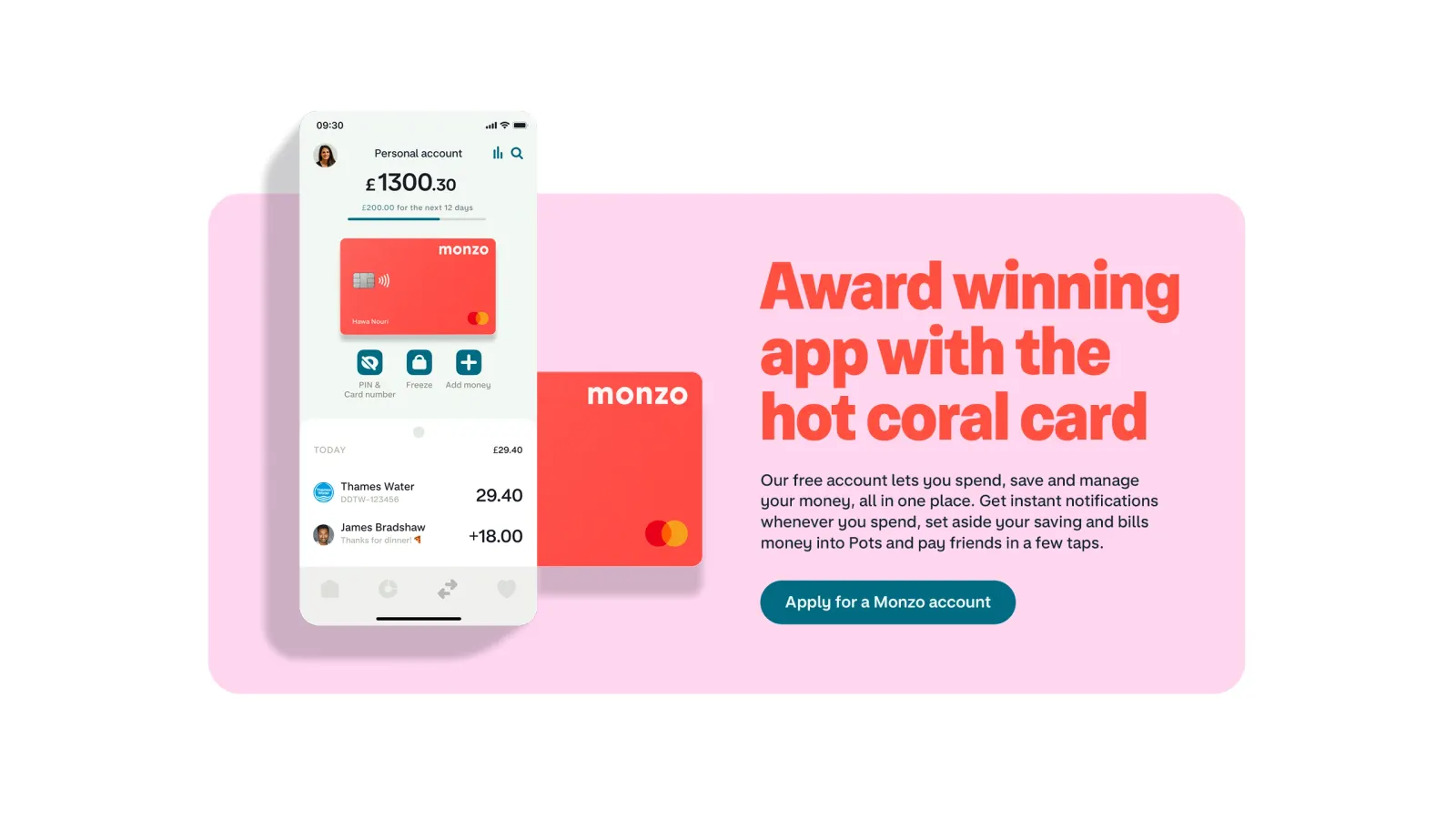
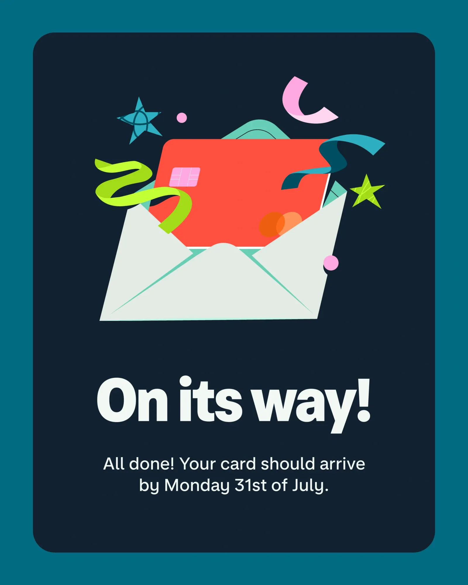
Working with Monzo's brand team, the studio rebuilt the system to live in the app and out in the world. The coral is more intense, and supporting colors give the palette more range. Illustrator Ola Dobrzyńska drew 90 pieces that untangle dense financial messages and add lift to good news. Monzo's in-house team then rolled it out, as part of a wider effort behind the bank's first profitable year.
Why it works
Banking is a category of safe blues and stock imagery, and Monzo already owned a color nobody else would touch. Intensifying it, rather than replacing it, protects recognition while making the brand feel more confident. The supporting colors matter just as much, because they stop coral from carrying every moment alone. The illustrations do quieter work. Money is stressful, and a consistent, hand-drawn voice makes difficult messages feel friendlier. A library of 90 also keeps the product from falling back on generic visuals.
Applications
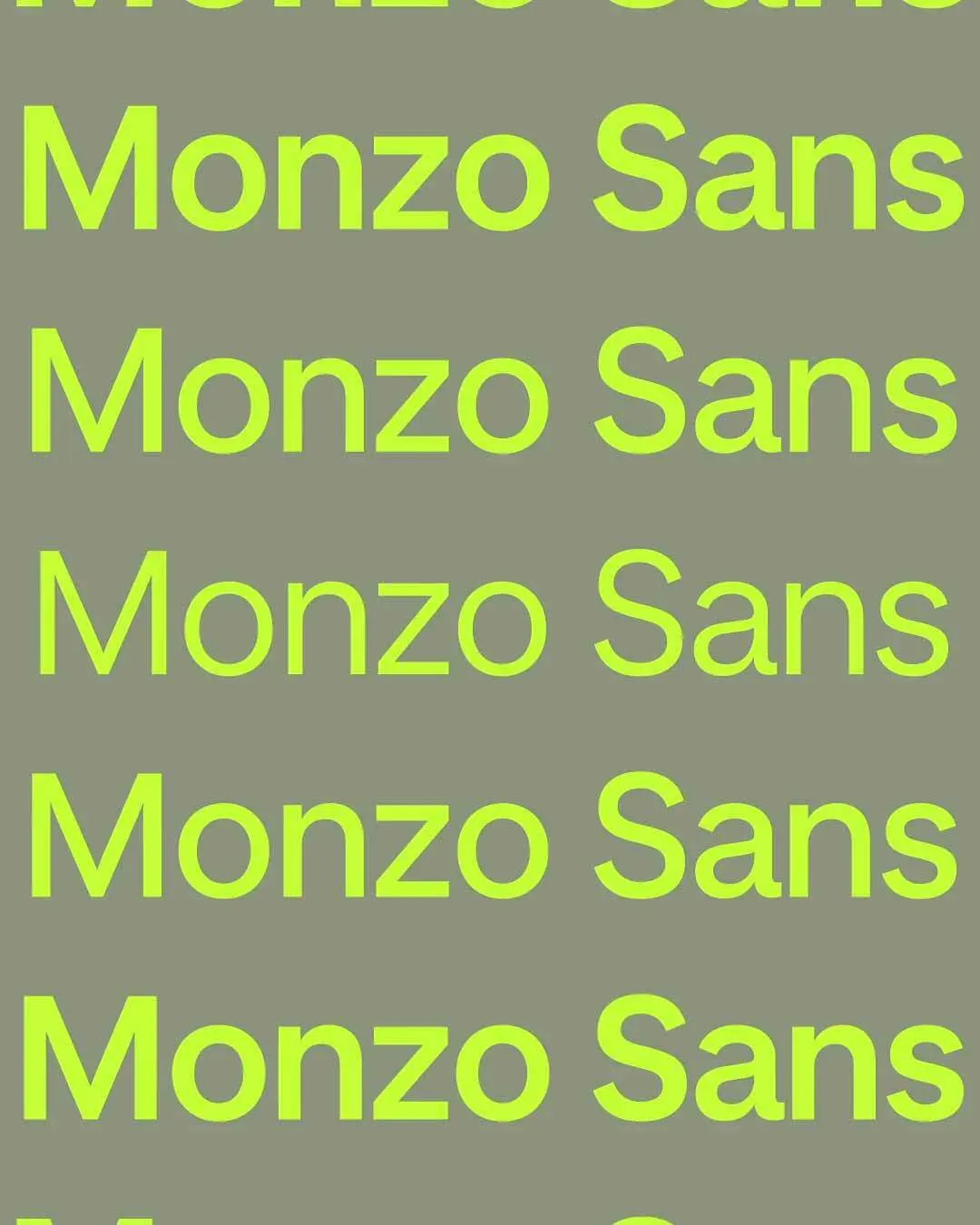
Typography
Logo
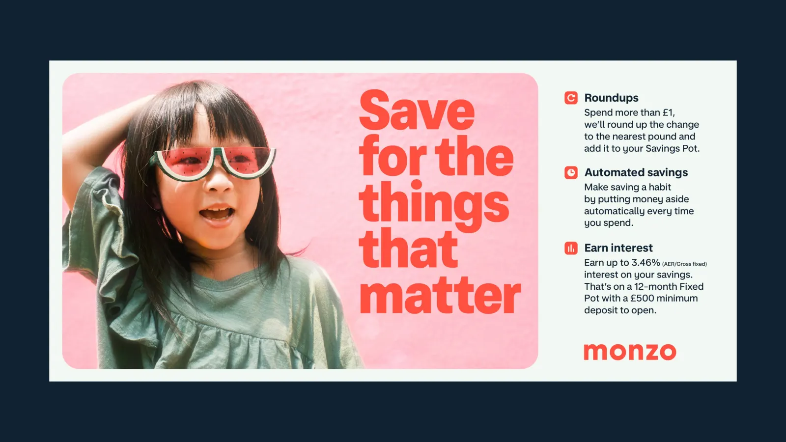
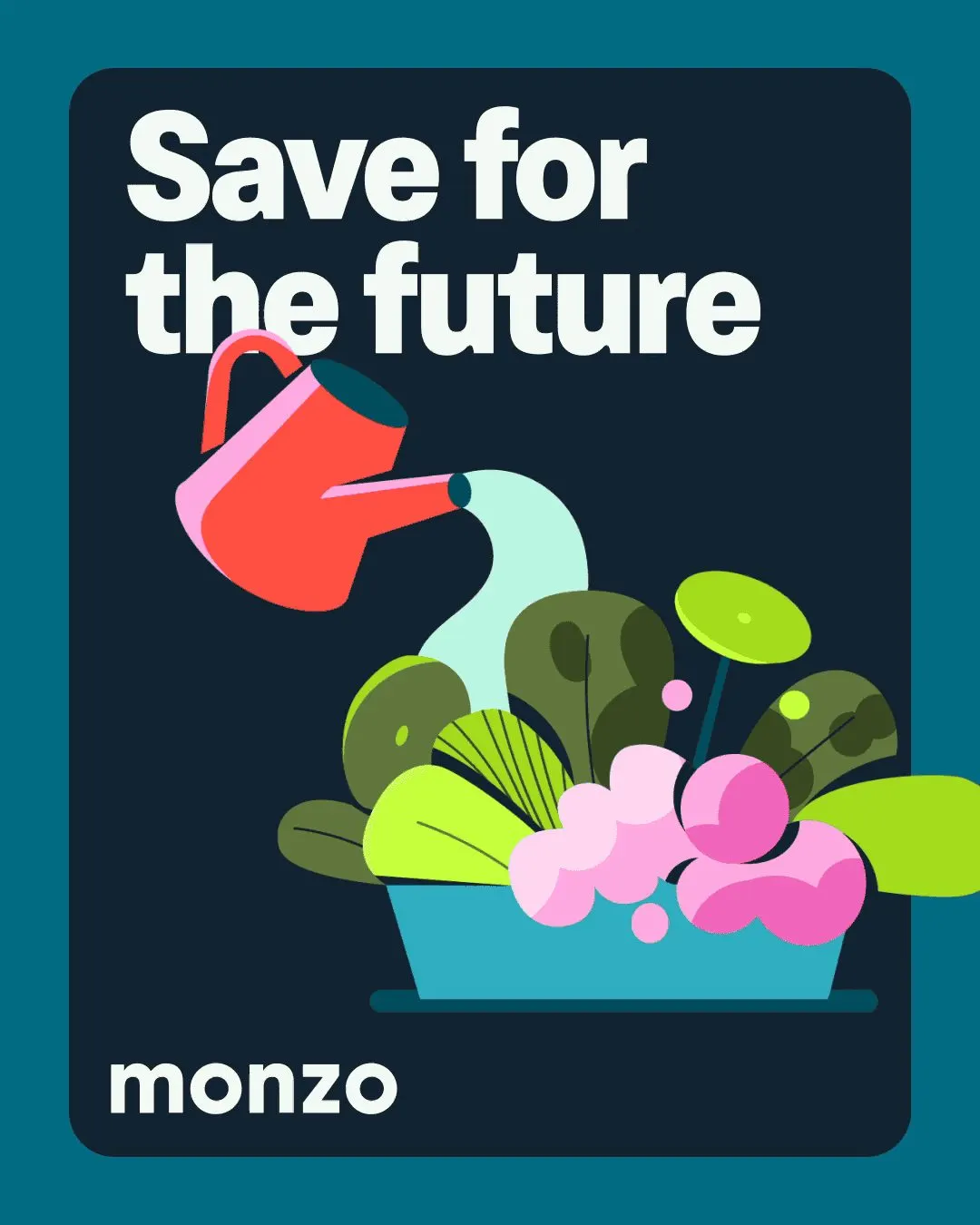
Images and video from raggededge.com, by Ragged Edge.