The Brand Monograph
Mozilla brand identity by JKR
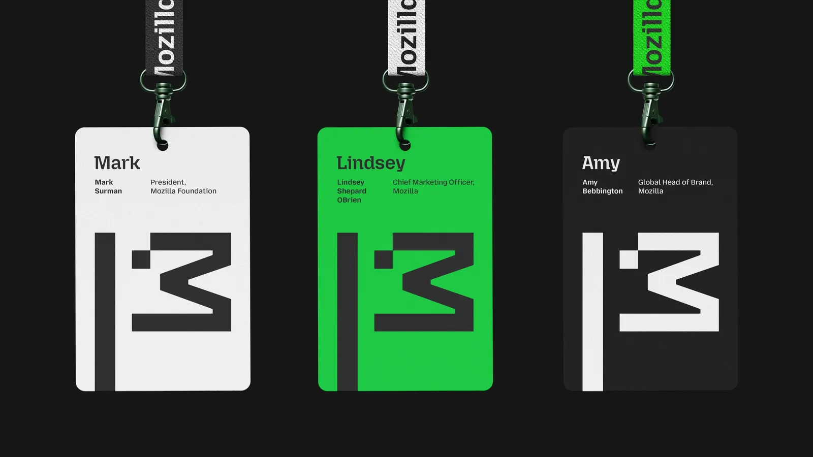
↗JKR's work for Mozilla stands out because it treats an identity as a position, not a polish. The brief was narrow in focus and huge in ambition: help return the internet to the people who use it, and give activists, innovators, and builders around the world something to organize under.
The studio answered with an identity that pushes back against the conventions of mainstream tech design. It leans on typography to carry much of the voice, developed with Igino Marini and Studio DRAMA. The tone is confident, urgent, and unapologetic, which suits an organization arguing that waiting is the real risk.
Why it works
Mozilla's audience is a movement, not just a customer base, and this identity is built for that. Bringing in two typography specialists suggests JKR saw letterforms as the main carrier of personality, which makes sense for an organization whose message is its product. The identity also takes a visibly different stance from the smooth, neutral look most tech brands share. That gives supporters something distinct to stand behind, and it shows that technology can be designed differently before anyone reads a word.
Applications
Logo
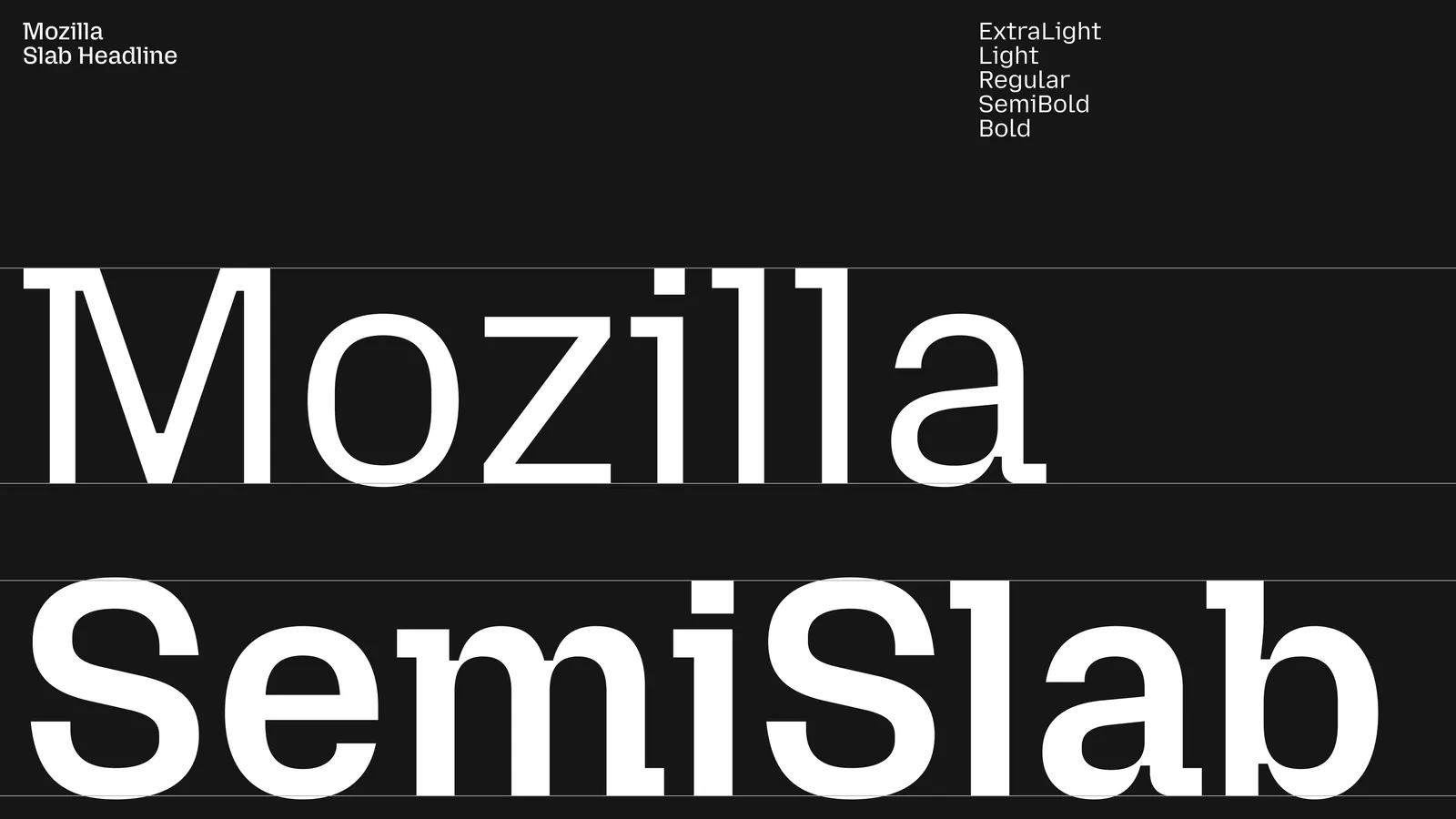
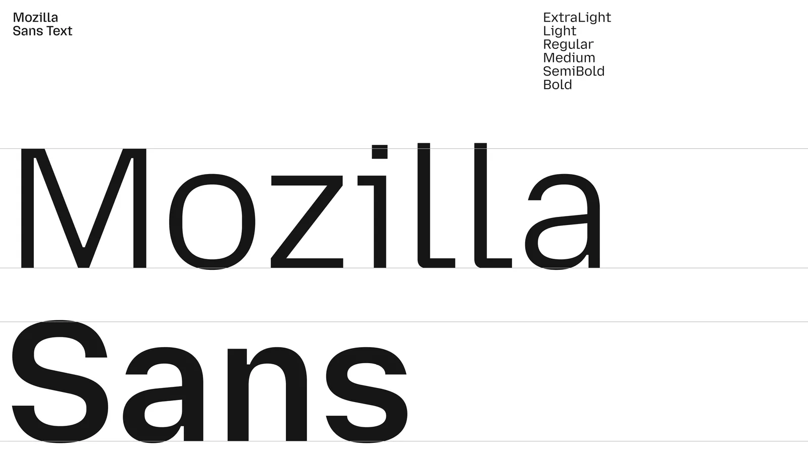
Typography
Images and video from jkrglobal.com, by JKR.