The Brand Monograph
Munson Museum of Art brand identity by Order
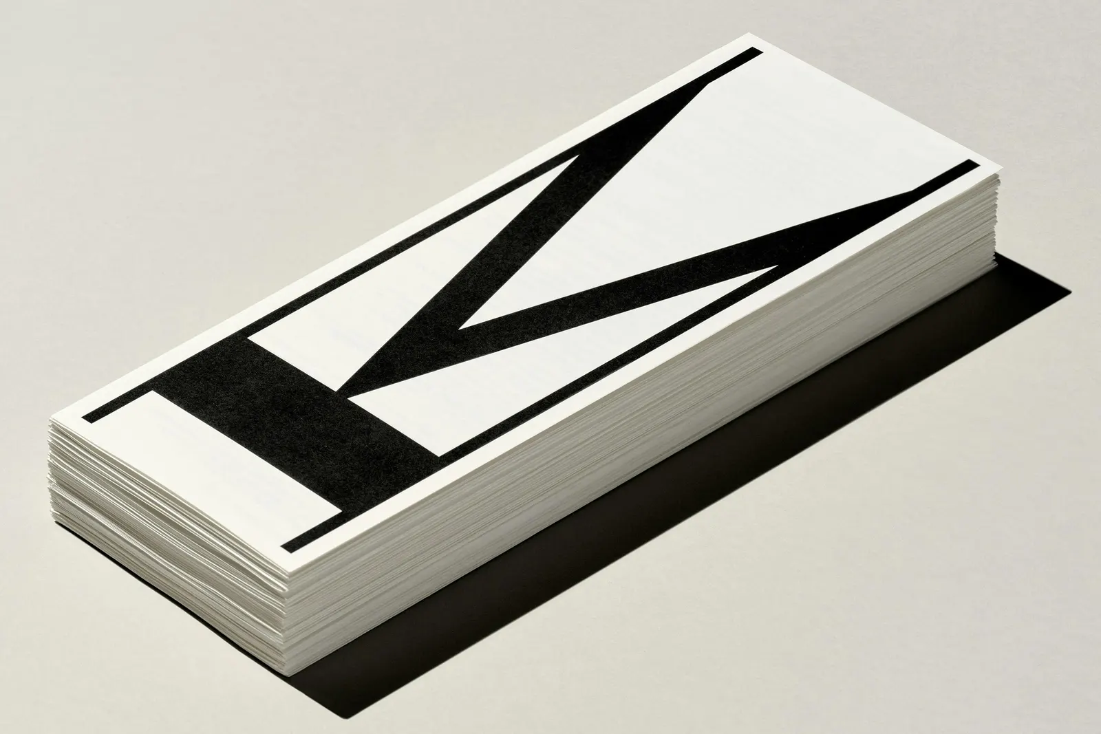
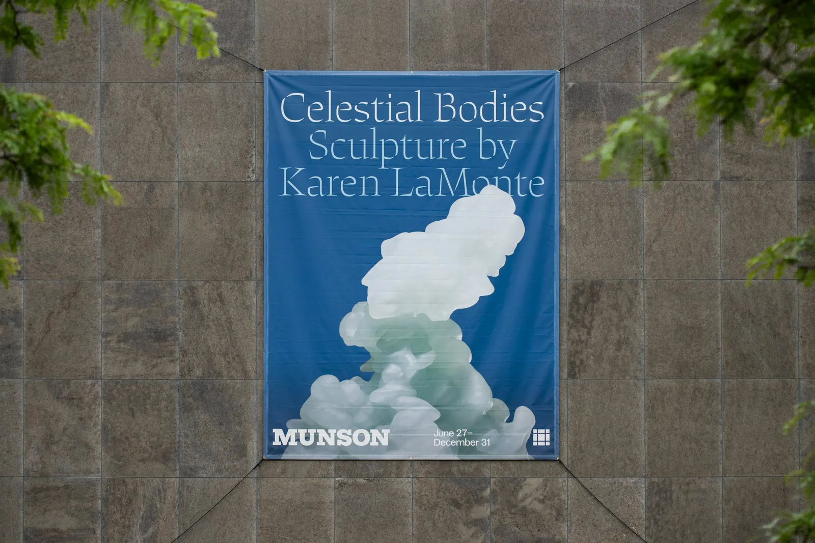
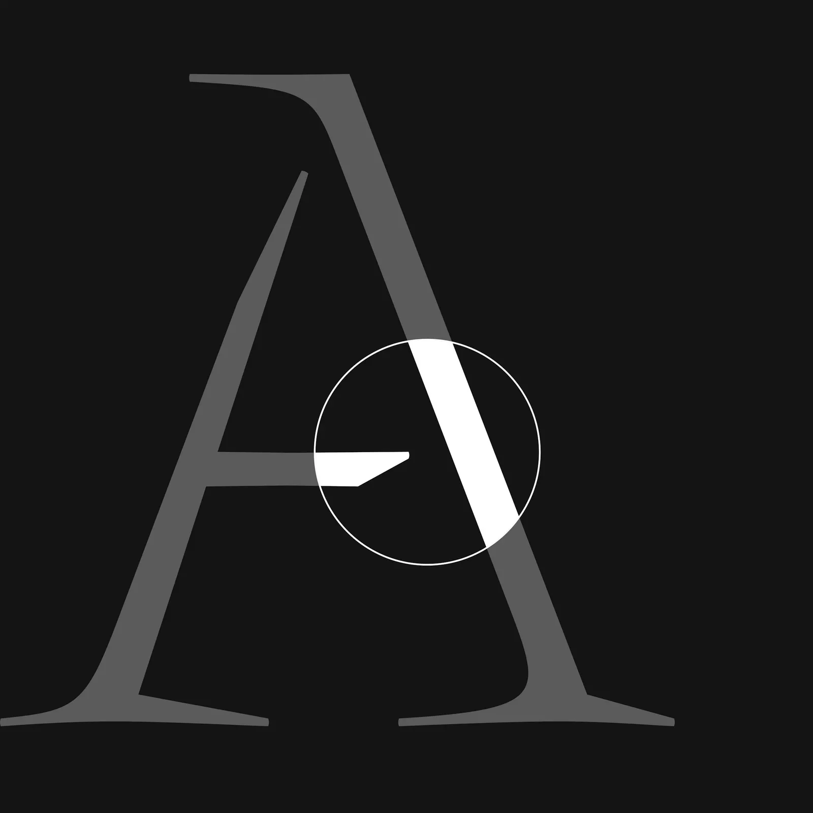
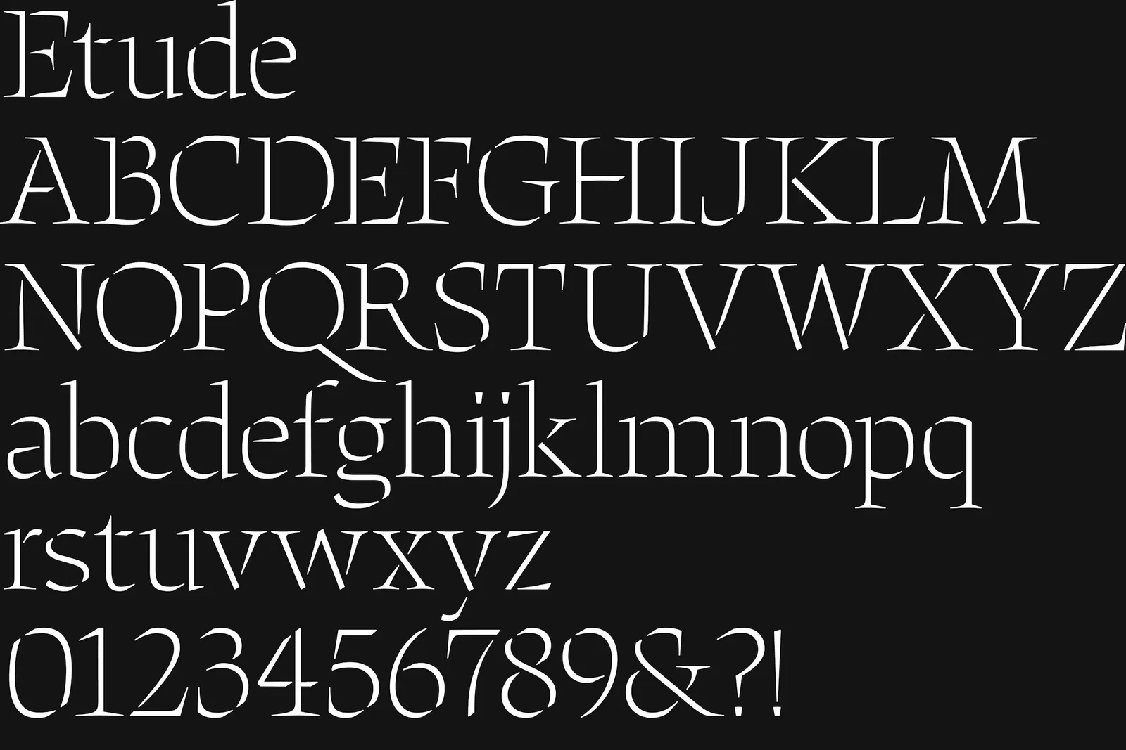
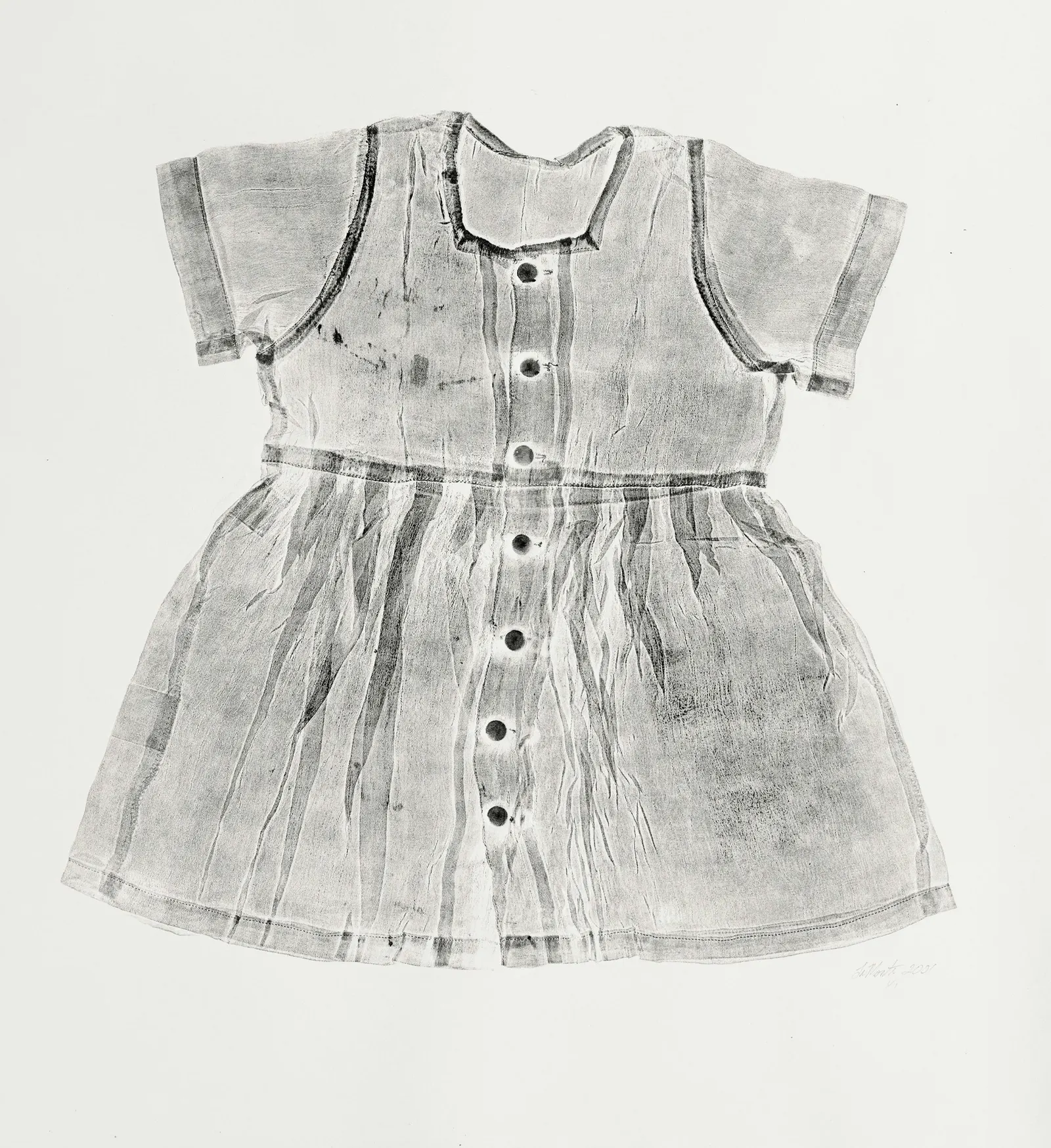
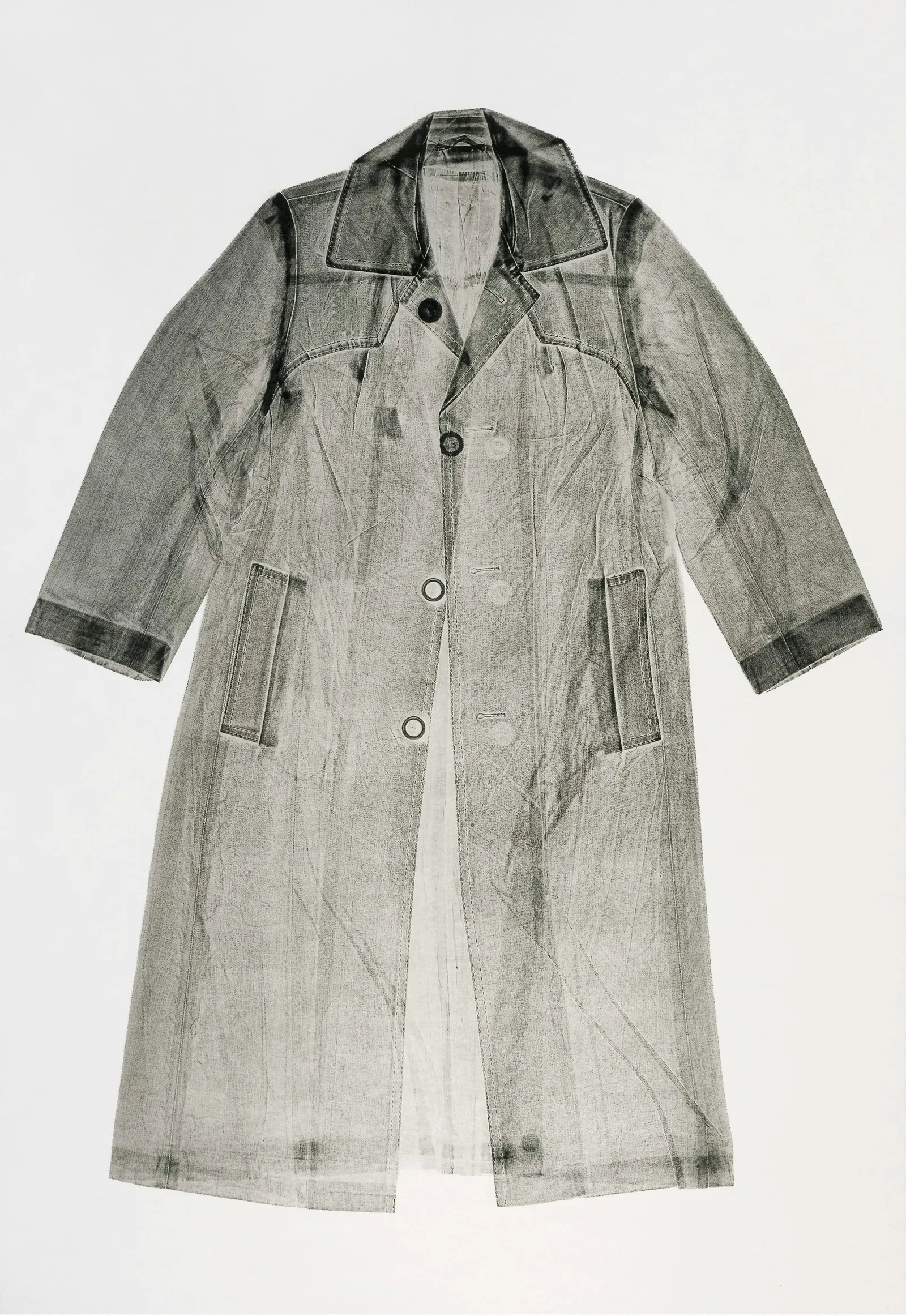
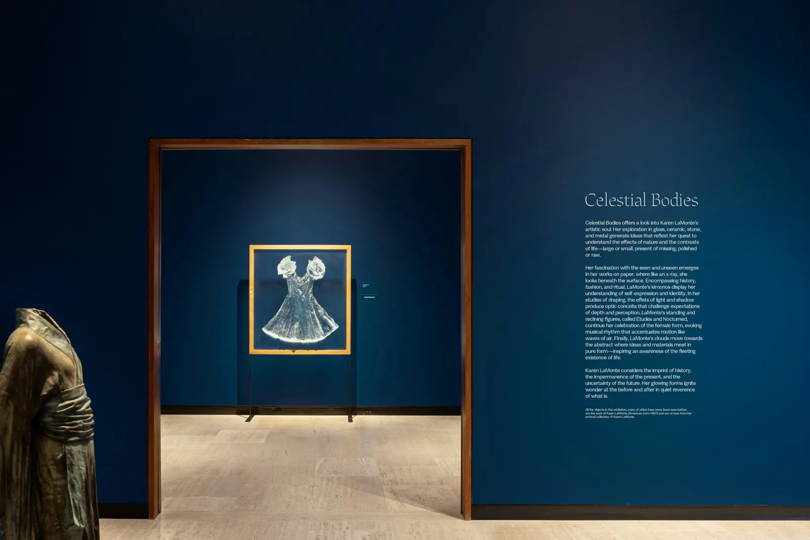
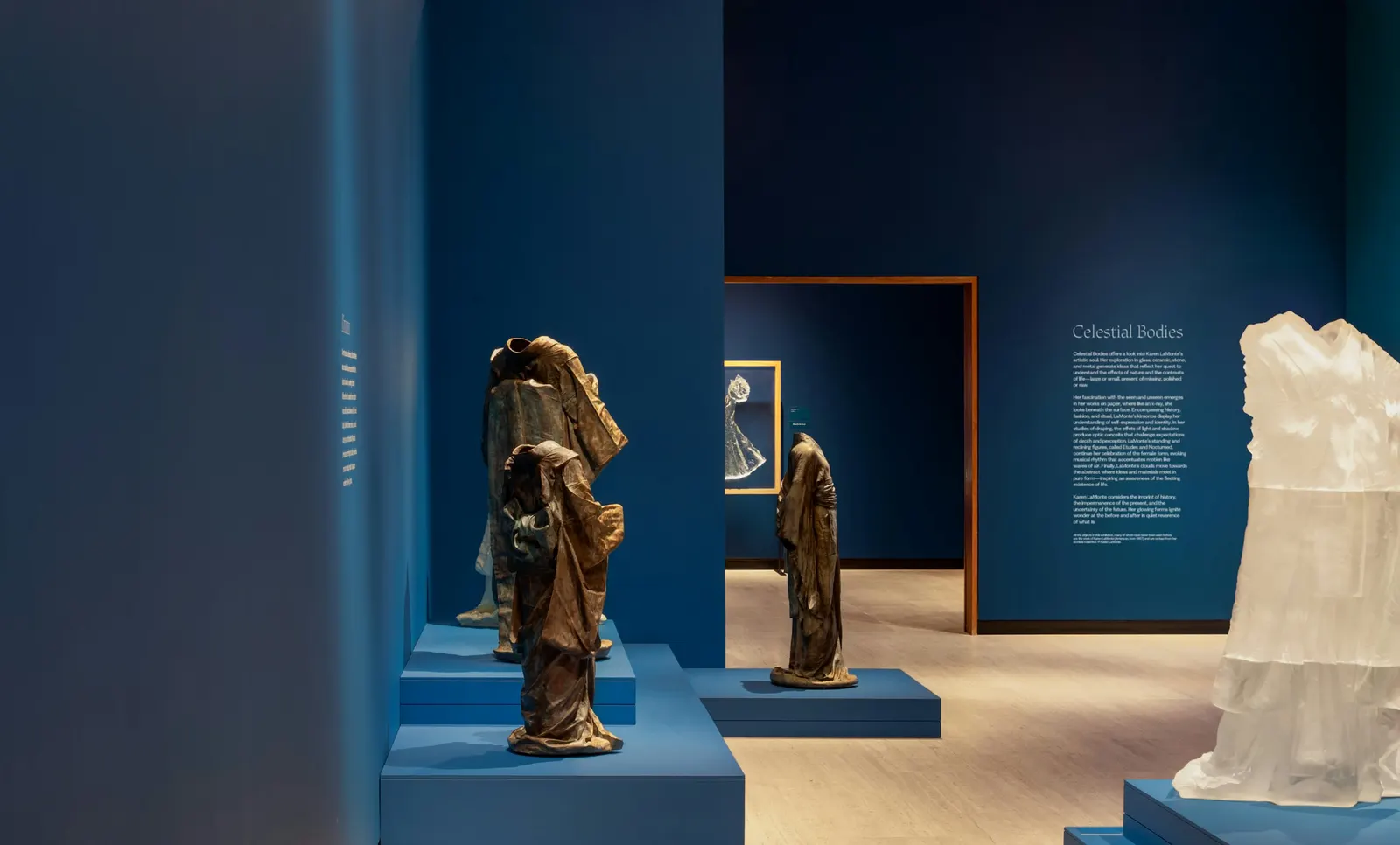
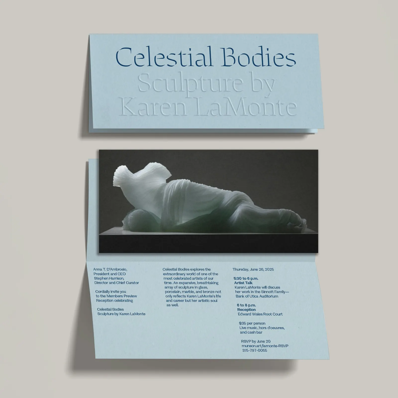
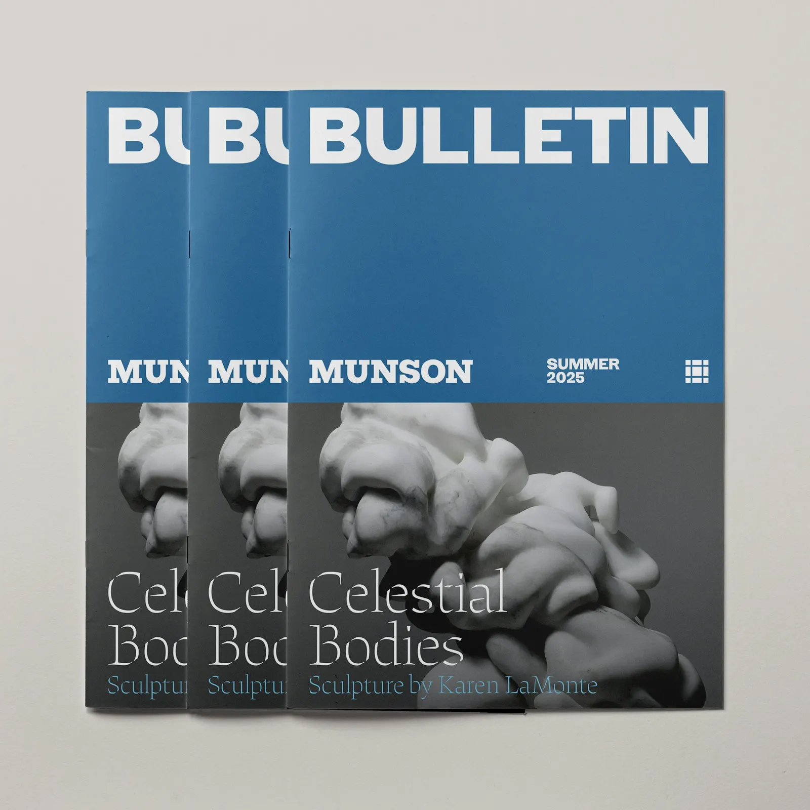
↗Order's identity for Celestial Bodies, the Munson Museum of Art's retrospective of Karen LaMonte, gives a career spanning paper, glass, porcelain, marble, and bronze a single voice without flattening any of it. The studio set the show in Etude, a stencil typeface from its own foundry drawn by Emily Atwood, and used a light weight of Munson Sans, the museum's house face, for supporting text.
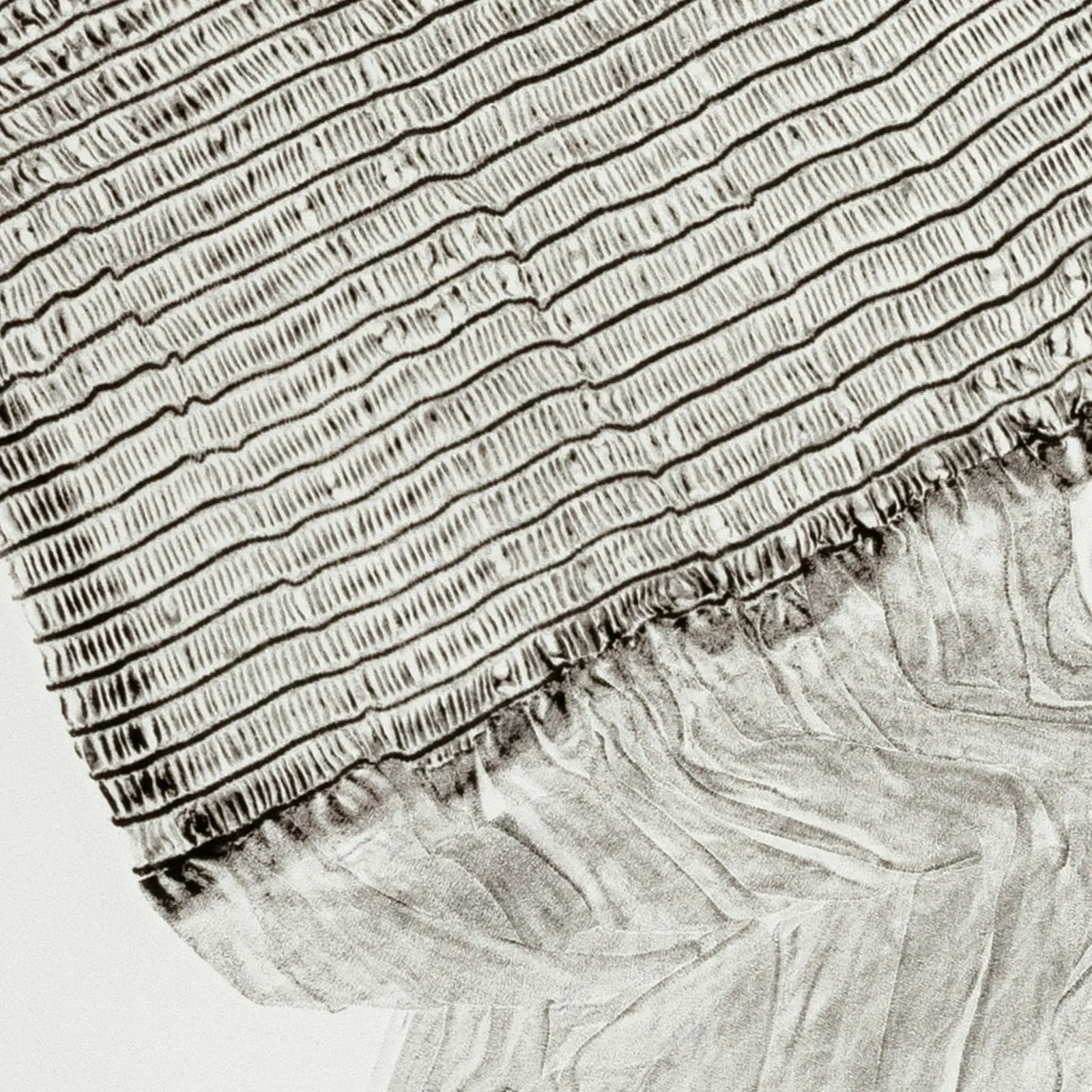
Color comes from a run of blues that shifts from gallery to gallery, taking its cues from LaMonte's glass. The reception invite is blind embossed, so its surface carries as much as its ink. Campaign materials rotate through different works to signal the show's range. Atwood and Laurel Warner led design, with Jesse Reed on strategy. The exhibition opened in summer 2025.
Why it works
Etude's stencil breaks are gaps, and a gap is a kind of sculpture. The type behaves like the work instead of simply labeling it. A single blue family is a smart restraint for an artist with this many materials: it unifies the galleries without competing with the objects. Pairing Etude with a light Munson Sans keeps the hierarchy quiet and the museum's own brand present. The embossed invite gives collectors and members something to touch before they arrive.
Applications
Logo
Typography
Images and video from order.design, by Order.