The Brand Monograph
Neveo brand identity by Nemesis
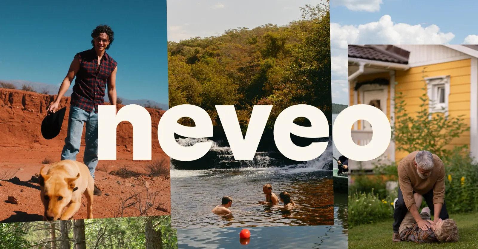
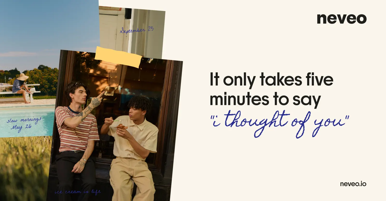
↗Most tools for staying in touch promise speed or polish. Neveo, as shaped by Nemesis, goes the other way: its identity is built on the idea that a keepsake doesn't have to be good, only yours. A blurry dinner, a cat on the counter, and a kid caught mid-laugh are the main event.
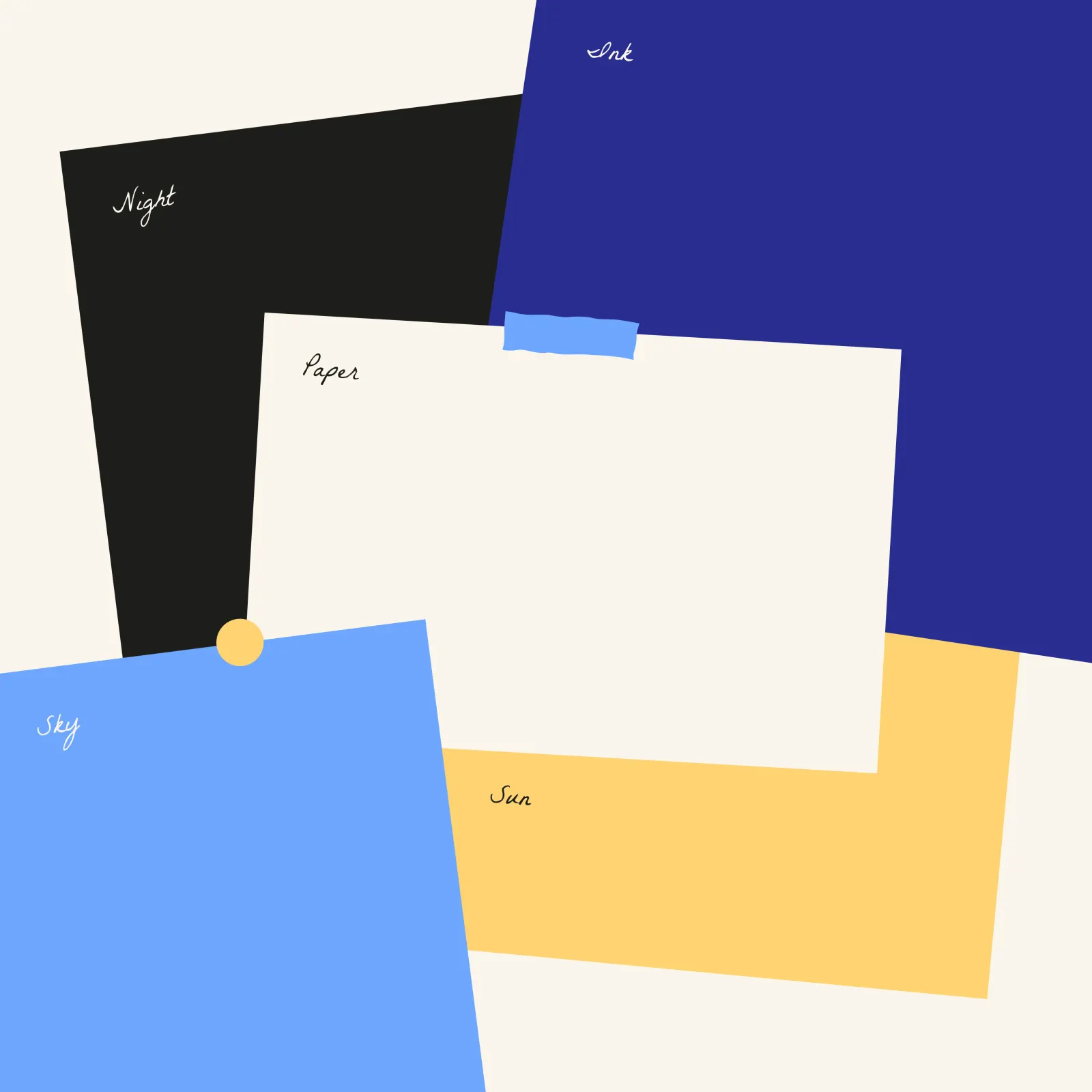
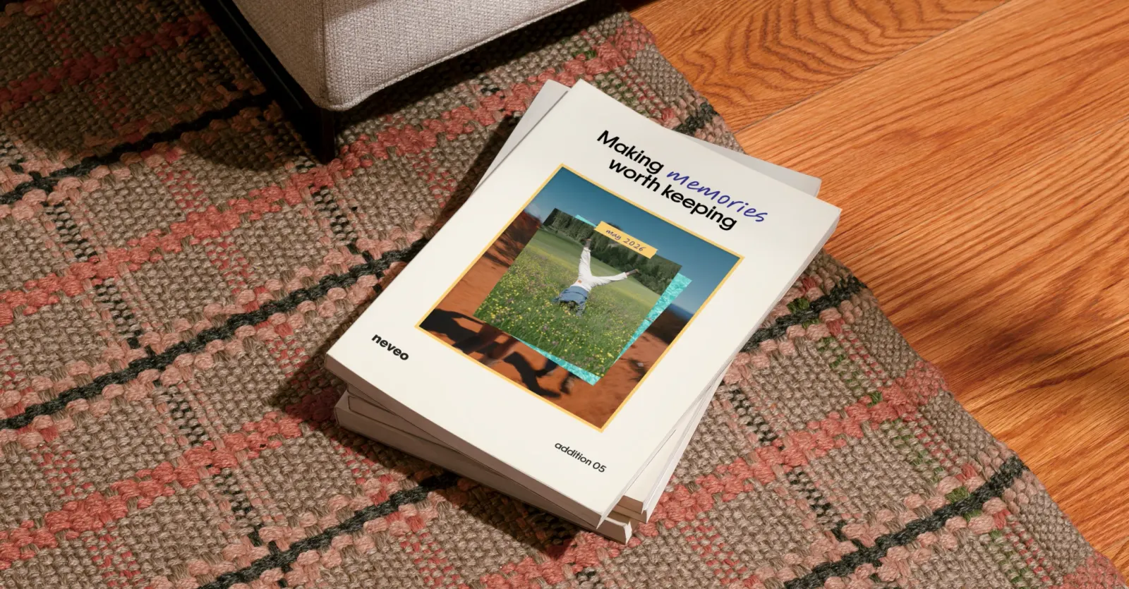
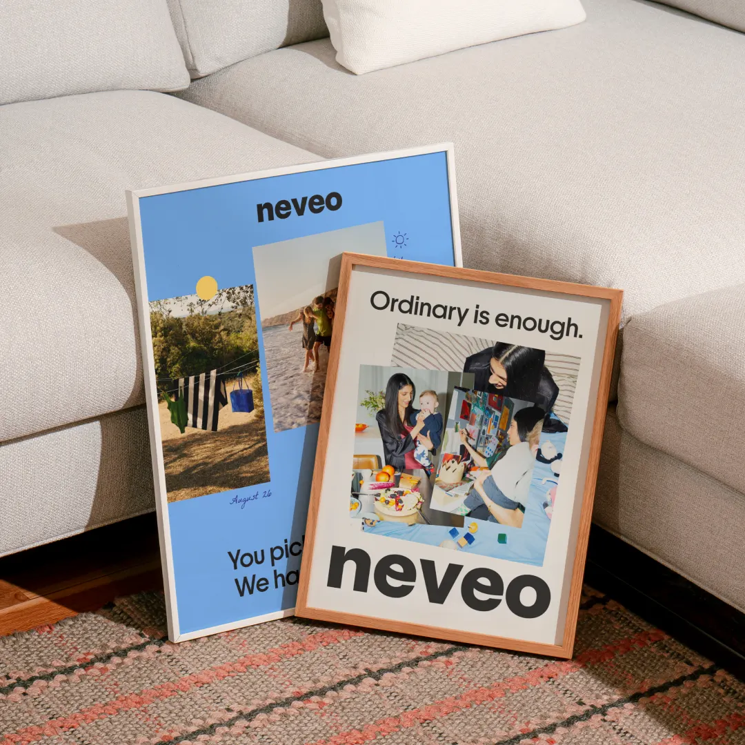
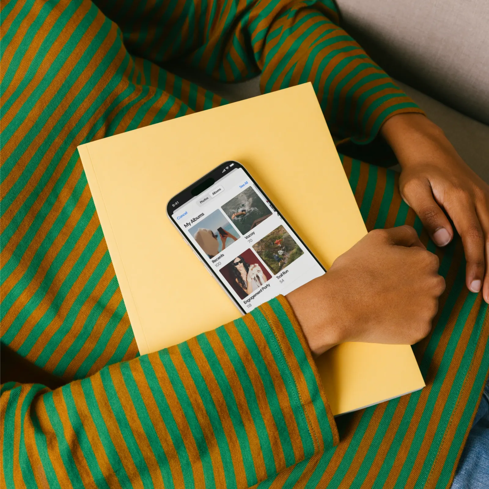
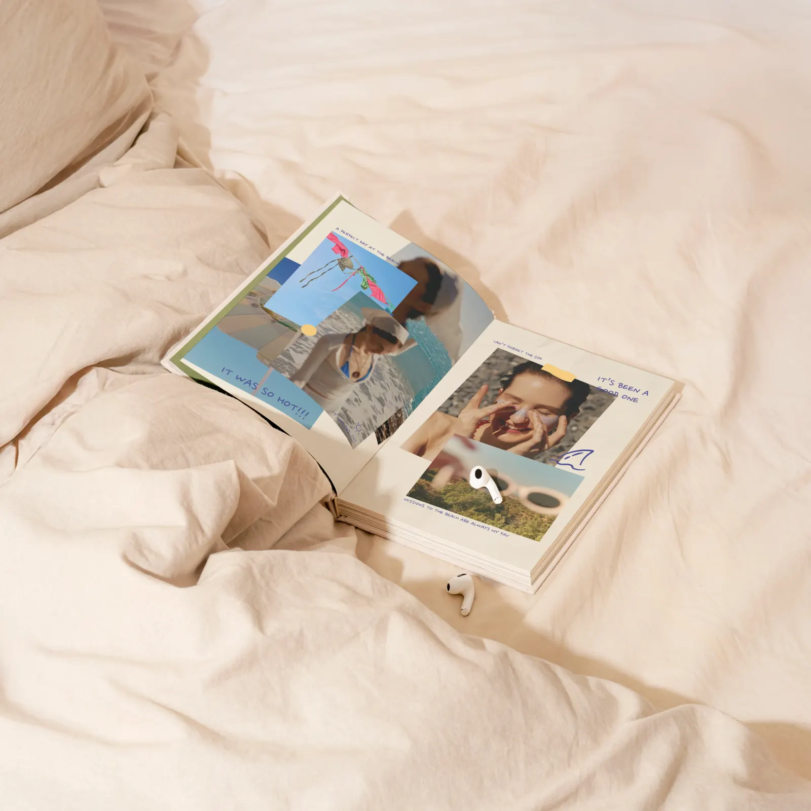
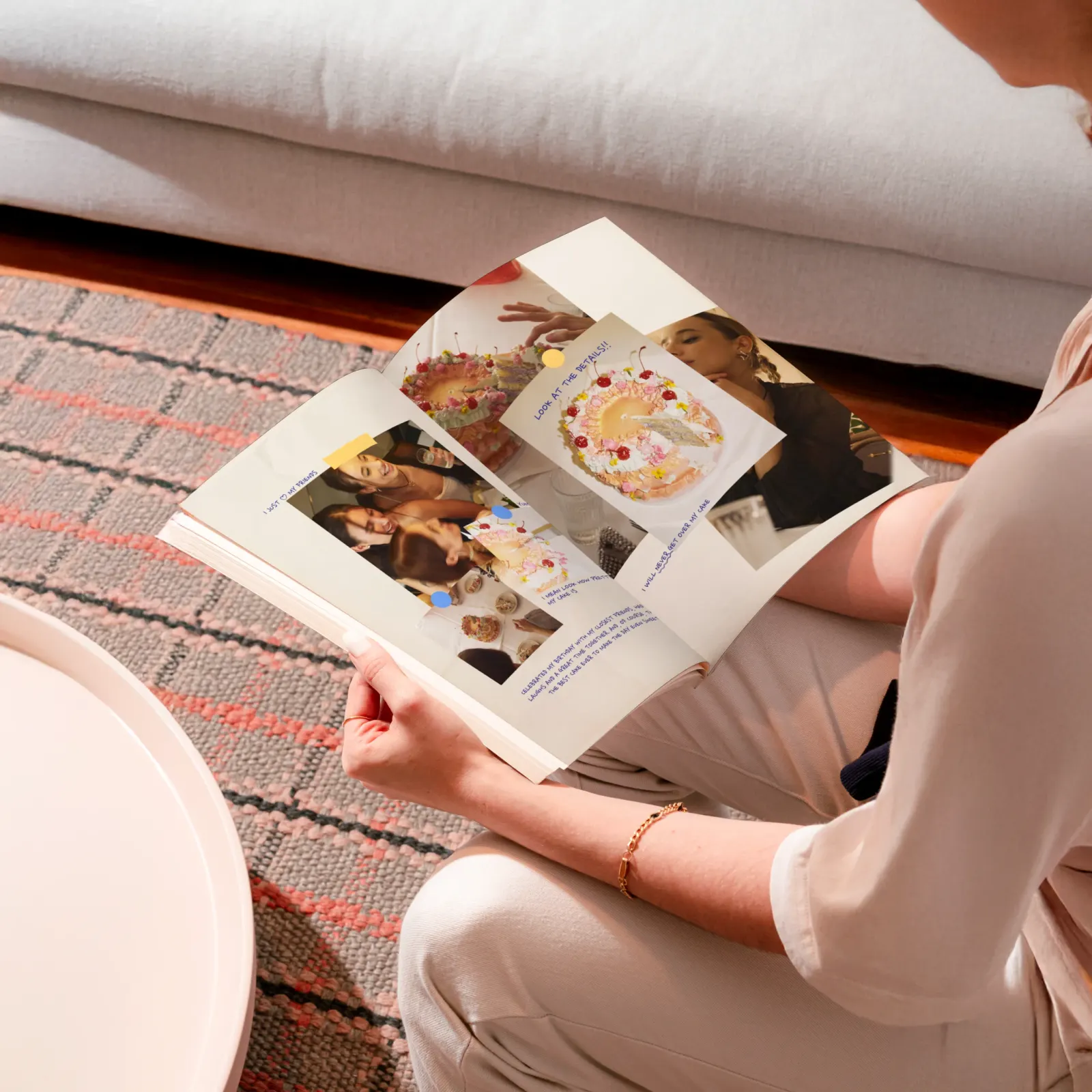
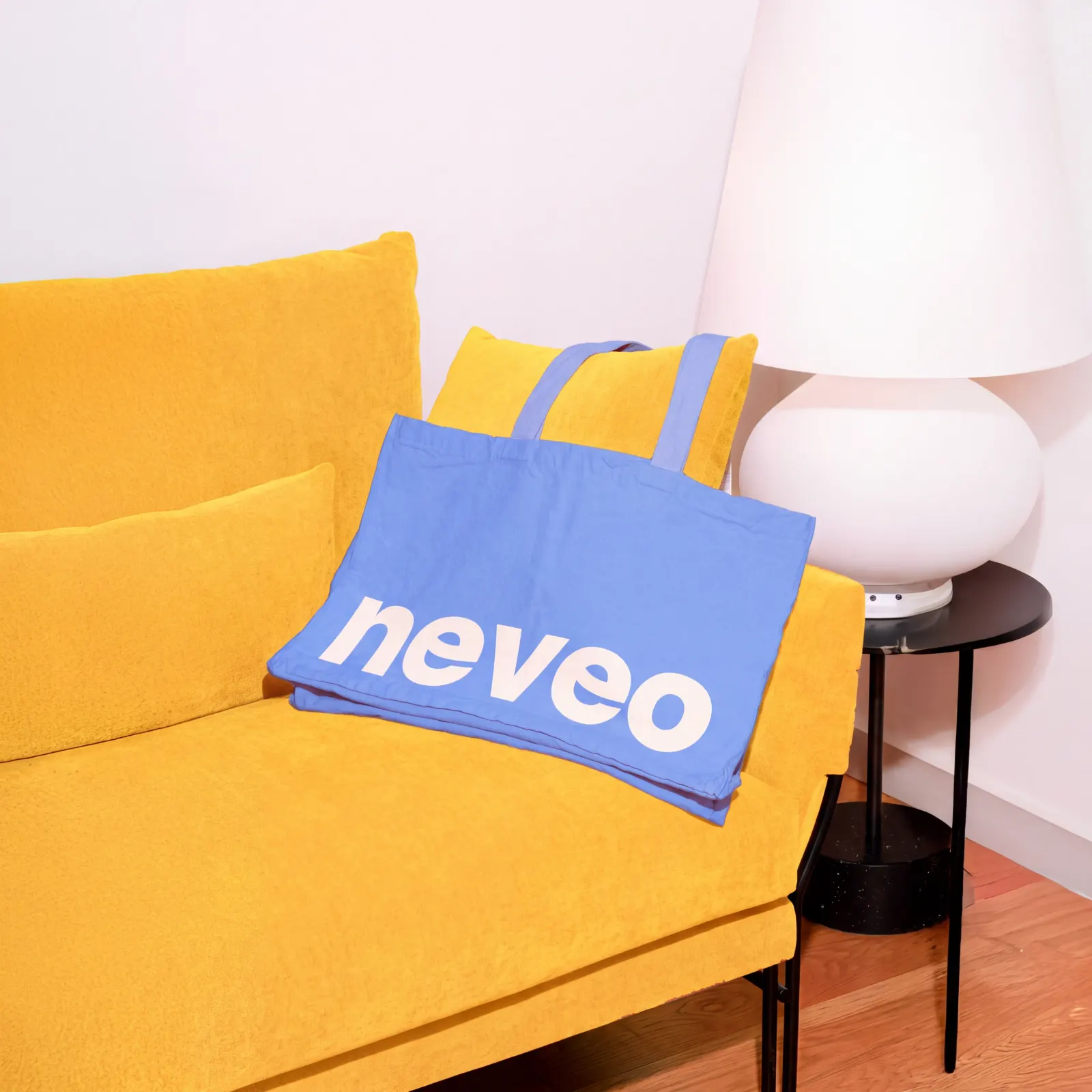
The brief was to help families, expats, long-distance couples, and grandparents who find technology hard feel close without it taking over their days. Nemesis answered with scrapbook logic. The wordmark is made from two smiles, one for the sender and one for the receiver. Handwritten typefaces stand in for different relatives contributing to one shared gazette. Tape, paperclips, and tilted frames sit on warm paper tones and ink blues, and the design components carry that handmade feel across touchpoints.
Why it works
The two-smile mark shows both sides of the exchange in a category that often leans on generic chat bubbles and hearts. Handwriting and deliberately ordinary photos lower the bar for participation, so a less confident user, like a grandparent, never feels they must perform. The paper and ink palette adds a tactile layer that makes a digital product feel like something you keep rather than something you scroll. Every choice supports the same promise: no effort required to show up.
Applications
Typography
Images and video from nemesis.studio, by Nemesis.