The Brand Monograph
North Sydney Olympic Pool brand identity by Frost*collective
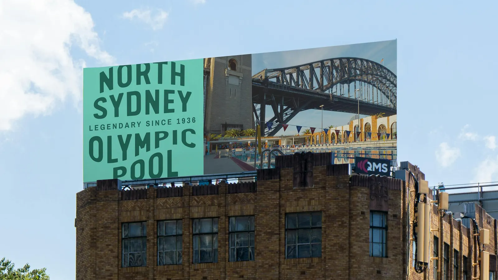
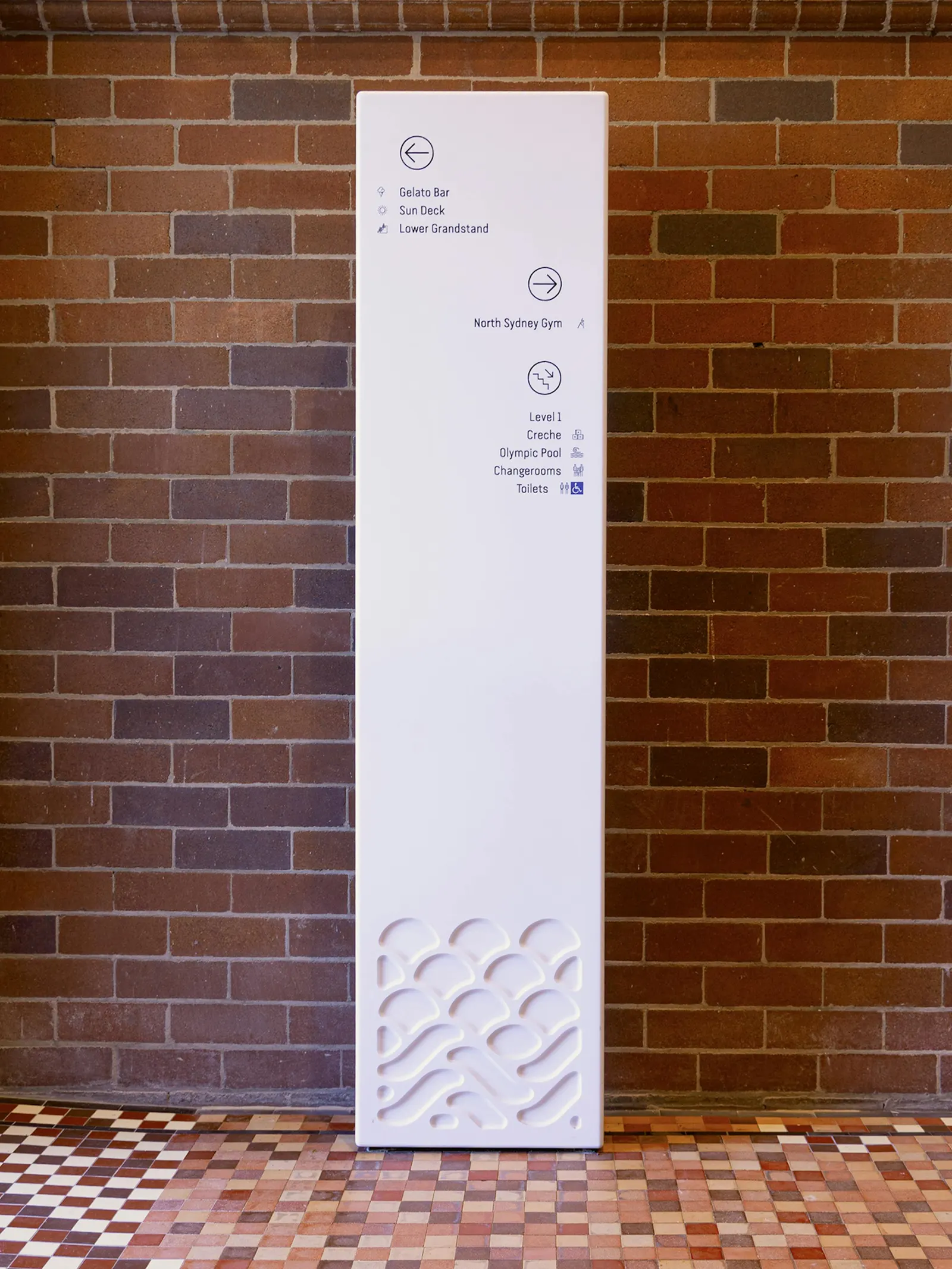
↗Few pools have a view like North Sydney Olympic Pool's, and Frost*collective built the identity around it. Working with North Sydney Council ahead of the reopening after a major refurbishment, the studio designed the brand, signage, and internal graphics for a 1936 Art Deco landmark that sits beside Luna Park and beneath the Sydney Harbour Bridge.
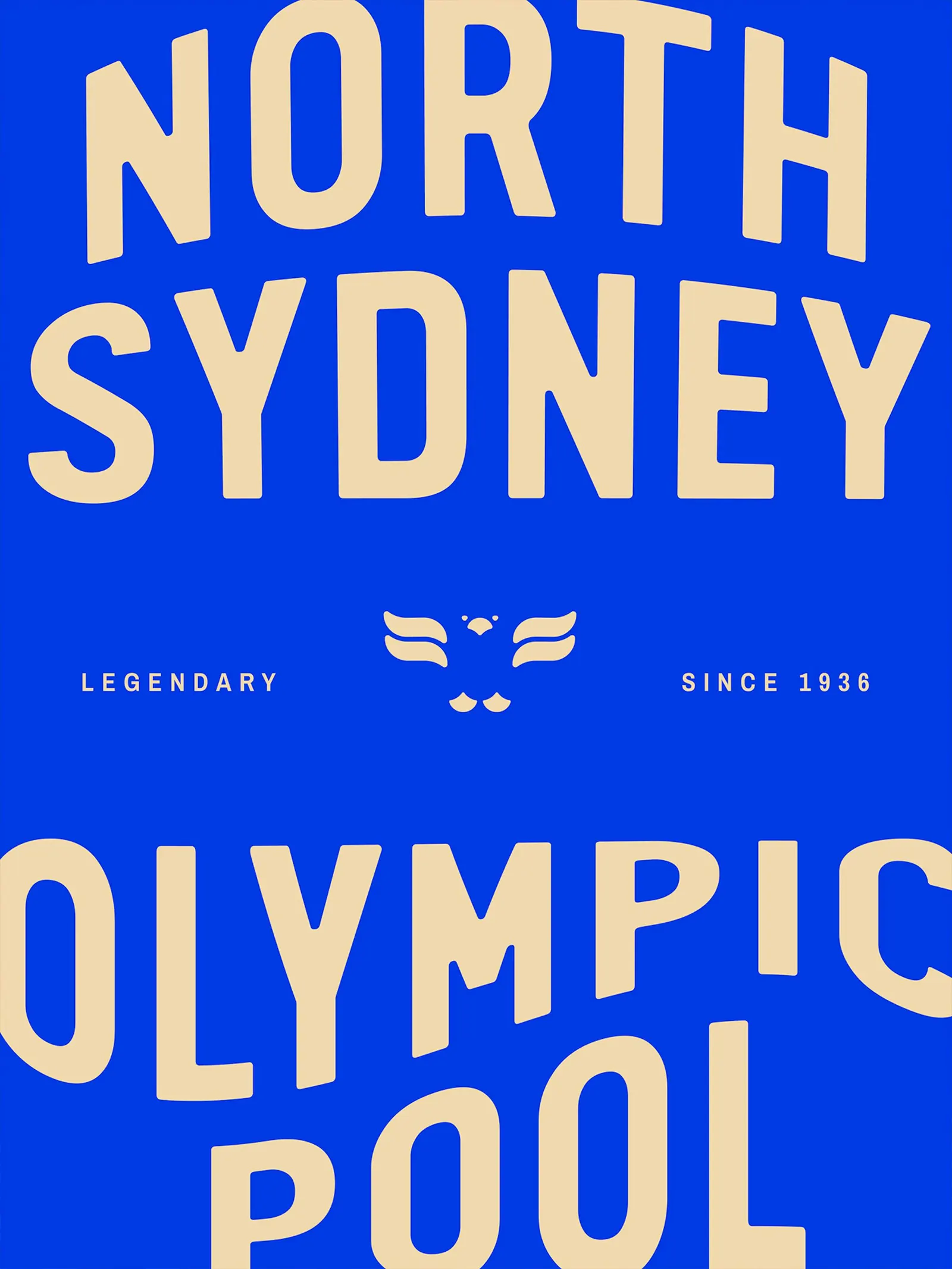
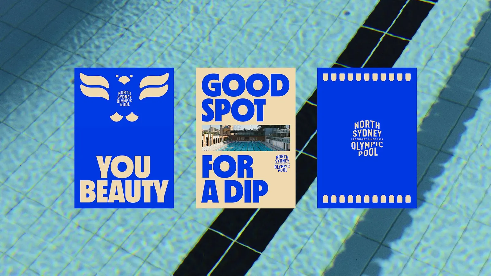
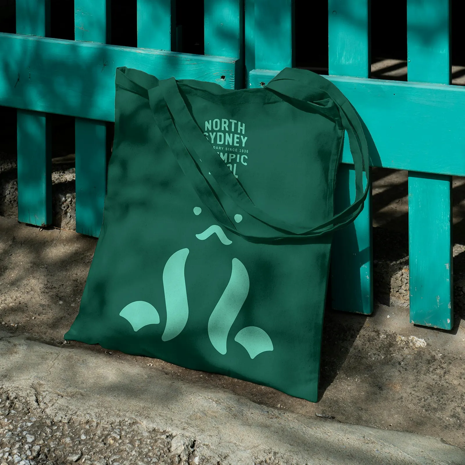
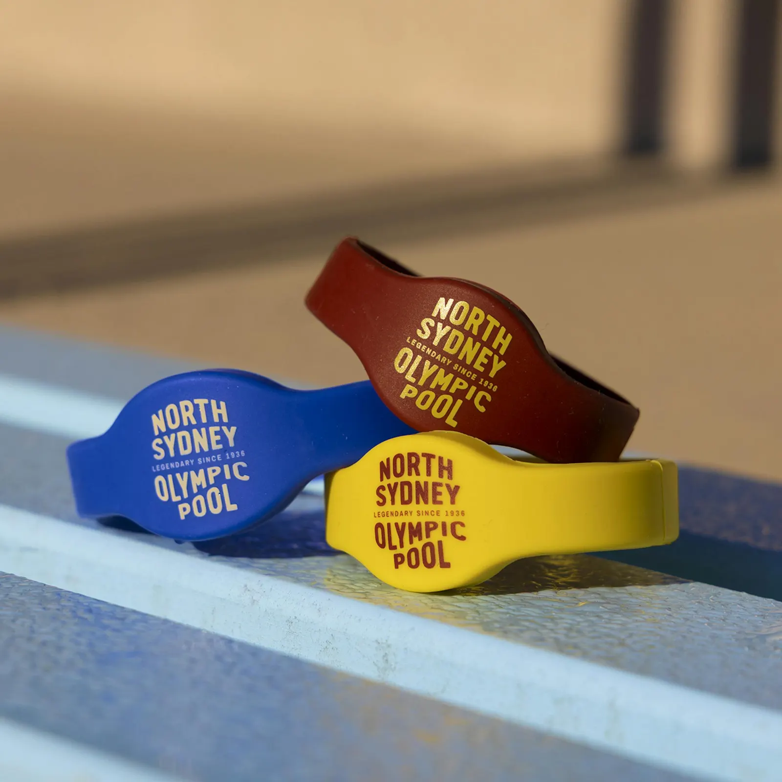
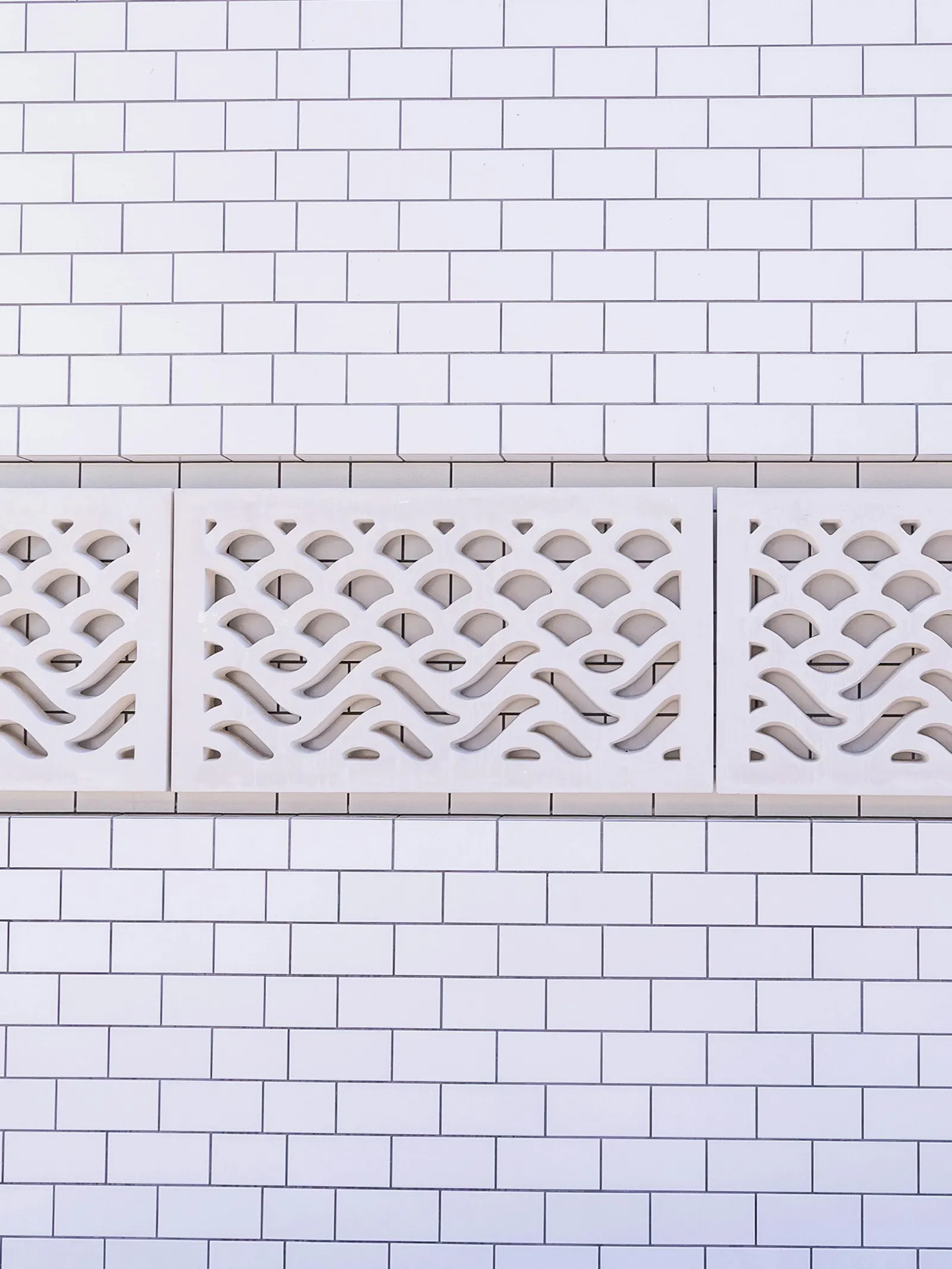
Research began in the archive and moved on to the regulars, including the North Sydney Masters. A round of AI-facilitated conversations with 60 community members then tested the direction. The logo uses letterforms to suggest the bridge overhead and the water below. Color and type borrow from the 1970s, illustrations draw on marine life and Art Deco water patterns, and the same language carries into patterned concrete blocks and wayfinding, along with more than 100 bronze frogs set into the concrete. In its first two months the brand drew over 2,000 new social followers, and preview tours were close to booked out.
Why it works
Public pool branding tends to default to blue and wave graphics. Here the mark is built on the one thing no other pool can borrow, and it works without a literal bridge icon. Splitting the eras is smart: Art Deco belongs to the architecture and patterns, while the 1970s palette and type bring the warmth of childhood summers, so the heritage never feels like a museum piece. The frogs and illustrated creatures give a large complex some personality, which makes the signage feel welcoming rather than merely directional.
Logo
Applications
Images and video from frostcollective.com, by Frost*collective.