The Brand Monograph
Northzone brand identity by Ragged Edge
↗Most venture firms announce themselves with the same swagger, so Northzone stands out by sounding like a publication rather than a fund. Ragged Edge took on a firm that had backed more than 175 companies across Europe and the US and had just closed its ninth fund, a $500m one, yet presented itself quietly.
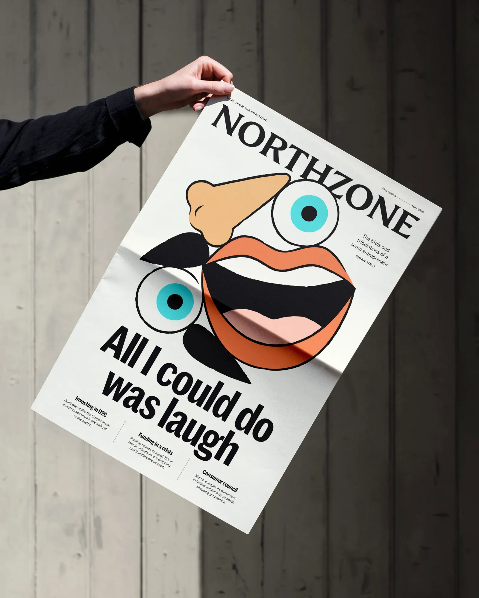
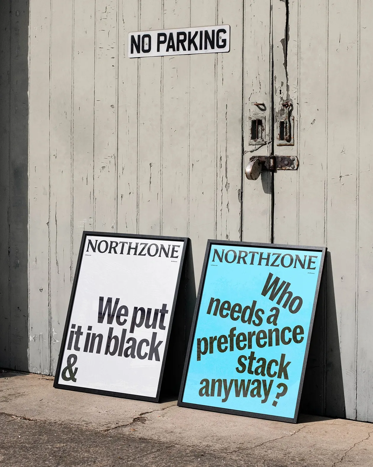
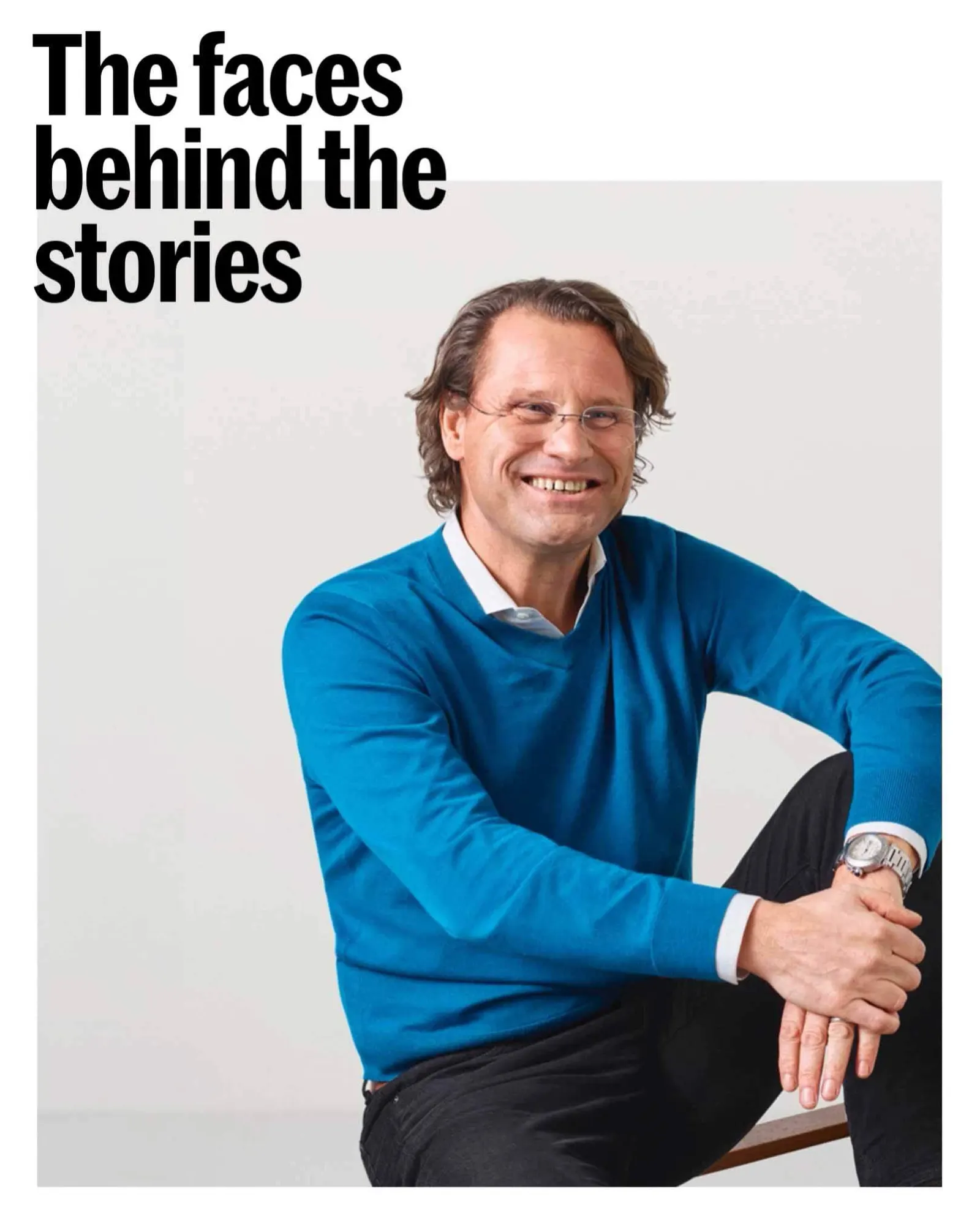
The studio's answer is a magazine-minded identity: a logotype that borrows from newspaper mastheads, a candid and sometimes contrarian tone of voice, and an adaptive design system that holds together in print and on screen. Typography was developed with Dinamo Typefaces and Newglyph. The website extends the idea with stories from founders and a short set of principles, and the relaunch let Northzone present itself as a lean, distributed team rather than a monolith. In September 2022 the firm raised over $1.2 billion.
Why it works
The masthead is the smartest move here. Publications earn trust by being credible, specific, and consistent, which is exactly what founders want to judge in an investor, and the borrowed format steers clear of the gradients and futurism that crowd the category. Type developed with respected foundries gives the wordmark a voice of its own, which matters when the name has to hold its own beside older American firms. Plain-spoken copy does the rest. In an industry of superlatives, restraint reads as confidence.
Applications
Color
Images and video from raggededge.com, by Ragged Edge.