The Brand Monograph
Royal Drawing School brand identity by Pentagram
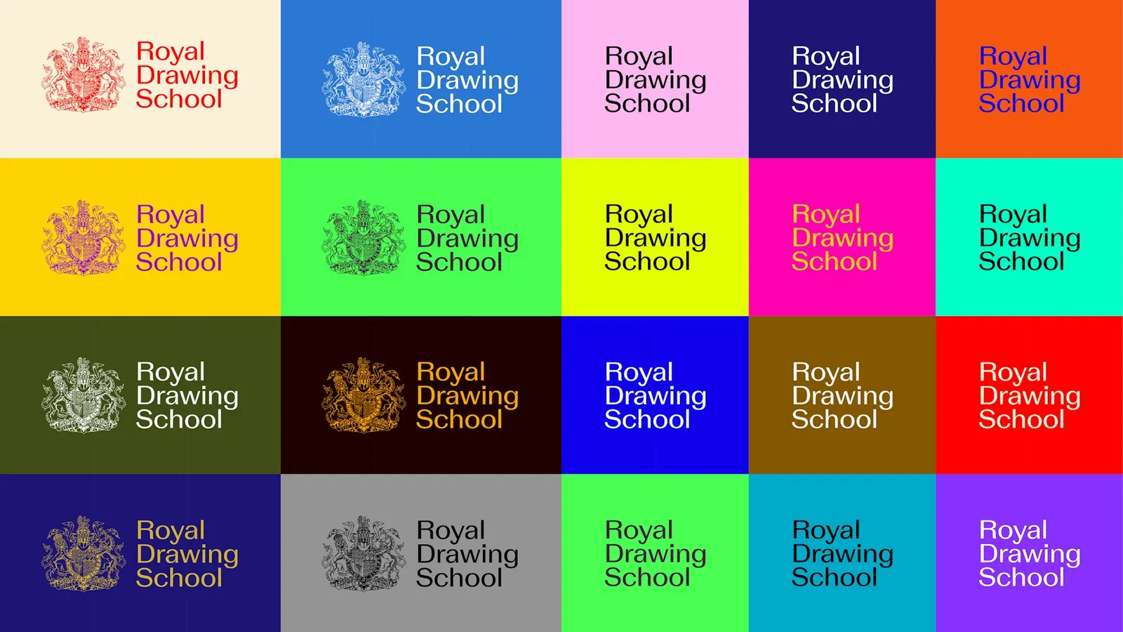
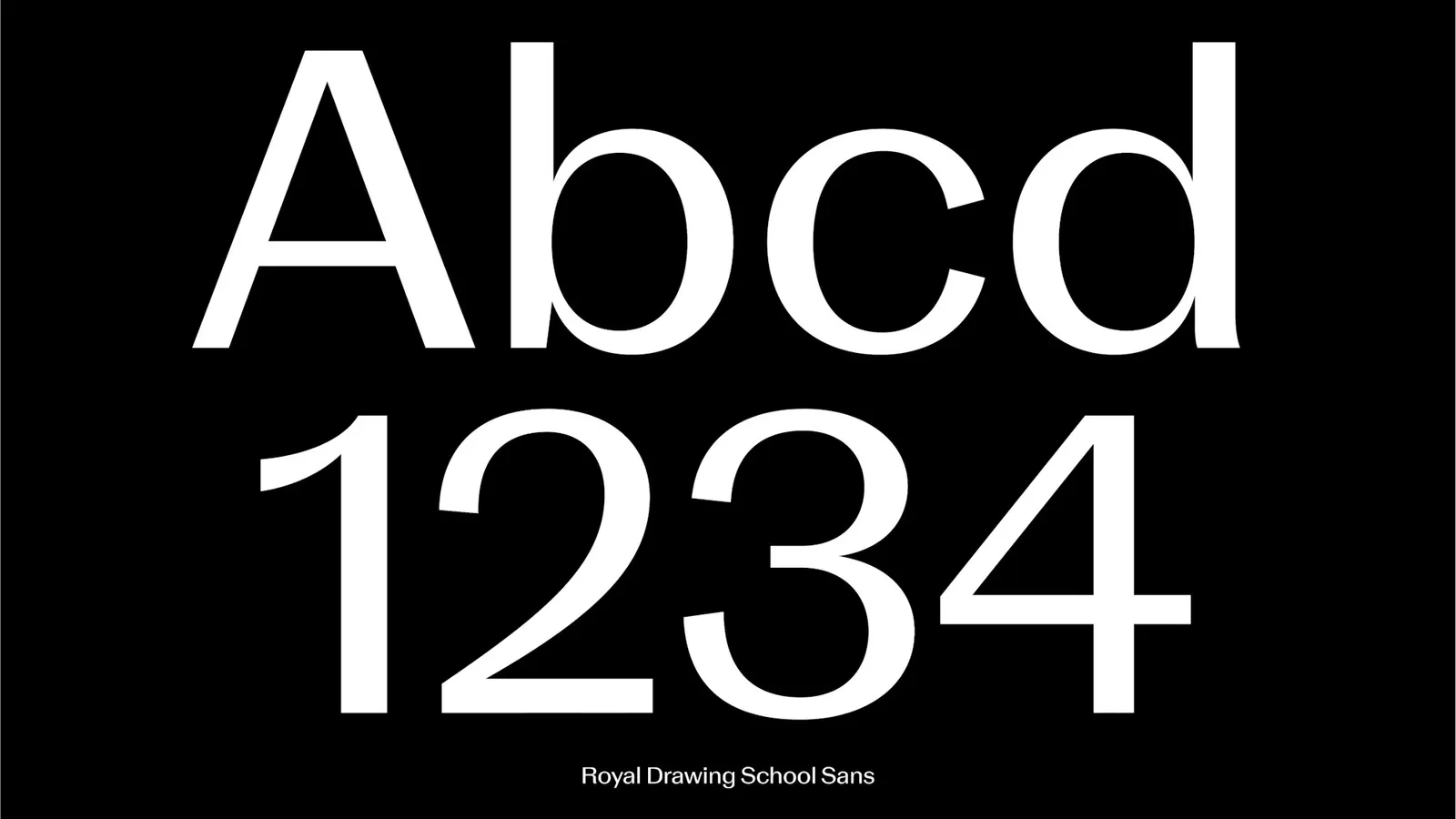
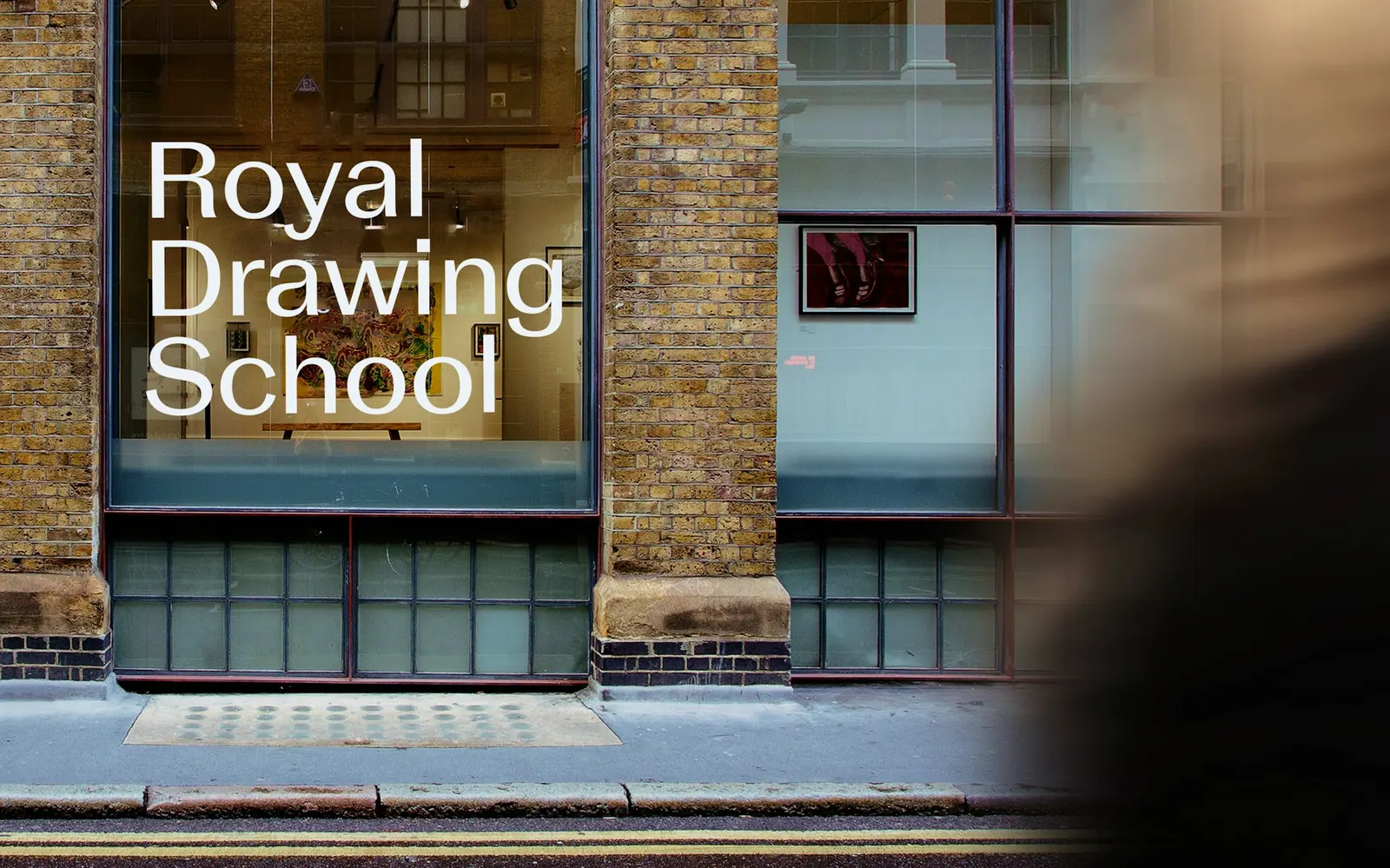
↗Pentagram drew the Royal Drawing School's logo the way a student might approach a still life: only what is in front of you. The studio designed just the letters the name required, starting from plain sans serif forms and stretching them wider. It then softened the joins with small pinches and flared the stroke ends so they look as if a loaded brush made them.
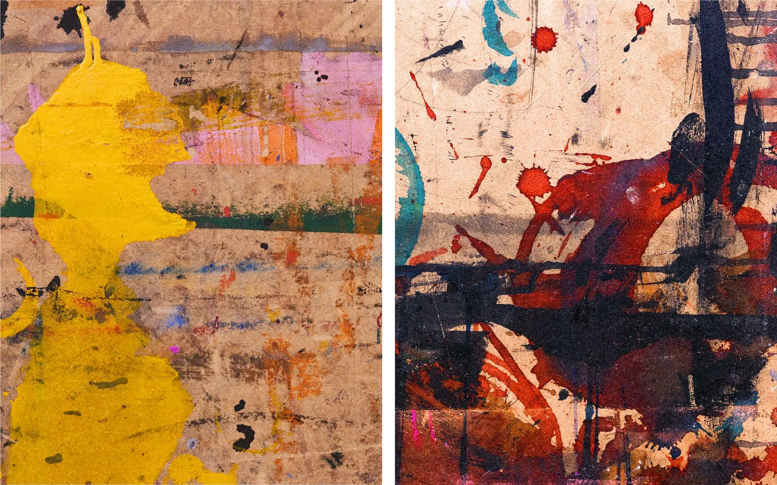
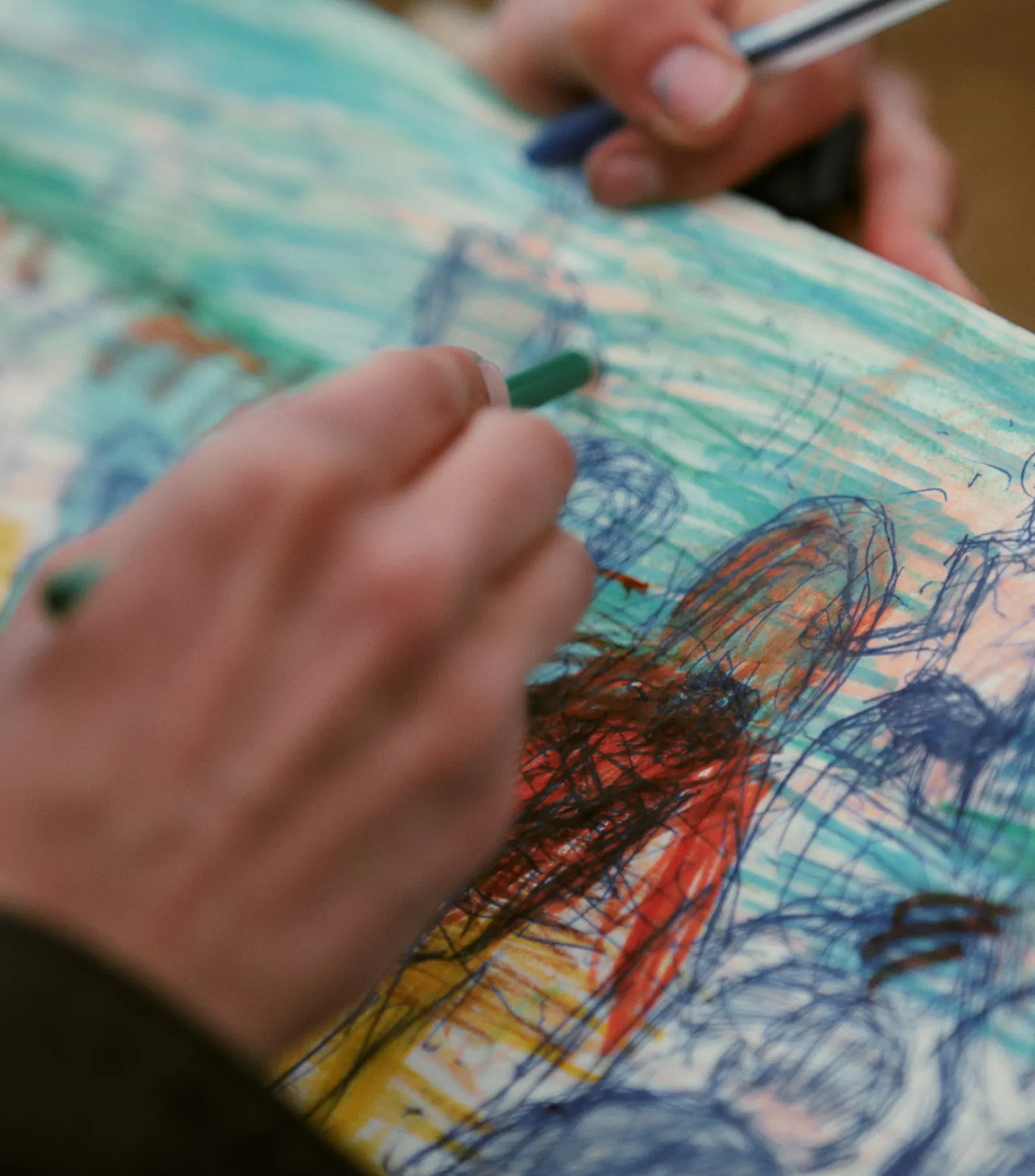
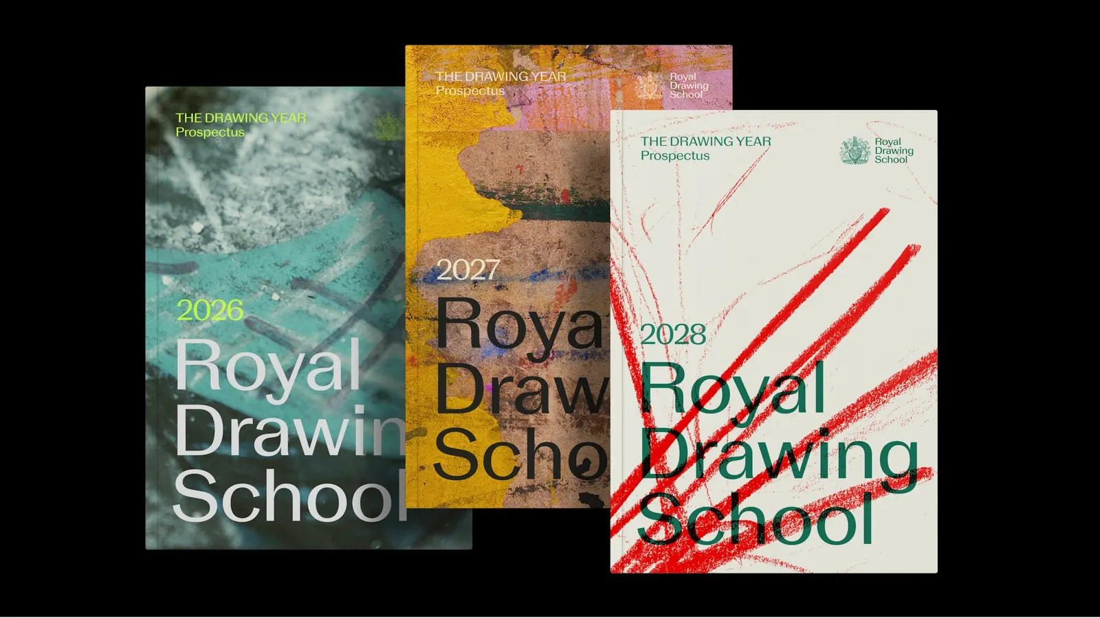
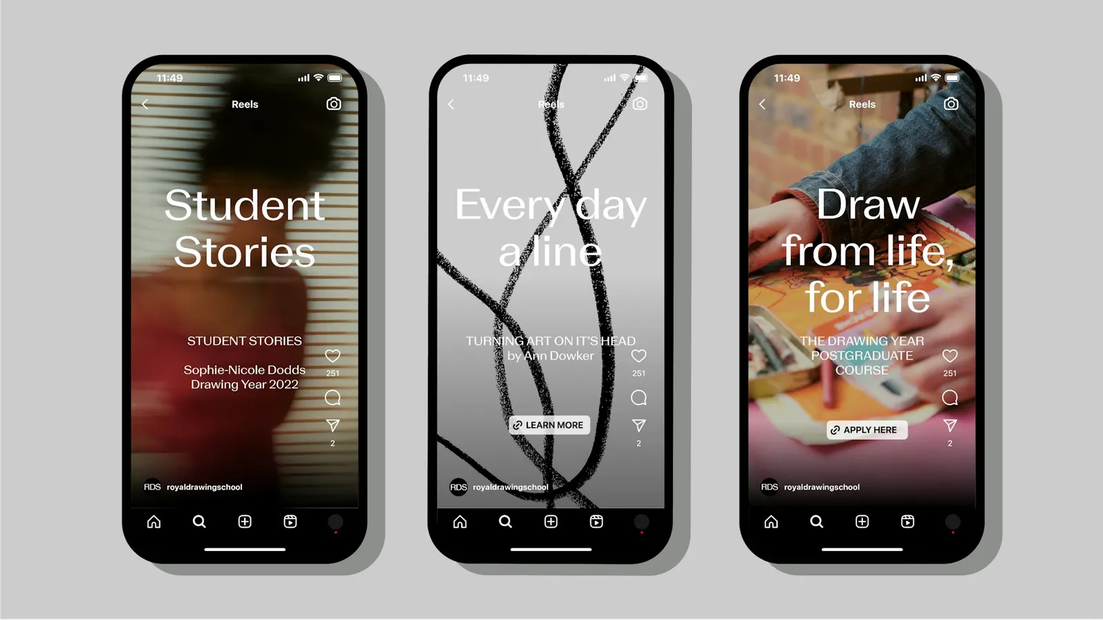
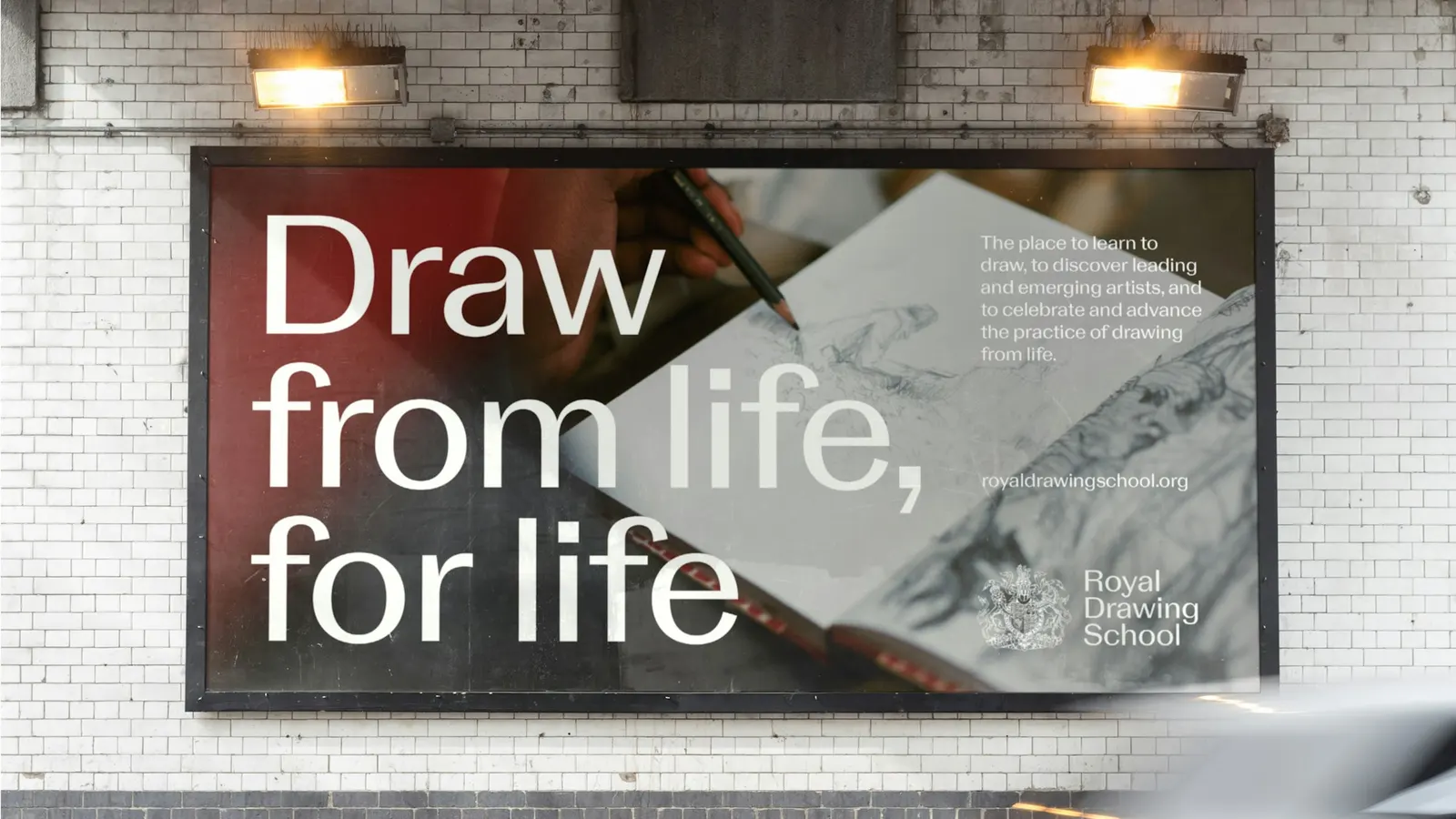
The brief arrived as the School neared its 25th anniversary. Its output spans drawing, painting, print, and sculpture, so the identity couldn't favor any one of them. Harry Pearce and the Pentagram team extended the logo into a custom grotesque typeface and set a photographic approach that covers lively group classes and quiet solitary sessions alike. For the anniversary exhibition The Power of Drawing, the studio also produced an oversized limited-edition catalog with fluorescent pink details.
Why it works
The restraint is the smart part. A neutral grotesque keeps the focus on the students' and artists' work, while the pinched joins and flared terminals stop the mark from feeling like a default sans. That trace of the hand matters in a category that tends toward either heritage crests or generic minimalism. For a school with a royal founder, it also strikes a useful balance: credible to philanthropic supporters, approachable to a beginner. The fluorescent pink in the catalog adds a jolt of energy without disturbing the calm of the core system.
Applications
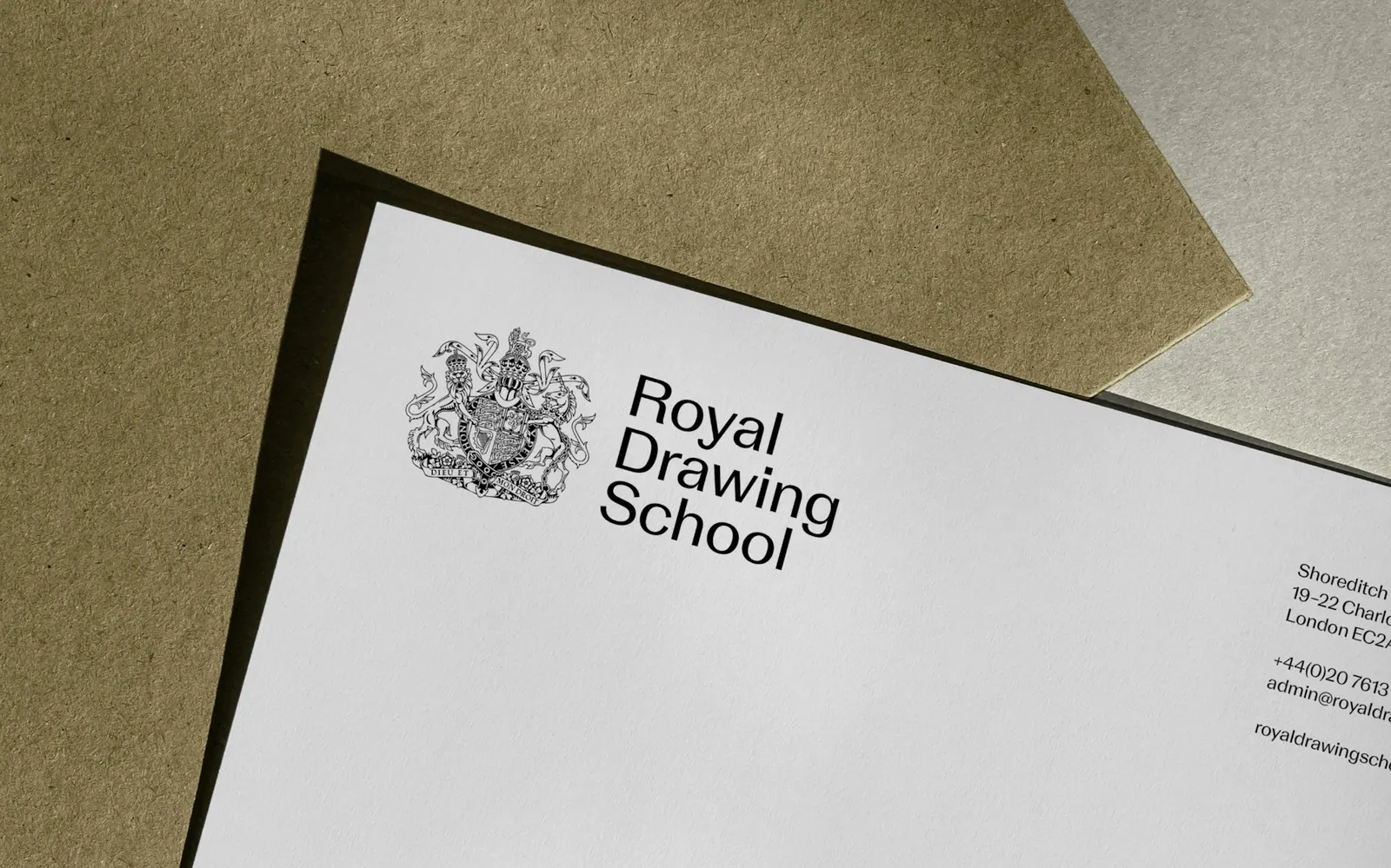
Logo
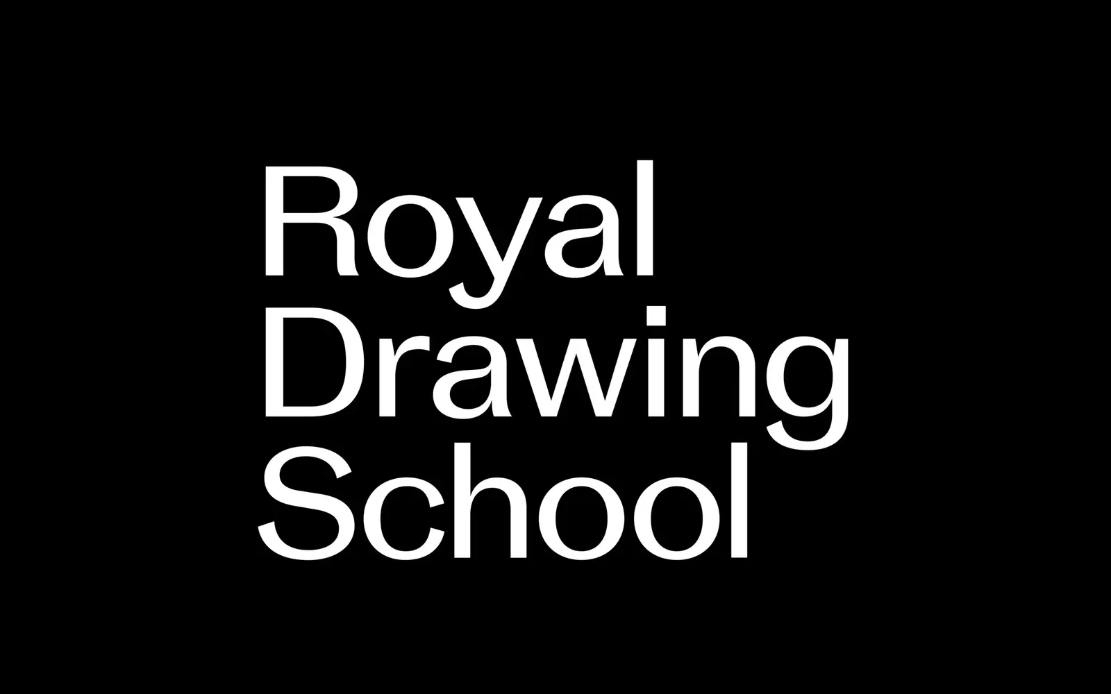
Typography
Images and video from pentagram.com, by Pentagram.