The Brand Monograph
SC brand identity by Pentagram
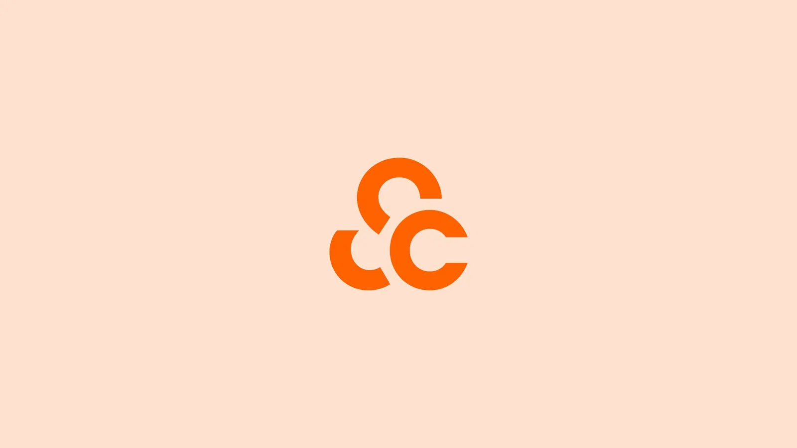
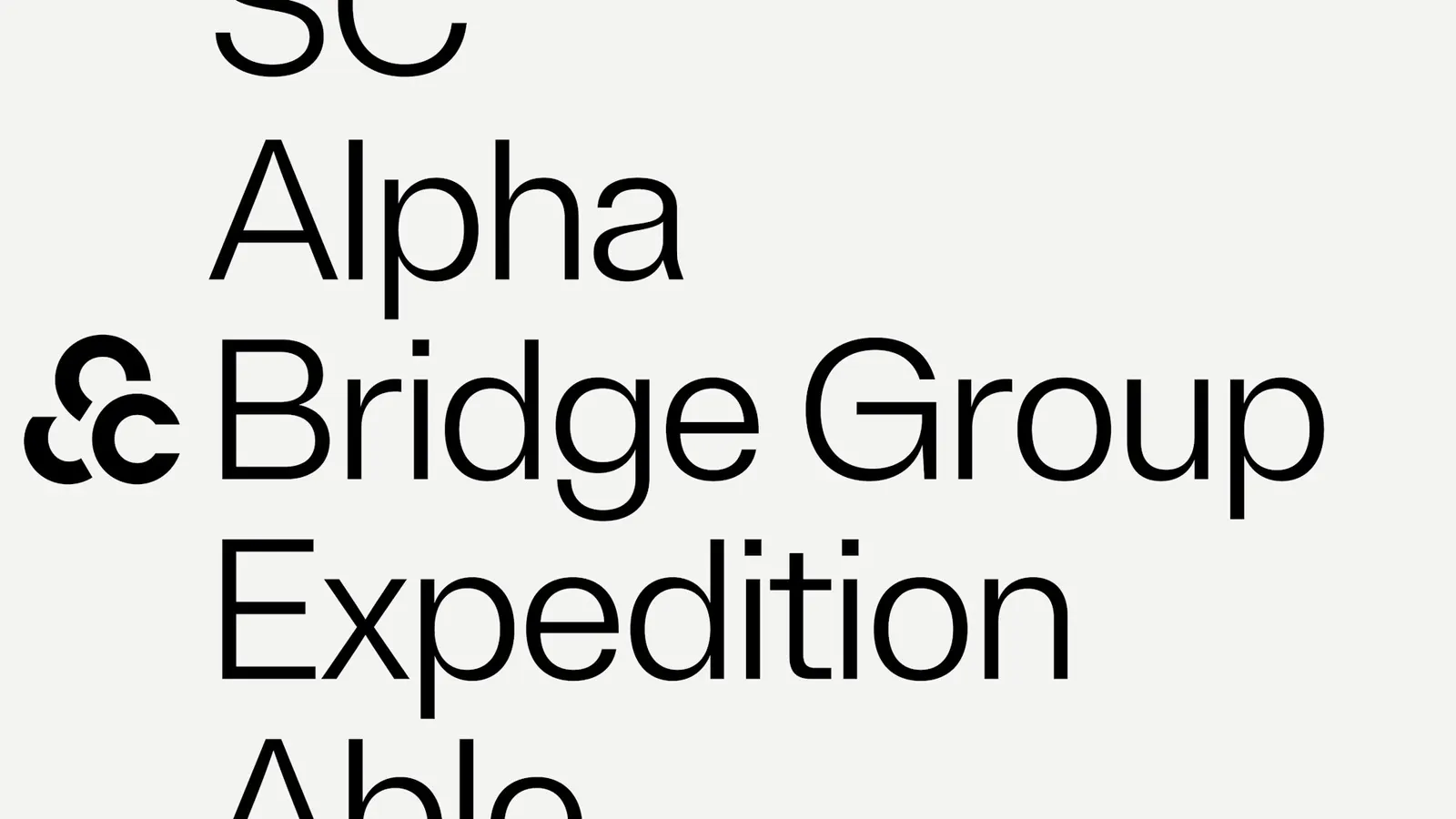
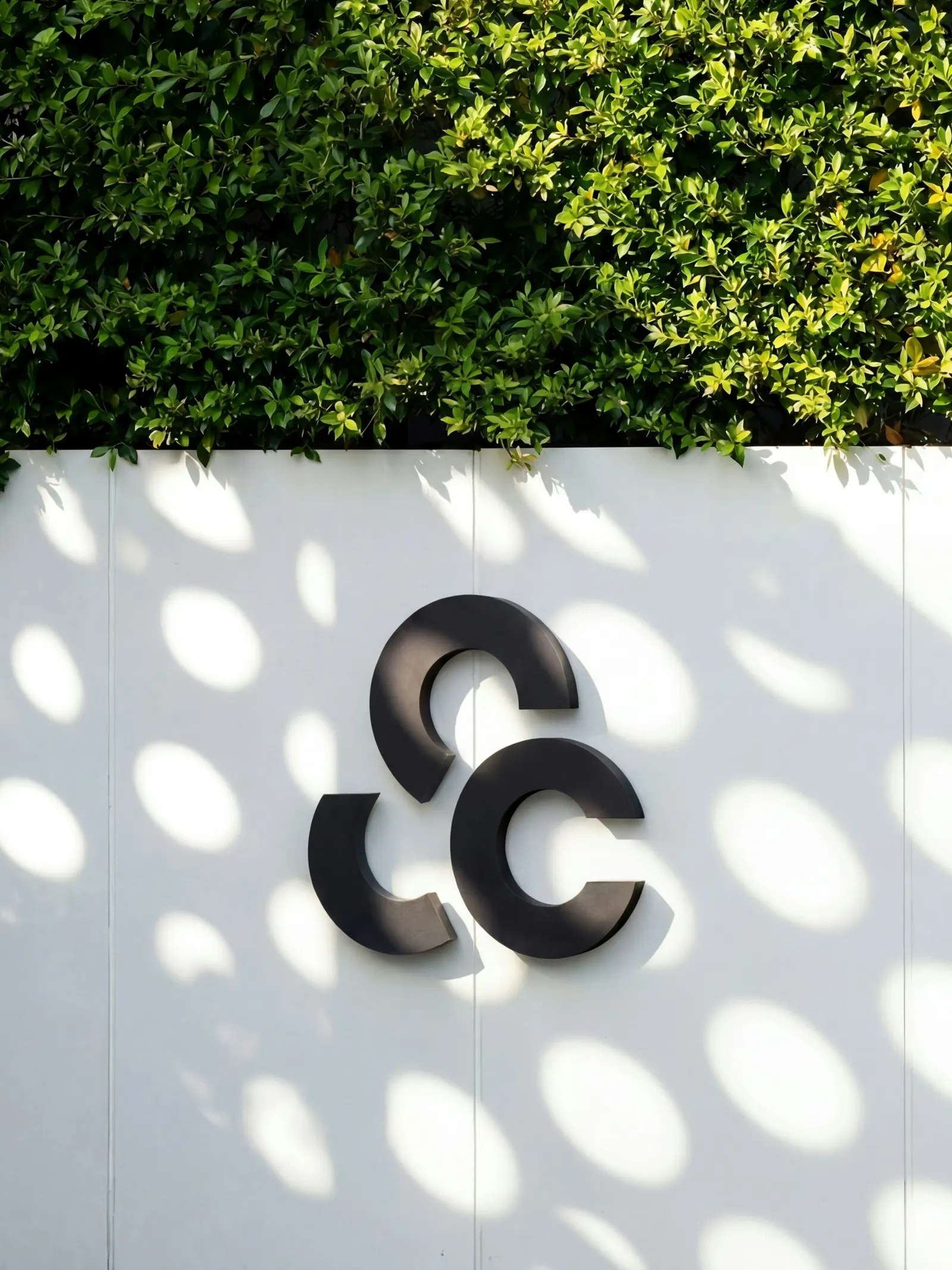
↗Pentagram's identity for SC begins with a subtraction. SC Asset is a major Thai developer of premium and luxury homes and commercial projects, but its name kept pointing people toward finance. Cutting it to "SC" gives the company something shorter and more ownable, plus a wordmark that works alone or beside its residential and commercial sub-brands.
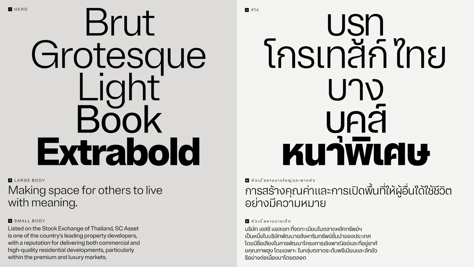
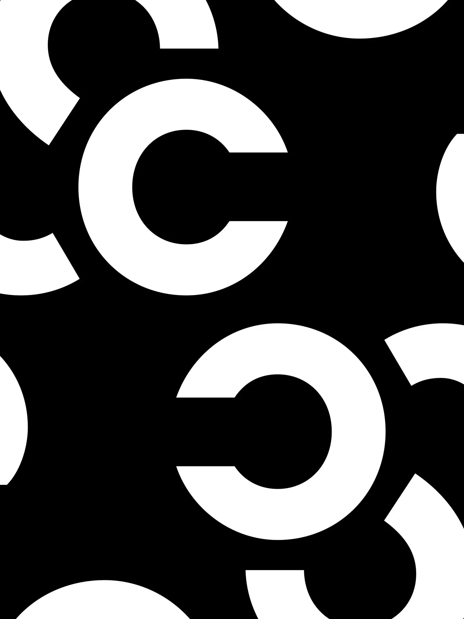
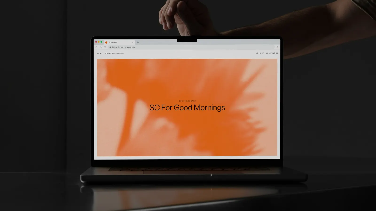
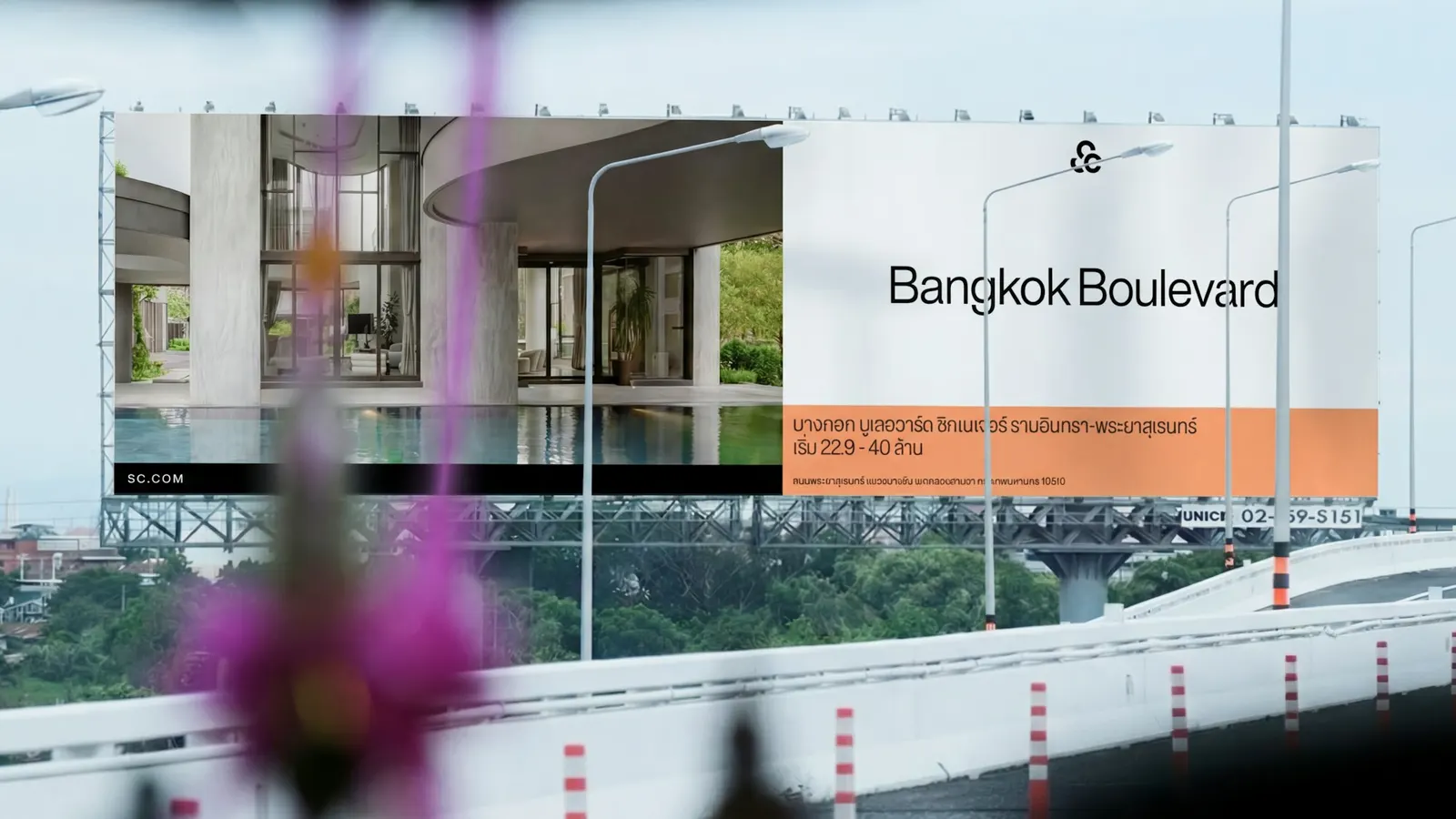
The letterforms take their cue from the seed at the heart of a flower. Around them, the team of Hazal Ozkaya, Jack Llewellyn, Jody Hudson-Powell, Luke Powell, and Nav Bhatia set a softened orange with pale pinks and warm neutrals, over abstract plant imagery given a grainy finish. Brut Grotesque from Bureau Brut leads the type, joined by a custom Thai companion drawn with Promphan Suksumek of Boom Type. Two pattern families grow from the mark: a spiral set based on phyllotaxis and a tighter, interlocking one.
Why it works
The strongest decision is the name. A two-letter mark is easy to remember, and without "Asset" the confusion with banking loses its footing. The botanical story gives a developer something warmer than the usual language of towers and skylines, which suits buyers who care about how a home feels. Muting the orange keeps the brand recognizable while moving it toward luxury, and the pink-toned neutrals read as residential rather than corporate. A Thai typeface built to match the Latin one shows the local audience wasn't an afterthought. The restrained interlocking pattern gives the premium end of the portfolio a quieter register.
Applications

Logo
Typography
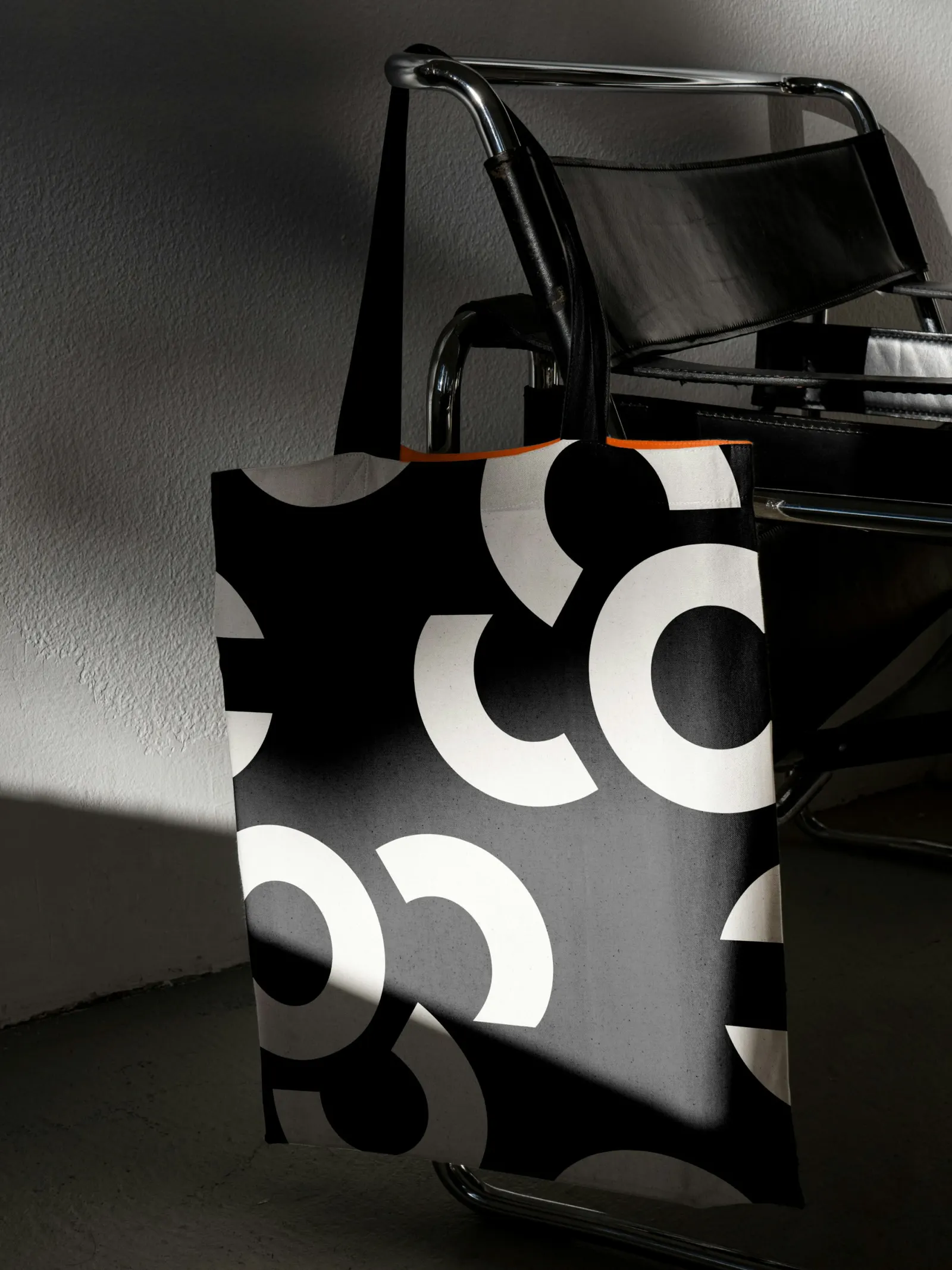
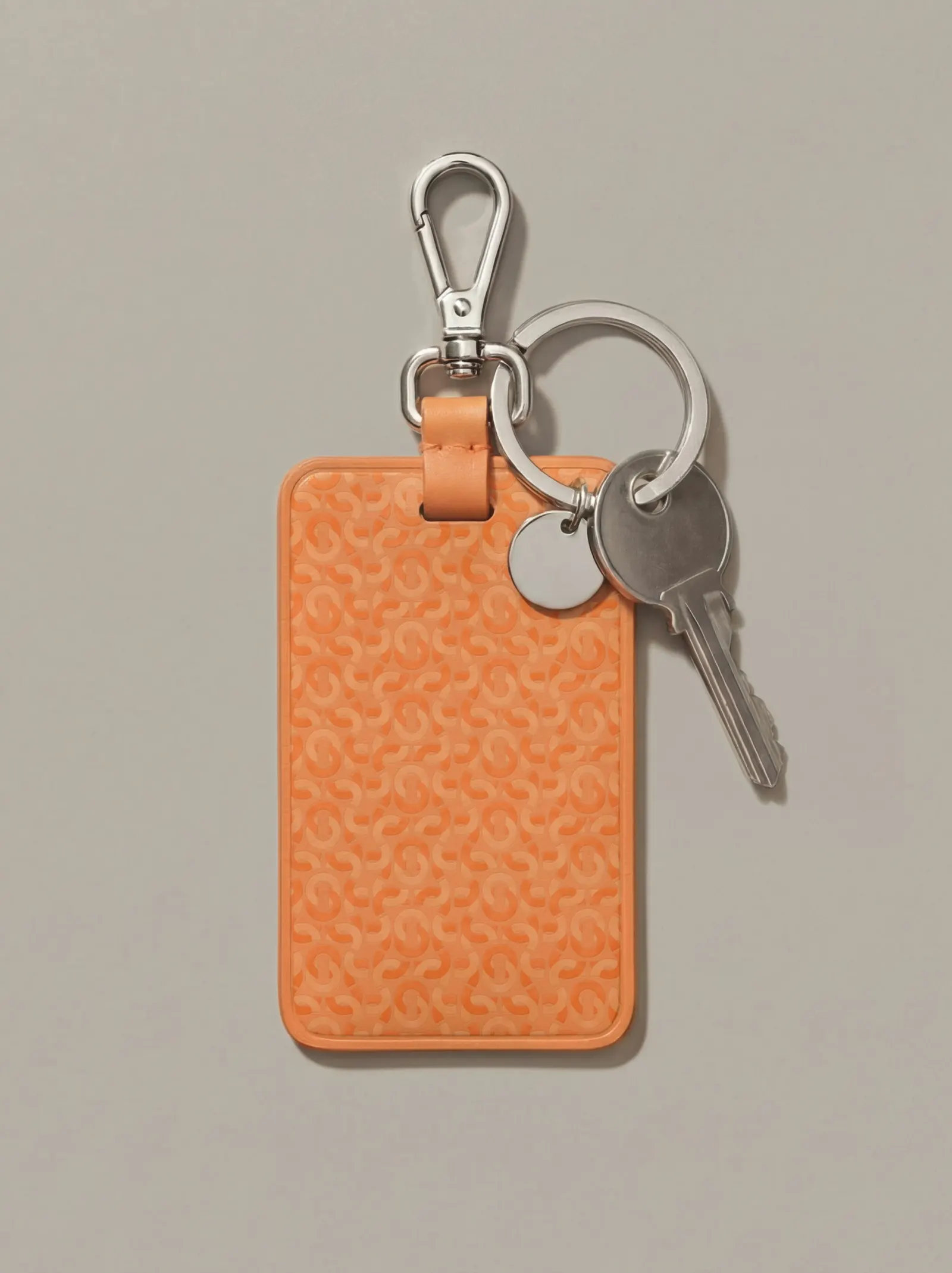
Images and video from pentagram.com, by Pentagram.