The Brand Monograph
Super Peach brand identity by Pentagram
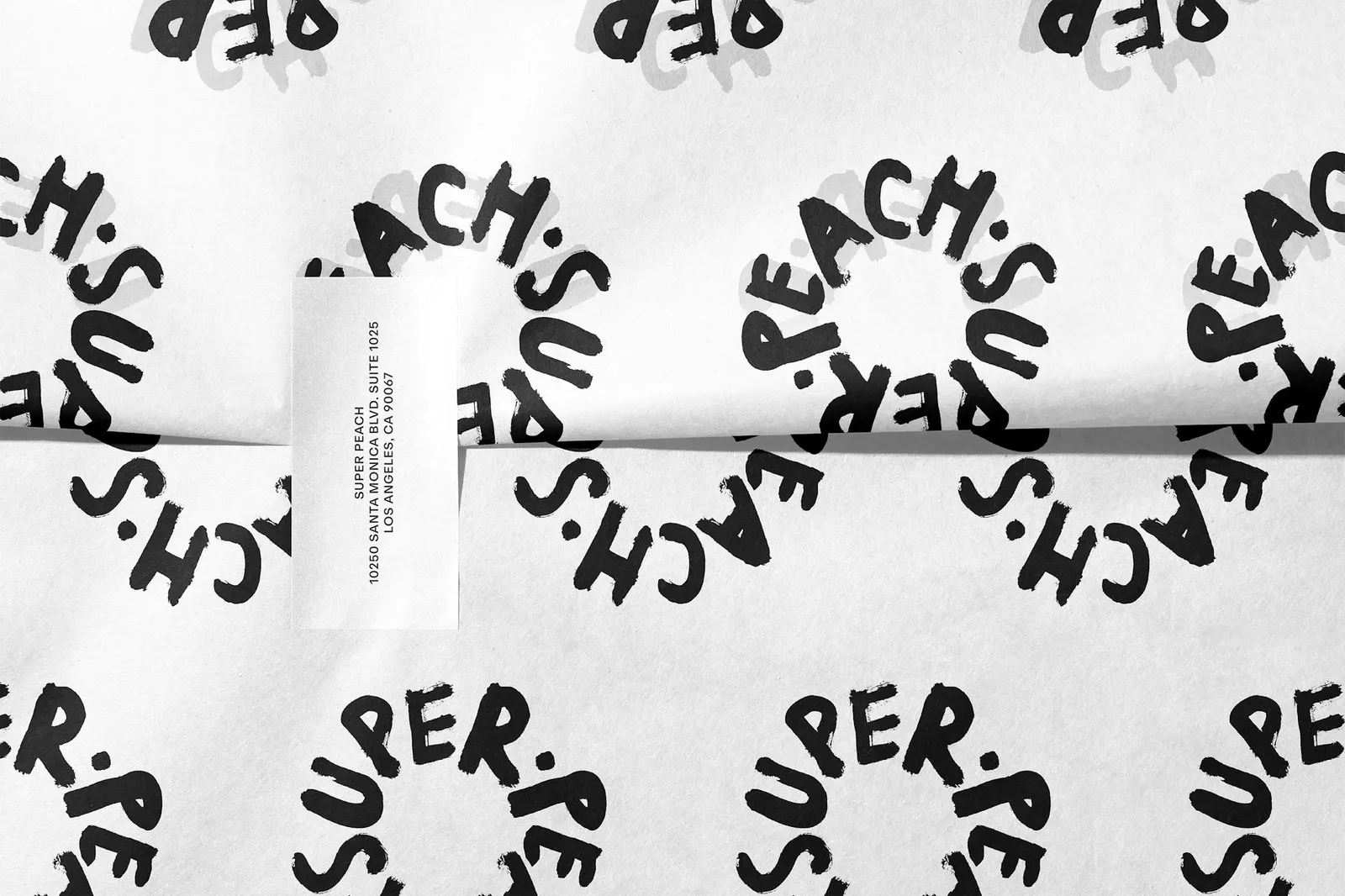
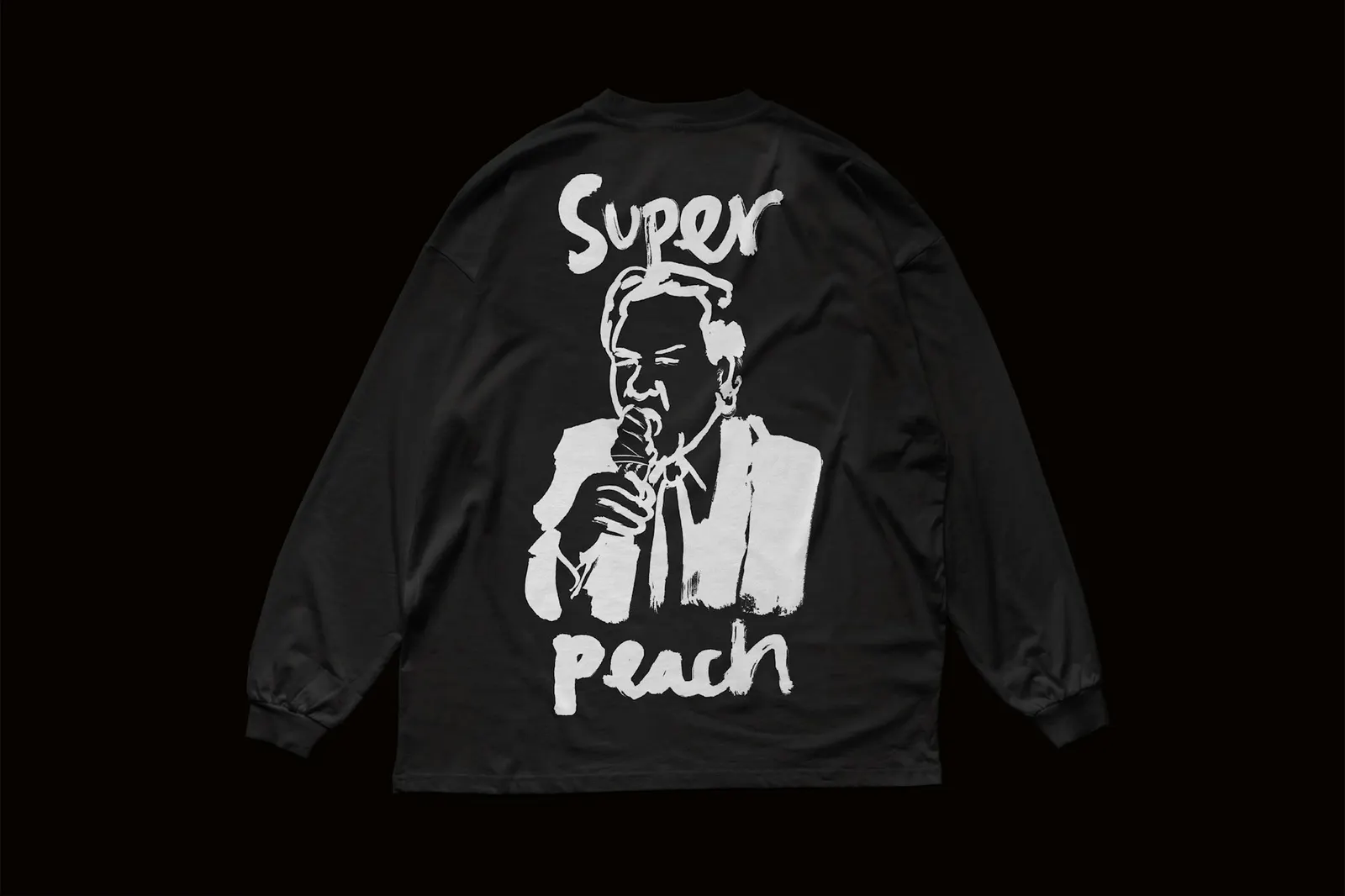
↗Most restaurant logos pick one mark and stay with it. Super Peach doesn't. For Momofuku's newest restaurant, at Westfield Century City in Los Angeles, Pentagram's Matt Willey and team worked with illustrator Pol Montserrat on a set of hand-drawn wordmarks that swap in and out of one another, so the name never looks quite the same twice.
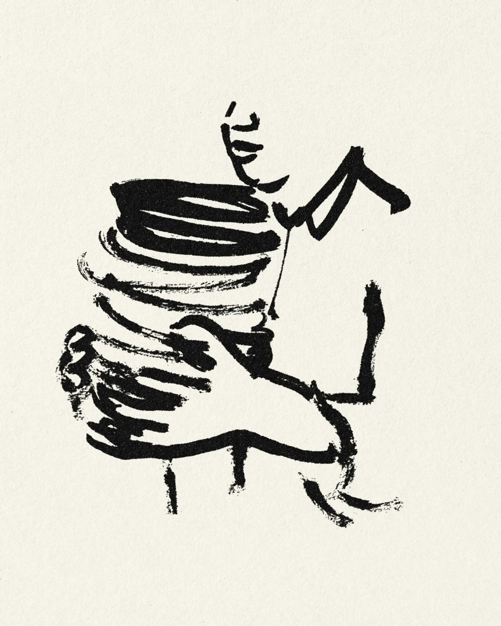
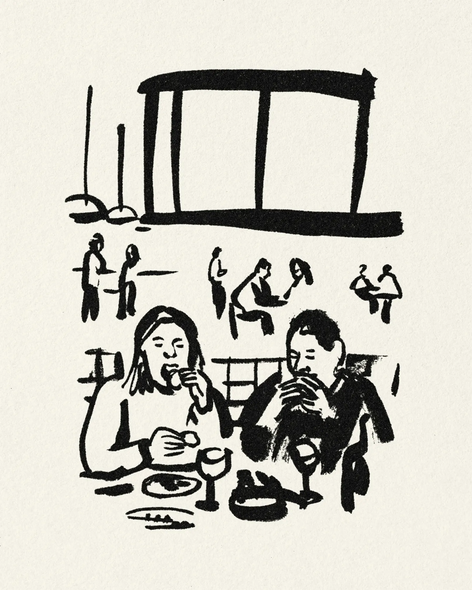
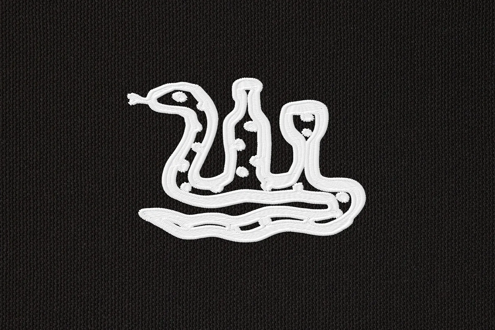
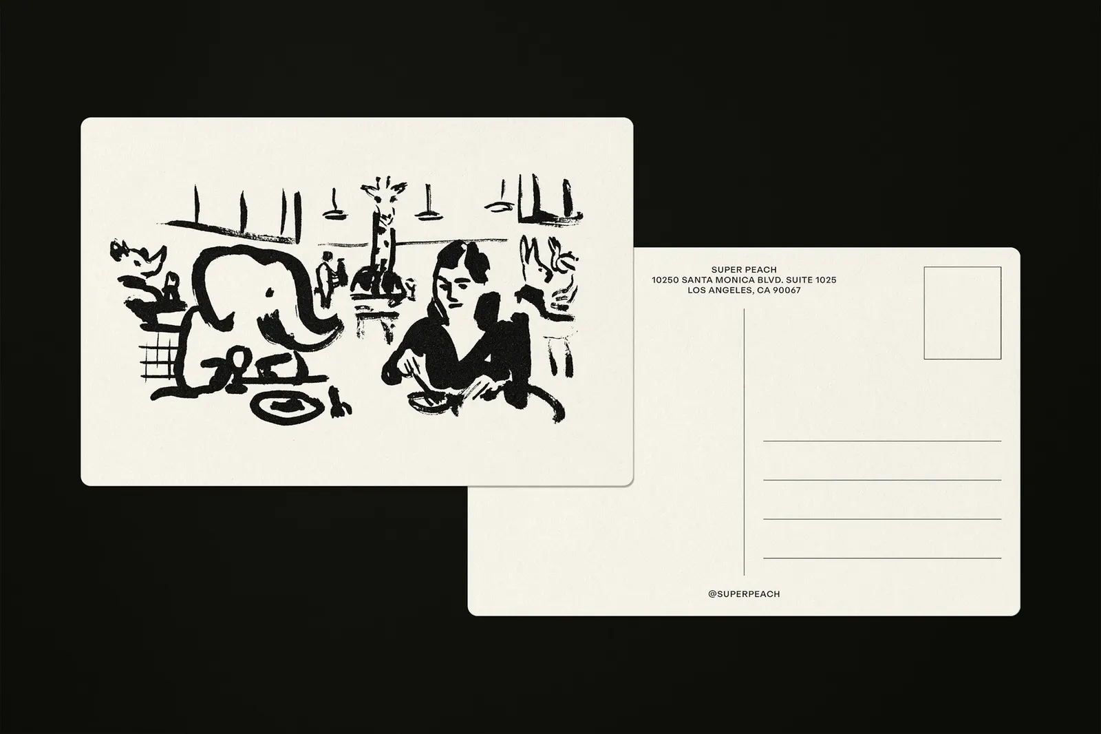
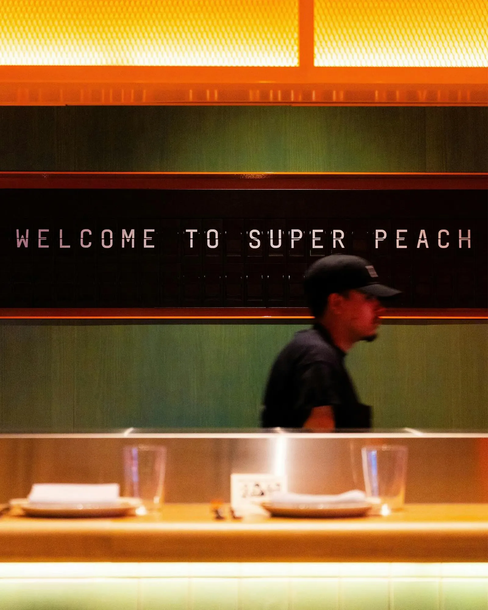
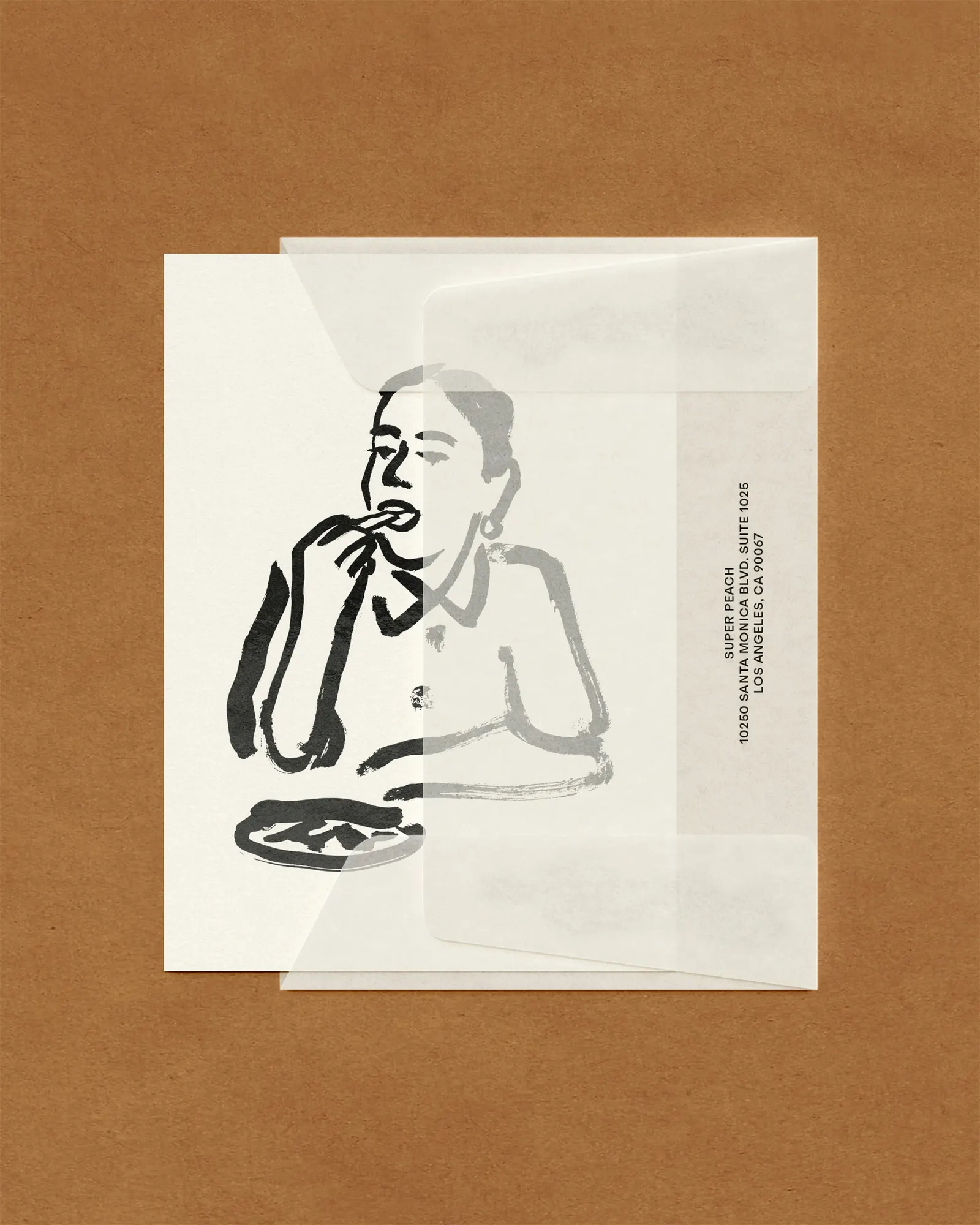
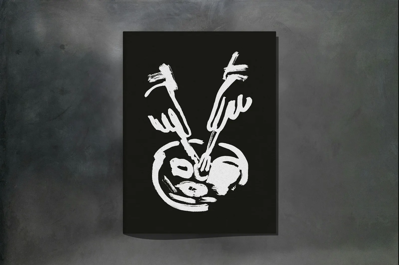
Super Peach is Momofuku's all-day, upscale casual format, a 196-seat room with a fish counter, open kitchen, and busy bar. Pentagram built the identity on contrast, setting loose lettering against ABC Repro from Dinamo, a plain, functional sans. The palette is strictly black and white, and Montserrat's illustrations add jokes and personality across menus, stationery, postcards, coasters, to-go bags, and uniforms.
Why it works
The restraint around the lettering is what makes the variety feel deliberate. Because the typeface and palette hold still, the wordmarks can be as loose and odd as they like without the system falling apart. Each coaster, bag, or menu gives guests a slightly different version of the name, which suits a room built on movement and rewards repeat visits. It also sets Super Peach apart from the single, tidy logo that tends to define upscale casual dining.
Applications
Logo
Images and video from pentagram.com, by Pentagram.