The Brand Monograph
USDC brand identity by Mother Design
↗Mother Design's identity for USDC stands out because it looks to money rather than to tech for its cues. USDC is the dollar-pegged stablecoin issued by Circle, and it needed to come across as fully backed and ready for regulation. The studio skipped the glowing gradients and abstract illustrations common in crypto and borrowed from banknotes and coins instead.
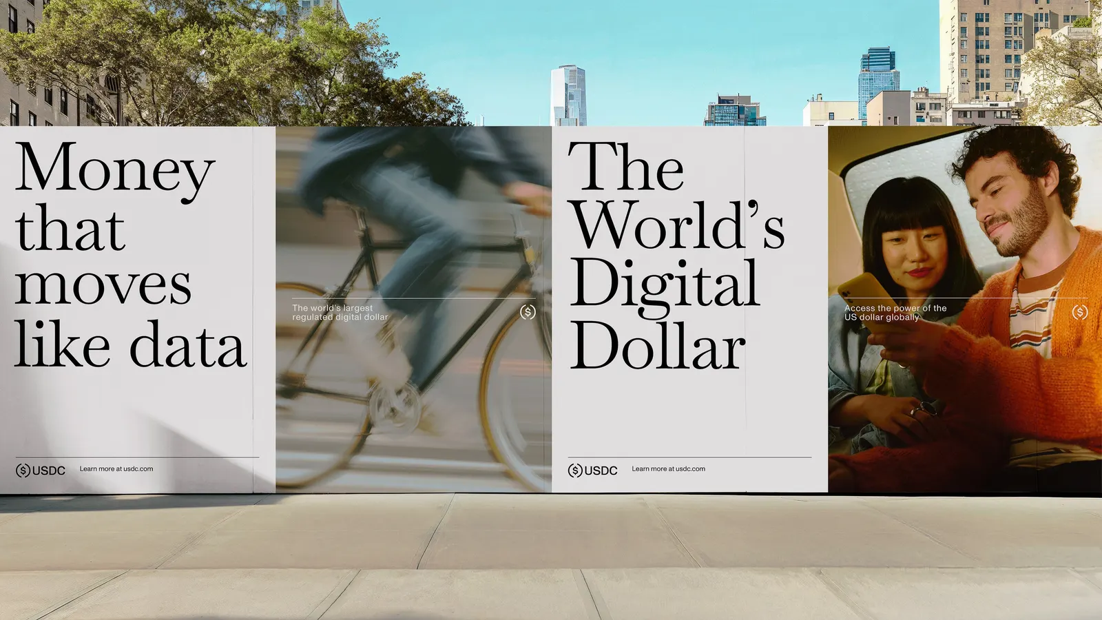
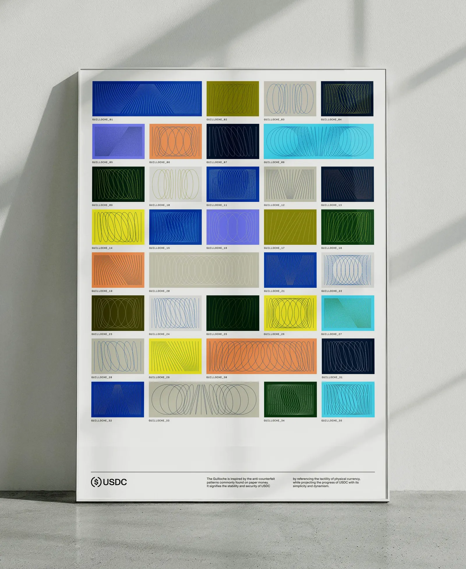
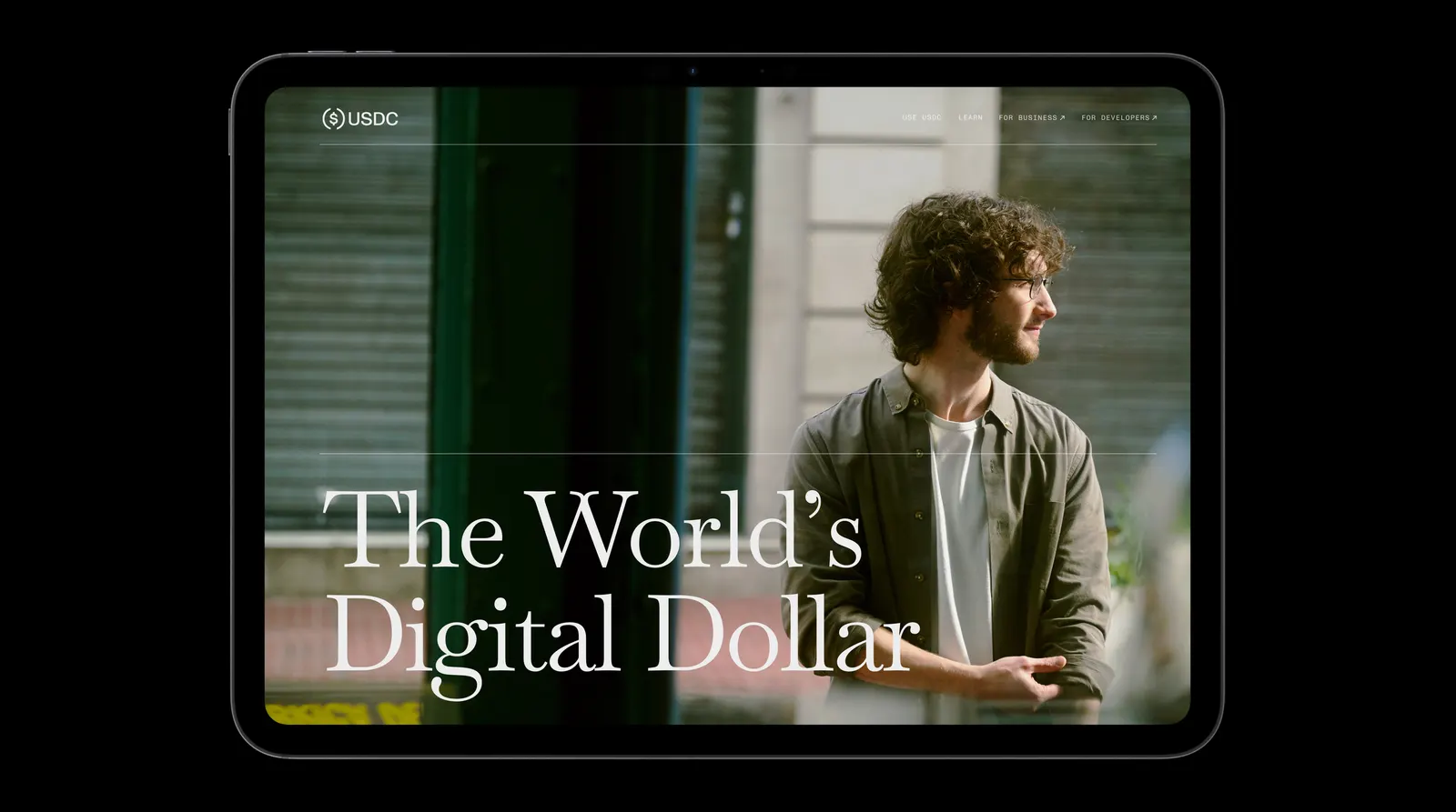
The studio sharpened the corners of the circular logo to sit alongside a customized Monument Grotesk wordmark, then built a EURC wordmark on the same structure. Baskervville, a historical serif redrawn with modern tools, is paired with Monument Grotesk Mono. The palette combines USDC blue, greens from the dollar, and accents taken from black-light security strips. Guilloché patterns built from circles and lines, plus coin-reeding stripes, form the graphic system, and Cotton Design helped build a generator for static and animated versions. Joao Canziani's photography shows everyday use.
Why it works
The strongest decision is making every layer tie back to the mark. The guilloché patterns are built from the logo's own circles and lines, so the decoration feels structural rather than applied. The serif and mono pairing says "established" and "precise" at once, which is the tension a regulated digital dollar has to hold. Real photography gives a skeptical audience something concrete to look at, and the shared wordmark structure lets EURC sit in the same family without a redesign.
Logo
Applications


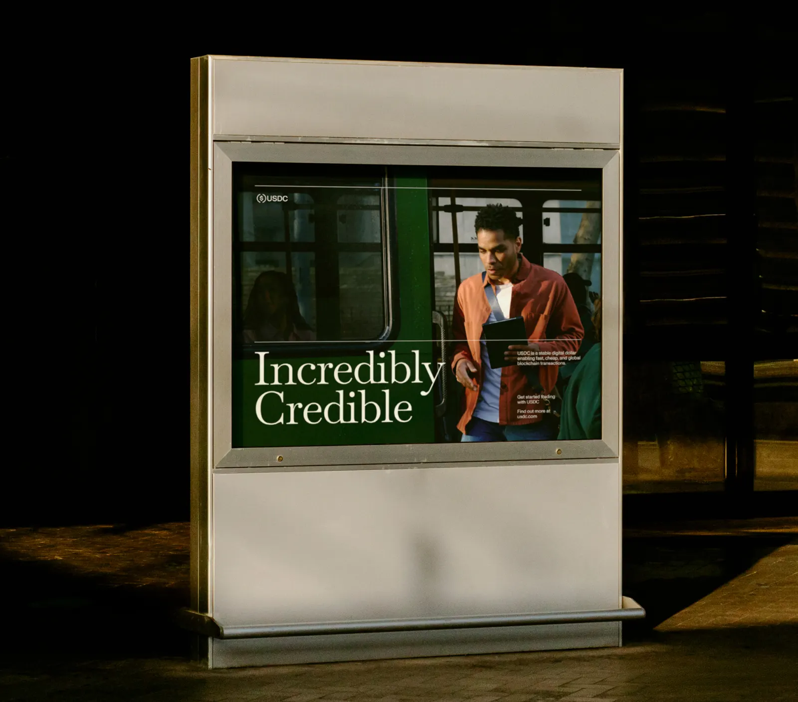
Images and video from motherdesign.com, by Mother Design.