The Brand Monograph
YZD brand identity by Pentagram
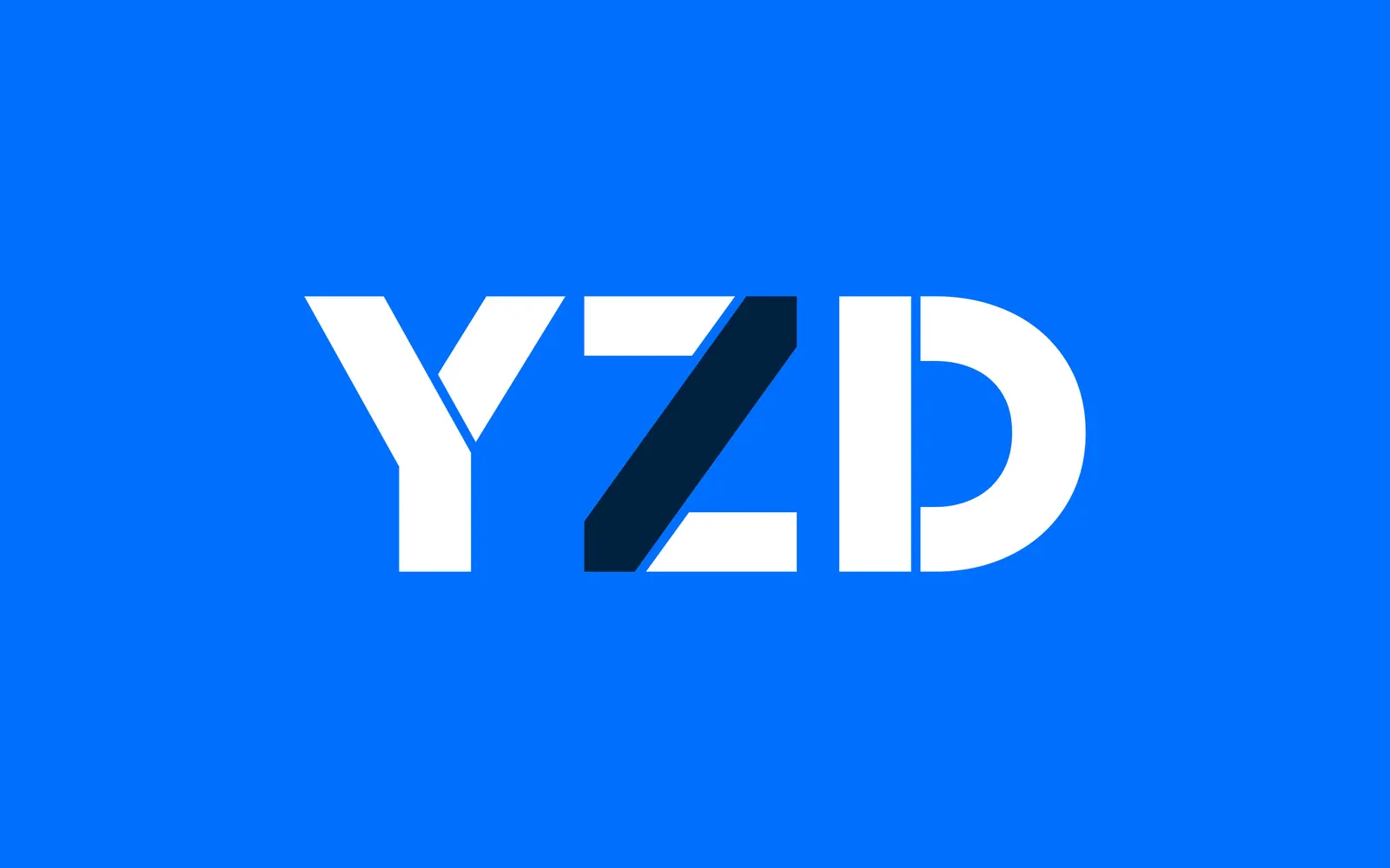
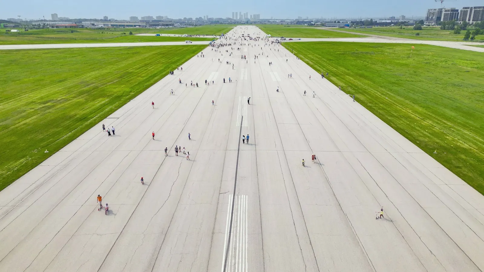
↗Pentagram's identity for YZD had to last through roughly three decades of construction. Northcrest Developments is turning the former Downsview Airport lands in Toronto, 370 acres of runways and hangars, into seven neighborhoods. Working with strategist Raul Barreneche, the studio kept the airport's call sign as the name and made it the umbrella for every district, beginning with the Hangar District.
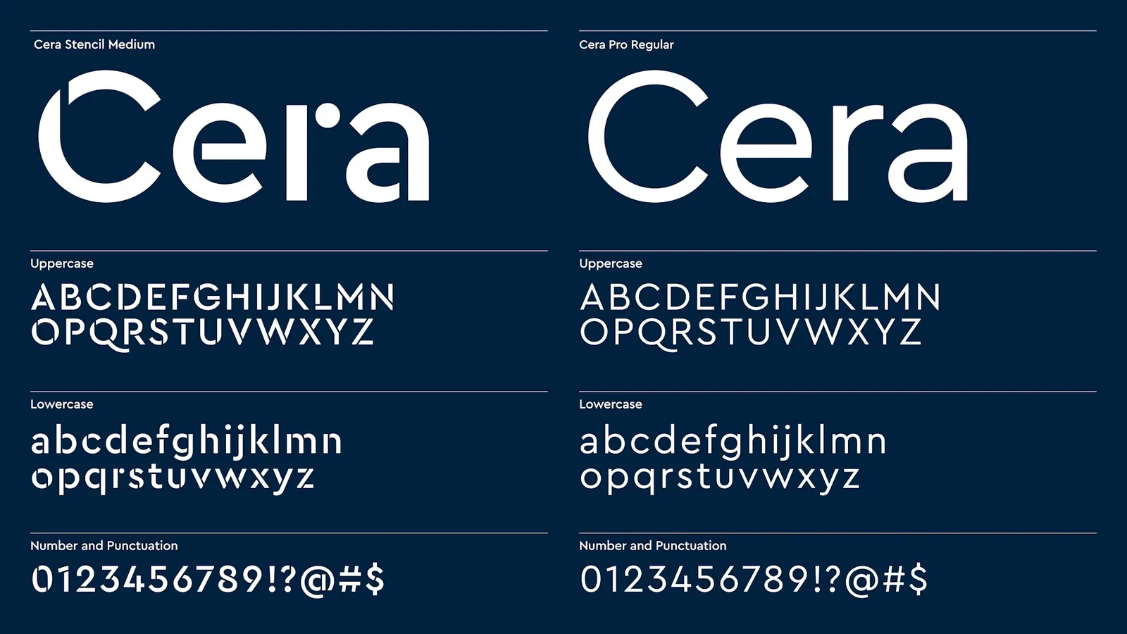
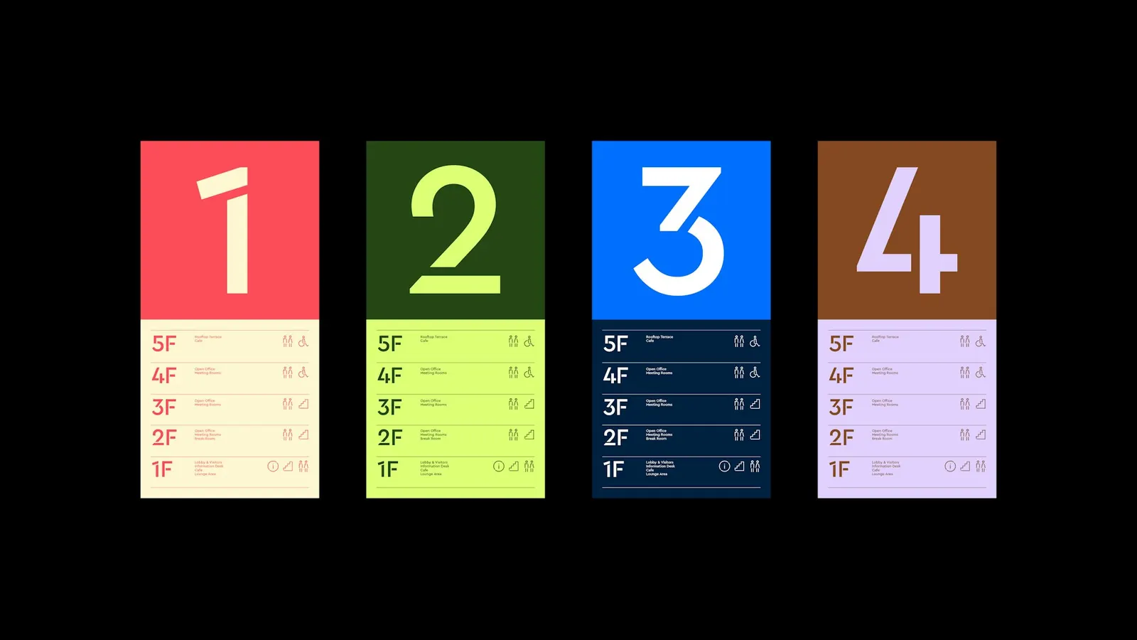
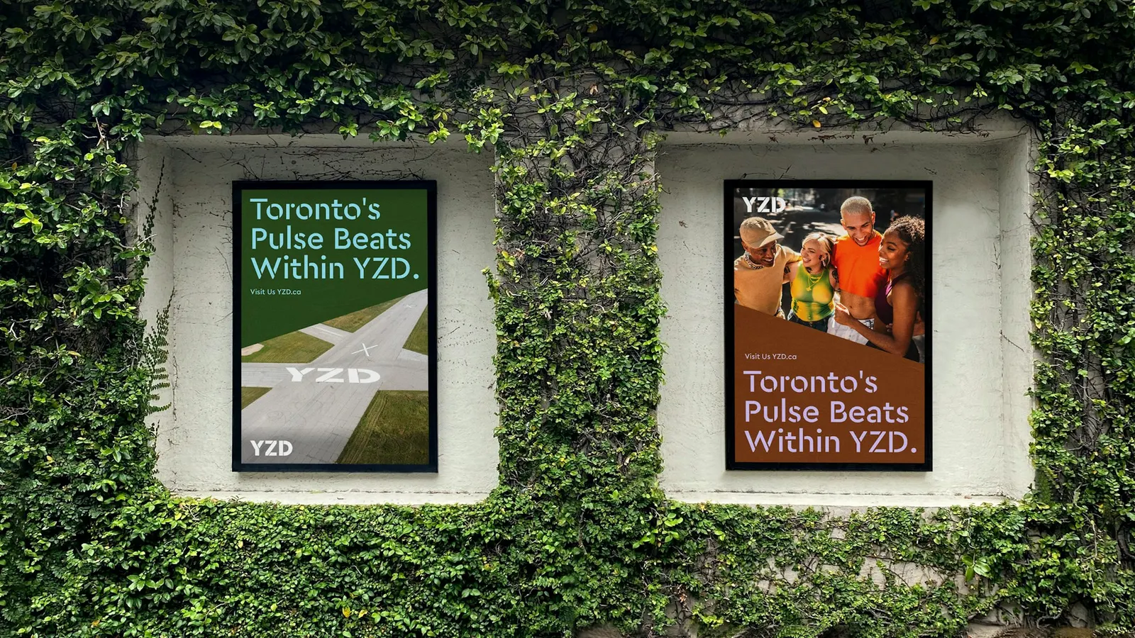
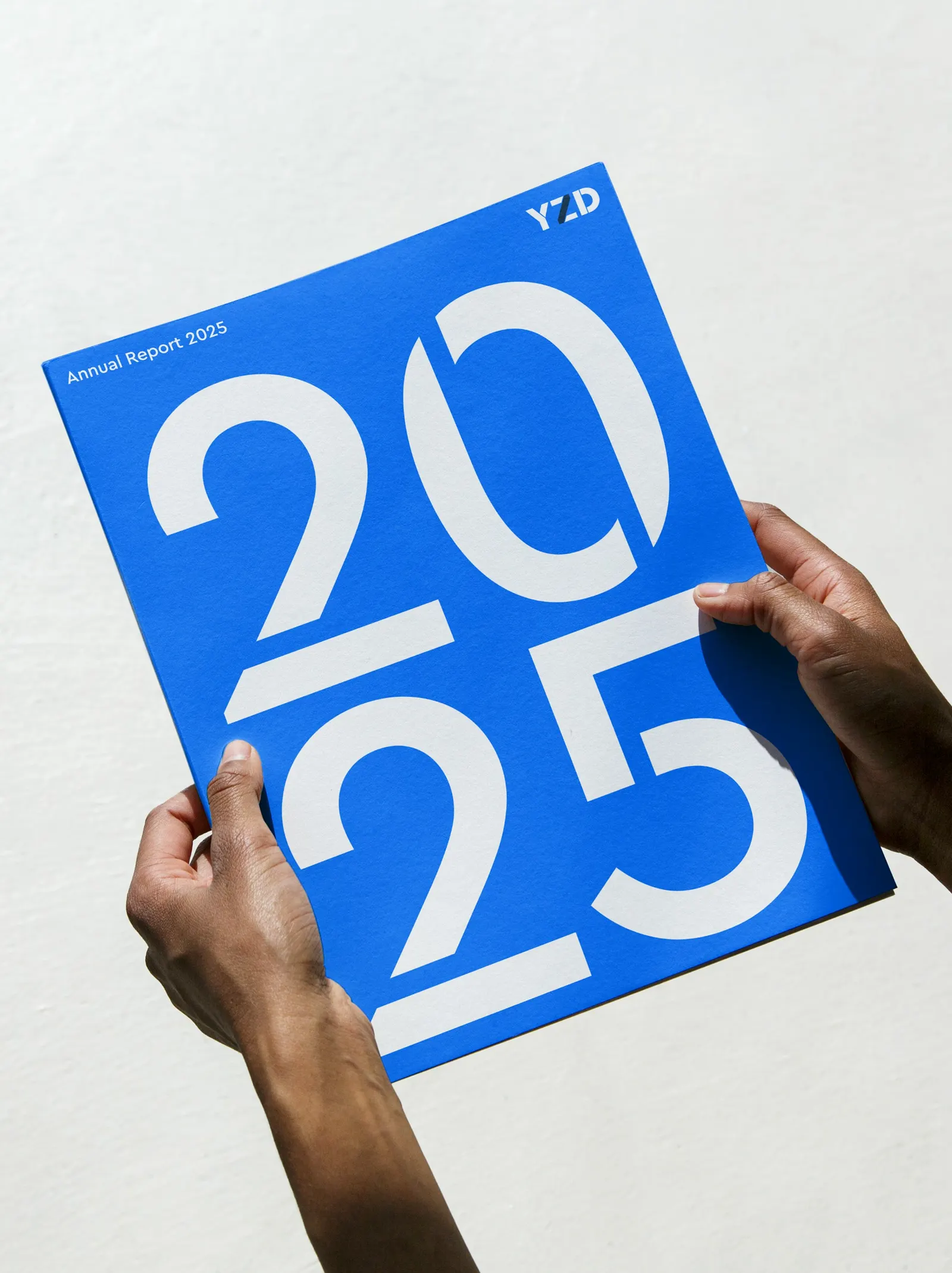
The look comes from airfield signage, which has to be read from far away and still be exact up close. The Z in the logotype takes its 54-degree angle from the runway that crosses the site, and the angle returns in layout, motion, and icons. Cera Stencil handles display type, and photography stays with the people who will live and work there. Alex Hulme, Jin Chun, Justin Zhang, Kent Ortiz, Natasha Jen, Nick Tallent, Virginia Galvan, and Zoë Thompson also built a vector map library that runs from abstract to literal.
Why it works
The 54-degree cut is the smartest decision here. One real fact about the site gives the Z a reason to exist and hands future designers a rule to follow, so the system can grow for decades without drifting. Stencil lettering is also a brave choice in a category that usually defaults to polished, neutral sans serifs. It feels industrial and honest about the place's past, and it holds up on a highway graphic or a tenant door. Because every district shares one name, each new phase builds on the last.
Applications
Logo
Typography
Images and video from pentagram.com, by Pentagram.